Data visualization

Communicating data effectively with data visualization - Part 4 (Time series)

Introduction

An important element of data visualization is to tell a story. To do that, we should have the end in mind. Namely, what is it you want to share with your audience?

Often, time series data can do this using some clever data visualization. Typically, this is presented on an XY plane where time is presented on the X-axis and the value of interest is presented on the Y-axis. We will not go into time series analysis, which involves a lot more than just plotting the data. However, we will go over the proper way in which to present your time series data visually.


Motivating example

We will use data from the National Health Expenditure Account (NHEA), which contains historical data on health expenditures in the U.S. from 1960 to 2016. The costs presented by the NHEA are properly adjusted for inflation. You can find the data at this link: https://www.cms.gov/Research-Statistics-Data-and-Systems/Statistics-Trends-and-Reports/NationalHealthExpendData/NationalHealthAccountsHistorical.html


Time series data

To visualize time series data, it is best to have increments of time that are equally spaced in the X-axis. We use Excel to illustrate these examples. Figure 1 illustrates the annual interval of national health expenditures ($ billions) in the United States from 1960 to 2016. The outcome (national health expenditure) is on the Y-axis and time (year) is on the X-axis. Notice that each time increment is one year and evenly spaced across the X-axis. This allows the eyes to intuitively see the changes across time in the U.S. national health expenditure.

Figure 1. National Healthcare Expenditure in the United States, 1960 to 2016.

Figure 1.png

What if the story is to see highlight health expenditures in the last decade? How would we do this?

First, we can use the same data and restrict the X-axis to 2007 to 2016 as in Figure 2.


Figure 2. National Health Expenditures in the United States, 2007 to 2016.

Screen Shot 2018-01-24 at 6.02.04 PM.png

Figure 2 doesn’t seem interesting. There is an increase in health expenditures from 2007 to 2016, but this doesn’t seem significant. However, there is a 45% increase from 2007 to 2016 in health expenditures ($2,295 billion to $3,337 billion). Figure 2 doesn’t convey this increase because there is a lot of white space between the lowest health expenditure value in 2007 and $0.

One way to illustrate the large increase in health expenditure is to truncate the Y-axis. In previous articles, we stressed that truncated axis can distort and trick the mind into seeing large differences where they don’t exist. However, this same technique can be used to make sure that differences that exist are not misinterpreted as not visually significant. According to Tufte:

In general, in a time-series, use a baseline that shows the data not the zero point. If the zero point reasonably occurs in plotting the data, fine. But don't spend a lot of empty vertical space trying to reach down to the zero point at the cost of hiding what is going on in the data line itself.[1]

In other words, time series data should focus on the area of the timeline that is interesting. The graphic should eliminate the white space and show the data horizontally for time series visuals.

Eliminating the white space and identifying the baseline value as $2,200 billion instead of $0 changes the figure as illustrated in Figure 3.


Figure 3. National Health Expenditures in the United States, 2007 to 2016.

Figure 3.png

Figure 3 illustrates the increase in national expenditure in the last decade better than Figure 2 and maintains the narrative that there was a visually significant increase.

Putting these concepts together (along with Tufte’s other principles), we can generate a similar figure using R (Figure 4). The R code is listed below.

# Plot trend - without truncation
library(lattice)
  
xyplot(y~x, 
       xlab=list(label="Year", cex=1.25),
       ylab=list(label="National Health Expenditures ($ Billions)", cex=1.25),
       main=list(lable="National Health Expenditure (2007 to 2016)", cex=2),
       par.settings = list(axis.line = list(col="transparent")),
       panel = function(x, y,...) { 
          panel.xyplot(x, y, col="darkblue", pch=16, cex=2, type="o")
          panel.rug(x, y, col=1, x.units = rep("snpc", 2), y.units = rep("snpc", 2), ...)})

Figure 4. National Health Expenditures in the United States, 2007 to 2016.

Figure 4 (darkblue).png

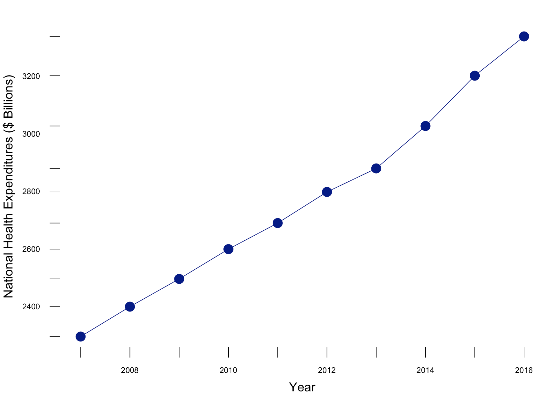
Figure 4 incorporates the use of Tufte’s principles on data-ink ratio and truncation on the y-axis to highlight the change in National Health Expenditure between 2006 go 2017.


Conclusions

With time series data, truncating the Y-axis to eliminate white space and show the data horizontally is appropriate when telling the story of what’s happening across time. Using zero as the baseline for the Y-axis is appropriate if it is reasonable. However, do not compromise the story by having the Y-axis extend all the way to zero if it doesn’t tell the story properly. Knowing when and how to truncate the Y-axis will help you explain to your audience the significance of a change across a specific period in time.


References

1. Edward Tufte forum: baseline for amount scale [Internet]. [cited 2018 Jan 14];Available from: https://www.edwardtufte.com/bboard/q-and-a-fetch-msg?msg_id=00003q

Communicating data effectively with data visualization – Part 3 (Truncated Axis and Area as Quantity)

Introduction

Data visualization is a powerful tool that allows us to use data to tell an engaging story. The narrative we present is enhanced by our data, especially when it is easily accessible and intuitive to understand. This is evident by the large amount of data visualization tools and galleries available throughout the internet. For example, Tableau Software hosts a data viz gallery that allows users to post their creations using their software. However, for most users, Microsoft Excel is the first tool they are exposed to when it comes to developing data visualizations for their business, school, and social projects.

Creating data visualization has its caveats. Improper data visualization can mislead, distort, and “lie,” which can result in poor decisions, loss of profit, and regret. In this blog, we will explore two of the most common distortion techniques that violate Tufte’s principles of graphical integrity: Truncated Axis and Area as Quantity.[1]


Motivating example

We will use data from the Medical Expenditures Panel Survey, which is a large-scale survey of households on health care resource use and spending in the United States. We will compare insurance status (Private, Public, Uninsured) between genders, which is summarized in Table 1. We will use Microsoft Excel to generate all our examples.

Table 1.png


Distortions

Data visualization has opened the door to increased misrepresentation of numbers. Interest groups and advocates will distort the data visualization to try and mislead or convince their audience of their arguments or narrative. Such techniques include using truncating axes and disproportionate sizes.

Let’s compare the difference in the proportion of males with public insurance to females with public insurance. In Figure 1, a bar chart is used to compare the proportion of males and females with access to public insurance. In Panel A, a truncated y-axis is used to distort the difference in the proportion of males and females with public insurance. The absolute difference is approximately 4%. However, Panel B, which uses a non-truncated y-axis, the perceived difference is not as great as that appearing in Panel A, despite having an absolute difference of 4%. Our mind perceives Panel A as having a greater difference; however, Panel B shows the same absolute difference of 4%, but does not illicit the same perception. This is supported by a study performed by Pandey and colleagues who reported that respondents rated the truncated bar chart as having a greater difference than the non-truncated bar chart.[2] It is our recommendation that a non-truncated y-axis is used when presenting data as a bar chart.

Figure 1. Comparisons of bar charts using a truncated y-axis (A) and a full y-axis (B).

Figure 1.png

Another distortion technique uses disproportionate sizes or “Area and Quantity” method. With this distortion, the values or quantitative data is not proportional to the area that represents it. Tufte argues that “the representation of numbers, as physically measured on the surface of the graph itself, should be directly proportional to the numerical quantities represented.”[1] In order words, the area used to represent the values or quantitative data should not be grossly exaggerated. Figure 2 illustrates how this principle is violated.

Figure 2. Proportion of males and females with public insurance using improper Area as Quantity.

Figure 2.png


In Figure 2, 27% of males have public insurance versus 31% of females. In terms of relative difference, females have a 15% greater proportion with public insurance compared to males per the equation: .

However, the area in Figure 2 has females with an area that is 96% greater than males, which is not reflective of the relative difference of 15%.

Figure 3 illustrates the correct Area as Quantity that reflect the relative difference between males and females with public insurance. We estimated the area of the circle for males and females and properly adjusted the sizes to reflect their relative differences. Now, the relative difference is not as great as previously illustrated. Instead, we have an accurate representation of the relative difference in having public insurance between males and females. We recommend estimated the area of a shape to reflect the relative difference between the groups with these types of data visualizations.

Figure 3. Proportion of males and females with public insurance using the proper Area as Quantity.

Figure 3.png

Conclusions

Distortions can mislead or convince an audience of a narrative that do not reflect the actual data. Developing data visualization that provides empirical support for your narrative should be accurate and honest. Fortunately, innocent mistakes like the examples above are easy to correct, especially when using programs like Microsoft Excel.


Notes

We calculated the area of the circle using Archimedes method where Area = pr^2 where p is the constant (p=3.14) and r is the radius of the circle.


References

1. Tufte ER. The Visual Display of Quantitative Information. Second. Cheshire, CT: Graphics Press, LLC.; 2001.

2. Pandey AV, Rall K, Satterthwaite ML, Nov O, Bertini E. How Deceptive Are Deceptive Visualizations?: An Empirical Analysis of Common Distortion Techniques [Internet]. In: Proceedings of the 33rd Annual ACM Conference on Human Factors in Computing Systems. New York, NY, USA: ACM; 2015. p. 1469–1478.Available from: http://doi.acm.org/10.1145/2702123.2702608


Communicating data effectively with data visualizations - Part 1 (Principles of Data Viz)

Introduction

Data visualization is a form of visual communication that takes quantitative information and displays it as a graphic, an abstraction of the real world. Effective data communication makes complex statistical analysis accessible without excessive mental burden. It is also used to identify patterns through data exploration. Unlike information visualization which includes catch-phrases such as “Infoviz” and “Infographics,” data visualization is intuitive, informative, and “pretty” while simultaneously focused on scientifically structured comparisons, analytic precision, and statistical inference. The challenge is compressing all the quantitative information into a single chart or graphic that provides a narrative or purpose that can be synthesized and acted on with very little mental effort.

There are a variety of data visualizations that can be used such as choropleths, heatmaps, scatter plots, and dot plots (this list is not all inclusive). The selection is dependent on the data, audience, and narrative. How complex is the analysis? Who are you presenting this information to? Why should the audience care?

The best way to present data effectively is with a good story. Your graphic should be able to tell a story based on the quantitative information. Every graphic you create should be a self-contained narrative of the data. This can be achieved using simple tools, but the creation of effective data visualization depends more on your ability to tell a good story. The purpose of this article is to highlight some important principles of data visualization, review common data visualizations, and develop a mechanism to select the most effective data visualization.

Principles of data visualization

Data visualization can be traced to several different schools of thought (e.g., Edward Tufte and William S. Cleveland), but the fundamental principles are similar and often overlap. Edward Tufte identified several key principles when developing data visualizations (Table 1).

Table 1. Tufte's principles for graphical integrity. *

Principle**

Description

Avoid chart junk

Inventive displays seldom generate interest. Rather, they generate visual noise.


Data-ink ratio

Use ink to show the data. Ink that does not contribute to the reporting of the data should be removed.


Numbers should be directly proportional to the numerical quantities represented

The "Lie Factor" is a proportion of the Size of the effect shown in the graphing / Size of the effect in the data. The graphic should not inflate the actual magnitude of the change.


Use small multiples and repeat

High quality information graphic portrays many numbers per square inch. Small multiple, comparative images work especially well for this. Examples include sparklines.


Avoid graphical distortions and ambiguity

Avoid distortions of numbers by graphic devices. Show data variation in context, and label them. Write out explanation of the data on the graphic itself. Properly label events in the data.


Multifunction

Information layers and architecture emerge best when data display elements serve multiple functions. Different readings at different levels of detail (micro-macro) serve this goal well. For example, the y-axis can be used to provide scale while calling out to important values by either coloring that value differently or enlarging it.


Show data variation, not design variation

Use scales that are similar and do not generate ambiguity. Be consistent in the data when displaying them as a graphic.


In time-series displays of money, deflated and standardized units of monetary measurement are nearly always better than nominal units

Properly adjust current due to inflation or population growth. We want to the currency in real purchasing power (value) rather than nominal purchasing power.


The number of information-carrying (variable) dimensions depicted should not exceed the number of dimensions in the data

Using graphics to show the proportional change of a metric can bias our perception due to the number of dimensions that are changing. If we look at a single metric such as budget, then we are only looking at a one-dimensional scale, meaning that when the budget increase, it only changes in one dimension. However, it is easy to use a display such as a 2-dimensional picture and scale it up according to the one-dimensional scale. For example, if we have a 2-dimensional graphic and we scale it according to an increase on a one-dimensional metric, the actual proportional increase in 4 times (2^2 = 4). If this was a 3-dimensional object, then the proportional increase in 8 (2^3 = 8).


Graphics must not quote data out of context

An accurate picture must report the totality of the effect. Showing only one piece of the data with graphics is just as bad as the data. Context is critical. In time-series analysis, it is imperative that the researcher provides an illustration of the overall trend including any changes in seasonality. Therefore, apply rational judgement when presenting data visualization. The use of comparison groups helps to answer any secular impacts that may not be captured when looking at data at a single point in time.


* From Tufte ER. (2001) The Visual Display of Quantitative Information. Second Edition. Cheshire, CT. Graphics Press, LLC.

** This table provides fundamental principles on graphical integrity and data graphics and is not all inclusive.

Figure 1. Box plots of MLB wins in the 2017 season. [click to enlarge]

Dot plots are simple graphics that use points (filled in circles) instead of line or bars on a simple scale. They convey the same information as bar charts, but use less ink to do so. The advantage they provide is that they reduce the junk of the bar charts which contain useless space that are uninformative. In Figure 2a, the dot plot provides the same information from the previous bar charts; however, there is a better sense of scale with the removal of the clutter introduced by the bar charts. Like the bar charts, use pastel colors to dampen the effect of the teams that are not the focus of the chart and use solid colors to bring out the teams with the most and least wins (Figure 2b). The minor grid lines do not provide any information about the data and should be removed (Figure 2c). Finally, Figure 2d takes the dot plots and use data values to provide the audience with the actual number of wins. This is also reinforced by the pastel and solid colors, which provide good contrast between the teams that have the most and least wins.

Figure 2. Dot plots of MLB wins in the 2017 season. [click to enlarge]

Line plots are graphics that use lines to illustrate a trend. A line plot would not be appropriate for the baseball wins example because the x-axis does not have any continuous scale, which is needed for line plots. Table 2 provides data on MLB players’ batting averages from 2013 to 2017. The table provides us with information across five years, but the order and rankings are difficult to determine.

Table 2. Batting averages of Major League Baseball players (2013-2017).

Players

2013

2014

2015

2016

2017

Yasiel Puig

0.319

0.296

0.255

0.263

0.260

Justin Turner

0.280

0.340

0.294

0.275

0.332

Michael Trout

0.323

0.287

0.299

0.315

0.329

Ichiro Suzuki

0.262

0.284

0.229

0.291

0.250

The table doesn’t do a good job illustrating the trends over time. Instead, it is a good reference that is searchable. When it comes to visually telling a story, the table doesn’t do a good job. Converting this table to several line plots can help illustrate the changes in each players’ batting averages over time. Figure 3a trends each player’s batting averages, but the clutter makes it difficult to identify any important patterns. For graphics that use a time interval (or continuous interval) on the x-axis, it is useful to truncate the y-axis to see any incremental changes in the trend.

Figure 3b truncates the batting average from 0 to 0.360 to 0.200 to 0.360. Now the changes in batting average is more discernable from this truncated y-axis. It’s clear that Yasiel Puig’s batting average declined from 2013, but Justin Turner’s batting average improved. However, this still feels cluttered. The different lines and colors make it hard tell that Justin Turner was improving. In fact, it seems like all the players except for Yasiel Puig were improving. To make sense of the clutter, let’s assume that we were interested in the player who had the most improvement from 2013. Calculating the percent change between 2013 and 2017 and then putting it on the graphic provides us with some metric to distinguish Justin Turner from the rest of the other players.

Figure 3c adds the percent change in batting averages from 2013 to 2017 with the player’s name. The legend was removed because it didn’t contribute much to the graphic once the names were adjacent to each line. Despite these modifications, it’s not easy to distinguish the improvement in batting averages for Justin Turner. There are too many competing colors, which distract the focus from Justin Turner’s improvement.

Figure 3d dampens the non-critical lines using a single pastel color and matching the to the trend lines, which highlights Justin Turner’s trend line, the only one with color. This technique draws your attention to Justin Turner’s trend while providing details about the change in trend and the player associated with that change.

Figure 3. Line plots of MLB players’ batting averages (2013-2017). [click to enlarge]

Summary

So far, basic principles and examples of data visualization were presented in this article, which is part of an on-going series on data visualization. Since this is a primer on data visualizations, you should review existing graphics and try to apply some of these principles. Web-based data visualizations are prevalent and can be found in places such as the R-Shiny gallery and Tableau gallery. As you start to explore different data visualizations, you’ll discover many creative and useful tools. Next issue, we’ll discuss other data visualization graphics that will reflect the Tufte’s principles for graphical integrity and excellence.

References

Tufte ER. (2001) The Visual Display of Quantitative Information. Second Edition. Cheshire, CT. Graphics Press, LLC.

Knaflic CN. (2015) Storytelling with Data: A Data Visualization Guide for Business Professionals. Hoboken, New York. John Wiley & Sons, Inc.