Introduction
It is tempting to “enhance” our data visuals in order to “spice-up” the narrative. Changing perspective, scale, and using unreasonable comparisons can “trick” the mind into thinking that an effect is real when it isn’t. Of course, a reasonable amount of creativity is needed in the narrative, it is important to consider what your best options are. According to Edward Tufte, the pioneer of data visualization, number (values) should be directly proportion to the numerical quantities represented. The graphic should not inflate the actual magnitude of that change. Moreover, Tufte also stated that our data visualization should avoid graphical distortions and ambiguity. Data should be shown in context and properly labelled to avoid ambiguity. Most importantly, we should avoid using “chart junk.”
Goals
In this blog, we will use data from the Washington State Department of Health Adverse Event Report from 2016 to illustrate concepts of visual distortions, scales, and volume in designing your data visualization.
Motivating example
The Washington State Department of Health provides quarterly reports of serious adverse events that occur across 94 Acute Care Hospitals, 186 Ambulatory Surgical Facilities, 18 Child Birthing Centers, 8 Department of Corrections Medical Facilities, and 7 Psychiatric Hospitals. Figure 1 is a 3-dimensional bar chart of the frequency of serious adverse events that occurred in 2016.
Figure 1. Number of adverse events in Washington State (2016).
Excel generates this bar chart by default (we included the y-label title and chart title). There are two pieces of data used to make this bar chart: frequency and type of adverse events. However, this bar chart actually is illustrated in three dimensions. The lack of a third element makes 3-dimensional charts inappropriate. In fact, it doesn’t make sense to have this extra dimension to the bar chart. Figure 2 illustrates this principle. In the first two dimensions, you have data (frequency and type of adverse events) but the third dimension lacks any meaningful data. This is ambiguous and distorts the true meaning of the bar chart. Therefore, it is recommended that the third dimension is removed in favor of a 2-dimensional bar chart.
Figure 2. Multiple dimensions of data visualization with a bar chart.
Figure 3 removes the unnecessary dimension and presents the frequency of adverse events without any ambiguity. We also remove the gridlines because they are considered a waste of ink that doesn’t provide more information about the data visualization (data-ink ratio).
Figure 3. Bar chart on the number of adverse events in WA state in 2016.
Figure 4 rearranges the types of adverse events in descending order. Ordering the types of serious adverse events in either ascending or descending order helps to see which categories have the most or least amount of adverse effects. Since there is no order in the categories (nominal categorical data), it’s reasonable to order them based by the frequency of events.
Figure 4. Bar chart with the types of adverse events in descending order.
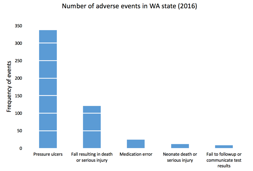
We can add gridlines to the bar chart to better enhance our ability to detect differences in the frequency of adverse events. Figure 5 illustrates the results after gridlines are added to separate counts of the bar chart into intervals of 50, which is easier to synthesize visually. We also reduced the y-axis maximum limit from 400 to 350 to remove the empty space and increase our data-ink ratio.
Figure 5. Bar chart with gridlines.
Gridlines that overlay in front of the bar charts is not a feature in Excel. All gridlines are in the background (default), which do not achieve the effect in Figure 5. If you turn the gridlines on, you’ll see something similar to Figure 6 where the gridlines are in the background and do not overlay the bars in the chart. To achieve the look in Figure 5, you need to make a few additional modifications to the data and chart.
Figure 6. Bar chart with gridlines turned on.
Here is the setup for our data to include gridlines in front of the bar chart. We used a “5.5” for our x-axis because there are five types of adverse effects and we reserved the next x-axis bin as the location of our scatter plot values. You can always modify this based on the number of categories in the x-axis. Additionally, we chose to use a 50-count interval.
After selecting the data, Excel will automatically incorporate these data into the current bar chart.
Right-click on the orange bars and change the chart type to scatter plot XY.
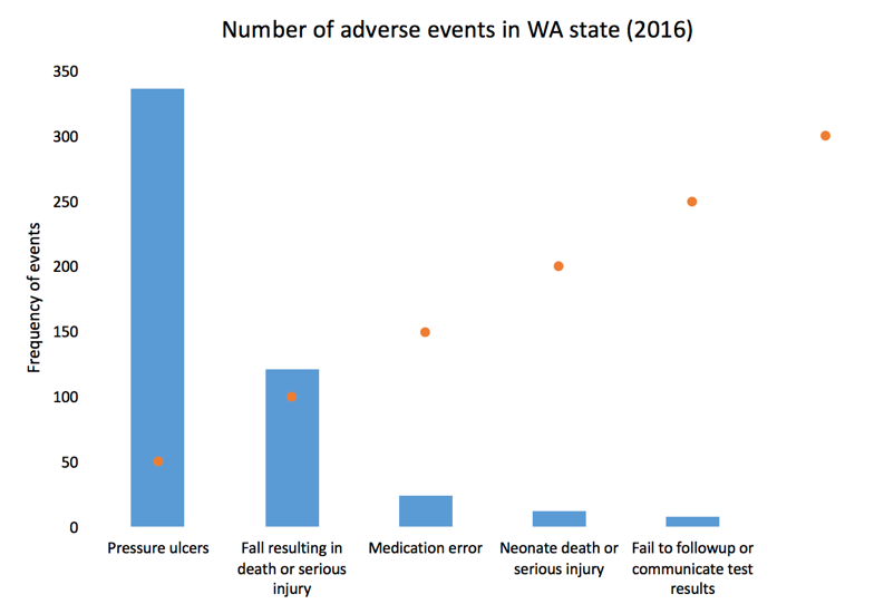
The scatter plot values will plot a point on each x-axis value.
Next, right-click on the plot area and click “Select data...” You may need to change the Series 2 data X-axis values to 5.5 by selecting the columns in your data. This is because Excel automatically plots the scatter plot using the x-values from Series1, which contains the data for the frequency of adverse events (not shown).
When you click the box on the right, you will be prompted to select the data array. Select the left column of the data set and click “Ok.”
You bar chart should look like the following.
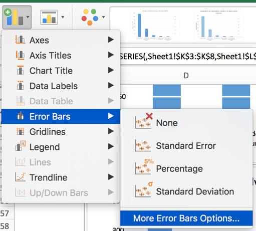
Left click on the dots for the scatter plot and the “More Error Bars Options.”
Make sure you are working on the horizontal error bars and select “Minus” for the Directions, “No Cap” for the End Style, and “Custom” for the Error Amount.
Specify a value for the “Negative Error Value” as 5. Then click “Ok.” Your plot should look like the following.
Now, you can change the width of the error bars, change the color of the error bars to white, and hide the scatter plot dots to get the chart in Figure 5. We used a navy blue color for the bars and a width of 1.5 for the error bars and increased by width by 15%.
After making additional changes to the font and color, our final bar chart can impress while yielding very useful information about the number of adverse events in WA state in 2016. You can easily discriminate the most common type of adverse events and quickly eyeball by how much.
Conclusion
In this blog, we explained the rationale for not using dimensional bar charts with 2-dimensional data. We also provided instructions on how to create bar charts with gridlines that are informative and in front of the bars. In the next blog, we will discuss distortion and how it can generate ambiguity and confusion when not properly scaled.
References
Credit for creating the gridlines in front of the bars goes to Jon Peltier who wrote a tutorial on gridlines (https://peltiertech.com/column-chart-gridlines-cutting-through-bars/).
1. Tufte ER. (2001) The Visual Display of Quantitative Information. Second Edition. Cheshire, CT. Graphics Press, LLC.


