Introduction
An important element of data visualization is to tell a story. To do that, we should have the end in mind. Namely, what is it you want to share with your audience?
Often, time series data can do this using some clever data visualization. Typically, this is presented on an XY plane where time is presented on the X-axis and the value of interest is presented on the Y-axis. We will not go into time series analysis, which involves a lot more than just plotting the data. However, we will go over the proper way in which to present your time series data visually.
Motivating example
We will use data from the National Health Expenditure Account (NHEA), which contains historical data on health expenditures in the U.S. from 1960 to 2016. The costs presented by the NHEA are properly adjusted for inflation. You can find the data at this link: https://www.cms.gov/Research-Statistics-Data-and-Systems/Statistics-Trends-and-Reports/NationalHealthExpendData/NationalHealthAccountsHistorical.html
Time series data
To visualize time series data, it is best to have increments of time that are equally spaced in the X-axis. We use Excel to illustrate these examples. Figure 1 illustrates the annual interval of national health expenditures ($ billions) in the United States from 1960 to 2016. The outcome (national health expenditure) is on the Y-axis and time (year) is on the X-axis. Notice that each time increment is one year and evenly spaced across the X-axis. This allows the eyes to intuitively see the changes across time in the U.S. national health expenditure.
Figure 1. National Healthcare Expenditure in the United States, 1960 to 2016.
What if the story is to see highlight health expenditures in the last decade? How would we do this?
First, we can use the same data and restrict the X-axis to 2007 to 2016 as in Figure 2.
Figure 2. National Health Expenditures in the United States, 2007 to 2016.
Figure 2 doesn’t seem interesting. There is an increase in health expenditures from 2007 to 2016, but this doesn’t seem significant. However, there is a 45% increase from 2007 to 2016 in health expenditures ($2,295 billion to $3,337 billion). Figure 2 doesn’t convey this increase because there is a lot of white space between the lowest health expenditure value in 2007 and $0.
One way to illustrate the large increase in health expenditure is to truncate the Y-axis. In previous articles, we stressed that truncated axis can distort and trick the mind into seeing large differences where they don’t exist. However, this same technique can be used to make sure that differences that exist are not misinterpreted as not visually significant. According to Tufte:
In general, in a time-series, use a baseline that shows the data not the zero point. If the zero point reasonably occurs in plotting the data, fine. But don't spend a lot of empty vertical space trying to reach down to the zero point at the cost of hiding what is going on in the data line itself.[1]
In other words, time series data should focus on the area of the timeline that is interesting. The graphic should eliminate the white space and show the data horizontally for time series visuals.
Eliminating the white space and identifying the baseline value as $2,200 billion instead of $0 changes the figure as illustrated in Figure 3.
Figure 3. National Health Expenditures in the United States, 2007 to 2016.
Figure 3 illustrates the increase in national expenditure in the last decade better than Figure 2 and maintains the narrative that there was a visually significant increase.
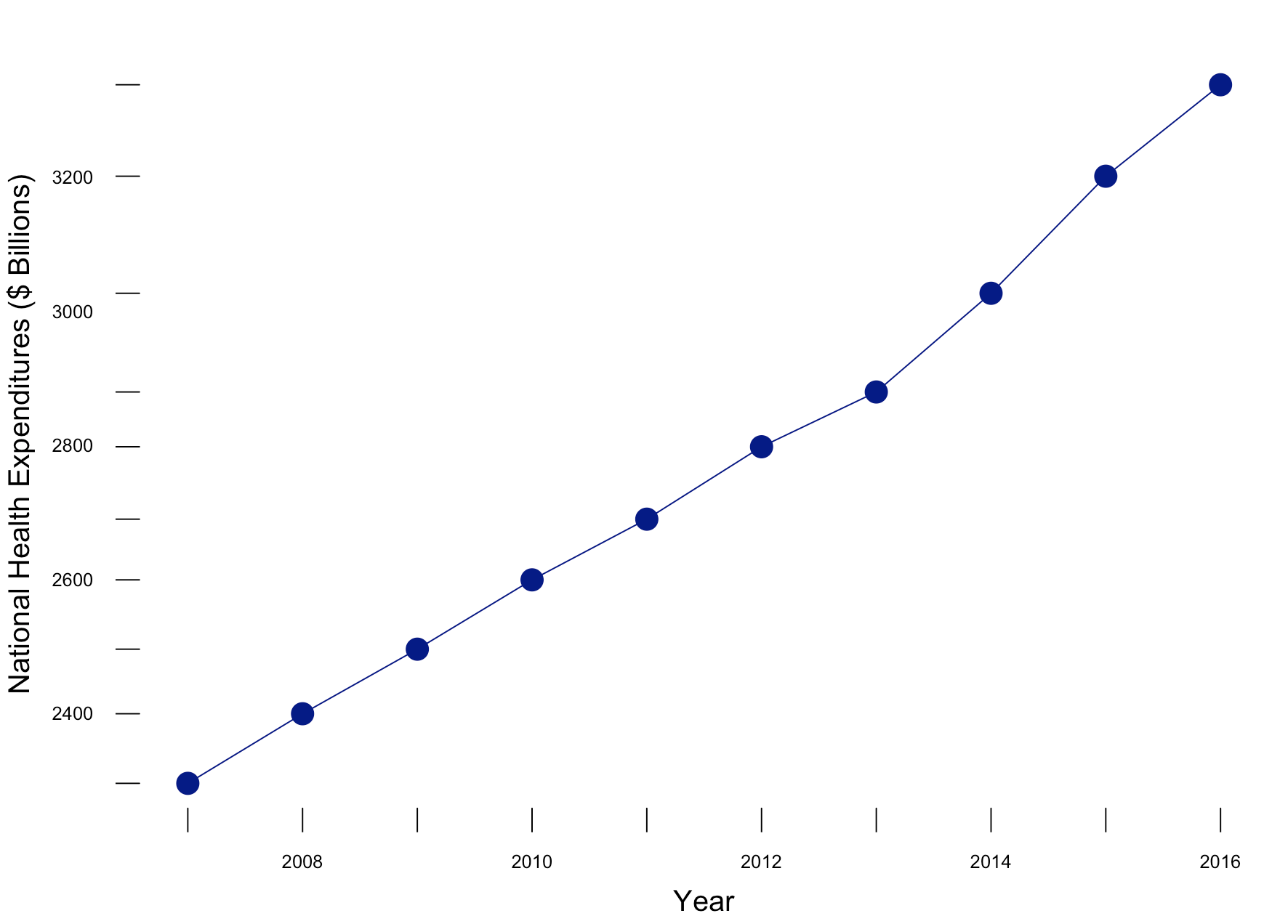
Putting these concepts together (along with Tufte’s other principles), we can generate a similar figure using R (Figure 4). The R code is listed below.
# Plot trend - without truncation
library(lattice)

xyplot(y~x,
       xlab=list(label="Year", cex=1.25),
       ylab=list(label="National Health Expenditures ($ Billions)", cex=1.25),
       main=list(lable="National Health Expenditure (2007 to 2016)", cex=2),
       par.settings = list(axis.line = list(col="transparent")),
       panel = function(x, y,...) {
          panel.xyplot(x, y, col="darkblue", pch=16, cex=2, type="o")
          panel.rug(x, y, col=1, x.units = rep("snpc", 2), y.units = rep("snpc", 2), ...)})
Figure 4. National Health Expenditures in the United States, 2007 to 2016.
Figure 4 incorporates the use of Tufte’s principles on data-ink ratio and truncation on the y-axis to highlight the change in National Health Expenditure between 2006 go 2017.
Conclusions
With time series data, truncating the Y-axis to eliminate white space and show the data horizontally is appropriate when telling the story of what’s happening across time. Using zero as the baseline for the Y-axis is appropriate if it is reasonable. However, do not compromise the story by having the Y-axis extend all the way to zero if it doesn’t tell the story properly. Knowing when and how to truncate the Y-axis will help you explain to your audience the significance of a change across a specific period in time.
References
1. Edward Tufte forum: baseline for amount scale [Internet]. [cited 2018 Jan 14];Available from: https://www.edwardtufte.com/bboard/q-and-a-fetch-msg?msg_id=00003q


