BACKGROUND
Surveys or questionnaires are used to capture respondent’s perceptions about any number of products, ideas, or subjects. You can ask someone how they are feeling to how much they agree with a particular statement. Or you can ask someone if they are satisfied with a product or service they recently received. Items (or questions) in surveys can solicit these types of responses. Free response questions allow the respondents to write their responses in an unstructured manner as long as it answers the question or purpose of the survey. But most surveys ask questions that require a specific response using multiple choice, ratings scale, or Likert scales.
In this article, we will discuss the Likert-type scale and how we can visualize this using Excel.
LIKERT-TYPE SCALE
The Likert scale was first developed by Rensis Likert, who was a psychologist in the early 20th Century. He developed the 5-point Likert scale as part of his PhD dissertation in order to capture peoples’ ratings of international affairs. The Likert scale is unique because it provides a rating that is ordered sequentially (Positively to Negatively or Agreement to Disagreement).
Figure 1. Example of a 5-point Likert scale.
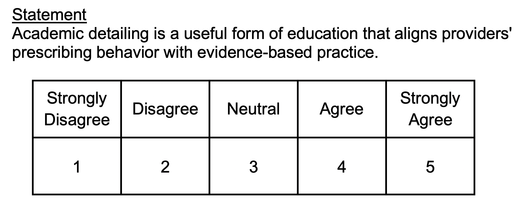
The 5-point Likert scale is quite common in psychometric research. A statement is usually provided and the participant is asked to rate their level of agreement. Notice how the scale is ordered sequentially from Strongly Disagree in the left of the scale and Strongly Agree to the right of the scale. This is an important feature of Likert-type scales with an added convenience, higher values are associated with higher agreements. You can reverse this as well, but we will keep the order for the remainder of this article.
VISUALIZE THE LIKERT-TYPE SCALE
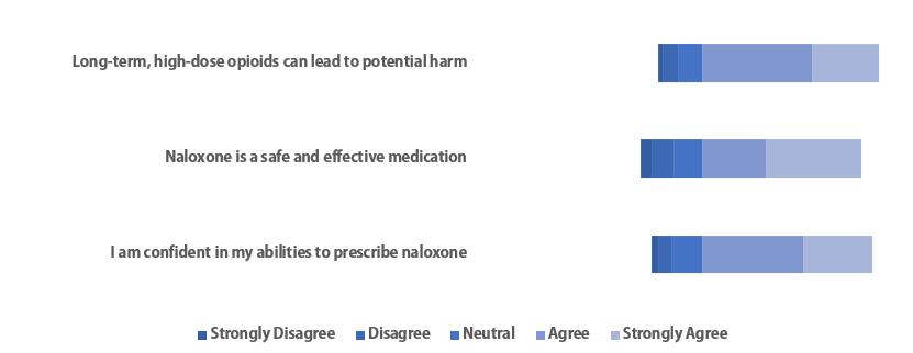
There are many ways to visualize a Likert scale. We can use pie or bar charts to capture the different responses to a Likert-type question or statement.
Figure 2. Bar and Pie charts used to visualize Likert scale responses.

However, the best way to visualize Likert scales is to build a Diverging Stacked Bar Chart.
Figure 3. Diverging stacked bar chart using a set of hypothetical data for three statements.
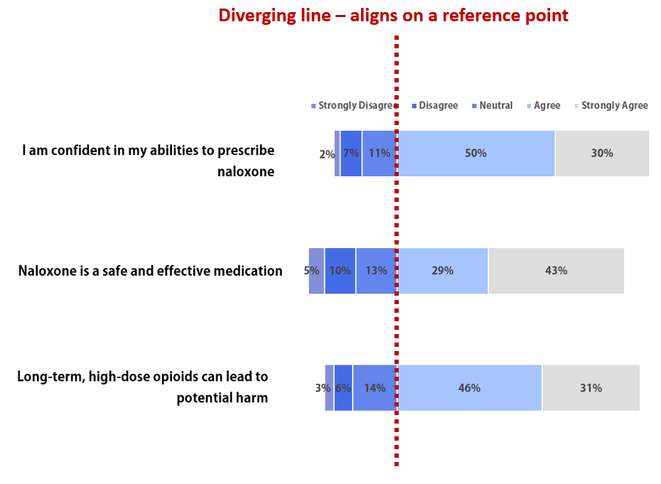
The red dotted line in Figure 3 represents the divergent point where the stacked horizontal bar chart aligns. This is effective when you want to suggest that certain set of ranked responses are more important than the other. In this example, Strongly Agree and Agree are given more precedence than the other ranks. Rightly so, since a majority of the responses were Strongly Agree or Agree.
MOTIVATING EXAMPLE
Let’s assume that we administered a survey with three questions. The results are as follows:
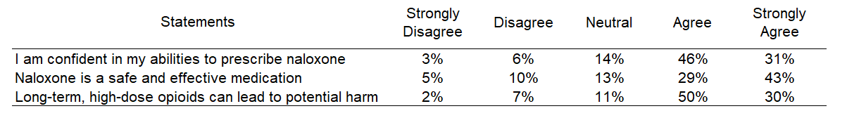
We have a 5-point Likert scale with responses in all the different ranks. A majority of the responses were either Strongly Agree or Agree, so we’ll create a diverging point with these two ranks.
TUTORIAL
The Excel file for the tutorial is located here.
There are two ways to create this diverging stacked bar chart.
Method 1: I learned how to create diverging stacked bar charts from Stephanie Evergreen’s blog Evergreendata. I got her method step-by-step and then go over an alternative method.
Part 1.1 Estimate the buffers at the end of the stacks.
First, change the values to percentages (Step 1). Then, determine where the divergence will occur (Step 2). For our example, the divergence is between Neutral and Agree.
The next step involves estimating the values at the ends of the stacked bar chart. There are two ends, left and right (Steps 3 and 4). Once the buffers have been estimated, we will plot the stacked bar chart.
Part 1.2. Plot the divergence stacked bar chart.
First, select all the data (Step1). Then Select the 100% Stacked Bar Chart from the Insert tab (Step 2). This should generate a default stacked bar chart (Step 3).
Right-click on the any area in the chart and click on the “Select data…” to change the data arrangement (Step 4). Select the “Switch row/column” to change the Y-X arrangement of the data.
Once you switch the rows and column, the chart will change and look like the one below.
Now, we want to remove the color of the buffers at the ends of the stacked bar (Step 7). Right-click the left end of the stack and select “No Fill” (Step 8). Repeat this for the right end of the stack.
The diverging stacked bar chart should resemble the figure we presented at the beginning of this article.

Removing the buffer labels from the legend, deleting the grid lines, changing the font (Adobe Gothic Standard B), and changing the stacked bars colors can improve the figure.
The challenge with this chart is the labels on the axis. The statements are too far to the left of the diverging stacked bar chart. To fix this, delete the labels on the left and insert text boxes with the statements.

Remove the borders, right alignment with the statements, and add labels. We should be very close to the figure we presented above.

Here is the final diverging stacked bar chart.

Method 2: I learned this other method from John Peltier at his Peltier Tech Blog.
This method requires you to create a divergent point based on distance. For instance, if you want to make sure that you have the divergent point where the responses are at Strongly Agree and Agree. So, subtract the distance from that point.

First, change all the values left of the divergent point to negative (Step 1).
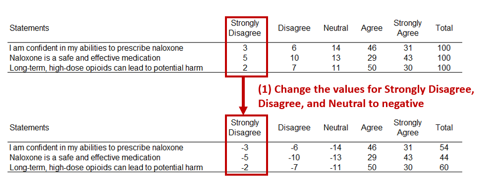
Then rearrange the order of responses so that the furthest rank is closest to the divergent point (Step 2).
The select the data (Step 3), Insert a 100% Stacked Bar Chart (Step 4), and then Visualize the chart (Step 5).
Right-click anywhere in the chart area and click “Select Date…” (Step 6). Then Switch row and column (Step 7).
You will get the chart on the left below. However, this is not complete. Right-click on the Y-axis (Step 8) and the Format Axis (Step 9).
Change the label position for “Low” (Step 10) and then review the chart. Notice where the divergent point is located at. This is the same as the previous stacked bar chart that was constructed using Method 1.
Now, you can change the colors, delete the gridlines, remove the X-axis to create a plot below. Notice that there are some values that are negative. That’s because of the data we rearranged earlier to generate the distance from the divergent point. To fix this, you will need to manually change the values.

After manually change the values, your plot will look similar to the one below.

Conclusions
Visualizing the Likert scale using horizontal diverging stacked bar charts is a good method to see how the participants respond to questions or statements on a survey or questionnaire. However, not all Likert-type scales will necessarily need a diverging stacked bar chart to illustrate its point. You can also use a conventional stacked bar chart, which we will discuss in a future article.
The Excel file for this tutorial is located here.
REFERENCES
I used the following references to help write this article.
Stephanie Evergreen’s blog Evergreendata is an excellent resource for learning about other data visualization methods.
John Peltier’s blot Peltier Tech Blog is another wonderful resource where you can learn more about Excel charts and data visualization.
The following paper provides details on how to create diverging stacked bar charts using R.
Heiberger RM, Robbins NB. Design of diverging stacked bar charts for Likert scales and other applications. Journal of Statistical Software. 2014;57(5): 1-32. https://www.jstatsoft.org/article/view/v057i05/v57i05.pdf