INTRODUCTION
With the introduction of the COVID-19 vaccines, states have monitored their vaccination progress. Current progress of each state’s vaccination rates are available at USAFacts.org. California, which has been experiencing some of the highest COVID-19 related rates and deaths, has approximately 81.2% of its current allocation of COVID-19 vaccines. Here is a screen capture of California’s progress as of 22 February 2021:
This visualization contains several progress bars showcasing the COVID-19 vaccination progress in California. We will re-create this in Excel using the data presented in this visualization.
Step 1. Enter data into Excel.
Using the visualization, we can enter the data into Excel. The data should be arranged in the following manner as reflected in Table 1:
Step 2. Select the data and insert a clustered bar chart.
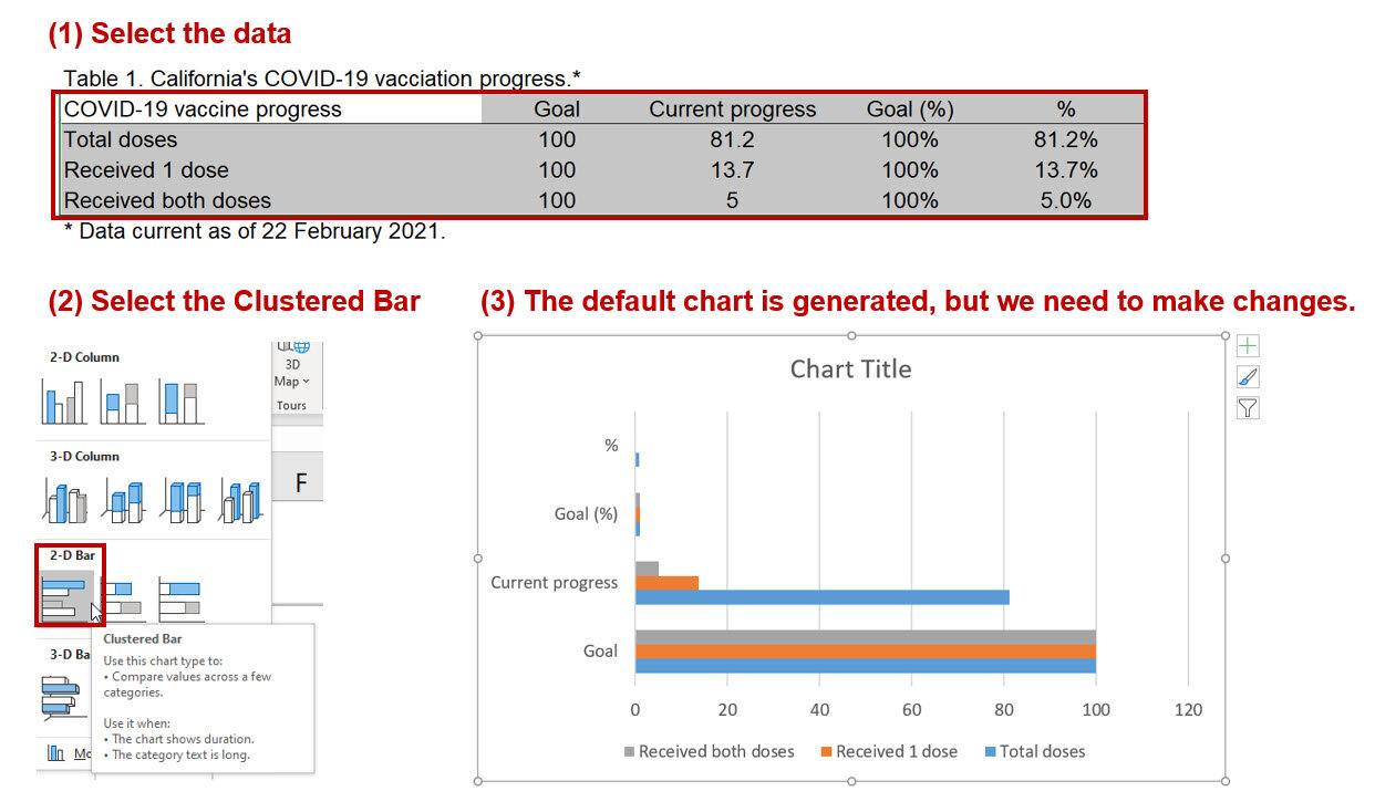
The default chart is automatically generated by Excel. However, we want to have the labels for the axis to denote the legend. To do that we need to right-click on the chart area and click on “Select Data…” This will bring up a window where you will need to click on “Switch Row/Column” to change the horizontal axis labels.

Step 3. Modify chart to add data labels.
Right-click on the chart area and click on “Select the data…” This will bring up a window that will allow you to make changes to the data structure. We will unselect the “Goal” and “Current progress” data. This will only leave the Goal (%) and % bars. Next, right-click the top bar and click on “Add data labels.”

Step 4. Overlap the two bars.
Next, we want to overall the two bars so that we can show the progress of vaccinations in California. Right-click on one of the bars and click on “Format Data Series…” Change the series overlap to 100%. This will cause the two bars to overlap, which will look like a progress bar. Since we only left the data label for the top bar, we can see distinctly the vaccination progress in California.

Step 5. Modify the aesthetics.
The progress chart is modified using the Abadi font and changed the patterns and colors of the bars. I also added the title “COVID-19 vaccination progress, California.

Step 6. Add some text.
Then we can add some text to emulate the visualization from USAFacts.org. Change the order of the data so that it reflects the one on the USAFacts.org website.

Conclusions
Using the overlap feature of Excel will allow us to make progress charts. The example from California showcases how this visualization can effectively show the current vaccination progress. These types of visualizations will help decision makers monitor progress and make any changes when necessary. Files for this exercise can be downloaded here.
References
Data from USAFacts.org.