Data visualization

Presentations with R Markdown - Part 3: Changing font colors

I continue my series on constructing a presentation using R Markdown with a new addition (Part 3) on font colors. We use colors to highlight text to enhance or draw attention to it. In this article, I provide code on how one can do this in R Markdown’s presentation using revealjs.

Part 3 of this series is available on my RPubs site.

R Markdown: Adding icons using the "fontawesome" package -- a short tutorial

I discovered an interesting package that allowed me to insert icons into my R Markdown documents. I learned how to use some of the basic commands and wrote a short tutorial on how to do this. I posted the tutorial on my GitHub page. I also posted the R Markdown code on my GitHub site.

I also encourage you to check out the Font Awesome GitHub page to learn more about the different icons that are available.

Stata tutorial: Adding the 95% Confidence Interval to a Two-way Line Plot

I created a tutorial on how to add the 95% CI to a two-way line plot in Stata. I use the “connected” command to generate a line plot in Stata, and then I added the 95% CI to each value. Surprisingly, Stata does not have a native feature to allow users to generate these 95% CI on a two-way line plot.

I used the AHRQ Medical Expenditure Panel Survey (MEPS) database for the motivating example. In this tutorial, we plotted the average total healthcare expenditure from 2008 to 2019.

I build this tutorial on Stata, but I used R Markdown to write the tutorial. The R Markdown code is located in my GitHub site (Stata - Line plot with 95% CI tutorial).

You can find the tutorial on my Github site and RPubs page.

I used Stata SE 17 to build this.

R plotly - Bar Charts

I wrote a tutorial on how to use plotly, an R package that allows users to include interactive charts in R Markdown projects.

Here is an example of the bar chart that was created using plotly in an R Markdown project:

The tutorial is available on RPubs, and the R Markdown code is available on my GitHub page.

I really like using plotly for my R Markdown projects because it has some nice interactive features. Hopefully, this tutorial will open the doors to more creativity with R Markdown projects.

Communicating data effectively with data visualization: Part 41 (Color Blind Friendly Palette)

BACKGROUND

Data visualization has evolved into sophisticated interactive graphics where users can gather more information compared to simple two-dimensional graphics. Color has become an important element to data visualization adding another dimension of information and data. However, people with color vision deficiency (also known as “color blindness”) are unable to experience or benefit from the use of colors in data visualization. This can have important implications when developing our data visualization, which is meant to inform and educate. To maximize the uptake and adoption of  our tools and reports with data visualization, we need to consider using color blind friendly palettes.


Recently, I created a report using the RColorBrewer color palette, which contains three types of color palettes: sequential, diverging, and qualitative. This color palette package in R was developed by Cynthia Brewer, and you can experiment with different color combinations at https://colorbrewer2.org.


Sequential palettes are used for ordered data which are represented varying gradient levels of color. For example, a low order might be represented by a light shade of blue, but a high order might be represented by a darker shade of blue (Figure 1). 

Figure 1. Example of a sequential palette

Diverging palettes are used to put equal emphasis on the mid-range values with the ends denoted by contrasting hues. For example, using colors to represent the values between 1 and 5 where 3 is the mid-range, we could color 3 as White, 1 as Blue, and 5 as Red (Figure 2).

Figure 2. Example of a diverging palette

Qualitative palettes are used to on categorical data, and the colors are used to represent distinct categories. Suppose you have a variable called food and there are 5 categories in that variable (chicken, meat, fish, vegetables, and fruit). You can use different hues to represent each category (Figure 3)

COLOR VISION DEFICIENCY

Color vision deficiency affects approximately 8% of males and 0.4% of females in the general population who are of European descent.1 However, these numbers vary among other races. For example, the prevalence of color vision deficiency among males in China and Japan are 4% and 6.5%, respectively.


There are several types of color vision deficiency. The red-green color vision deficiency is the most common, which are classified as protanomaly for red weakness and deuteranomaly for green weakness.2 For red-blind and green-blind, the categories are protanopia and deuteranopia, respectively. Less prevalent are the blue-weakness/blind (tritanomaly and tritanopia) and complete absence of color vision (achromatopsia). Examples of the different types of color vision deficiency are provided in the figure below (Figure 4).

Figure 4. Examples of color vision deficiency.

POTENTIAL SOLUTIONS

Picking color palettes that would not affect readers with color vision deficiency is not easy. Particularly, when you have a lot of colors on the palette that you are using. One tool that is helpful is ColorBrewer 2.0. You can select the “colorblind safe” option to select color palettes are friendly for readers with color vision deficiency (Figure 5).

Figure 5. ColorBrewer options. Source: https://colorbrewer2.org/

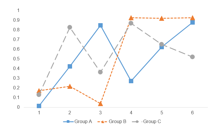
Another method to generate data visualizations for readers with color vision deficiency is to use different line styles or shapes. For example, we can use different types of dashed lines and markers for this line chart (Figure 6).

Figure 6. Line chart using different dash line types and markers (square, triangle, and circle).

CONCLUSIONS

Color vision deficiency can hinder our readers from extracting information from our data visualization. Hence, it is critical that we generate data visualization using the methods above to help our audience. Using the correct color palette and varying the style of the figures by changing the line styles (e.g., dashed) or marker shapes, can assist our readers regardless of their color vision deficiency. More importantly, it will help to reduce any barriers to accessing vital information for our entire audience.


ACKNOWLEDGMENTS

I used the Coblis-Color Blindness Simulator to generate the varying color vision deficiency examples in Figure 4.


REFERENCES

1.         Birch J. Worldwide prevalence of red-green color deficiency. J Opt Soc Am A Opt Image Sci Vis. 2012;29(3):313-320. doi:10.1364/JOSAA.29.000313

2.         Chakrabarti S. Psychosocial aspects of colour vision deficiency: Implications for a career in medicine. Natl Med J India. 2018;31(2):86-96. doi:10.4103/0970-258X.253167

Communicating data effectively with data visualization: Part 40 (Percentage of population with COVID-19 vaccination)

INTRODUCTION

Since the COVID-19 pandemic began on 12 December 2019, there have been several innovations in the forms of vaccinations and treatments. Of critical importance is the world-wide international support for COVID-19 vaccination. A timeline of the COVID-19 pandemic can be found at the CDC website.

The website informationisbeautiful.net has a great COVID-19 dashboard that ranks countries that have administered vaccinations.

Source: www.informationisbeautiful.net (https://informationisbeautiful.net/visualizations/covid-19-coronavirus-infographic-datapack/)

TUTORIAL

We will recreate this chart using Excel. Data can be download from my Dropbox folder or from Our World in Data website.

The data will contain information for 39 countries. These variables include the total number of vaccinations, the number of people vaccinated, the number of people who are fully vaccinated, the number of boosters, the total population, percentage of the population who are vaccinated, percentage of the population who are fully vaccinated, and the percentage of the population with boosters.

We will create a vertical bar chart for the percentage of the total population that received at least one COVID-19 vaccination. You can use these methods to recreate the vertical bar charts of the remaining figures in the figure above.

Visually inspect the data. It should look like the following.

We will us the “total_vaccinations,” “percent_vaccinated,” “percent_full_vaccinated,” and “percent_boosted” to generate the figures.

Step 1: Insert the vertical bar chart.

Once the vertical bar chart is inserted onto the Excel sheet, right click on the chart and click on “Select data.” We want to highlight the data column titled, “percent_fully_vaccinated.” For the “Series name,” enter “% fully vaccinated.”

Step 2. Edit the labels.

In the “Horizontal (Category) Axis Labels,” click on the “Edit” button and select the
location.” In the “Axis label range,” highlight the values in the “location” column. This will assign each value of the “percent_fully_vaccinated” with the country.

Step 3. Delete unnecessary labels and titles.

The figure should look like the following. We can delete the x-axis, the axis title, and the chart title. Extend the chart so that you can view all the countries. You can also narrow the chart so that it will resemble the size of the informationisbeautiful.net figures.

Step 4. Create a progress bar

We will add a progress bar, which will allow us to see how much of the population is fully vaccinated. This requires us to use the “full_bar” column which has a value of “1” for each country. This value represents a 100% progress goal.

Right-click on the chart and add a new data entry. Select the data under the column called “full_bar.” The values are all “1” to represent a 100% progress bar.

The chart will have two bars for each country; one bar represents the percentage of the population that is fully vaccinated, and other bar represents 100% progress. We need to edit the overlay and the width of the bar to match the ones on the informationisbeautiful.net charts.

Right-click the chart and select “Format Data Series…” Change the “Series Overlap” to 100% and the “Gap Width” to 40%. You may not see the blue bar chart because the red bar chart will be in front of it. To fix this, go to the “Select Data Source” window and use the arrow to reposition the data series. This will place the blue bar chart in front of the red bar chart.

Step 5. Add the data labels.

The next step will include the data labels to the progress bar. We want to have the data labels aligned on the right. When you right-click the blue chart, you will get the data labels to be aligned to the left or the end of the bar. This does not get us to the data labels aligned on the right.

To do this, we need to right-click the red bar (not the blue bar) and click on “Add data labels.” This will all the data value for the progress bar, which is “1.”

Right-click on one of the data labels that has a “1” and select “Format Data Labels…” This will open a window where you will need to check the box next to “Value From Cells.” When prompted, select the values in the “percent_fully_vaccinated” column. This will add the percentage of the population that is fully vaccinated on the right-side of the bar chart. Additionally, uncheck the box next to “Value.” This will remove the value from the bar chart so that you will no longer see the “1.”

The chart should be updated to have the percentage of the population who are fully vaccinated aligned to the right-side of the bar chart.

Step 6. Modify the chart to improve the aesthetics.

Once you’ve added the data labels and aligned them on the right-side of the bar chart, you can start to edit the font color, bar colors, and delete the grid lines to emulate the chart in informationinbeautiful.net website.

I changed the background to a dark gray and the data labels to a white color. I also changed the font to Arial Narrow.

I only presented part of the figure here. But you can download and view the whole figure from my Drobox folder.

CONCLUSIONS

Using the vertical bar chart with progress bars allow us to emulate the figures generated by informationisbeautiful.net. I like these types of charts for data visualization because they provide some indication of progress. You can see that the United States is behind many nations when it comes to having the population fully vaccinated. This is much lower than the UAE and South Korea where 95.6% and 86.6% of the total population are fully vaccinated. Hopefully, you can use this exercise to help you develop similar charts for your data visualizations.


REFERENCES

Data was access using the Our World in Data COVID-19 site.

The data visualization that inspired this exercise was based on informationisbeautiful.net COVID-19 Coronavirus Data Dashboard.

The Excel file with the data used for this tutorial is available on my Dropbox folder.

Communicating data effectively with data visualization: Part 39 (Heatmaps of COVID-19 deaths)

INTRODUCTION

I wanted to incorporate a heatmap that illustrated the death rates (per 100,000 population) across time in the United States. But I also wanted to show when the coronavirus pandemic 2019 (COVID-19) vaccine was introduced and how it impacted death rates. I thought that a heatmap would do a nice job of illustrating this.

The data visualization by Tynan DeBold and Dov Friedman from the Wall Street Journal has a great visualization on the impact of vaccines for various disease from the measles to smallpox on death rates (See figure below). This heatmap shows the number of measles cases per 100,000 population between 1920 and 2000. Each row represents a state or territory of the United States (U.S.). In this tutorial, we’ll create a similar heatmap for COVID-19 deaths.

Source: Tynan DeBold and Dov Friedman, Wall Street Journal (link)

I set out to create my own heat map with COVID-related death rates using data from the Centers for Disease Prevention and Protection (CDC). The CDC provides a dashboard to visualize the trends in death rates by states and U.S. territories (Compare Trends in COVID-19 Cases and Deaths in the US). However, the data was not compiled in an easy manner. You can only visualize 6 territories at a time. I was able to download all the data and compile this into a single file for this tutorial, which you can download here. Use the file with the *.xlsm extension, which supports macros.

TUTORIAL

Step 1. Download the Excel file with the data. Use the data from the “data” tab. Inspect the data. The columns represent the weekly death rate (7-day average number of deaths per 100,000 population). The rows represents the states and U.S. territories.

Step 2. Use the VBA macro. In a previous article, I explained how to create a heatmap with different gradient levels. We will use a modified version of the macro for this exercise.

This is the VBA macro that we’ll use (link). Don’t be intimidated by this. I’ll go over how to use this code

I start by determining the number of gradient levels for the heatmap. The average death rate was 0.35 per 100,000 population, so I generated 20 levels of gradient (0 to 0.999, 1.0 to 1.999, 2.0 to 2.999, etc). I wanted a “blue” shade for this heatmap, so I had to figure out the RGB scheme for each level. I identified the RGB color scheme using a gradient generator by ColorDesigner. RGB code uses three values to represents the main color on the spectrum (red, green, blue).

Once you have the RGB codes for the gradient levels, you can edit the VBA macro.

In the Developer tab, click on “Visual Basic.” Make sure that the Developer tab is viewable on the Ribbon. If it is not, then you can activate this by going to the File > Options > Customize Ribbon and activate it by entering a check by the Ribbon box.

The Visual Basic interface is a separate window that pops up.

In the “Sub ChangeCellColor()” macro, we’re going to include 20 gradient levels. It’s important to make sure the Range() includes the data that we’re interested in modifying. Since the first cell is in A1 and the last cell is in CZ61, the range is Range("A1:CZ61").

Then we include the 20 gradient levels by changing the Case statement with the corresponding RGB codes. As you modify each Case statement, make sure to change the value ranges for each statement. For example, if you want to apply the RGB code for (18, 123, 141), the death rate range is 1.8 to 1.8999999. You can do this for all the gradient levels.

Here is an example:

    Case 1.8 To 1.8999999
         oCell.Interior.Color = RGB(18, 23, 141)
         oCell.Font.Bold = True
         oCell.Font.Color = RGB(18, 23, 141)
         oCell.Font.Name = "Times New Roman"
         oCell.HorizontalAlignment = xlCenter

Case 1.8 to 1.8999999 denotes the range of the values in each cell (7-day average deaths per 100,000 population).

oCell.Interior.Color = RGB(18, 23, 141) denotes the RGB color scheme for our gradient

oCell.Font.Bold = True denotes that the font is bolded

oCell.Font.Color = RGB(18, 23, 141) denotes that the font color matches the cell color

oCell.Font.Name = "Times New Roman" denotes that the font is Times New Roman

oCell.HorizontalAlignment = xlCenter denotes that the value is aligned in the center

After you’ve adjusted your code, you can execute the macro. To execute the macro, go to the Ribbon and select “Macros.” The Macro window will appear with three macros. Select the “ChangeCellColor” macro and click “Run.” This should execute the macro, and you will notice that the data will start to change color to the corresponding gradient values.

To sort by the last column, select the “SortColumn” macro and click “Run.”

To create white borders around the cells, select on the “WhiteOutlineCells” macro and click “Run.”

Step 4. Final touches. You can select the columns and change width to 2.

Once you have the correct cell sizes, you can start to add labels to the file. I included a line to delineate when the first vaccine was introduced and a line for when the president announced that COVID-19 was a national emergency. I also added labels to the bottom part of the table to indicate dates along the timeline. The rows represented the states and U.S. territories.

CONCLUSIONS

The number of deaths was high early in the pandemic in a few select places in the U.S. As the vaccine is introduced, the number of deaths reached a zenith around December 2020 before falling to low levels in February 2021. Then, the death rate started to increase around the beginning of July 2021. Based on the heatmap, the vaccine may have resulted in a decrease in deaths. But the death rate increased approximately 6 months later in what appears to be the beginning of a seasonal pattern. It is unclear whether the introduction of new variants causes the increased death rate, but there is speculation that it may be a contributor. This heatmap does not generate any claims to what is actually happening; it only provides a visual of the patterns that are reported across each U.S. state and territory.

REFERENCES

I took inspiration from the data visualization by Tynan DeBold and Dov Friedman from the Wall Street Journal.

Date for this exercise came from the CDC (link).  

A previous article on how to create heatmaps is available here.

I used the Gradient Generator by ColorDesigner to find out the RGB values for my gradient levels.

Visualizing linear regression models using R - Part 2

I continue my previous blog post on visualizing linear regression models using R (link). Part 2 focuses on using visualization to assess whether the model’s residuals were associated with the predicted values and whether they are normally distributed.

The R Markdown code that I wrote to create this tutorial is located on my GitHub site (link).

You can find the tutorials on my RPubs site:

  • Part 1 - Visualizing linear regression model using R (link)

  • Part 2 - Visualizing linear regression model using R (link)

(NOTE: on 30 January 2022, I updated these tutorials and they can be found in my RPubs page here. The R Markdown code is saved on my GitHub page here.)

Reproduction number—COVID-19

BACKGROUND

As the COVID-19 pandemic, which began in December 2019, continues into its second year, public health measures have been put into place to mitigate its spread. At the time of writing this article, there have been over 4.5 million deaths and over 216 million cases due to COVID-19.[1] Surveillance of COVID-19 remains an important public health measure of understanding the spread and impact. Daily reports such as the John Hopkins COVID-19 dashboard provide end users with visual and statistical information about the surges in cases and deaths associated with COVID-19. However, one measure that is of great interest is the reproduction number or R0.


Reproduction number (R0) and effective reproduction number (Rt)

The reproduction number is the number of new cases that is directly caused by exposure to a single case.[2,3] Figure 1 provides a visual explanation of the basic reproduction number. However, the underlying assumption with R0 is that everyone in the population is susceptible to infection. With the introduction of vaccines, the R0 isn’t a good measure of the reproductive capabilities of COVID-19. Instead, the effective reproduction number (Rt) is used to provide a more realistic reproduction number based on the population being infected, recovered, or vaccinated. The Rt changes over time as the population susceptible to infection changes.

Figure 1. Basic reproduction number.

I wanted to create a figure that would highlight the changes associated with the Rt for each state in the United States. To do this, I downloaded the Rt data from the by Xihong Lin's Group in the Department of Biostatistics at the Harvard T.H. Chan School of Public Health. They have an amazing COVID-19 tracker dashboard that captures the changing patterns of Rt for each state. Then I created a Cleveland plot to show where the Rt was near the beginning of the pandemic and where it is currently (August 2021). (Note: I wrote a tutorial on creating Cleveland plots that you can review here.) Here is the final figure (because of the length of the figure, I cropped it to show the first 30 states or territories):


Figure 2. Effective reproduction number (Rt) for U.S. states and territories, April 17, 2020 (past) to August 14, 2021 (recent).

The blue dots denote the most recent effective reproduction number (14 August 2021) and the past dots denote the earliest effective reproduction number (17 April 2020).

It seems that some states have gotten worse in terms of increase effective reproduction number since the beginning of the pandemic. This could be due to lack of good data in the early phases of the pandemic. However, what is of concern is the high effective reproduction numbers in some states (Rt > 2), which indicates that the pandemic is still spreading at an alarming rate.

There were some missing data which are identified by a single dot (blue or red) or an empty field in the recent or past effective reproduction number. Rather than fill these in, I left them empty. There may be data in between the two time periods that I could have used, but I left those out.

One thing to mention is that this Cleveland plot only tells us one dimension of the effective reproduction number story (the difference between the most recent Rt and the earliest Rt). It doesn’t tell us much about how the effective reproduction number changes across time. For that, I direct your attention to the Lin’s Laboratory Group at Harvard, they have a great figure that shows the fluctuation of the effective reproduction number for the U.S. and its states/territories (see example):

Source: Lin’s Laboratory Group at Harvard (link). [last accessed on 30 August 2021].

CONCLUSIONS

The effective reproduction number provides us with some interesting patterns in spread of COVID-19 by states/territories. It seems to have worsened over time, but this could be due to poor data early in the pandemic. There are some issues with the us of effective reproduction number for policy decisions. Reporting delays can impact the estimates for the effective reproduction number. A technique called “nowcasting” is used to estimate the reproduction number.[3] But when I explored some of the work in this area, there appears to be a variety of methods for performing this technique. Despite this limitation, the effective reproduction number may be useful to evaluate public health policy decisions to reduce the spread of the COVID-19 pandemic.[4,5]


DATA SOURCE

I provided the link to the COVID-19 Spread Tracker from the Lin Lab at Harvard. You can also download a curated version of the data for this article from my Dropbox folder. The data are current as of 17 August 2021. If you’re interested in recreating this Cleveland plot, I recommend downloading the most recent data to see how much the effective reproduction number has changed.

REFERENCES

  1. Worldometeres.info. COVID Live Update: 217,770,381 Cases and 4,521,936 Deaths from the Coronavirus - Worldometer. Accessed August 30, 2021. https://www.worldometers.info/coronavirus/

  2. Lim J-S, Cho S-I, Ryu S, Pak S-I. Interpretation of the Basic and Effective Reproduction Number. J Prev Med Pub Health. 2020;53(6):405-408. doi:10.3961/jpmph.20.288

  3. Adam D. A guide to R — the pandemic’s misunderstood metric. Nature. 2020;583(7816):346-348. doi:10.1038/d41586-020-02009-w

  4. Inglesby TV. Public Health Measures and the Reproduction Number of SARS-CoV-2. JAMA. 2020;323(21):2186-2187. doi:10.1001/jama.2020.7878

  5. Pan A, Liu L, Wang C, et al. Association of Public Health Interventions With the Epidemiology of the COVID-19 Outbreak in Wuhan, China. JAMA. 2020;323(19):1915-1923. doi:10.1001/jama.2020.6130

Forest plots in R

I wrote a tutorial on how to create forest plots in R. It’s posted on the RPubs site; here’s the link.

I wrote the tutorial on R Markdown and posted the code on my GitHub page (link).

This was an entertaining exercise to learn how to do this in R. There are, of course, lots of ways to create forest plots in R, but I wanted to learn how to do this using ggplot2 and some native R packages.

Here is the final forest plot.