INTRODUCTION
The introduction of COVID-19 vaccines sparked a race to administer as many people as possible in the United States (US). To date (31 May 2021), there have been over 167 million people with at least one dose of the vaccine administered according to the Centers for Disease Control and Prevention (CDC).1 However, there have been some concerns about disparities in vaccine coverage among racial, gender, and age groups. The CDC Covid Data Tracker indicates that a disproportionate number of racial groups are not receiving the vaccine. Additionally, there are a disproportionate number of older people who have received at least one dose of the vaccine and less males receiving the vaccine compared to the percentages that make up the US population. We will use simple data visualization techniques to characterize the vaccination of racial groups in the US using data from the CDC.
DATA SOURCE
Data used in this article are located at the CDC’s website (link).
There are several pieces of data that are important. The “% Persons at least One Dose” represents the percentage of people who received at least one dose in the US among those with data on race. The “% US population” represents the percentage of the US population made up by the group. For example, among those who received vaccine, 14.2% identified as Hispanic/Latino, which makes up 17.2% of the entire US population.

VACCINATIONS BY RACE
A horizontal bar chart was constructed to visually compare the percentage of people in different racial groups who received a vaccine and the percentage of people that made up that racial group in the US.
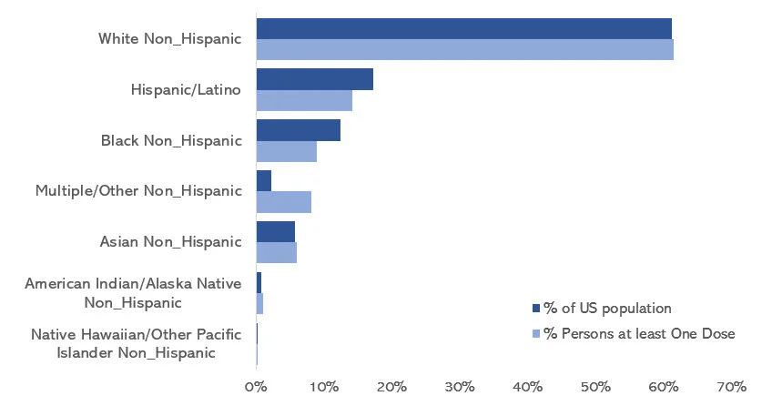
Based on this chart, the percentages of Hispanic/Latino and Black, non-Hispanic who received vaccines are less than the percentages that make up the US population. This is in contract to the White non-Hispanic and Asian, non-Hispanic racial groups who have a similar percentages of people who received the vaccine and make up the US population. This figure gives us an illustration on the potential disparities associated with vaccinations.
However, another way to view this figure is to look at the differences in the percentages that received vaccination and make up the US population. With the figure below, we can easily see the disparities.

VACCINATIONS BY GENDER
According to the CDC, the percentage of males who received vaccination is lower than the percentage that make up the US population. Females have the opposite issue; the percentage of females who received vaccination exceed the percentage the make up the US population.

We can also view this as the differences in the percentages that received COVID-19 vaccination and make up the US population. The percentages of females who received a vaccination exceeds the percentage that makes up the US population, but the percentage of males who received a vaccination is below the percentage that makes up the US population.

VACCINATIONS BY AGE GROUPS
According to the CDC, most of the vaccinations occurred among age groups of 40-49, 50-64, 65-74, and 75+ years. However, fewer percentages of the younger age groups have received the vaccination compared to the percentages that make up the US population.

When we change the metric to look at the differences in the percentages that received the vaccination and the percentages that make up the US population, it is apparent that younger age groups are not receiving the vaccines. However, this is a reflection of the vaccination roll out when early on older age groups were given priority.

CONCLUSIONS
Using simple data visualization techniques and differences in the percentages of vaccination and US population composition, we can graphically display disparities in vaccinations by racial, gender, and age groups. It is unclear what causes these disparities, but it will be paramount that any barriers to a fair and equitable distribution of healthcare be addressed. The biggest challenge will be to establish healthcare policies that will distribute vaccines equitably to all patients in the US.
REFERENCES
Centers for Disease Control and Prevention. COVID Data Tracker. Centers for Disease Control and Prevention. Published March 28, 2020. Accessed May 31, 2021. https://covid.cdc.gov/covid-data-tracker