vaccination

Communicating data effectively with data visualization: Part 40 (Percentage of population with COVID-19 vaccination)

INTRODUCTION

Since the COVID-19 pandemic began on 12 December 2019, there have been several innovations in the forms of vaccinations and treatments. Of critical importance is the world-wide international support for COVID-19 vaccination. A timeline of the COVID-19 pandemic can be found at the CDC website.

The website informationisbeautiful.net has a great COVID-19 dashboard that ranks countries that have administered vaccinations.

Source: www.informationisbeautiful.net (https://informationisbeautiful.net/visualizations/covid-19-coronavirus-infographic-datapack/)

TUTORIAL

We will recreate this chart using Excel. Data can be download from my Dropbox folder or from Our World in Data website.

The data will contain information for 39 countries. These variables include the total number of vaccinations, the number of people vaccinated, the number of people who are fully vaccinated, the number of boosters, the total population, percentage of the population who are vaccinated, percentage of the population who are fully vaccinated, and the percentage of the population with boosters.

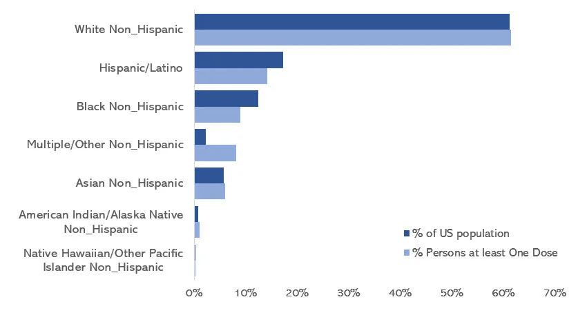
We will create a vertical bar chart for the percentage of the total population that received at least one COVID-19 vaccination. You can use these methods to recreate the vertical bar charts of the remaining figures in the figure above.

Visually inspect the data. It should look like the following.

We will us the “total_vaccinations,” “percent_vaccinated,” “percent_full_vaccinated,” and “percent_boosted” to generate the figures.

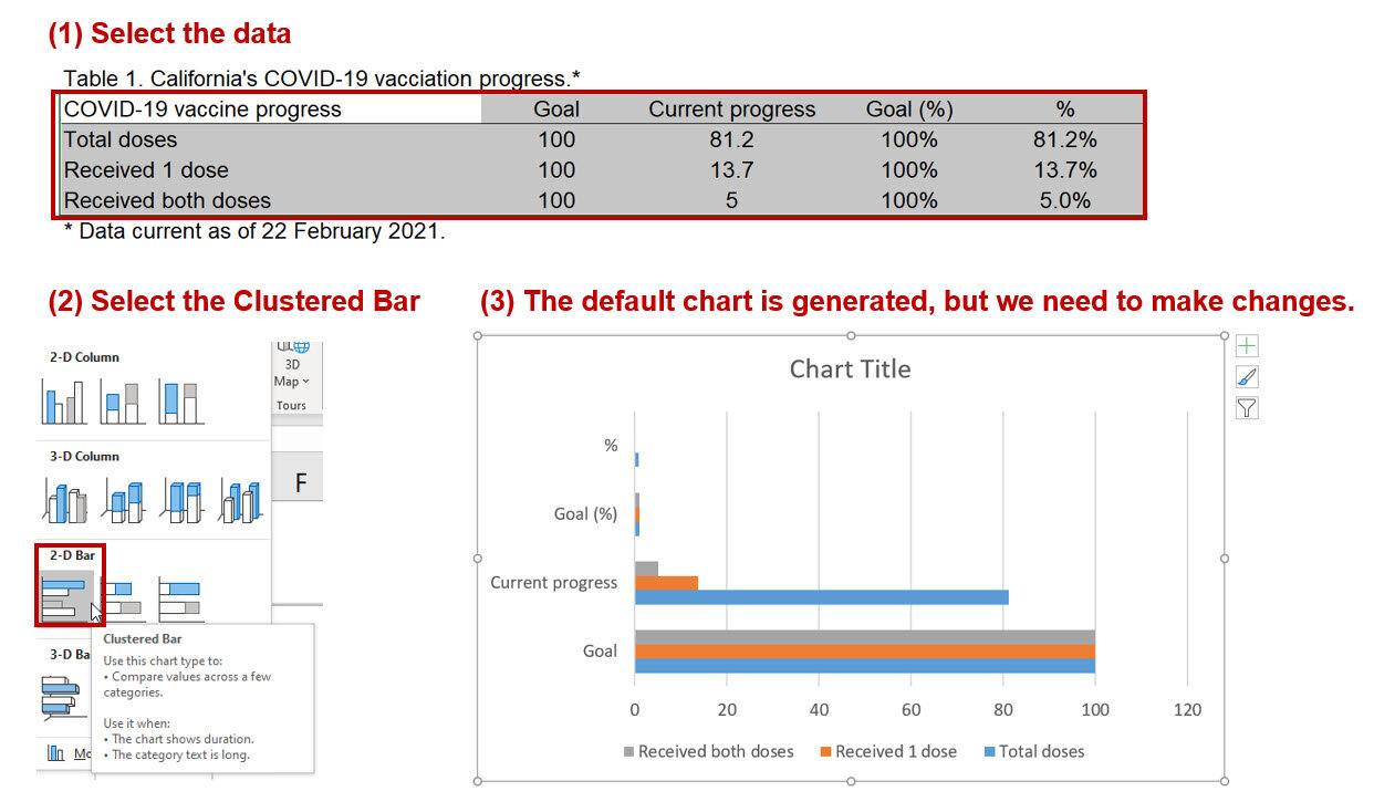
Step 1: Insert the vertical bar chart.

Once the vertical bar chart is inserted onto the Excel sheet, right click on the chart and click on “Select data.” We want to highlight the data column titled, “percent_fully_vaccinated.” For the “Series name,” enter “% fully vaccinated.”

Step 2. Edit the labels.

In the “Horizontal (Category) Axis Labels,” click on the “Edit” button and select the
location.” In the “Axis label range,” highlight the values in the “location” column. This will assign each value of the “percent_fully_vaccinated” with the country.

Step 3. Delete unnecessary labels and titles.

The figure should look like the following. We can delete the x-axis, the axis title, and the chart title. Extend the chart so that you can view all the countries. You can also narrow the chart so that it will resemble the size of the informationisbeautiful.net figures.

Step 4. Create a progress bar

We will add a progress bar, which will allow us to see how much of the population is fully vaccinated. This requires us to use the “full_bar” column which has a value of “1” for each country. This value represents a 100% progress goal.

Right-click on the chart and add a new data entry. Select the data under the column called “full_bar.” The values are all “1” to represent a 100% progress bar.

The chart will have two bars for each country; one bar represents the percentage of the population that is fully vaccinated, and other bar represents 100% progress. We need to edit the overlay and the width of the bar to match the ones on the informationisbeautiful.net charts.

Right-click the chart and select “Format Data Series…” Change the “Series Overlap” to 100% and the “Gap Width” to 40%. You may not see the blue bar chart because the red bar chart will be in front of it. To fix this, go to the “Select Data Source” window and use the arrow to reposition the data series. This will place the blue bar chart in front of the red bar chart.

Step 5. Add the data labels.

The next step will include the data labels to the progress bar. We want to have the data labels aligned on the right. When you right-click the blue chart, you will get the data labels to be aligned to the left or the end of the bar. This does not get us to the data labels aligned on the right.

To do this, we need to right-click the red bar (not the blue bar) and click on “Add data labels.” This will all the data value for the progress bar, which is “1.”

Right-click on one of the data labels that has a “1” and select “Format Data Labels…” This will open a window where you will need to check the box next to “Value From Cells.” When prompted, select the values in the “percent_fully_vaccinated” column. This will add the percentage of the population that is fully vaccinated on the right-side of the bar chart. Additionally, uncheck the box next to “Value.” This will remove the value from the bar chart so that you will no longer see the “1.”

The chart should be updated to have the percentage of the population who are fully vaccinated aligned to the right-side of the bar chart.

Step 6. Modify the chart to improve the aesthetics.

Once you’ve added the data labels and aligned them on the right-side of the bar chart, you can start to edit the font color, bar colors, and delete the grid lines to emulate the chart in informationinbeautiful.net website.

I changed the background to a dark gray and the data labels to a white color. I also changed the font to Arial Narrow.

I only presented part of the figure here. But you can download and view the whole figure from my Drobox folder.

CONCLUSIONS

Using the vertical bar chart with progress bars allow us to emulate the figures generated by informationisbeautiful.net. I like these types of charts for data visualization because they provide some indication of progress. You can see that the United States is behind many nations when it comes to having the population fully vaccinated. This is much lower than the UAE and South Korea where 95.6% and 86.6% of the total population are fully vaccinated. Hopefully, you can use this exercise to help you develop similar charts for your data visualizations.


REFERENCES

Data was access using the Our World in Data COVID-19 site.

The data visualization that inspired this exercise was based on informationisbeautiful.net COVID-19 Coronavirus Data Dashboard.

The Excel file with the data used for this tutorial is available on my Dropbox folder.

Communicating data effectively with data visualization: Part 39 (Heatmaps of COVID-19 deaths)

INTRODUCTION

I wanted to incorporate a heatmap that illustrated the death rates (per 100,000 population) across time in the United States. But I also wanted to show when the coronavirus pandemic 2019 (COVID-19) vaccine was introduced and how it impacted death rates. I thought that a heatmap would do a nice job of illustrating this.

The data visualization by Tynan DeBold and Dov Friedman from the Wall Street Journal has a great visualization on the impact of vaccines for various disease from the measles to smallpox on death rates (See figure below). This heatmap shows the number of measles cases per 100,000 population between 1920 and 2000. Each row represents a state or territory of the United States (U.S.). In this tutorial, we’ll create a similar heatmap for COVID-19 deaths.

Source: Tynan DeBold and Dov Friedman, Wall Street Journal (link)

I set out to create my own heat map with COVID-related death rates using data from the Centers for Disease Prevention and Protection (CDC). The CDC provides a dashboard to visualize the trends in death rates by states and U.S. territories (Compare Trends in COVID-19 Cases and Deaths in the US). However, the data was not compiled in an easy manner. You can only visualize 6 territories at a time. I was able to download all the data and compile this into a single file for this tutorial, which you can download here. Use the file with the *.xlsm extension, which supports macros.

TUTORIAL

Step 1. Download the Excel file with the data. Use the data from the “data” tab. Inspect the data. The columns represent the weekly death rate (7-day average number of deaths per 100,000 population). The rows represents the states and U.S. territories.

Step 2. Use the VBA macro. In a previous article, I explained how to create a heatmap with different gradient levels. We will use a modified version of the macro for this exercise.

This is the VBA macro that we’ll use (link). Don’t be intimidated by this. I’ll go over how to use this code

I start by determining the number of gradient levels for the heatmap. The average death rate was 0.35 per 100,000 population, so I generated 20 levels of gradient (0 to 0.999, 1.0 to 1.999, 2.0 to 2.999, etc). I wanted a “blue” shade for this heatmap, so I had to figure out the RGB scheme for each level. I identified the RGB color scheme using a gradient generator by ColorDesigner. RGB code uses three values to represents the main color on the spectrum (red, green, blue).

Once you have the RGB codes for the gradient levels, you can edit the VBA macro.

In the Developer tab, click on “Visual Basic.” Make sure that the Developer tab is viewable on the Ribbon. If it is not, then you can activate this by going to the File > Options > Customize Ribbon and activate it by entering a check by the Ribbon box.

The Visual Basic interface is a separate window that pops up.

In the “Sub ChangeCellColor()” macro, we’re going to include 20 gradient levels. It’s important to make sure the Range() includes the data that we’re interested in modifying. Since the first cell is in A1 and the last cell is in CZ61, the range is Range("A1:CZ61").

Then we include the 20 gradient levels by changing the Case statement with the corresponding RGB codes. As you modify each Case statement, make sure to change the value ranges for each statement. For example, if you want to apply the RGB code for (18, 123, 141), the death rate range is 1.8 to 1.8999999. You can do this for all the gradient levels.

Here is an example:

    Case 1.8 To 1.8999999
         oCell.Interior.Color = RGB(18, 23, 141)
         oCell.Font.Bold = True
         oCell.Font.Color = RGB(18, 23, 141)
         oCell.Font.Name = "Times New Roman"
         oCell.HorizontalAlignment = xlCenter

Case 1.8 to 1.8999999 denotes the range of the values in each cell (7-day average deaths per 100,000 population).

oCell.Interior.Color = RGB(18, 23, 141) denotes the RGB color scheme for our gradient

oCell.Font.Bold = True denotes that the font is bolded

oCell.Font.Color = RGB(18, 23, 141) denotes that the font color matches the cell color

oCell.Font.Name = "Times New Roman" denotes that the font is Times New Roman

oCell.HorizontalAlignment = xlCenter denotes that the value is aligned in the center

After you’ve adjusted your code, you can execute the macro. To execute the macro, go to the Ribbon and select “Macros.” The Macro window will appear with three macros. Select the “ChangeCellColor” macro and click “Run.” This should execute the macro, and you will notice that the data will start to change color to the corresponding gradient values.

To sort by the last column, select the “SortColumn” macro and click “Run.”

To create white borders around the cells, select on the “WhiteOutlineCells” macro and click “Run.”

Step 4. Final touches. You can select the columns and change width to 2.

Once you have the correct cell sizes, you can start to add labels to the file. I included a line to delineate when the first vaccine was introduced and a line for when the president announced that COVID-19 was a national emergency. I also added labels to the bottom part of the table to indicate dates along the timeline. The rows represented the states and U.S. territories.

CONCLUSIONS

The number of deaths was high early in the pandemic in a few select places in the U.S. As the vaccine is introduced, the number of deaths reached a zenith around December 2020 before falling to low levels in February 2021. Then, the death rate started to increase around the beginning of July 2021. Based on the heatmap, the vaccine may have resulted in a decrease in deaths. But the death rate increased approximately 6 months later in what appears to be the beginning of a seasonal pattern. It is unclear whether the introduction of new variants causes the increased death rate, but there is speculation that it may be a contributor. This heatmap does not generate any claims to what is actually happening; it only provides a visual of the patterns that are reported across each U.S. state and territory.

REFERENCES

I took inspiration from the data visualization by Tynan DeBold and Dov Friedman from the Wall Street Journal.

Date for this exercise came from the CDC (link).  

A previous article on how to create heatmaps is available here.

I used the Gradient Generator by ColorDesigner to find out the RGB values for my gradient levels.

Communicating data effectively with data visualizations: Part 37 (visualization COVID vaccinations by race, gender, and age)

INTRODUCTION

The introduction of COVID-19 vaccines sparked a race to administer as many people as possible in the United States (US). To date (31 May 2021), there have been over 167 million people with at least one dose of the vaccine administered according to the Centers for Disease Control and Prevention (CDC).1 However, there have been some concerns about disparities in vaccine coverage among racial, gender, and age groups. The CDC Covid Data Tracker indicates that a disproportionate number of racial groups are not receiving the vaccine. Additionally, there are a disproportionate number of older people who have received at least one dose of the vaccine and less males receiving the vaccine compared to the percentages that make up the US population. We will use simple data visualization techniques to characterize the vaccination of racial groups in the US using data from the CDC.


DATA SOURCE

Data used in this article are located at the CDC’s website (link).

There are several pieces of data that are important. The “% Persons at least One Dose” represents the percentage of people who received at least one dose in the US among those with data on race. The “% US population” represents the percentage of the US population made up by the group. For example, among those who received vaccine, 14.2% identified as Hispanic/Latino, which makes up 17.2% of the entire US population.

Figure 1.jpg

VACCINATIONS BY RACE

A horizontal bar chart was constructed to visually compare the percentage of people in different racial groups who received a vaccine and the percentage of people that made up that racial group in the US.

Figure 2.jpg

Based on this chart, the percentages of Hispanic/Latino and Black, non-Hispanic who received vaccines are less than the percentages that make up the US population. This is in contract to the White non-Hispanic and Asian, non-Hispanic racial groups who have a similar percentages of people who received the vaccine and make up the US population. This figure gives us an illustration on the potential disparities associated with vaccinations.

However, another way to view this figure is to look at the differences in the percentages that received vaccination and make up the US population. With the figure below, we can easily see the disparities.

Figure 3.jpg

VACCINATIONS BY GENDER

According to the CDC, the percentage of males who received vaccination is lower than the percentage that make up the US population. Females have the opposite issue; the percentage of females who received vaccination exceed the percentage the make up the US population.

Figure 4.jpg

We can also view this as the differences in the percentages that received COVID-19 vaccination and make up the US population. The percentages of females who received a vaccination exceeds the percentage that makes up the US population, but the percentage of males who received a vaccination is below the percentage that makes up the US population.

Figure 5.jpg

VACCINATIONS BY AGE GROUPS

According to the CDC, most of the vaccinations occurred among age groups of 40-49, 50-64, 65-74, and 75+ years. However, fewer percentages of the younger age groups have received the vaccination compared to the percentages that make up the US population.

Figure 6.jpg

When we change the metric to look at the differences in the percentages that received the vaccination and the percentages that make up the US population, it is apparent that younger age groups are not receiving the vaccines. However, this is a reflection of the vaccination roll out when early on older age groups were given priority.

fIGURE 7.jpg

CONCLUSIONS

Using simple data visualization techniques and differences in the percentages of vaccination and US population composition, we can graphically display disparities in vaccinations by racial, gender, and age groups. It is unclear what causes these disparities, but it will be paramount that any barriers to a fair and equitable distribution of healthcare be addressed. The biggest challenge will be to establish healthcare policies that will distribute vaccines equitably to all patients in the US.


REFERENCES

  1. Centers for Disease Control and Prevention. COVID Data Tracker. Centers for Disease Control and Prevention. Published March 28, 2020. Accessed May 31, 2021. https://covid.cdc.gov/covid-data-tracker

Communicating data effectively with data visualizations: Part 34 (Progress bars in Excel)

INTRODUCTION

With the introduction of the COVID-19 vaccines, states have monitored their vaccination progress. Current progress of each state’s vaccination rates are available at USAFacts.org. California, which has been experiencing some of the highest COVID-19 related rates and deaths, has approximately 81.2% of its current allocation of COVID-19 vaccines. Here is a screen capture of California’s progress as of 22 February 2021:

This visualization contains several progress bars showcasing the COVID-19 vaccination progress in California. We will re-create this in Excel using the data presented in this visualization.


Step 1. Enter data into Excel.

Using the visualization, we can enter the data into Excel. The data should be arranged in the following manner as reflected in Table 1:

Step 2. Select the data and insert a clustered bar chart.

Figure 3.jpg

The default chart is automatically generated by Excel. However, we want to have the labels for the axis to denote the legend. To do that we need to right-click on the chart area and click on “Select Data…” This will bring up a window where you will need to click on “Switch Row/Column” to change the horizontal axis labels.

Figure 4.jpg

Step 3. Modify chart to add data labels.

Right-click on the chart area and click on “Select the data…” This will bring up a window that will allow you to make changes to the data structure. We will unselect the “Goal” and “Current progress” data. This will only leave the Goal (%) and % bars. Next, right-click the top bar and click on “Add data labels.”

Figure 5.jpg

Step 4. Overlap the two bars.

Next, we want to overall the two bars so that we can show the progress of vaccinations in California. Right-click on one of the bars and click on “Format Data Series…” Change the series overlap to 100%. This will cause the two bars to overlap, which will look like a progress bar. Since we only left the data label for the top bar, we can see distinctly the vaccination progress in California.

Figure 6.jpg

Step 5. Modify the aesthetics.

The progress chart is modified using the Abadi font and changed the patterns and colors of the bars. I also added the title “COVID-19 vaccination progress, California.

Figure 7.jpg

Step 6. Add some text.

Then we can add some text to emulate the visualization from USAFacts.org. Change the order of the data so that it reflects the one on the USAFacts.org website.

Figure 8.jpg

Conclusions

Using the overlap feature of Excel will allow us to make progress charts. The example from California showcases how this visualization can effectively show the current vaccination progress. These types of visualizations will help decision makers monitor progress and make any changes when necessary. Files for this exercise can be downloaded here.


References

Data from USAFacts.org.