INTRODUCTION
A useful calendar can be helpful in scheduling your meetings, avoiding conflicts, and remembering important dates. Applying data visualization to a calendar can help to identify key events throughout the day, week, or month. Here is an example of a color-coded calendar for a single person from Sadiq Javer from BoostSolutions.
Each meeting or event is color coded to indicate a particular category. For a single user, this is sufficient to manage a complex day, week, or month. However, if you are a project manager or lead, managing the calendars of a group or team, this task can be challenging.
A solution is to use a Gantt chart to organize the calendars of several members in your team. Gantt chart is a type of bar chart that provides a longitudinal visualization of schedules and timelines. It was invented by Henry Gantt who is known for his work on scientific management. Gantt charts are useful for project management and can illustrate major deadlines or milestones in the project’s life cycle.
Conveniently, the same tools used for project management can be applied to managing schedules for multiple team members in a group. In this article, we will apply the Gantt chart to managing a team’s schedule using Excel.
MOTIVATING EXAMPLE
We will create a Gantt chart using a hypothetical team’s schedule to visualize their and vacations.
Download the Excel sheet here.
Suppose we have a team who will be taking vacation in the upcoming calendar year (2019). There are several important dates that the Team will need to block for meetings. In order to avoid conflicts, a Gantt chart is used to plan an efficient annual schedule.
Here is a figure of our Gantt chart.
The Gantt chart blocks weekend and holidays so that the manager can easily see the entire 7-day week. Each column represents a day nested in a 7-day week. The months are color coded to identify when it begins and ends. Each staff has a unique color to identify their days off, and the Team meeting is highlighted in red to indicate the critical meeting dates.
TUTORIAL
You can use any version of Excel to build the Gantt chart. After opening a new Excel sheet, follow these steps.
Step 1. Resize the column’s width:
Resizing the column’s width to 2.33 seems to give an efficient size cell for the days.
Step 2. Assigning days and months:
In our example, each column represents one day. Therefore, we can assign 7 days into a week. Since the month starts on different days, we make sure to start with the correct day in our calendar. In 2019, January begins on Tuesday, therefore, our Gantt chart will start on Tuesday.
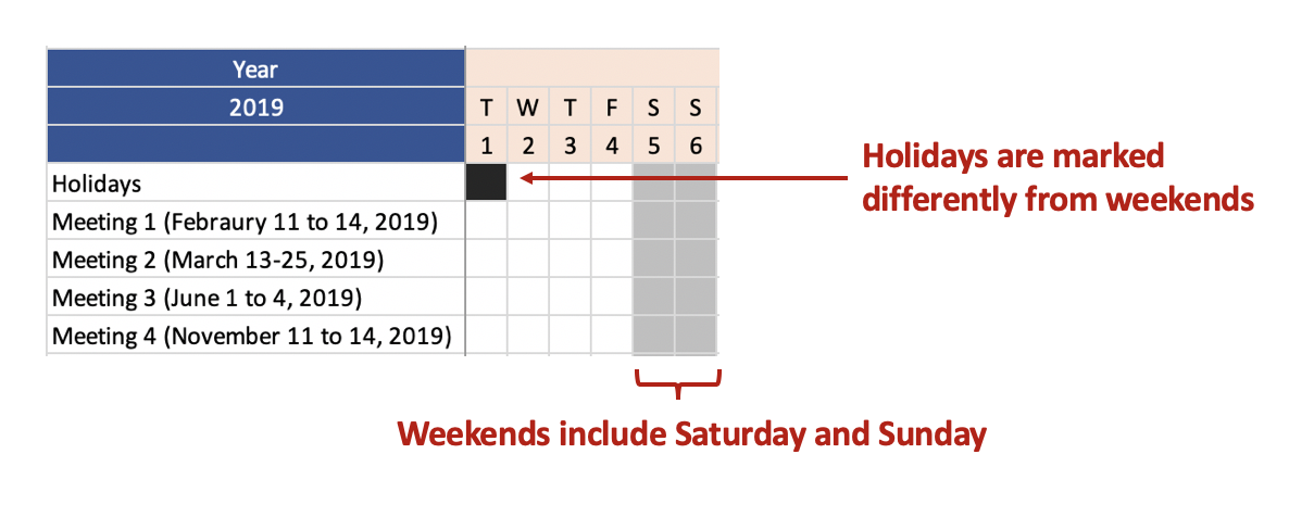
Step 3. Highlight the weekends and holidays:
Hopefully, your team doesn’t have to work on the weekends. However, there are exceptions. Clinicians work on the weekends, so your Gantt chart may need an indicator for differential pay (if it is part of the benefits). In our example, we will assume that no one from the team works on the weekends.
The holidays are highlight with a different color from the weekend
Step 4. Include the team members and Meetings to the Gantt chart.
Once you block out the holidays and weekends, you can start entering information on meetings and team members’ vacations. Different colors were used for the meetings and individual team members to provide easy visualization.
CONCLUSIONS
The final Gantt chart should be able to help you organize your team’s schedule while making sure that there are no conflicts with important team meetings or deadlines. Although Gantt charts were designed for project management, it can also be used to efficiently manage a team’s complex schedule.
You can download the Excel exercise at this link.
REFERENCES
I used the following references to assist me with this tutorial.
Sadiq Javer’s article on Gantt charts published on the Boostsoultions.com website.
Wikipedia’s page on Gantt charts, Henry Gantt, and Scientific Management.


