
I’m back with some Literary Cafe series updates.
I have regularly informal discussions with my students about interesting papers in the biomedical sciences. Recently, we discussed a great paper by Jurecka and colleagues on the impact of a state-wide law to change the definition of fentanyl possession on opioid-related overdose death rates.
Jurecka and colleagues used publicly available data to perform their research, and I wanted to show my students how this was done using CDC WONDER data. Hence, I started this Literary Care series to document these exercises for others to learn from.
Last month, I wrote an article on how to get data from the CDC WONDER site, which you can read here. I considered this Part 1 (Getting the data).
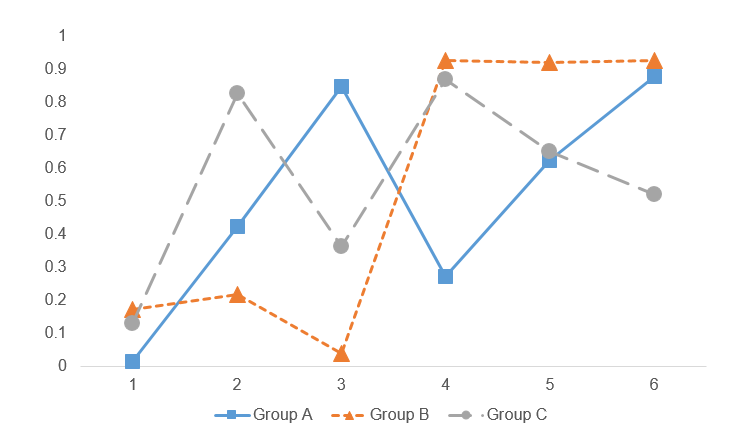
This is the second part of a two-part series that illustrates how to use publicly available data to replicate the findings from a published study. In Part 2, I use the data from Part 1 to analyze the impact of the statwide fentanyl possession law on opioid-related overdose death rates using an interrupted time series analysis. I posted this on my RPubs site (link) along with part 1 (link).


