color

Presentations with R Markdown - Part 3: Changing font colors

I continue my series on constructing a presentation using R Markdown with a new addition (Part 3) on font colors. We use colors to highlight text to enhance or draw attention to it. In this article, I provide code on how one can do this in R Markdown’s presentation using revealjs.

Part 3 of this series is available on my RPubs site.

Communicating data effectively with data visualization: Part 41 (Color Blind Friendly Palette)

BACKGROUND

Data visualization has evolved into sophisticated interactive graphics where users can gather more information compared to simple two-dimensional graphics. Color has become an important element to data visualization adding another dimension of information and data. However, people with color vision deficiency (also known as “color blindness”) are unable to experience or benefit from the use of colors in data visualization. This can have important implications when developing our data visualization, which is meant to inform and educate. To maximize the uptake and adoption of  our tools and reports with data visualization, we need to consider using color blind friendly palettes.


Recently, I created a report using the RColorBrewer color palette, which contains three types of color palettes: sequential, diverging, and qualitative. This color palette package in R was developed by Cynthia Brewer, and you can experiment with different color combinations at https://colorbrewer2.org.


Sequential palettes are used for ordered data which are represented varying gradient levels of color. For example, a low order might be represented by a light shade of blue, but a high order might be represented by a darker shade of blue (Figure 1). 

Figure 1. Example of a sequential palette

Diverging palettes are used to put equal emphasis on the mid-range values with the ends denoted by contrasting hues. For example, using colors to represent the values between 1 and 5 where 3 is the mid-range, we could color 3 as White, 1 as Blue, and 5 as Red (Figure 2).

Figure 2. Example of a diverging palette

Qualitative palettes are used to on categorical data, and the colors are used to represent distinct categories. Suppose you have a variable called food and there are 5 categories in that variable (chicken, meat, fish, vegetables, and fruit). You can use different hues to represent each category (Figure 3)

COLOR VISION DEFICIENCY

Color vision deficiency affects approximately 8% of males and 0.4% of females in the general population who are of European descent.1 However, these numbers vary among other races. For example, the prevalence of color vision deficiency among males in China and Japan are 4% and 6.5%, respectively.


There are several types of color vision deficiency. The red-green color vision deficiency is the most common, which are classified as protanomaly for red weakness and deuteranomaly for green weakness.2 For red-blind and green-blind, the categories are protanopia and deuteranopia, respectively. Less prevalent are the blue-weakness/blind (tritanomaly and tritanopia) and complete absence of color vision (achromatopsia). Examples of the different types of color vision deficiency are provided in the figure below (Figure 4).

Figure 4. Examples of color vision deficiency.

POTENTIAL SOLUTIONS

Picking color palettes that would not affect readers with color vision deficiency is not easy. Particularly, when you have a lot of colors on the palette that you are using. One tool that is helpful is ColorBrewer 2.0. You can select the “colorblind safe” option to select color palettes are friendly for readers with color vision deficiency (Figure 5).

Figure 5. ColorBrewer options. Source: https://colorbrewer2.org/

Another method to generate data visualizations for readers with color vision deficiency is to use different line styles or shapes. For example, we can use different types of dashed lines and markers for this line chart (Figure 6).

Figure 6. Line chart using different dash line types and markers (square, triangle, and circle).

CONCLUSIONS

Color vision deficiency can hinder our readers from extracting information from our data visualization. Hence, it is critical that we generate data visualization using the methods above to help our audience. Using the correct color palette and varying the style of the figures by changing the line styles (e.g., dashed) or marker shapes, can assist our readers regardless of their color vision deficiency. More importantly, it will help to reduce any barriers to accessing vital information for our entire audience.


ACKNOWLEDGMENTS

I used the Coblis-Color Blindness Simulator to generate the varying color vision deficiency examples in Figure 4.


REFERENCES

1.         Birch J. Worldwide prevalence of red-green color deficiency. J Opt Soc Am A Opt Image Sci Vis. 2012;29(3):313-320. doi:10.1364/JOSAA.29.000313

2.         Chakrabarti S. Psychosocial aspects of colour vision deficiency: Implications for a career in medicine. Natl Med J India. 2018;31(2):86-96. doi:10.4103/0970-258X.253167

Communicating data effectively with data visualizations: Part 20 (Enhance your data visualization with labels and contrast)

USING LABELS TO ENHANCE YOUR DATA VISUALIZATIONS

Labeling objects (data points, categories, axes, etc.) in your data visualizations is an important part of telling a good story. Without proper labels the figures in your presentation will leave out important elements of the narrative. Labels provide information about the data points or the categories in the figure. We normally use labels to provide information about the axes of the figure (e.g., horizontal and vertical). This is crucial because it tells our audience what the data visualization is measuring. But labels can also be used to provide a richer and informative description of your data visualization that enhances the narrative of your data-driven story.

Take a look at the two figures below. Which one tells you a better story?

The obvious answer is the right figure because it contains labels for the lines that reflect the sales of hardware and software products between 2010 and 2019. We easily see the sales growth from 2010 to 2019 because the labels identify these two products. Additionally, the labels are color coordinated with the line colors so that these are explicitly clear what lines the labels represent. Without these labels, we would have no idea what the lines represent.

Take a look at the next set of figures, what’s different about them? Are they better than the figures above?

The figure on the left removes the Y-axis and tells us that the growth of hardware sales was greater than software. However, we don’t know the magnitude of the difference in the sales. The figure on the right is more efficient in presenting the hardware and software sales because it includes the values from 2010 to 2019. In other words, the right figure removes the unnecessary values from the X-axis and provides the values that are relevant, in particular, those from 2010 and 2019. (This is a return to Tufte’s principle of the data-ink ratio where we want to maximize the information the ink provides in terms of the data.)  


CONTRAST RATIO

According to the Web Content Accessibility Guidelines (WCAG), the minimum contrast ratio between the text and background is 4.5:1. This meets Section 508 requirements from the Rehabilitation Act (29 U.S.C. 794d) that was amended by the Workforce Rehabilitation Act of 1973, which requires that all electronic content purchased by any Federal Agency be accessible to people with disabilities. These requirements are in place to assist those who have difficulties seeing the full color spectrum.

Take a look at the following figures below. Which one has a better contrast ratio?

The left figure has a contrast ratio of 2.35:1, which is below Section 508 requirements. The right figure has a contrast ratio of 7.36:1, which is above Section 508 requirements. It’s clear that the data labels are much easier to see in the right figure compared to the left figure. Having a good contrast ratio is critical to telling your narrative with data, but it is also a considerable advantage when presenting using slides where colors can be washed out by different projectors or bright rooms. Make sure to use high contrast ratio to have your data be more effective for your audience. (Note: For large-scale text (≥ 18 point font or ≥ 14 bold point font), you can use a contrast ratio of 3:1.)

You can check the contrast ratio using online tools such as the one here (developed by WebAIM). However, you will need to get the hex triplet color number from your data visualization. The hex triplet is a six-digit hexadecimal code used for web-based design and reflects the 24-bit RGB color spectrum.

To get the hex triplet color number from your data visualization in Excel (we are using Excel as an example, but this can work with other products that use a color palette), go to color format window and select the “More Colors…” option.

Use the eye dropper to select the color from your file (e.g., Excel, Word). The hex triplet color number will automatically populate in the “Hex Color #” field. Use this on the following website to determine the contrast ratio. (Remember, you want to have a contrast ratio of ≥ 4.5:1.)


CONSISTENCY

Labels should be consistent throughout your data visualization. If you decide to use Arial font in your labels, make sure that you consistently use them for the same label type.

Compare the two figures below. The figure in the bottom panel uses different fonts for the data labels, but the figure in the top panel has a font that is consistent. Having different fonts can be distracting, so it’s best to be consistent with the font (and size) that you use in your data visualizations.

Another point about consistency is the case rule for labels. Normal sentence case is the preferred method for providing labels according to the US Data Visualization Standards. However, I believe you are the best judge for when to use sentence case or other case rules for your data visualizations.

Compare the two figures below. The left figure has a legend that uses a sentence case where each word is capitalized (e.g., “Prevalence Of Deaths in 2015”). The right figure’s legend uses a normal sentence case (e.g.,  “Prevalence of deaths in 2015”). Which is better?

For me, having each word capitalized looks awkward (see below). I prefer to use a legend with a normal sentence case, but you may choose to use something different. I encourage you to experiment and find the right rules for your specific scenarios.


The top panel has the sentence case where all the words are capitalized. The bottom panel has normal sentence case.


CONCLUSIONS

Including data labels can enhance your data visualizations and strengthen your narrative. But you need to make sure that you are consistent and apply high contrast to be effective with your presentation. In this article, we introduce the importance of using the correct contrast ratios according to the WCAG and standardizing your font style. However, it is also important to incorporate your own creativity into your data visualization. Some rules should be broken in order to improv the narrative. So, be adventurous!


REFERENCES

WebAIM is a site that provides a contrast ratio tool, that checks the contrast ratio for your projects. WebAIM a non-profit organization that is based at the Center for Persons with Disabilities in the University of Utah. Their mission is to “…empower organizations to make their web content accessible to people with disabilities.”

The US Data Visualization Standards (DVS) is a great site for rules that the US Government uses for their data visualizations and web tools.

Web Content Accessibility Guidelines are a great resource for learning more about standardizing your data visualization. Although the WCAG was meant for web content and design, it can be generalized to your presentations, publications, and other data visualization tools.

Communicating data effectively with data visualizations - Part 10 (Heat Maps)

BACKGROUND

A heat map is a data visualization tool that uses positioning and coloring to identify clusters and correlations in multivariable analysis. The most common type of heat map is a 2 x 2 matrix, where two variables are examined using the rows and columns (R x C) positions on a matrix. A heat map matrix helps us identify any patterns or similarities across the different dimensions. In a heat map, color is critical in denoting degrees of change. (Please see refer to the past blog on colors.)

For example, we can see the changes in opioid overdose rates across time for each state (Figure 1). As the rates increase, the cells are darker (indicated by the legend). All the states experience an increase in opioid overdose deaths, but State 1 is experiencing it faster than States 2 and 3.

In this tutorial, we will perform two methods to create heat maps. The first method will use the built in Excel conditional formatting rules and the second method will use VBA macros.

Figure 1. Heat map matrix.

Figure 1 - heatmap matrix.png

MOTIVATING EXAMPLE

We will continue to use the state-level drug overdose mortality data from the CDC.

https://www.cdc.gov/drugoverdose/data/statedeaths.html

Mortality rate is presented as the number of deaths per 100,000 population.

In this tutorial, we will develop a heat map using opioid overdose mortality from 2013 to 2016.

The data setup in Excel has State indicators as the rows and time indicators as the columns. We are visualizing the change in opioid overdose mortality from 2013 to 2016 for each state. Figure 2 illustrates the data structure for the first seven states.


Figure 2. Data structure for the first seven states.  

Figure 2 - Data structure.png


METHOD 1: CONDITIONAL FORMATTING RULES

Excel has a convenient tool that allow us to use conditional formatting to shade our heat map matrix.

Step 1: First highlight all the data.


Step 2: In the Excel Ribbon, select Conditional formatting and then New.

Figure 3 - conditional formatting.png

Step 3: Select “Format all cells based on their values” and change the Format Style to “3-Color scale.” Change the color to the different shades you are interested in using. (In this example, we used a blue base with varying degrees of shading.) Select percentile and then click “Ok.” The percentile will use the Median for each column to distinguish the middle category for the rates of opioid overdose mortality for each state.

Figure 4 - 3-color scale.png

Step 4: Visually inspect the results. If there are no apparent pattern in the heat map, we will need to sort the rate of opioid overdose mortality for 2016 in descending order.

Figure 4 - Descending order.png

The heat map should look like the following:

 
Figure 6 - heat map example 1.png
 

There is a pattern emerging in regards to the rate of opioid overdose mortality across the different states. West Virginia has the highest opioid overdose mortality rate in 2016, but they also appear to have the highest from 2013 to 2015. The dark cell in 2016 indicates that West Virginia has exceeded the 50 deaths per 1000 population incidence rate. Other states also have high rates of opioid overdose mortality across 2013 to 2016, which continued to increase. The 2013 column is clearly lighter indicating that the opioid overdose mortality has increased over time up to the available data in 2016.


Step 5: We can improve this heat map by removing the numbers, which can be distracting. We need to select all the data and format the cells. Select only the numeric data and then format the number. Use the “Custom” category and enter the following: "";"";"";"". This will change the number values so that it doesn’t show in the cells.

Figure 7 - change the number format.png

Step 6: Change the column width and row height so that you have a nice square-like matrix for the final result. We used a column width of 5 and a row height of 30. (Only the first fifteen states are shown.)

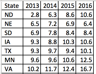
The heat map can be used to quickly identify states with the highest opioid overdose mortality and the trends across time. The states with the highest rates of opioid overdose mortality are clustered at the top while the states with the lowest rates are clustered at the bottom.

We could also arrange this into regions of the US to further stratify the results (not shown).


METHOD 2: USING VBA MACROS FOR CONDITIONAL FORMATTING OF MORE THAN 3 CATEGORIES

Excel only allows us to choose up to 3-Color scales. If we wanted to use more than 3 color categories, we will need to use VBA macros.

But before we do, we need to think about the colors for the scales. Since we have more than 3 categories, we will need to figure out how to divide the colors.


COLOR CODES

We will need to determine the base color for our heat map. In this example, we will use a blue base-color and change the shading using the RGB color values. RGB colors are based on a system using a combination of three base colors (red, green, and blue) that can be used to change the intensity of the color from a range between 0 and 250. An example of an RGC color table can be found in the following site.

For this example, we used the following RGB color values where dark-navy denotes high rates of opioid overdose mortality (50 or more per 1000 population). However, you can change the values of these colors however you like.

Figure color codes.png

We will continue to use the blue color base and change the gradient using the RGB values.


VISUAL BASIC FOR APPLICATION (VBA) MACRO

The VBA macro comes from the site Excel For Beginners and written by Kristoff deCunha. We used the VBA code on the site, but modified it for this tutorial.

The VBA code is written in a way where any changes in the values will automatically update the color of the cell. Additionally, the code also sorts the 2016 opioid overdose mortality rate in descending order, adds thin-white continuous borders around the cells, and changes the font to Times New Roman.

Here are the VBA macros used for Method 2.


Macro 1 changes the font to Times New Roman.

‘Macro1
Sub ChangeFont()

Dim rng As Range
Set rng = Range("J1:N52")

With rng.Font
    .Name = "Times New Roman"
    .Size = 12
    .Strikethrough = False
    .Superscript = False
    .Subscript = False
    .OutlineFont = False
    .Shadow = False
    .Underline = xlUnderlineStyleNone
    .ThemeColor = xlThemeColorLight1
    .TintAndShade = 0
    .ThemeFont = xlThemeFontNone
End With

End Sub


Macro 2 changes the cell shading to the 6-Color scale (blue-base)

‘Macro2
Sub ChangeCellColor()


Dim rng As Range
Dim oCell As Range

Set rng = Range("K2:N52")

For Each oCell In rng
        Select Case oCell.Value
                 Case 50 To 100
                     oCell.Interior.Color = RGB(37, 54, 97)
                     oCell.Font.Bold = True
                     oCell.Font.Name = "Times New Roman"
                     oCell.HorizontalAlignment = xlCenter
                 Case 40 To 49.999
                     oCell.Interior.Color = RGB(56, 83, 145)
                     oCell.Font.Bold = True
                     oCell.Font.Name = "Times New Roman"
                     oCell.HorizontalAlignment = xlCenter
                 Case 30 To 39.999
                     oCell.Interior.Color = RGB(147, 168, 215)
                     oCell.Font.Bold = True
                     oCell.Font.Name = "Times New Roman"
                     oCell.HorizontalAlignment = xlCenter
                 Case 20 To 29.999
                     oCell.Interior.Color = RGB(183, 198, 228)
                     oCell.Font.Bold = True
                     oCell.Font.Name = "Times New Roman"
                     oCell.HorizontalAlignment = xlCenter
                 Case 10 To 19.999
                     oCell.Interior.Color = RGB(218, 225, 240)
                     oCell.Font.Bold = True
                     oCell.Font.Name = "Times New Roman"
                     oCell.HorizontalAlignment = xlCenter
                 Case 0 To 9.999
                     oCell.Interior.Color = RGB(230, 237, 253)
                     oCell.Font.Bold = True
                     oCell.Font.Name = "Times New Roman"
                     oCell.HorizontalAlignment = xlCenter
                  Case Else
                     oCell.Interior.ColorIndex = xlNone
         End Select
    Next oCell
    
End Sub


Macro 3 sorts the 2016 opioid overdose mortality rates in descending order.

‘Macro3
Sub SortColumn()

Dim DataRange As Range
Dim keyRange As Range
Set DataRange = Range("J1:N52")
Set keyRange = Range("N1")
DataRange.Sort Key1:=keyRange, Order1:=xlDescending

End Sub


Macro 4 hides the font from the heat map.

‘Macro4
Sub HideFont()
    
Dim rng As Range
Dim oCell As Range

Set rng = Range("K2:N52")

    For Each oCell In rng
        oCell.Font.Color = oCell.Interior.Color
    Next oCell
    
End Sub


Macro 5 creates thick white borders for each cell in the table.

‘Macro5
Sub WhiteOutlineCells()

    Dim rng As Range

    Set rng = Range("J1:N52")

    With rng.Borders
        .LineStyle = xlContinuous
        .Color = vbWhite
        .Weight = xlThick
    End With
    
End Sub

INSERTING DATA AND RUNNING MACRO

The five macros are assigned to a button in the Excel Macro-Enabled Workbook. Pressing the button will perform the task of creating a 6-Color scale heat map. Download the Excel Macro-Enabled Workbook here. This file will have the raw data and the macro-enabled worksheet for you to create a heat map.

Step 1: Copy the raw data from the “combined” worksheet.

Figure 9 - Copy Data.png

Step 2: Paste it in the worksheet “heatmap_2” starting on cell "J1".

Figure 10 - Copy onto J1.png

Step 3: Then press the “PressStart” button to run the macros. Your final heat map should look like the following:

Compare the heat map from Method 1 (3-Color scale) to the one generated by Method 2 (6-Color scale). The heat map with the 6-Color scale has a lighter pattern compared to the 3-Color scale heat map. The differences are dramatic. Depending on the granularity of the heat map you want, either one of these color scales would be fine. However, Method 2 requires some VBA coding.

* Not all states shown.


Conclusions

Heat maps allow us to observe patterns in the data. In our example, we notice that West Virginia has a high rate of opioid overdose mortality indicated by the clustering of dark cells from 2013 to 2016. Other states had similar patterns as West Virginia. Using heat maps provides a quick and easy interpretation of the changes in opioid overdose mortality across time and the states that are clustered together that have high rates of opioid overdose mortality.


REFERENCES

I used the following websites to help develop this tutorial.

Conditional formatting with more than 3 categories:
https://sites.google.com/site/excelforbeginners/Home/vba-codes/conditional-formatting-more-than-3-criterias
 
Changing the RGB color codes:
https://analysistabs.com/excel-vba/change-background-color-of-cell-range/
https://www.w3schools.com/colors/colors_rgb.asp

Excel color palette library:
http://dmcritchie.mvps.org/excel/colors.htm

Excellent site for VBA coding:
https://www.excel-easy.com/vba.html


Communicating data effectively with data visualizations - Part 5 (Colors)

Background

As we decide the type of chart we want to visualize our data with, we should also think about our color scheme. Color should represent the data value. We should be able to see a chart, identify the color that interests us and associate a value with it. However, it is easy to misidentify the data that the color is supposed to represent and it is also easy to confuse the magnitude of the difference between groups.

In this tutorial, we will discuss some basic elements of color theory that will help you to select the best color palette for your graphical presentations. We will use the following simple data and color schemes to illustrate some of these lessons (Figure 1). The X column denotes some arbitrary category that uses the alphabet and the Y column denotes the values associated with each category.

Figure 1. Example data used to illustrate the different color schemes.

table example.png

Figure 2. Color schemes used in this example (single-hue color and rainbow color schemes).

color hues.png


Bias-Precision Tradeoff

There is always a tradeoff between bias and precision. Bias is associated with the ability to accurately identify the data value associated with the color. Precision is associated with the ability to correctly identify the data with little variation. Figure 3 illustrates the differences between the two.


Figure 3. Bias and Precision tradeoff.

Figure 3. Bias-precision tradeoff.png

For example, if you had a single-hue progression color scheme (blue), it is easy to identify the color that contains the higher value versus the color that contains the lower value. In Figure 4A, the darker shade of blue is associated with a higher value compared to the lighter shade of blue. However, it may not be easy when you have a rainbow color scheme because the values can be arbitrarily associated with a different color (Figure 4B). In other words, Figure 4A helps to reduce the bias while Figure 4B can generate a lot of bias.


Figure 4. Comparison between single hue color scheme and rainbow color scheme.

Additionally, Figure 4B is easier to distinguish between the groups. You can easily identify Group F compared to Group E because the colors are distinctly differentiable. However, in Figure 4A, it is very difficult to distinguish between Group F and Group E because the shades of blue associated with both groups appear similar. Therefore, the ability to precisely detect the differences in the groups is limited by the single-hue color scheme (Figure 4A) compared to the rainbow color scheme (Figure 4B).

Another way to look at these principles is to think about the concurrence between the true value and the estimated value. Suppose you were given these color schemes and asked to estimate the correct value. How do you think you’ll do? Would it be easier to estimate the true value from the single-hue color scheme or the rainbow color scheme?


Figure 5. Performance of color schemes according to estimated and true values.

I generated data in Figure 5 to illustrate the principles in this tutorial. Figure 5 compares performance between the single-hue color scheme and rainbow color scheme. Figure 5A has low bias but some scatter (moderate precision) across the gray line, which denotes the 1:1 accuracy between true and estimated values. However, Figure 5B has high bias but very little scatter (high precision) due to the easy identification of the groups. Whereas, there was some uncertainty in correctly identifying the true value within each group.


Summary

When deciding on the color scheme for your data, take into consideration what is more important. Is it critical that your audience precisely distinguish one group from another? Or is it more important to have them visually identify the correct value associated with the color? Ideally, you want to be able to use a color scheme that has low bias and high precision, but in reality, you will need to make a tradeoff between the two.


References

I used the following references to develop this tutorial.

Liu Y, Heer J. Somewhere over the rainbow: An empirical assessment of quantitative colormaps. ACM Human Factors in Computing Systems (CHI) 2018, April 21-26, 2018, Montreal, QC, Canada. http://dx.doi.org/10.1145/3173574.3174172

Cromwell W. Colour schemes in data visualisation: Bias and Precision. Presented at the useR! 2016 international R User conference, June 15, 2017. URL: https://channel9.msdn.com/Events/useR-international-R-User-conference/useR2016/Colour-schemes-in-data-visualisation-Bias-and-Precision