
I wrote a short exercise on how to load *.csv and *.xlsx files into the R environment, which I posted on my RPubs site (link)
R - Tips and Tricks (Guide) - Part 2
I wrote a second R guide to help students navigate and use R and RStudio in their biostatistics course. I focused on creating vectors, matrices, and dataframes.
The guide can be found on my RPubs site.
Communicating data effectively with data visualizations: Part 30 (Butterfly charts)
INTRODUCTION
COVID-19 data on cases and deaths highlight the devastating impact it has had on public health. As of 20 October 2020, there has been over 8.5 million cases and over 200,000 deaths. A majority of deaths have been among the elderly while a majority of the cases have been among the younger population. The Wall Street Journal recently published an article describing this relationship. Of concern is the potential for transmission to occur between the younger group who have the most cases and the elderly population.
In this tutorial, we will compare the distribution of cases and deaths across different age groups to visualize the relationships between these dimensions. To do that, we will use a butterfly chart, which juxtaposes two vertical bar charts in a mirror-like fashion. Butterfly charts allow us to plot two data sets using a common dimension; this allows us to visually see their differences and scales.
Here is an example of a butterfly chart from datavizproject.com.
MOTIVATING EXAMPLE
We will use data from the CDC on COVID-19 cases and deaths distributed by age groups. You can download the data from the CDC website site here. You can also download the Excel workbook for this exercise here.
CONSTRUCTING THE BUTTERFLY CHART
Step 1. Open the Excel File and review the data.
The main data will include the Age Group, Percentage of cases, Percentage of deaths, Mirror1, Mirror2, and Middle. These columns will be used to build the butterfly chart. The next smaller table will be used to re-align the data on a different X-axis.
Here are some data definitions:
Age Group = Age distribution of the population
Percentage of cases = Proportion of patients within each age group that had confirmed COVID-19 testing
Percentage of deaths = Proportion of patients within each age group that died of COVID-19 related disease
Mirror1 = Represents the amount of gap that is created from the left variable of the butterfly chart. This is estimated using: 50 – Percentage of cases (50 was used because it was a reasonable value after the max value). For instance, the max value for the Percentage of cases is 23.7. Therefore, Mirror1 = 50 – 23.7 = 26.3.
Mirror2 = Represents the amount of gap that is created from the right variable of the butterfly chart. This is estimated using: 50 – Percentage of deaths (50 was used because it was a reasonable value after the max value)
Middle = Represents the gap in the middle where we will place our data labels
Step 2. Create a stacked horizontal bar chart.
Select the data shown in the figure below and select the Stacked Bar Chart.
The stacked bar chart will look like the following:
Step 3. Order the categories.
Once the stacked bar chart is created, we will re-order the categories so that the Middle values are in the middle of the group. The order should be Mirror1, Percentage of cases, Middle, Percentage of deaths, and Mirror2.
Step 4. Remove color from the bars.
Next, we will remove the color fills from the Mirror1, Middle, and Mirror2 bars from the stacked bar chart. We should start to see the beginnings of a butterfly chart.
Step 5. Add labels to the middle of the butterfly chart.
Once the selected bars have their fill colors removed, we can add labels to reflect the age categories. First, we will reverse the order of the Y-axis by right-clicking on it and the selecting the “Categories in reverse order.” Second, we can remove the gridlines by clicking on them and then clicking on the “Delete” button. Third, we will add age category labels to the Middle bars by right-clicking on the bars, selecting “Add data labels,” then select “Format data label” and check the “Category Name” and uncheck the “Values.” This should replace the values with the age category names for the Middle bar in the stacked bar chart.

Step 6. Adding the new X-axis labels.
Since the current stacked bar chart uses the X-axis from the main data table, we don’t have a normalized axis. To do that, we will need to add a new set of data and then replace our current X-axis with the updated X-axis.
First, we need to establish where we would like to zero-out our normalized X-axis. Looking at the current X-axis, the left side of the butterfly chart starts at X=50 and the right side of the butterfly chart starts at X=90.
Second, Right-click anywhere on the chart area. Click to add a new data set, then click on the “Add” to add the new data. In the Series Values, select the values in the Old X-axis column.
You chart will look a little strange, but that’s okay. We’ll change the axis so that it looks a little bit more reasonable.
Third, right click on one of the bars from the newly added data, click on the “Change Series Chart Type…” Then change the Chart Type from Stacked Bar Chart for Series 6 to Scatter. This will change the bars to a scatter plot that we will manipulate into a new X-axis.
Fourth, we will right-click on the scatter plot and open a window to update the data by clicking on “Select Data…” Then on Series6, click on “Edit” to update the data. Using the values on the main table, select the Old X-axis values for the Y-values in the Edit Series window; then select the values in the New X-axis for the X-values.
The chart will have a scatter pattern like an upside trapezoid.
We will use a trick with the Y-axis to make this shape a straight line. Let’s add some data labels to the scatter. Afterwards, we want to reposition the label values to the bottom of the scatter points.
To change the scatter points from an upside trapezoid to a straight line, we will compress the Y-axis. To do this right-click on the Y-axis, and change the range of the axis from 0 to 10,000.
The bar chart will now have the scatter at the bottom of the chart along with the labels for the scatter points.
Step 7. Delete the Y-axes, remove the legend, and zoom into the chart.
We are nearly done. All that’s left is to clean the chart of unnecessary labels and axes. First, delete the two Y-axes. Then delete the legend. We can also remove the top X-axis, there’ no need to have that. We just want to keep the bottom X-axis. We can remove the scatter by right-clicking on it and then changing the fill and border colors to none.
After a series of these aesthetic change, your chart should look like the following.
CONCLUSIONS
Based on the final butterfly chart, we can see that the younger patients had a large percentage of cases and the elderly patients had a large percentage of deaths. Policy makers can review this visualization and immediate identify this association, and they may conclude that the reason why there are so many deaths in the elderly population is due to transmission from the younger population.
REFERENCES
I used the following YouTube video by Doug H to help me write this tutorial.
The Excel file for this tutorial is located here.
The WSJ article that highlights the association between age and COVID-19 cases/deaths can be located here (but you will need a subscription to read the whole story).
Communicating data effectively with data visualizations: Part 22 (How to create a double axes figure in Excel)
INTRODUCTION
Displaying two types of information on a single figure is commonly done using double axes. Normally, you would use a single y-axis to reflect the outcome or metric of interest and a single x-axis for a standard set of categories (e.g., time). However, if the scales are different, leveraging a secondary axis can enhance and improve the visualization. In this article, we will demonstrate how to create a secondary axis using Excel.
MOTIVATING EXAMPLE
For example, the total overdose deaths are plotted on the y-axis and the year is plotted on the x-axis (Figure 1).

Figure 1. Total overdose deaths in the United States, 1999 to 2017.
Source: https://www.drugabuse.gov/related-topics/trends-statistics/overdose-death-rates
Total overdose deaths in the United States (US) is large and growing. In 1999 it started at 16,849 deaths, but by 2019, that number rose to over seventy thousand. This is a large number and the scale that is used can impact how the viewer will synthesize this visualization.
However, if you wanted to add another line or data dimension such as the number of deaths due to opioids with a benzodiazepine prescription, that number may not be on the same scale as the total overdose deaths that’s currently represented by the y-axis. Figure 2 illustrates the Total Overdose Deaths and Overdose Deaths due to an Opioid-Benzodiazepine combination. Notice how the Opioid Deaths due to an Opioid-Benzodiazepine combination is plotted on the same scale as the Total Overdose Deaths. Using the same scale makes it difficult to discern the change in deaths associated with an Opioid-Benzodiazepine combination.
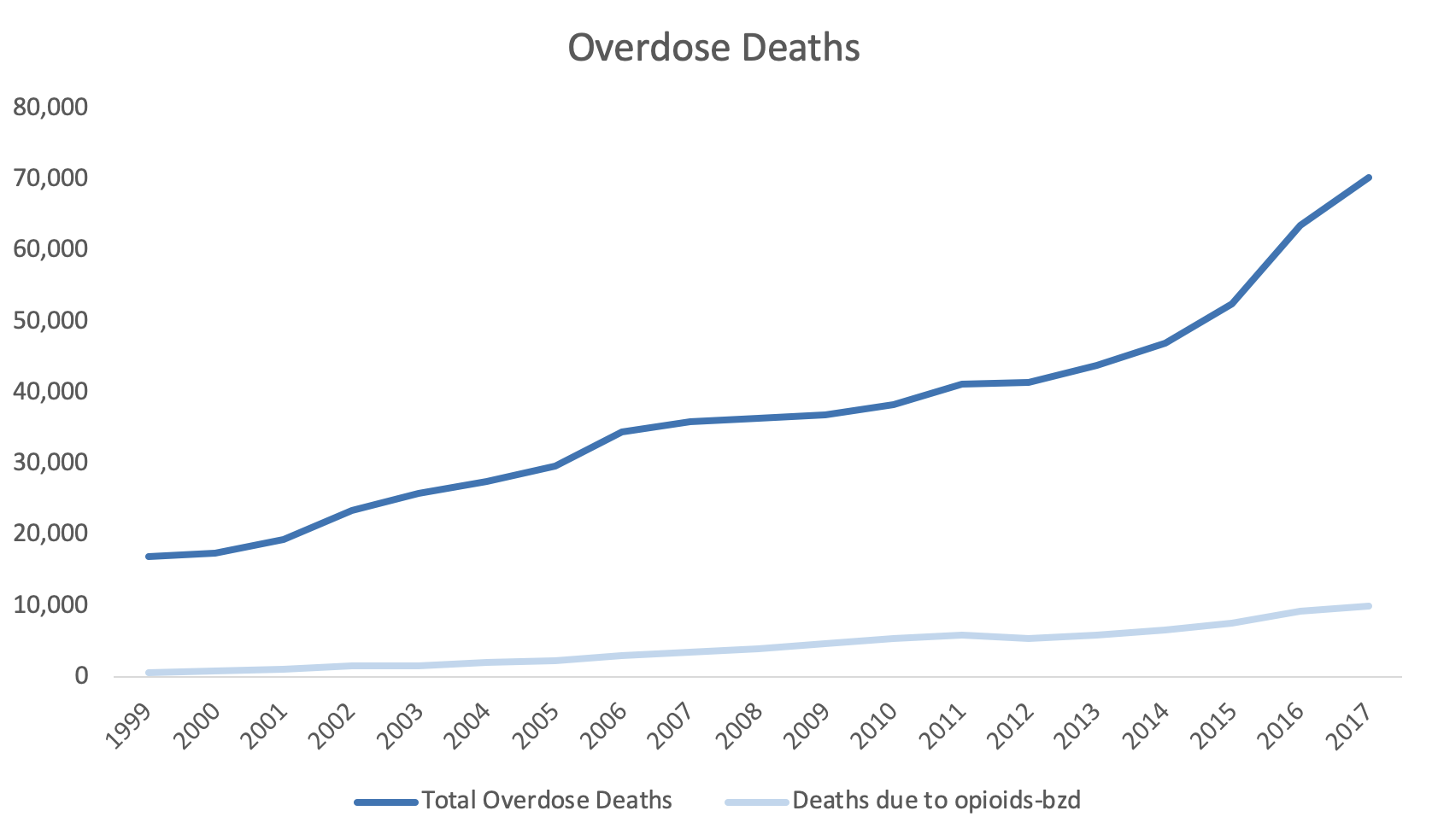
Figure 2. Overdose Deaths due to Opioids, 1999 to 2017.
To improve this, we may consider using a secondary y-axis to correctly scale for the number of deaths due to opioids-benzodiazepine co-prescribing.
Step 1. Open the Excel document with the data, which is located here.
Step 2. Review the data. In this example, we have the total overdose deaths and the deaths associated with opioids-benzodiazepine co-prescribing from 1999 to 2017.

Step 3. Select the three columns and use the Excel Insert tab to select the line figure.

Step 4. Review the line graph.
The default line plot that is generated includes all the variables in a single y-axis. This is not what we want.

We need to correct this and select the correct axes for these variables.
Step 5. The Year variable needs to be on the x-axis.
Right-click anywhere on the chart space. A menu of options will appear. You want to click on the Select Data… option to make changes to the data and how they are displayed on the chart.
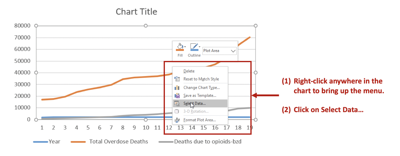
Then Remove the Year variable from the Legend Entries (Series) panel. This will remove Year from being plotted on the y-axis. Next, you want to edit the Total Overdose Deaths in the Horizontal (Category) Axis Labels panel.

After clicking on Edit, you will be given a small window to select the range of data to display on the x-axis. Use the button in the Axis label range to select the Years 1999 to 2017. This will populate the x-axis with the years corresponding to the Total Overdose Deaths.

Step 6. Selecting the secondary y-axis.
Once the Year has been correctly specified, we can create a secondary y-axis to represent the Deaths due to opioids-bzd since these numbers are much smaller than the Total Overdose Deaths.
Right click on the line that represents Deaths due to opioids-bzd. Select the Format Data Series… option. This will give you a menu with the choice to use the Primary or Secondary axis. Select the Secondary axis.

This will generate a chart that will include two y-axes: (1) Total Overdose Deaths and (2) Deaths due to opioids-bzd.

You can format the figure to improve its appearance with Excel’s other functions. In this example, the line colors were changed to provide a better contrast, the y-axes were properly labelled, and the font colors matched those of the lines.

CONCLUSIONS
Using double axes can improve the narrative of your data visualization. Take advantage of this option when presenting data with the same x-axis, but different measures. In this example, the metric of interest was death, but the scales were different. Total Overdose Deaths were significantly larger than Deaths due to opioid-benzodiazepine co-prescribing. Therefore, to better visualize the increasing number of deaths due to opioid-benzodiazepine co-prescribing, a secondary y-axis was added.
SUPPLEMENTS
Data and Excel file used for this exercise are available here.
Communicating data effectively with data visualizations: Part 20 (Enhance your data visualization with labels and contrast)
USING LABELS TO ENHANCE YOUR DATA VISUALIZATIONS
Labeling objects (data points, categories, axes, etc.) in your data visualizations is an important part of telling a good story. Without proper labels the figures in your presentation will leave out important elements of the narrative. Labels provide information about the data points or the categories in the figure. We normally use labels to provide information about the axes of the figure (e.g., horizontal and vertical). This is crucial because it tells our audience what the data visualization is measuring. But labels can also be used to provide a richer and informative description of your data visualization that enhances the narrative of your data-driven story.
Take a look at the two figures below. Which one tells you a better story?
The obvious answer is the right figure because it contains labels for the lines that reflect the sales of hardware and software products between 2010 and 2019. We easily see the sales growth from 2010 to 2019 because the labels identify these two products. Additionally, the labels are color coordinated with the line colors so that these are explicitly clear what lines the labels represent. Without these labels, we would have no idea what the lines represent.
Take a look at the next set of figures, what’s different about them? Are they better than the figures above?
The figure on the left removes the Y-axis and tells us that the growth of hardware sales was greater than software. However, we don’t know the magnitude of the difference in the sales. The figure on the right is more efficient in presenting the hardware and software sales because it includes the values from 2010 to 2019. In other words, the right figure removes the unnecessary values from the X-axis and provides the values that are relevant, in particular, those from 2010 and 2019. (This is a return to Tufte’s principle of the data-ink ratio where we want to maximize the information the ink provides in terms of the data.)
CONTRAST RATIO
According to the Web Content Accessibility Guidelines (WCAG), the minimum contrast ratio between the text and background is 4.5:1. This meets Section 508 requirements from the Rehabilitation Act (29 U.S.C. 794d) that was amended by the Workforce Rehabilitation Act of 1973, which requires that all electronic content purchased by any Federal Agency be accessible to people with disabilities. These requirements are in place to assist those who have difficulties seeing the full color spectrum.
Take a look at the following figures below. Which one has a better contrast ratio?
The left figure has a contrast ratio of 2.35:1, which is below Section 508 requirements. The right figure has a contrast ratio of 7.36:1, which is above Section 508 requirements. It’s clear that the data labels are much easier to see in the right figure compared to the left figure. Having a good contrast ratio is critical to telling your narrative with data, but it is also a considerable advantage when presenting using slides where colors can be washed out by different projectors or bright rooms. Make sure to use high contrast ratio to have your data be more effective for your audience. (Note: For large-scale text (≥ 18 point font or ≥ 14 bold point font), you can use a contrast ratio of 3:1.)
You can check the contrast ratio using online tools such as the one here (developed by WebAIM). However, you will need to get the hex triplet color number from your data visualization. The hex triplet is a six-digit hexadecimal code used for web-based design and reflects the 24-bit RGB color spectrum.
To get the hex triplet color number from your data visualization in Excel (we are using Excel as an example, but this can work with other products that use a color palette), go to color format window and select the “More Colors…” option.
Use the eye dropper to select the color from your file (e.g., Excel, Word). The hex triplet color number will automatically populate in the “Hex Color #” field. Use this on the following website to determine the contrast ratio. (Remember, you want to have a contrast ratio of ≥ 4.5:1.)
CONSISTENCY
Labels should be consistent throughout your data visualization. If you decide to use Arial font in your labels, make sure that you consistently use them for the same label type.
Compare the two figures below. The figure in the bottom panel uses different fonts for the data labels, but the figure in the top panel has a font that is consistent. Having different fonts can be distracting, so it’s best to be consistent with the font (and size) that you use in your data visualizations.
Another point about consistency is the case rule for labels. Normal sentence case is the preferred method for providing labels according to the US Data Visualization Standards. However, I believe you are the best judge for when to use sentence case or other case rules for your data visualizations.
Compare the two figures below. The left figure has a legend that uses a sentence case where each word is capitalized (e.g., “Prevalence Of Deaths in 2015”). The right figure’s legend uses a normal sentence case (e.g., “Prevalence of deaths in 2015”). Which is better?
For me, having each word capitalized looks awkward (see below). I prefer to use a legend with a normal sentence case, but you may choose to use something different. I encourage you to experiment and find the right rules for your specific scenarios.
The top panel has the sentence case where all the words are capitalized. The bottom panel has normal sentence case.
CONCLUSIONS
Including data labels can enhance your data visualizations and strengthen your narrative. But you need to make sure that you are consistent and apply high contrast to be effective with your presentation. In this article, we introduce the importance of using the correct contrast ratios according to the WCAG and standardizing your font style. However, it is also important to incorporate your own creativity into your data visualization. Some rules should be broken in order to improv the narrative. So, be adventurous!
REFERENCES
WebAIM is a site that provides a contrast ratio tool, that checks the contrast ratio for your projects. WebAIM a non-profit organization that is based at the Center for Persons with Disabilities in the University of Utah. Their mission is to “…empower organizations to make their web content accessible to people with disabilities.”
The US Data Visualization Standards (DVS) is a great site for rules that the US Government uses for their data visualizations and web tools.
Web Content Accessibility Guidelines are a great resource for learning more about standardizing your data visualization. Although the WCAG was meant for web content and design, it can be generalized to your presentations, publications, and other data visualization tools.