INTRODUCTION
Displaying two types of information on a single figure is commonly done using double axes. Normally, you would use a single y-axis to reflect the outcome or metric of interest and a single x-axis for a standard set of categories (e.g., time). However, if the scales are different, leveraging a secondary axis can enhance and improve the visualization. In this article, we will demonstrate how to create a secondary axis using Excel.
MOTIVATING EXAMPLE
For example, the total overdose deaths are plotted on the y-axis and the year is plotted on the x-axis (Figure 1).

Figure 1. Total overdose deaths in the United States, 1999 to 2017.
Source: https://www.drugabuse.gov/related-topics/trends-statistics/overdose-death-rates
Total overdose deaths in the United States (US) is large and growing. In 1999 it started at 16,849 deaths, but by 2019, that number rose to over seventy thousand. This is a large number and the scale that is used can impact how the viewer will synthesize this visualization.
However, if you wanted to add another line or data dimension such as the number of deaths due to opioids with a benzodiazepine prescription, that number may not be on the same scale as the total overdose deaths that’s currently represented by the y-axis. Figure 2 illustrates the Total Overdose Deaths and Overdose Deaths due to an Opioid-Benzodiazepine combination. Notice how the Opioid Deaths due to an Opioid-Benzodiazepine combination is plotted on the same scale as the Total Overdose Deaths. Using the same scale makes it difficult to discern the change in deaths associated with an Opioid-Benzodiazepine combination.
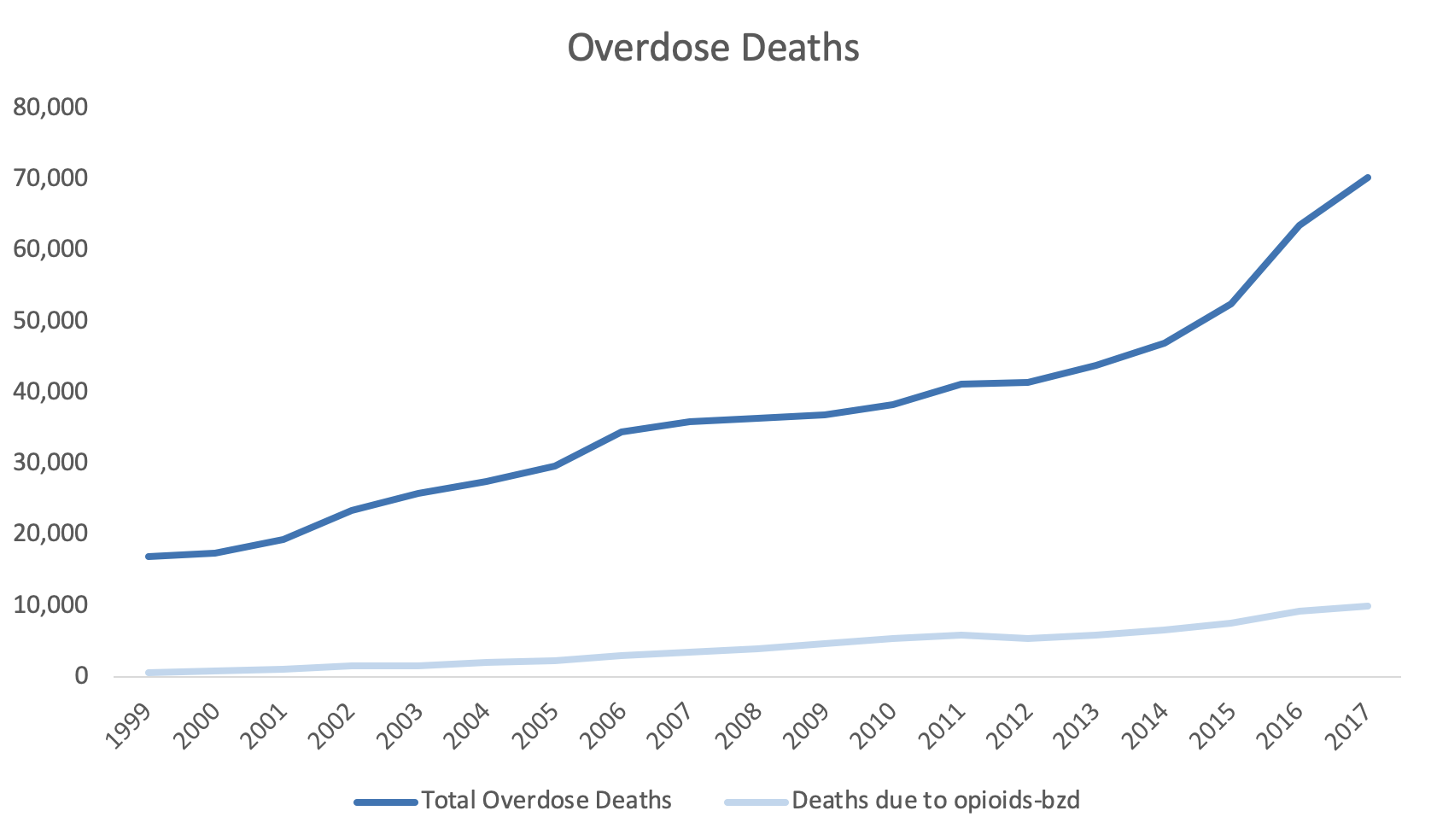
Figure 2. Overdose Deaths due to Opioids, 1999 to 2017.
To improve this, we may consider using a secondary y-axis to correctly scale for the number of deaths due to opioids-benzodiazepine co-prescribing.
Step 1. Open the Excel document with the data, which is located here.
Step 2. Review the data. In this example, we have the total overdose deaths and the deaths associated with opioids-benzodiazepine co-prescribing from 1999 to 2017.

Step 3. Select the three columns and use the Excel Insert tab to select the line figure.

Step 4. Review the line graph.
The default line plot that is generated includes all the variables in a single y-axis. This is not what we want.

We need to correct this and select the correct axes for these variables.
Step 5. The Year variable needs to be on the x-axis.
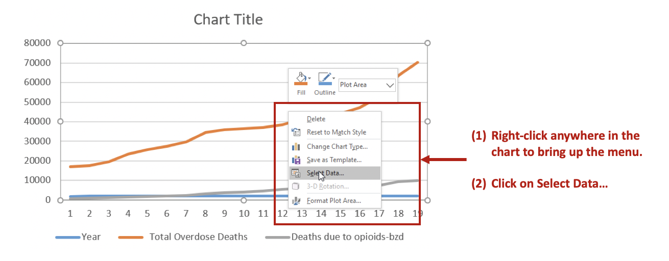
Right-click anywhere on the chart space. A menu of options will appear. You want to click on the Select Data… option to make changes to the data and how they are displayed on the chart.
Then Remove the Year variable from the Legend Entries (Series) panel. This will remove Year from being plotted on the y-axis. Next, you want to edit the Total Overdose Deaths in the Horizontal (Category) Axis Labels panel.

After clicking on Edit, you will be given a small window to select the range of data to display on the x-axis. Use the button in the Axis label range to select the Years 1999 to 2017. This will populate the x-axis with the years corresponding to the Total Overdose Deaths.

Step 6. Selecting the secondary y-axis.
Once the Year has been correctly specified, we can create a secondary y-axis to represent the Deaths due to opioids-bzd since these numbers are much smaller than the Total Overdose Deaths.
Right click on the line that represents Deaths due to opioids-bzd. Select the Format Data Series… option. This will give you a menu with the choice to use the Primary or Secondary axis. Select the Secondary axis.

This will generate a chart that will include two y-axes: (1) Total Overdose Deaths and (2) Deaths due to opioids-bzd.

You can format the figure to improve its appearance with Excel’s other functions. In this example, the line colors were changed to provide a better contrast, the y-axes were properly labelled, and the font colors matched those of the lines.

CONCLUSIONS
Using double axes can improve the narrative of your data visualization. Take advantage of this option when presenting data with the same x-axis, but different measures. In this example, the metric of interest was death, but the scales were different. Total Overdose Deaths were significantly larger than Deaths due to opioid-benzodiazepine co-prescribing. Therefore, to better visualize the increasing number of deaths due to opioid-benzodiazepine co-prescribing, a secondary y-axis was added.
SUPPLEMENTS
Data and Excel file used for this exercise are available here.