secondary axes

Communicating data effectively with data visualizations: Part 33 (Bar charts with secondary axis)

INTRODUCTION

Secondary axis allows us to plot two pieces of data with large differences in their scale. For instance, plotting the number of new COVID cases, which number in the hundreds of thousands, will outweigh the number of employees who lose their jobs, which number in the tens of thousands. There is an order of magnitude that makes it difficult to see how these two metrics are presented side-by-side on a single figure. However, we can take advantage of the secondary vertical axis to present both pieces of data that will be visually intuitive to interpret, while preserving the differences in their scale. One problem with this method is how Excel executes this. Instead of maintaining the bar or column chart, Excel will overlay both bars (or columns). This is illustrated in Figure 1.


Figure 1. Excel overlays the two bars in the figure when using the secondary axis.

To address this issue, we will use a method described by Steve True on his Excel Dashboard Templates Website.


MOTIVATING EXAMPLE

We will use data from the California’s Employment Development Department to visualize the number of employees who lost their jobs during the COVID-19 pandemic and compare these trends to the number of new COVID-19 cases in California. Data on the number of COVDI-19 cases in California came from the California Data Portal. You can also download the Excel exercise file from the following shared Dropbox location.


Step 1. Selecting the data.

First, inspect the data. There are three columns of data the contain the month, number of employees affected, and the number of new COVID-19 cases. Next select the data and insert a “Clustered Column” chart.

Excel will automatically generate a figure where the dates are on the X-axis and the values for the metrics are on the Primary Y-axis.

Notice that the Number of new cases is exponentially larger than the number of employees who lost their jobs during the pandemic. It is difficult to see how the pandemic impacts the number of employees who’ve lost their jobs. To address this, we’ll use the secondary axis for the Number of new cases.

Step 2. Select the secondary axis.

To select the secondary axis, right-click on one of the orange bars that denotes the Number of new cases. This will open a window where you can select “Format Data Series…” Once you’ve done this, select the “Secondary Axis.” This will change your current bar chart into a chart with two axes.

The problem with this updated chart is the way Excel overlays the bars. Here is an illustration of how Excel does this. By changing the gap width, we reveal that the bars are actually over one another and not stacked.

Step 3. Fixing this problem.

The solution to this issue is to add gaps between the bars. Add two new columns between the Number of Employees affected and the Number of new cases; label these as “gap1” and “gap2.”

Now, select all the data and insert a bar chart. You should get the following chart.

Right-click on the yellow bar to open the Format Data Series option. In the Format Data Series window, use the “Series Options” drop-down button to select the data element we want to edit. The first data element is “gap2” and the second data element is “gap1.” We want to assign “gap2” to the Secondary Axis and “gap1” to the Primary Axis. Make sure that you change the “Gap Width” to 25% for both the “gap1” and “gap2” data elements. Keep the “Series Overlap” at 0% for both data elements.

Now, your bar chart should have the bars for the Number of Employees affected and the Number of new cases side-by-side (rather than overlaid) and using both axes.

We could improve this bar chart by editing the legend to remove the “gap1” and “gap2” labels, change the color of the bars, modify the fonts, add axis labels, and add a chart title.

CONCLUSIONS

It is possible to use Excel to create bar charts with two vertical axes. Although Excel doesn’t do this intuitively, we can use the extra columns denoted by “gap1” and “gap2” to generate the space needed to have the bars side-by-side.

REFERENCES

I ran into this problem when I wanted to use two different scales of metrics on a recent project, and I was perplexed as how Excel doesn’t intuitively create the bar chart that I needed. Fortunately, I found Steve True’s Excel Dashboard Templates website where he details how to solve this issue. I highly recommend visiting his site as he has wealth of resources on how to use Excel efficiently.

California COVID-19 data are located at the California Open Data Portal

Data on California layoffs are located at California Employment Development Department

Communicating data effectively with data visualizations: Part 22 (How to create a double axes figure in Excel)

INTRODUCTION

Displaying two types of information on a single figure is commonly done using double axes. Normally, you would use a single y-axis to reflect the outcome or metric of interest and a single x-axis for a standard set of categories (e.g., time). However, if the scales are different, leveraging a secondary axis can enhance and improve the visualization. In this article, we will demonstrate how to create a secondary axis using Excel.


MOTIVATING EXAMPLE

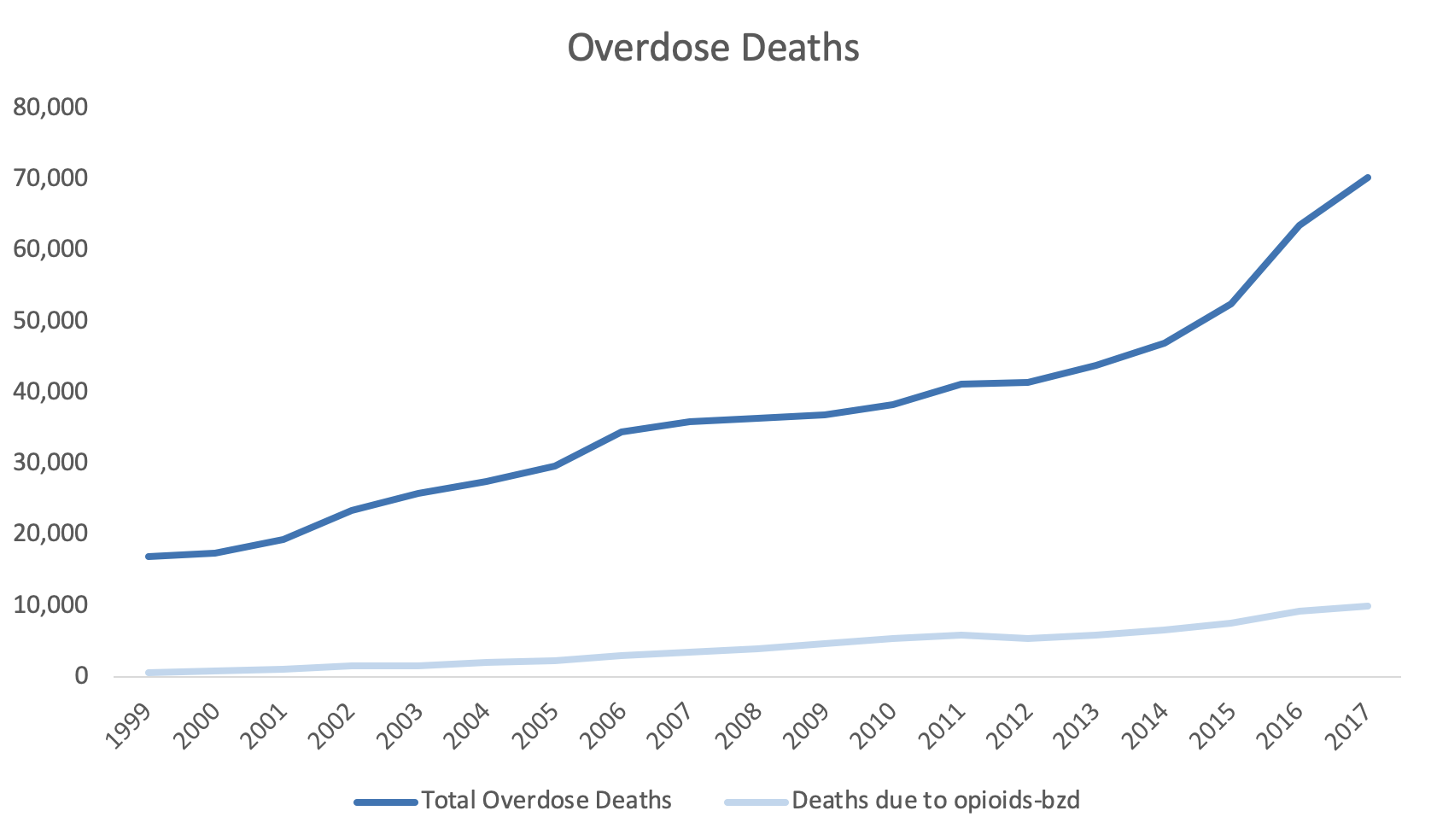
For example, the total overdose deaths are plotted on the y-axis and the year is plotted on the x-axis (Figure 1).

Figure 1. Total overdose deaths in the United States, 1999 to 2017.Source: https://www.drugabuse.gov/related-topics/trends-statistics/overdose-death-rates

Figure 1. Total overdose deaths in the United States, 1999 to 2017.

Source: https://www.drugabuse.gov/related-topics/trends-statistics/overdose-death-rates

Total overdose deaths in the United States (US) is large and growing. In 1999 it started at 16,849 deaths, but by 2019, that number rose to over seventy thousand. This is a large number and the scale that is used can impact how the viewer will synthesize this visualization.

However, if you wanted to add another line or data dimension such as the number of deaths due to opioids with a benzodiazepine prescription, that number may not be on the same scale as the total overdose deaths that’s currently represented by the y-axis. Figure 2 illustrates the Total Overdose Deaths and Overdose Deaths due to an Opioid-Benzodiazepine combination. Notice how the Opioid Deaths due to an Opioid-Benzodiazepine combination is plotted on the same scale as the Total Overdose Deaths. Using the same scale makes it difficult to discern the change in deaths associated with an Opioid-Benzodiazepine combination.

Figure 2. Overdose Deaths due to Opioids, 1999 to 2017.

Figure 2. Overdose Deaths due to Opioids, 1999 to 2017.

To improve this, we may consider using a secondary y-axis to correctly scale for the number of deaths due to opioids-benzodiazepine co-prescribing.


Step 1. Open the Excel document with the data, which is located here.

Step 2. Review the data. In this example, we have the total overdose deaths and the deaths associated with opioids-benzodiazepine co-prescribing from 1999 to 2017.


Step 3. Select the three columns and use the Excel Insert tab to select the line figure.

Figure 4.png

Step 4. Review the line graph.

The default line plot that is generated includes all the variables in a single y-axis. This is not what we want.

Figure 5.png

We need to correct this and select the correct axes for these variables.


Step 5. The Year variable needs to be on the x-axis.

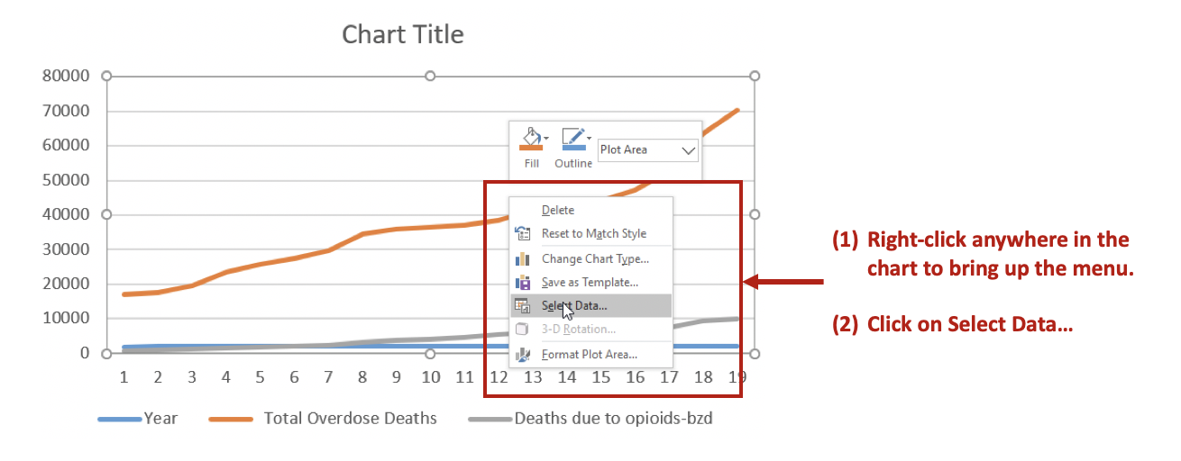
Right-click anywhere on the chart space. A menu of options will appear. You want to click on the Select Data… option to make changes to the data and how they are displayed on the chart.

Figure 6.png

Then Remove the Year variable from the Legend Entries (Series) panel. This will remove Year from being plotted on the y-axis. Next, you want to edit the Total Overdose Deaths in the Horizontal (Category) Axis Labels panel.

Figure 7.png

After clicking on Edit, you will be given a small window to select the range of data to display on the x-axis. Use the button in the Axis label range to select the Years 1999 to 2017. This will populate the x-axis with the years corresponding to the Total Overdose Deaths.

Figure 8.png

Step 6. Selecting the secondary y-axis.

Once the Year has been correctly specified, we can create a secondary y-axis to represent the Deaths due to opioids-bzd since these numbers are much smaller than the Total Overdose Deaths.

Right click on the line that represents Deaths due to opioids-bzd. Select the Format Data Series… option. This will give you a menu with the choice to use the Primary or Secondary axis. Select the Secondary axis.

Figure 9.png

This will generate a chart that will include two y-axes: (1) Total Overdose Deaths and (2) Deaths due to opioids-bzd.

Figure 10.png

You can format the figure to improve its appearance with Excel’s other functions. In this example, the line colors were changed to provide a better contrast, the y-axes were properly labelled, and the font colors matched those of the lines.

Figure 12.png

CONCLUSIONS

Using double axes can improve the narrative of your data visualization. Take advantage of this option when presenting data with the same x-axis, but different measures. In this example, the metric of interest was death, but the scales were different. Total Overdose Deaths were significantly larger than Deaths due to opioid-benzodiazepine co-prescribing. Therefore, to better visualize the increasing number of deaths due to opioid-benzodiazepine co-prescribing, a secondary y-axis was added.


SUPPLEMENTS

Data and Excel file used for this exercise are available here.