bar charts

R plotly - Bar Charts

I wrote a tutorial on how to use plotly, an R package that allows users to include interactive charts in R Markdown projects.

Here is an example of the bar chart that was created using plotly in an R Markdown project:

The tutorial is available on RPubs, and the R Markdown code is available on my GitHub page.

I really like using plotly for my R Markdown projects because it has some nice interactive features. Hopefully, this tutorial will open the doors to more creativity with R Markdown projects.

Communicating data effectively with data visualization: Part 40 (Percentage of population with COVID-19 vaccination)

INTRODUCTION

Since the COVID-19 pandemic began on 12 December 2019, there have been several innovations in the forms of vaccinations and treatments. Of critical importance is the world-wide international support for COVID-19 vaccination. A timeline of the COVID-19 pandemic can be found at the CDC website.

The website informationisbeautiful.net has a great COVID-19 dashboard that ranks countries that have administered vaccinations.

Source: www.informationisbeautiful.net (https://informationisbeautiful.net/visualizations/covid-19-coronavirus-infographic-datapack/)

TUTORIAL

We will recreate this chart using Excel. Data can be download from my Dropbox folder or from Our World in Data website.

The data will contain information for 39 countries. These variables include the total number of vaccinations, the number of people vaccinated, the number of people who are fully vaccinated, the number of boosters, the total population, percentage of the population who are vaccinated, percentage of the population who are fully vaccinated, and the percentage of the population with boosters.

We will create a vertical bar chart for the percentage of the total population that received at least one COVID-19 vaccination. You can use these methods to recreate the vertical bar charts of the remaining figures in the figure above.

Visually inspect the data. It should look like the following.

We will us the “total_vaccinations,” “percent_vaccinated,” “percent_full_vaccinated,” and “percent_boosted” to generate the figures.

Step 1: Insert the vertical bar chart.

Once the vertical bar chart is inserted onto the Excel sheet, right click on the chart and click on “Select data.” We want to highlight the data column titled, “percent_fully_vaccinated.” For the “Series name,” enter “% fully vaccinated.”

Step 2. Edit the labels.

In the “Horizontal (Category) Axis Labels,” click on the “Edit” button and select the
location.” In the “Axis label range,” highlight the values in the “location” column. This will assign each value of the “percent_fully_vaccinated” with the country.

Step 3. Delete unnecessary labels and titles.

The figure should look like the following. We can delete the x-axis, the axis title, and the chart title. Extend the chart so that you can view all the countries. You can also narrow the chart so that it will resemble the size of the informationisbeautiful.net figures.

Step 4. Create a progress bar

We will add a progress bar, which will allow us to see how much of the population is fully vaccinated. This requires us to use the “full_bar” column which has a value of “1” for each country. This value represents a 100% progress goal.

Right-click on the chart and add a new data entry. Select the data under the column called “full_bar.” The values are all “1” to represent a 100% progress bar.

The chart will have two bars for each country; one bar represents the percentage of the population that is fully vaccinated, and other bar represents 100% progress. We need to edit the overlay and the width of the bar to match the ones on the informationisbeautiful.net charts.

Right-click the chart and select “Format Data Series…” Change the “Series Overlap” to 100% and the “Gap Width” to 40%. You may not see the blue bar chart because the red bar chart will be in front of it. To fix this, go to the “Select Data Source” window and use the arrow to reposition the data series. This will place the blue bar chart in front of the red bar chart.

Step 5. Add the data labels.

The next step will include the data labels to the progress bar. We want to have the data labels aligned on the right. When you right-click the blue chart, you will get the data labels to be aligned to the left or the end of the bar. This does not get us to the data labels aligned on the right.

To do this, we need to right-click the red bar (not the blue bar) and click on “Add data labels.” This will all the data value for the progress bar, which is “1.”

Right-click on one of the data labels that has a “1” and select “Format Data Labels…” This will open a window where you will need to check the box next to “Value From Cells.” When prompted, select the values in the “percent_fully_vaccinated” column. This will add the percentage of the population that is fully vaccinated on the right-side of the bar chart. Additionally, uncheck the box next to “Value.” This will remove the value from the bar chart so that you will no longer see the “1.”

The chart should be updated to have the percentage of the population who are fully vaccinated aligned to the right-side of the bar chart.

Step 6. Modify the chart to improve the aesthetics.

Once you’ve added the data labels and aligned them on the right-side of the bar chart, you can start to edit the font color, bar colors, and delete the grid lines to emulate the chart in informationinbeautiful.net website.

I changed the background to a dark gray and the data labels to a white color. I also changed the font to Arial Narrow.

I only presented part of the figure here. But you can download and view the whole figure from my Drobox folder.

CONCLUSIONS

Using the vertical bar chart with progress bars allow us to emulate the figures generated by informationisbeautiful.net. I like these types of charts for data visualization because they provide some indication of progress. You can see that the United States is behind many nations when it comes to having the population fully vaccinated. This is much lower than the UAE and South Korea where 95.6% and 86.6% of the total population are fully vaccinated. Hopefully, you can use this exercise to help you develop similar charts for your data visualizations.


REFERENCES

Data was access using the Our World in Data COVID-19 site.

The data visualization that inspired this exercise was based on informationisbeautiful.net COVID-19 Coronavirus Data Dashboard.

The Excel file with the data used for this tutorial is available on my Dropbox folder.

Communicating data effectively with data visualizations: Part 38 (Replicating the LA Times COVID-19 tracker)

INTRODUCTION

Recently, the staff at the Los Angeles Times (LA Times) provided a COVID-19 tracker on their website. This is an impressive set of data visualizations of COVID-19 cumulative cases, new cases, vaccinations, and deaths. I was particularly struck by the “New cases by day” figure which includes a bar chart overlaid with a 7-day moving average line chart. The visualization effectively used the moving average to adjust for the spikes in new COVID-19 cases but maintained the spikes on a daily basis. None of the data are lost and illustrates the spikes in new COVID-19 cases while adjusting for the moving average. The color schemes were also optimal where the daily new cases used a softer color, but the moving average line used a darker color highlighting its importance in the figure.

I wanted to write an article on how to replicate this figure using Excel.

Source: Los Angeles Times, “Tracking the coronavirus in California,” url: https://www.latimes.com/projects/california-coronavirus-cases-tracking-outbreak/ [Accessed on June 24, 2021] * This is for educational purposes only.

DATA SOURCE

Data used in this article can be found on the LA Times GitHub site. I used the “latimes-county-totals.csv” data (link to the raw data). I also made the data available with the final figure on the following Dropbox location.


TUTORIAL

Step 1. Download and visually inspect the data.

After you’ve downloaded the data, take a moment to inspect them. The columns that are used in this tutorial are “date” and “new_confirmed_cases.” But you can use the other columns to replicate other parts of the LA Times COVID-19 tracker.

Step 2. Insert a bar chart and select the appropriate data.

Insert a clustered column chart using the Insert tab on the Excel ribbon. When selecting the data, make sure that you select the “new_confirmed_cases” (other data are available, but the new cases are what we are replicating in this exercise).

The default bar chart does a pretty good job of replicating the LA Times figure.

However, we’ll have to do a few edits to the axes to match the LA Times figure.


Step 3. Modify the axes.

Let’s focus on the Y-axis first. Right-click on the Y-axis and select “Format Axis…” In the Axis Options panel, change the Minimum value to 0 and the Major value to 20000. This will match the settings in the target figure. (Note: There are negative values in the data, but these are very small numbers and assumed to be ignorable.) Next, in the Number options, change Category to “Number” and the value in the “Decimal places” to 0. Make sure that you check the box next to “Use 1000 Separator (,)” to replicate the same format in the target figure.

For the X-axis, right-click on the bottom axis and select “Format Axis…”This will open the Axis Options panel where you can make several adjustments to the X-axis. First, we want to change the X-axis display values from dates to months. Change the Number Category field to “Custom” then change the Format Code to “mmm”; make sure to click on “Add” for the changes to take effect. Next, go to the Axis Type area and change the Minimum to “02/01/2020” since we want our timeline to begin on Feb of 2020. Then change the Major value to 4 to match the monthly interval of the target figure. The X-axis should be thicker with tick marks on the outside. To modify these, navigate to the Tick Marks option and change Major type to “Outside” and then click on the Paint Bucket (Fill & Line) option; increase the Width to 1.5. These should match the target figure’s X-axis format.

Step 4. Add the 7-day moving average.

Excel has a Data Analysis tool that will automatically estimate the 7-day average. I’ve written a previous tutorial that describes how to use this tool. I’ll briefly review how to estimate a 7-day moving average.

In the Data tab, click on the Data Analysis tool (instructions on how to install the Data Analysis tool is here). This will open the Data Analysis Tools box. Select “Moving Average” from the tools kit and enter the appropriate values in the options box. For the Input Range, select all the values from “new_confirmed_cases” column. Enter a value of “7” in the Interval field; this will automatically calculated the 7-day moving average. In the Output Range, select a single cell where you want to moving average to be pasted after it is calculated. I chose to use the next available cell on the dataset ($F$2).

Step 5. Add the 7-day moving average to the chart.

To include the moving average data to the current daily new cases bar chart, right-click on the chart and select “Select Data.” This will open a box where you can add new data. Select “Add” which will open the “Edit Series” box. Updates the Series name with the name of the column (“moving_avg”). For the Interval field, change this to “7” for the 7-day moving average. Then in the Series values, select the 7-day moving average data.

By default, Excel will generate a bar chart for the 7-day moving average. However, we want a link chart. We can change this by right-clicking on the bars of the chart and selecting “Change Series Chart Type…” This will open a box that will allow us to select the type of chart for each data. For the “moving_avg” data, change the Chart Type to “Line.” This will create a line chart for the 7-day moving average which will be overlaid over the daily new cases.

Step 6. Modifying the chart format.

To closely match the chart to the one presented in the LA Times, I made the following adjustments. Your mileage may vary depending on the library of fonts available. I tried to select fonts that most Excel users will have access to.

I changed the Y-axis font to Adabi script. The X-axis font was changed to Arial Nova.

The width of the horizontal gridlines was increased to 1.5. The color of the daily new cases bar chart was changed to a light blue using a hex code of #8DC6DF. The color of the 7-day moving average was changed to a dark blue using a hex code of #2B869B; additionally, the width was increased to 2.0.

Step 7. Comparison between LA Times and user-generated charts.

Once the modifications have been made, compare the charts.

CONCLUSIONS

Using data from the LA Times, we can replicate the data visuals on their COVID-19 tracker website. This allows users to verify the data that are presented on a public site. Additionally, it allows us to generate our own data visualizations that could inform policy and education the public on the rate of new cases in California.


REFERENCES

Data was based on the LA Times (link), which was accessed on 24 June 2021.

Excel file used for this exercise can be download from the following Dropbox folder.


ACKNOWLEDGEMENT

The data visual used in this exercise was based on the work of the staffers at the LA Times. They deserve all the credit and acknowledgement for developing these stunning visuals.

Communicating data effectively with data visualizations: Part 33 (Bar charts with secondary axis)

INTRODUCTION

Secondary axis allows us to plot two pieces of data with large differences in their scale. For instance, plotting the number of new COVID cases, which number in the hundreds of thousands, will outweigh the number of employees who lose their jobs, which number in the tens of thousands. There is an order of magnitude that makes it difficult to see how these two metrics are presented side-by-side on a single figure. However, we can take advantage of the secondary vertical axis to present both pieces of data that will be visually intuitive to interpret, while preserving the differences in their scale. One problem with this method is how Excel executes this. Instead of maintaining the bar or column chart, Excel will overlay both bars (or columns). This is illustrated in Figure 1.


Figure 1. Excel overlays the two bars in the figure when using the secondary axis.

To address this issue, we will use a method described by Steve True on his Excel Dashboard Templates Website.


MOTIVATING EXAMPLE

We will use data from the California’s Employment Development Department to visualize the number of employees who lost their jobs during the COVID-19 pandemic and compare these trends to the number of new COVID-19 cases in California. Data on the number of COVDI-19 cases in California came from the California Data Portal. You can also download the Excel exercise file from the following shared Dropbox location.


Step 1. Selecting the data.

First, inspect the data. There are three columns of data the contain the month, number of employees affected, and the number of new COVID-19 cases. Next select the data and insert a “Clustered Column” chart.

Excel will automatically generate a figure where the dates are on the X-axis and the values for the metrics are on the Primary Y-axis.

Notice that the Number of new cases is exponentially larger than the number of employees who lost their jobs during the pandemic. It is difficult to see how the pandemic impacts the number of employees who’ve lost their jobs. To address this, we’ll use the secondary axis for the Number of new cases.

Step 2. Select the secondary axis.

To select the secondary axis, right-click on one of the orange bars that denotes the Number of new cases. This will open a window where you can select “Format Data Series…” Once you’ve done this, select the “Secondary Axis.” This will change your current bar chart into a chart with two axes.

The problem with this updated chart is the way Excel overlays the bars. Here is an illustration of how Excel does this. By changing the gap width, we reveal that the bars are actually over one another and not stacked.

Step 3. Fixing this problem.

The solution to this issue is to add gaps between the bars. Add two new columns between the Number of Employees affected and the Number of new cases; label these as “gap1” and “gap2.”

Now, select all the data and insert a bar chart. You should get the following chart.

Right-click on the yellow bar to open the Format Data Series option. In the Format Data Series window, use the “Series Options” drop-down button to select the data element we want to edit. The first data element is “gap2” and the second data element is “gap1.” We want to assign “gap2” to the Secondary Axis and “gap1” to the Primary Axis. Make sure that you change the “Gap Width” to 25% for both the “gap1” and “gap2” data elements. Keep the “Series Overlap” at 0% for both data elements.

Now, your bar chart should have the bars for the Number of Employees affected and the Number of new cases side-by-side (rather than overlaid) and using both axes.

We could improve this bar chart by editing the legend to remove the “gap1” and “gap2” labels, change the color of the bars, modify the fonts, add axis labels, and add a chart title.

CONCLUSIONS

It is possible to use Excel to create bar charts with two vertical axes. Although Excel doesn’t do this intuitively, we can use the extra columns denoted by “gap1” and “gap2” to generate the space needed to have the bars side-by-side.

REFERENCES

I ran into this problem when I wanted to use two different scales of metrics on a recent project, and I was perplexed as how Excel doesn’t intuitively create the bar chart that I needed. Fortunately, I found Steve True’s Excel Dashboard Templates website where he details how to solve this issue. I highly recommend visiting his site as he has wealth of resources on how to use Excel efficiently.

California COVID-19 data are located at the California Open Data Portal

Data on California layoffs are located at California Employment Development Department

Communicating data effectively with data visualizations - Part 6 (Tornado diagram)

BACKGROUND

Suppose you had some results and you were interested in whether or not these findings were sensitive to change. You can illustrate these effects using a tornado diagram, which uses bar charts to compare the change from the original findings. In other words, tornado diagrams are useful to illustrate a sensitivity analysis.

In this tutorial, we will provide you with a step-by-step guide on how to graph a tornado diagram from a sensitivity analysis.


MOTIVATING EXAMPLE

Imagine that you are planning a vacation, and you allocated $6,000 for the trip. You perform some cost estimates and find a vacation package that costs $5,050, which is within your budget. But then you see some deals and some extra luxuries that you want to add to your current vacation package. Some of these will change the cost of your original cost estimates. In order to see which of these additional deals or luxuries would impact your cost estimates, you decide to perform a one-way sensitivity analysis. That is, you change the cost of one variable at a time to see how it effects your original cost estimates (e.g., base-case).

Table 1 summarizes your base-case vacation costs and the possible changes due to the additions of deals and luxuries.

Table 1.png

The “Low input” or “deals” reduce the total cost of your vacation. The “High input” or luxuries increase the cost of your vacation.

You want to visualize if any of these adjustments will change your original cost estimates (e.g., $5,050).


BUILDING A TORNADO DIAGRAM

A tornado diagram can be used to visualize these additional changes to the variables.

Step 1: Open Excel and insert a clustered bar chart

Figure 1.png

Step 2: Enter data for the “Low input”

Right-click on the empty chart area and select “Name” and enter “Low input.” Then in the “Y values:” box, select all the values in the “Low result” column of your table. In the Horizontal (Category) axis labels:” highlight the variable names under the “Base-case results” column. The figure below illustrates the correct selections for each input box.

Figure 2.png

Step 3: Enter data for the “High input”

Repeat same steps for the “High input” data range.

Figure 3.png

Step 4: Center the axis at the estimated cost

Right-click on the X-axis and go to the Format Axis > Vertical Axis Crosses > Axis Value and enter “5050.” This will center the axis at the estimated cost of $5,050.

Figure 4.png

Step 5: Move the variable names to the left side of the plot

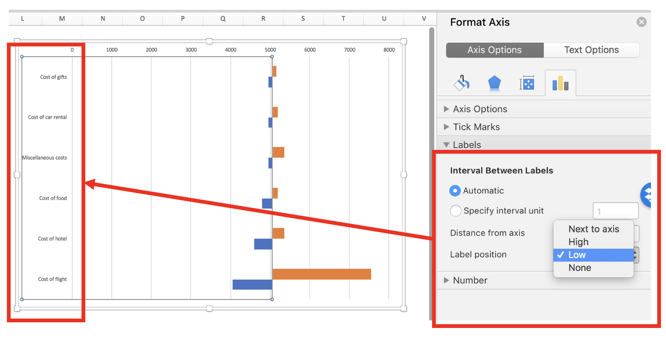
After centering the axis on the estimate cost of $5,050, you can start to see the beginnings of a tornado diagram. However, the variable names are in the way. To relocate these, Right-click on the Y-axis and select the Axis Options > Interval Between Labels and select “Low.” This will move the variable names to the left side so that it doesn’t interfere with the bars in the middle of the chart.

Figure 5.png

Step 6: Align the bars so that they are next to each other

The bars are not aligned with each other. You can align them using the series overlap option. Right-click on one of the bars and go to Series Options > Plot Series On and enter 100 on the “Series Overlap” widget. After you press Enter, the bars should be aligned with each other.

Figure 6.png

Step 7: Sort and change fonts

To complete the tornado diagram, you can sort the bars so that the largest change is at the top and the smallest change is at the bottom (looks like a tornado). Right-click on the Y-axis and got to Format Axis > Axis Options > Axis Position and check the box “Categories in reverse order.” This will order your diagram to look more like a tornado.

Figure 7.png

Step 8: Final changes and edits

The last steps improve the aesthetics. Changing the fonts and colors can improve the tornado diagram.

Figure 8.png

CONCLUSIONS

The tornado diagram tells us that paying for an additional “luxury” for the cost of the flight will exceed our budget of $6,000 (indicated by dotted red line). As a result, we will not spend extra capital to upgrade our seats! However, we can splurge a little when it comes to other elements of our trip (e.g., expensive meals, luxury vehicle rental, or additional excursions).


REFERENCES

I used the following guide developed by Excel Champs to develop this this blog.

 Note: Updated on 11 July 2022

Communicating data effectively with data visualizations - Part 1 (Principles of Data Viz)

Introduction

Data visualization is a form of visual communication that takes quantitative information and displays it as a graphic, an abstraction of the real world. Effective data communication makes complex statistical analysis accessible without excessive mental burden. It is also used to identify patterns through data exploration. Unlike information visualization which includes catch-phrases such as “Infoviz” and “Infographics,” data visualization is intuitive, informative, and “pretty” while simultaneously focused on scientifically structured comparisons, analytic precision, and statistical inference. The challenge is compressing all the quantitative information into a single chart or graphic that provides a narrative or purpose that can be synthesized and acted on with very little mental effort.

There are a variety of data visualizations that can be used such as choropleths, heatmaps, scatter plots, and dot plots (this list is not all inclusive). The selection is dependent on the data, audience, and narrative. How complex is the analysis? Who are you presenting this information to? Why should the audience care?

The best way to present data effectively is with a good story. Your graphic should be able to tell a story based on the quantitative information. Every graphic you create should be a self-contained narrative of the data. This can be achieved using simple tools, but the creation of effective data visualization depends more on your ability to tell a good story. The purpose of this article is to highlight some important principles of data visualization, review common data visualizations, and develop a mechanism to select the most effective data visualization.

Principles of data visualization

Data visualization can be traced to several different schools of thought (e.g., Edward Tufte and William S. Cleveland), but the fundamental principles are similar and often overlap. Edward Tufte identified several key principles when developing data visualizations (Table 1).

Table 1. Tufte's principles for graphical integrity. *

Principle**

Description

Avoid chart junk

Inventive displays seldom generate interest. Rather, they generate visual noise.


Data-ink ratio

Use ink to show the data. Ink that does not contribute to the reporting of the data should be removed.


Numbers should be directly proportional to the numerical quantities represented

The "Lie Factor" is a proportion of the Size of the effect shown in the graphing / Size of the effect in the data. The graphic should not inflate the actual magnitude of the change.


Use small multiples and repeat

High quality information graphic portrays many numbers per square inch. Small multiple, comparative images work especially well for this. Examples include sparklines.


Avoid graphical distortions and ambiguity

Avoid distortions of numbers by graphic devices. Show data variation in context, and label them. Write out explanation of the data on the graphic itself. Properly label events in the data.


Multifunction

Information layers and architecture emerge best when data display elements serve multiple functions. Different readings at different levels of detail (micro-macro) serve this goal well. For example, the y-axis can be used to provide scale while calling out to important values by either coloring that value differently or enlarging it.


Show data variation, not design variation

Use scales that are similar and do not generate ambiguity. Be consistent in the data when displaying them as a graphic.


In time-series displays of money, deflated and standardized units of monetary measurement are nearly always better than nominal units

Properly adjust current due to inflation or population growth. We want to the currency in real purchasing power (value) rather than nominal purchasing power.


The number of information-carrying (variable) dimensions depicted should not exceed the number of dimensions in the data

Using graphics to show the proportional change of a metric can bias our perception due to the number of dimensions that are changing. If we look at a single metric such as budget, then we are only looking at a one-dimensional scale, meaning that when the budget increase, it only changes in one dimension. However, it is easy to use a display such as a 2-dimensional picture and scale it up according to the one-dimensional scale. For example, if we have a 2-dimensional graphic and we scale it according to an increase on a one-dimensional metric, the actual proportional increase in 4 times (2^2 = 4). If this was a 3-dimensional object, then the proportional increase in 8 (2^3 = 8).


Graphics must not quote data out of context

An accurate picture must report the totality of the effect. Showing only one piece of the data with graphics is just as bad as the data. Context is critical. In time-series analysis, it is imperative that the researcher provides an illustration of the overall trend including any changes in seasonality. Therefore, apply rational judgement when presenting data visualization. The use of comparison groups helps to answer any secular impacts that may not be captured when looking at data at a single point in time.


* From Tufte ER. (2001) The Visual Display of Quantitative Information. Second Edition. Cheshire, CT. Graphics Press, LLC.

** This table provides fundamental principles on graphical integrity and data graphics and is not all inclusive.

Figure 1. Box plots of MLB wins in the 2017 season. [click to enlarge]

Dot plots are simple graphics that use points (filled in circles) instead of line or bars on a simple scale. They convey the same information as bar charts, but use less ink to do so. The advantage they provide is that they reduce the junk of the bar charts which contain useless space that are uninformative. In Figure 2a, the dot plot provides the same information from the previous bar charts; however, there is a better sense of scale with the removal of the clutter introduced by the bar charts. Like the bar charts, use pastel colors to dampen the effect of the teams that are not the focus of the chart and use solid colors to bring out the teams with the most and least wins (Figure 2b). The minor grid lines do not provide any information about the data and should be removed (Figure 2c). Finally, Figure 2d takes the dot plots and use data values to provide the audience with the actual number of wins. This is also reinforced by the pastel and solid colors, which provide good contrast between the teams that have the most and least wins.

Figure 2. Dot plots of MLB wins in the 2017 season. [click to enlarge]

Line plots are graphics that use lines to illustrate a trend. A line plot would not be appropriate for the baseball wins example because the x-axis does not have any continuous scale, which is needed for line plots. Table 2 provides data on MLB players’ batting averages from 2013 to 2017. The table provides us with information across five years, but the order and rankings are difficult to determine.

Table 2. Batting averages of Major League Baseball players (2013-2017).

Players

2013

2014

2015

2016

2017

Yasiel Puig

0.319

0.296

0.255

0.263

0.260

Justin Turner

0.280

0.340

0.294

0.275

0.332

Michael Trout

0.323

0.287

0.299

0.315

0.329

Ichiro Suzuki

0.262

0.284

0.229

0.291

0.250

The table doesn’t do a good job illustrating the trends over time. Instead, it is a good reference that is searchable. When it comes to visually telling a story, the table doesn’t do a good job. Converting this table to several line plots can help illustrate the changes in each players’ batting averages over time. Figure 3a trends each player’s batting averages, but the clutter makes it difficult to identify any important patterns. For graphics that use a time interval (or continuous interval) on the x-axis, it is useful to truncate the y-axis to see any incremental changes in the trend.

Figure 3b truncates the batting average from 0 to 0.360 to 0.200 to 0.360. Now the changes in batting average is more discernable from this truncated y-axis. It’s clear that Yasiel Puig’s batting average declined from 2013, but Justin Turner’s batting average improved. However, this still feels cluttered. The different lines and colors make it hard tell that Justin Turner was improving. In fact, it seems like all the players except for Yasiel Puig were improving. To make sense of the clutter, let’s assume that we were interested in the player who had the most improvement from 2013. Calculating the percent change between 2013 and 2017 and then putting it on the graphic provides us with some metric to distinguish Justin Turner from the rest of the other players.

Figure 3c adds the percent change in batting averages from 2013 to 2017 with the player’s name. The legend was removed because it didn’t contribute much to the graphic once the names were adjacent to each line. Despite these modifications, it’s not easy to distinguish the improvement in batting averages for Justin Turner. There are too many competing colors, which distract the focus from Justin Turner’s improvement.

Figure 3d dampens the non-critical lines using a single pastel color and matching the to the trend lines, which highlights Justin Turner’s trend line, the only one with color. This technique draws your attention to Justin Turner’s trend while providing details about the change in trend and the player associated with that change.

Figure 3. Line plots of MLB players’ batting averages (2013-2017). [click to enlarge]

Summary

So far, basic principles and examples of data visualization were presented in this article, which is part of an on-going series on data visualization. Since this is a primer on data visualizations, you should review existing graphics and try to apply some of these principles. Web-based data visualizations are prevalent and can be found in places such as the R-Shiny gallery and Tableau gallery. As you start to explore different data visualizations, you’ll discover many creative and useful tools. Next issue, we’ll discuss other data visualization graphics that will reflect the Tufte’s principles for graphical integrity and excellence.

References

Tufte ER. (2001) The Visual Display of Quantitative Information. Second Edition. Cheshire, CT. Graphics Press, LLC.

Knaflic CN. (2015) Storytelling with Data: A Data Visualization Guide for Business Professionals. Hoboken, New York. John Wiley & Sons, Inc.