Edward R. Tufte

Communicating data effectively with data visualization – Part 17 (Multivariate Dimensions)

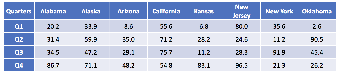
MULTI-DIMENSIONAL DATA VISUALIZATIONS

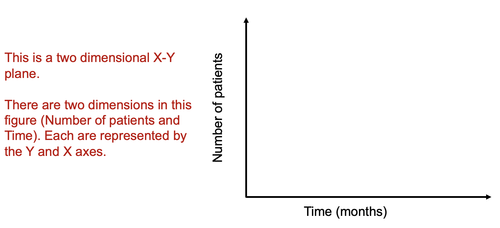
Data visualizations can improve how we see complex data, in particular, where multiple dimensions are involved. For instance, in an X-Y plan, we can have the months on the X-axis and the number of patients on the Y-axis (Figure 1). Let’s imagine that number of patients represents some outcome you are interested in (e.g., number of patients who has 5+ prescription medications). Time and the number of patients are dimensions on this two dimensional plan.


Figure 1. Two-dimensional X-Y axes figure.

Figure 1.png

As a rule, whenever you want to display multiple dimensions, each dimension needs to be represented onto a single figure, which is challenging given that a figure is normally on a two-dimensional plane. What if we wanted to have a figure with more than two dimensions? What if we wanted to have a figure with months on the X-axis, number of patients on the Y-axis, and include a third dimension denoting different genders? How would we go about doing that? Figure 2 illustrates how we can do this by adding lines and labeling them using different colors.


Figure 2. Figure with three dimensions.

Figure 2.png

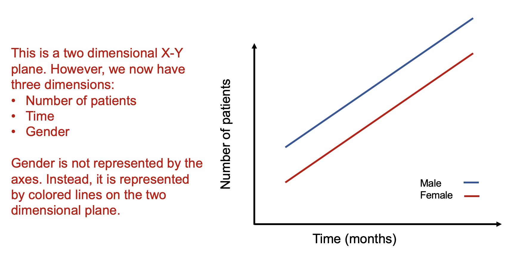
Figure 2 is able to capture three dimensions of data into a single two dimensional figure. The number of patients is captured in the Y-axis and the time in months is captured in the X-axis. Gender is represented by the colored lines that show the difference in the relationship between number of patients and time associated with males and females.

Alternatively, we use the color blue for the following conditions:

E[Y | male]


We use the color red for the following conditions:

E[Y | female]


The legend providers additional clarification that the different line colors denote the gender types. It is critical to include clear and intuitive legends so that your readers will immediately recognize their reference and label. Without a legend, your audience will have to guess what color belongs to what gender type.

How about adding another dimension such as age? This would increase the number of dimensions on this figure from three to four. For example, what if we wanted to see how being older (80+ years) impacted the relationship between the number of patients and time across genders? Well, this can be accomplished by using different types of lines (e.g., dotted lines and dashed lines).

Figure 3 illustrates how using different types of lines (dotted for the 80+ year old patient and dashed for the <80 year old patient) can provide a visual accounting of the differences across genders and across age in terms of the number of patients and months. The legend provides additional clarification as to the age groups associated with the different line types.


Figure 3. Figure with four dimensions.

Figure 3.png

Alternatively, we continue to use the color blue for the following conditions but add different line types for the age groups:

E[Y | 80+years & male] (dotted lines)

E[Y | <80 years & male] (dashed lines)


Similarly, we continue to use the color red for the following conditions but add different line types for the age groups:

E[Y | 80+years & female] (dotted lines)

E[Y | <80 years & female] (dashed lines)

Using colors and line types allow us to capture multiple dimensions onto a two dimensional figure. We essentially are showing a stratified descriptive analysis of the age groups nested within each gender and their relationships between the number of patients and time (months).

How about adding a fifth dimension? How could one do that?

A simple way to introduce a fifth dimension is to use the concept of small multiples by Edward Tufte.[1] Tufte uses small multiples to include additional dimensions. Figure 4 illustrates how we can leverage small multiples to look at the differences in the relationships between number of patient and time for different genders and age groups across different states.


Figure 4. Small multiples of states with differing patterns of number of patients and time for different genders and age groups.

Figure 4.png

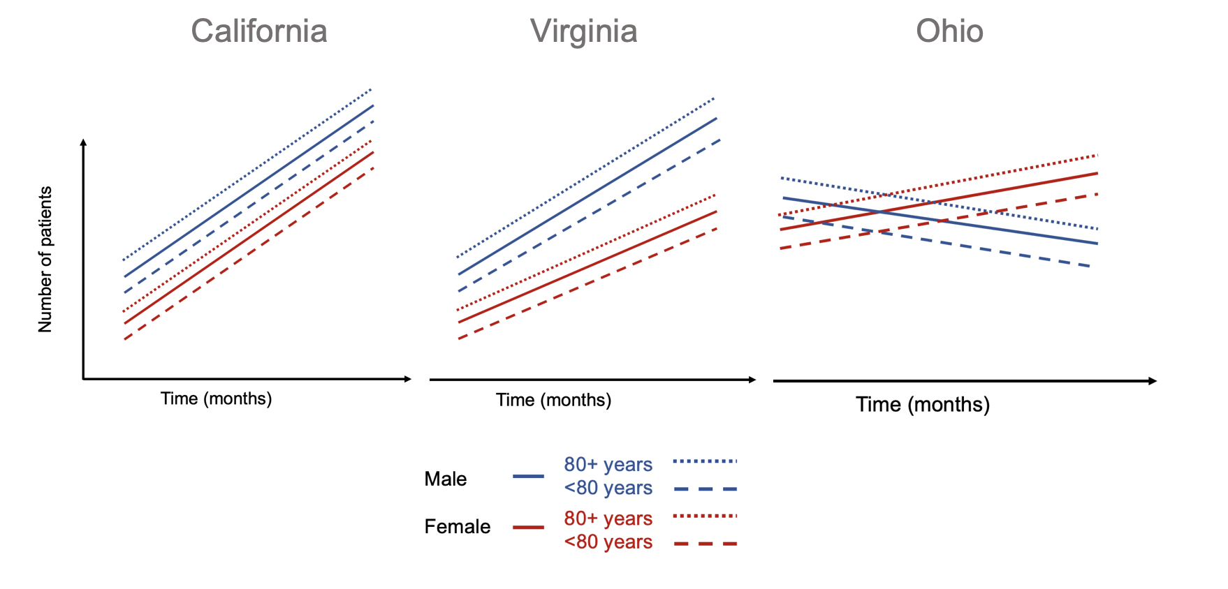
Using small multiples allow us to compare the differences in the association between number of patients and months across different states stratified by gender and age groups. The number of patients increased across time for all gender and age groups in California. Similar patterns are observed in Virginia, but the rate of increase in the number of patients across time is lower in the female group and age cohorts. In Ohio, different patterns are observed compared to California and Virginia. Males and their associated age groups have a decreasing number of patients across time. Conversely, females and their age cohorts have a positive correlation between the number of patients and time.


CONCLUSIONS

Adding dimensions can improve the figure you design by incorporating complex relationships across different data characteristics. In our example, we demonstrate how we can integrate dive dimensions of data to a two-dimensional figure that tell us information about the association between the outcomes (number of patients) with time (months) across states stratified by gender and age groups. Be creative with how you integrate multiple dimensions into a figure. Ask yourself if this is something that will help improve the story the figure is conveying. There are times when a simple figure will do. But when you have a lot of data and want to tell a story, consider adding dimensions to the figure to get a narrative that will excite and capture your audience’s attention.


REFERENCES

  1. Tufte ER. The Visual Display of Quantitative Information. Second. Cheshire, CT: Graphics Press, LLC.; 2001.

Communicating data effectively with data visualizations - Part 7 (Using Small Multiples or Panel Charts in Excel)

BACKGROUND

It can be challenging when you’re trying to visualize many different groups using the same metric repeatedly. Initially, you may want to do this with a single figure, but this is too crowded and prevents you from seeing the differences across the groups. Alternatively, you can separate and visualize the groups individually without compromising the space or size of the figure. In this article, we will discuss the use of small multiples or panel charts in Excel. This will make it easier for the eyes to see the differences while presenting a large number of data.


MOTIVATING EXAMPLE

I have created a data set that contains the average temperature (degrees F) across four quarters for eight states in the United States. These temperatures were generated using a random number generator.

The data has the following structure:

Figure 1.png

Using this data, we can generate a single plot that contains all the states and their average temperature for each quarter.

Figure 2.png

There are several issues with this plot. First, there is so much clutter, it is difficult to discern which states are increasing or decreasing over time. Second, the colors, despite being different, seem to mix in too much like spaghetti. In fact, this is commonly called a “spaghetti” plot.[1]

To avoid this cluster of tangled lines, it is best to view these lines separately in small multiples. We can apply the principle of small multiples into an 8 by 1 matrix (8 rows and 1 column of data). 

 
Figure 3.png
 

By separating each state into its own separate line, we can identify which states had temperatures that increased across time. From this figure, we can see that Alabama, Alaska, Arizona, and Kansas have temperatures that increased from Q1 to Q4. However, the magnitude in the change for Kansas looks similar to Alaska (absolute difference of 37 degrees F and 76 degrees F, respectively). Despite using the same Y-axis, the compressed scale gives the illusion that all the changes were similar in magnitude, which they were not.

We can improve upon this figure by furthering the use of small multiples. Tufte argues that small multiples can present a large amount of comparisons through repeated panels.[2] With this in mind, we can take the above figure and separate each state into a 2 by 4 matrix.

Figure 4.png

This is vastly improved. We can see trajectory for each state across the quarters. For example, we can clearly see that Alabama, Alaska, Arizona, and Kansas have temperatures that were increasing steadily across time. However, large fluctuations in temperatures were observed for New Jersey, New York, and Oklahoma. Only California appears to have a steady trend in the temperature across time.

The panel chart has equal sized boxes with temperature scales that are identical. This allowed our eyes to make quick comparisons between the states. Moreover, we can also identify the trends much more easily that in the “spaghetti” plot.


TUTORIAL: PANEL CHARTS (SMALL MULTIPLES)

To generate the above panel chart, we will use the randomly generate temperature dataset, which can be downloaded from here.

An important element of the dataset is the column called “strata.” This column will allow us to generate a staggered line plot separated by the strata.

The following figure illustrates the different variable names including the strata column.

 
Figure 5.png
 

Notice how the strata column alternates between 1 and 2? This will be used to separate the temperatures of each state into clusters. In other words, we will cluster the temperature from Q1, Q2, Q3, and Q4 for each state.

Once you’ve reviewed the data, select all the data and then use the pivot table feature to insert the new table onto a different worksheet.

Figure 6.png

Excel will automatically create a new worksheet with a blank pivot table work space. You can use this work space to generate different tables using the powerful pivot table features.

Figure 7.png

We will use the pivot table builder to generate the table we need for the panel chart. After you insert the pivot table into a new worksheet, move the State variable into the Row box followed by the Quarter variable. (This is denoted by A.) Move the Temperature variable into the Values box. (This is denoted by B.) Then move the Strata variable into the Columns box. (This is denoted by C.) Review your work with the following figure below.

Figure 8.png

Once you set up you pivot table, you should notice that the temperature values are staggered between the states. This is important for when you construct the line graphs for the panel charts.

Next, we will remove the Grand Total column. This isn’t important for us, so let’s right click the cell that contains the column header Grand Total and select Hide.

Figure 9.png

Then click on the Design tab on the ribbon and select Report Layout > Show in Tabular Form. This will change the design of the default pivot table.

Figure 10.png

Next, we are going to remove the total rows for each state. Right click on the first state (Alabama) and select Hide. You should notice that the total row for each state is now hidden. This updated pivot table design will make it easier to create panel charts.

 
Figure 11.png
 

You pivot table should look like the following:

 
Figure 12.png
 

Copy and paste this table and its values onto a blank section of the worksheet. Then highlight the data for the first four states and insert a line chart.

Figure 13.png

You will see the trend lines for the four states, which will be separated by the different time periods.

Figure 14.png

There are two colors for the alternating states. Change this to a single color (e.g. Blue). Then remove the gridlines, chart title, and the legend. The chart should look like the following:

Figure 15.png

The next part will be to include line partitions between each state, which will allow the eye to distinguish each line as separate trends for the states.

We will need to create a new dataset for the line partitions. To do that, count the number of time periods for one of the states (the time periods should be equivalent for all the states. In our case, there are four quarters for each state). In between Q4 and Q1, there is a gap. If you take all the quarters from Q1 and Q4 for Alabama to California, there are a total of 16 intervals. In between interval 4 and 5 is where we want to put first line partition. Interval 8 to 9 is where we want to put the second line partition, etc. For this example, the dataset should look like the following:

 
Figure 16.png
 

Select the chart and click on the Chart Design tab and click on Select Data.

Figure 17.png

The Select Data Source window will appear and list the previous data already used to generate the trend lines for each state. We will add a new dataset (A) and select the Y values from the dataset that was generated for the partitions (B). 

Figure 18.png

This will create a line at the bottom of the chart area.

Figure 19.png

Right click on the line (A) and select Change Chart Type > X Y (Scatter) > Scatter (B).

Figure 20.png

Right click on the scatter and go to Format Data Series > Series Options > Plot Series On > Secondary Axis.

 
Figure 21.png
 

Select the Y-axis on the right side of the chart (A).

Figure 22.png

Then go to Format Axis > Axis Options and set the Maximum to 1.0.

 
Figure 23.png
 

Next, we will align the scatter points into the correct partition. Right click on the chart area and click on Select Data. Select Series 3 and go to the X values box. In the X values box, select the data in the Partition column.

Figure 24.png

The scatter points appear to be in the correct location. The next steps will involve including error bars for the partition lines and formatting.

Figure 25.png

Click on scatter points and select Chart Design in the Ribbon. Click on the Add Chart Element and select Error Bars > More Error Bars Options….

 
Figure 26.png
 

Format the error bars and remove the cap. Depending on where the scatter points are, you want to choose error bars that will cover the empty region. In our example, the scatter points are at the top, so having the “Minus” or “Both” direction options will work for us. We will leave it at “Both” for this example.

 
Figure 27.png
 

Click on the horizontal error bars and delete them.

Figure 28.png

Click on the scatter point and go to the Format Data Series. Go to the Fill & Line > Marker Options > None.

 
Figure 29.png
 

The chart should look like the following:

Figure 30.png

The remainder of this tutorial will be to make this aesthetically appealing.

We want to hide the secondary Y-axis, which can be done by hiding the line and change the font color to match the background. Then we want to change the size of the chart using the Chart Options.

Figure 31.png

We also changed the font to Helvetica (native to Apple products), resized the chart boxes, included a Vertical Y-title bar for the temperature axis, added a mean Temperature band using 60% transparency, change the color of the vertical error bars to a lighter gray, changed font size on the Y-axis, and moved the X-axis labels to the top. We repeated these steps for the final four states and carefully placed it below the first four states, using the grid to assist with alignment.

The final panel chart:

Figure 32.png


CONCLUSIONS

When you encounter a data set that can be separated into smaller graphics, consider using the small multiple principle or panel charts approach. It requires a little more work, but the results can provide a narrative that is easy to visualize and interpret. In our example, we start to notice different trends using different approaches to the small multiple principle. It’s best to experiment which ones work best for your needs. Here are some examples of small multiples that may inspire you: link1 and link2.


REFERENCES

1. Knaflic CN. Strategies for avoiding the spaghetti graph. Storytelling with data. http://www.storytellingwithdata.com/blog/2013/03/avoiding-spaghetti-graph. Published March 14, 2013. Accessed May 16, 2018.

2. Tufte ER. The Visual Display of Quantitative Information. Second. Cheshire, CT: Graphics Press, LLC.; 2001.

Communicating data effectively with data visualizations - Part 1 (Principles of Data Viz)

Introduction

Data visualization is a form of visual communication that takes quantitative information and displays it as a graphic, an abstraction of the real world. Effective data communication makes complex statistical analysis accessible without excessive mental burden. It is also used to identify patterns through data exploration. Unlike information visualization which includes catch-phrases such as “Infoviz” and “Infographics,” data visualization is intuitive, informative, and “pretty” while simultaneously focused on scientifically structured comparisons, analytic precision, and statistical inference. The challenge is compressing all the quantitative information into a single chart or graphic that provides a narrative or purpose that can be synthesized and acted on with very little mental effort.

There are a variety of data visualizations that can be used such as choropleths, heatmaps, scatter plots, and dot plots (this list is not all inclusive). The selection is dependent on the data, audience, and narrative. How complex is the analysis? Who are you presenting this information to? Why should the audience care?

The best way to present data effectively is with a good story. Your graphic should be able to tell a story based on the quantitative information. Every graphic you create should be a self-contained narrative of the data. This can be achieved using simple tools, but the creation of effective data visualization depends more on your ability to tell a good story. The purpose of this article is to highlight some important principles of data visualization, review common data visualizations, and develop a mechanism to select the most effective data visualization.

Principles of data visualization

Data visualization can be traced to several different schools of thought (e.g., Edward Tufte and William S. Cleveland), but the fundamental principles are similar and often overlap. Edward Tufte identified several key principles when developing data visualizations (Table 1).

Table 1. Tufte's principles for graphical integrity. *

Principle**

Description

Avoid chart junk

Inventive displays seldom generate interest. Rather, they generate visual noise.


Data-ink ratio

Use ink to show the data. Ink that does not contribute to the reporting of the data should be removed.


Numbers should be directly proportional to the numerical quantities represented

The "Lie Factor" is a proportion of the Size of the effect shown in the graphing / Size of the effect in the data. The graphic should not inflate the actual magnitude of the change.


Use small multiples and repeat

High quality information graphic portrays many numbers per square inch. Small multiple, comparative images work especially well for this. Examples include sparklines.


Avoid graphical distortions and ambiguity

Avoid distortions of numbers by graphic devices. Show data variation in context, and label them. Write out explanation of the data on the graphic itself. Properly label events in the data.


Multifunction

Information layers and architecture emerge best when data display elements serve multiple functions. Different readings at different levels of detail (micro-macro) serve this goal well. For example, the y-axis can be used to provide scale while calling out to important values by either coloring that value differently or enlarging it.


Show data variation, not design variation

Use scales that are similar and do not generate ambiguity. Be consistent in the data when displaying them as a graphic.


In time-series displays of money, deflated and standardized units of monetary measurement are nearly always better than nominal units

Properly adjust current due to inflation or population growth. We want to the currency in real purchasing power (value) rather than nominal purchasing power.


The number of information-carrying (variable) dimensions depicted should not exceed the number of dimensions in the data

Using graphics to show the proportional change of a metric can bias our perception due to the number of dimensions that are changing. If we look at a single metric such as budget, then we are only looking at a one-dimensional scale, meaning that when the budget increase, it only changes in one dimension. However, it is easy to use a display such as a 2-dimensional picture and scale it up according to the one-dimensional scale. For example, if we have a 2-dimensional graphic and we scale it according to an increase on a one-dimensional metric, the actual proportional increase in 4 times (2^2 = 4). If this was a 3-dimensional object, then the proportional increase in 8 (2^3 = 8).


Graphics must not quote data out of context

An accurate picture must report the totality of the effect. Showing only one piece of the data with graphics is just as bad as the data. Context is critical. In time-series analysis, it is imperative that the researcher provides an illustration of the overall trend including any changes in seasonality. Therefore, apply rational judgement when presenting data visualization. The use of comparison groups helps to answer any secular impacts that may not be captured when looking at data at a single point in time.


* From Tufte ER. (2001) The Visual Display of Quantitative Information. Second Edition. Cheshire, CT. Graphics Press, LLC.

** This table provides fundamental principles on graphical integrity and data graphics and is not all inclusive.

Figure 1. Box plots of MLB wins in the 2017 season. [click to enlarge]

Dot plots are simple graphics that use points (filled in circles) instead of line or bars on a simple scale. They convey the same information as bar charts, but use less ink to do so. The advantage they provide is that they reduce the junk of the bar charts which contain useless space that are uninformative. In Figure 2a, the dot plot provides the same information from the previous bar charts; however, there is a better sense of scale with the removal of the clutter introduced by the bar charts. Like the bar charts, use pastel colors to dampen the effect of the teams that are not the focus of the chart and use solid colors to bring out the teams with the most and least wins (Figure 2b). The minor grid lines do not provide any information about the data and should be removed (Figure 2c). Finally, Figure 2d takes the dot plots and use data values to provide the audience with the actual number of wins. This is also reinforced by the pastel and solid colors, which provide good contrast between the teams that have the most and least wins.

Figure 2. Dot plots of MLB wins in the 2017 season. [click to enlarge]

Line plots are graphics that use lines to illustrate a trend. A line plot would not be appropriate for the baseball wins example because the x-axis does not have any continuous scale, which is needed for line plots. Table 2 provides data on MLB players’ batting averages from 2013 to 2017. The table provides us with information across five years, but the order and rankings are difficult to determine.

Table 2. Batting averages of Major League Baseball players (2013-2017).

Players

2013

2014

2015

2016

2017

Yasiel Puig

0.319

0.296

0.255

0.263

0.260

Justin Turner

0.280

0.340

0.294

0.275

0.332

Michael Trout

0.323

0.287

0.299

0.315

0.329

Ichiro Suzuki

0.262

0.284

0.229

0.291

0.250

The table doesn’t do a good job illustrating the trends over time. Instead, it is a good reference that is searchable. When it comes to visually telling a story, the table doesn’t do a good job. Converting this table to several line plots can help illustrate the changes in each players’ batting averages over time. Figure 3a trends each player’s batting averages, but the clutter makes it difficult to identify any important patterns. For graphics that use a time interval (or continuous interval) on the x-axis, it is useful to truncate the y-axis to see any incremental changes in the trend.

Figure 3b truncates the batting average from 0 to 0.360 to 0.200 to 0.360. Now the changes in batting average is more discernable from this truncated y-axis. It’s clear that Yasiel Puig’s batting average declined from 2013, but Justin Turner’s batting average improved. However, this still feels cluttered. The different lines and colors make it hard tell that Justin Turner was improving. In fact, it seems like all the players except for Yasiel Puig were improving. To make sense of the clutter, let’s assume that we were interested in the player who had the most improvement from 2013. Calculating the percent change between 2013 and 2017 and then putting it on the graphic provides us with some metric to distinguish Justin Turner from the rest of the other players.

Figure 3c adds the percent change in batting averages from 2013 to 2017 with the player’s name. The legend was removed because it didn’t contribute much to the graphic once the names were adjacent to each line. Despite these modifications, it’s not easy to distinguish the improvement in batting averages for Justin Turner. There are too many competing colors, which distract the focus from Justin Turner’s improvement.

Figure 3d dampens the non-critical lines using a single pastel color and matching the to the trend lines, which highlights Justin Turner’s trend line, the only one with color. This technique draws your attention to Justin Turner’s trend while providing details about the change in trend and the player associated with that change.

Figure 3. Line plots of MLB players’ batting averages (2013-2017). [click to enlarge]

Summary

So far, basic principles and examples of data visualization were presented in this article, which is part of an on-going series on data visualization. Since this is a primer on data visualizations, you should review existing graphics and try to apply some of these principles. Web-based data visualizations are prevalent and can be found in places such as the R-Shiny gallery and Tableau gallery. As you start to explore different data visualizations, you’ll discover many creative and useful tools. Next issue, we’ll discuss other data visualization graphics that will reflect the Tufte’s principles for graphical integrity and excellence.

References

Tufte ER. (2001) The Visual Display of Quantitative Information. Second Edition. Cheshire, CT. Graphics Press, LLC.

Knaflic CN. (2015) Storytelling with Data: A Data Visualization Guide for Business Professionals. Hoboken, New York. John Wiley & Sons, Inc.