BACKGROUND
It can be challenging when you’re trying to visualize many different groups using the same metric repeatedly. Initially, you may want to do this with a single figure, but this is too crowded and prevents you from seeing the differences across the groups. Alternatively, you can separate and visualize the groups individually without compromising the space or size of the figure. In this article, we will discuss the use of small multiples or panel charts in Excel. This will make it easier for the eyes to see the differences while presenting a large number of data.
MOTIVATING EXAMPLE
I have created a data set that contains the average temperature (degrees F) across four quarters for eight states in the United States. These temperatures were generated using a random number generator.
The data has the following structure:
Using this data, we can generate a single plot that contains all the states and their average temperature for each quarter.
There are several issues with this plot. First, there is so much clutter, it is difficult to discern which states are increasing or decreasing over time. Second, the colors, despite being different, seem to mix in too much like spaghetti. In fact, this is commonly called a “spaghetti” plot.[1]
To avoid this cluster of tangled lines, it is best to view these lines separately in small multiples. We can apply the principle of small multiples into an 8 by 1 matrix (8 rows and 1 column of data).
By separating each state into its own separate line, we can identify which states had temperatures that increased across time. From this figure, we can see that Alabama, Alaska, Arizona, and Kansas have temperatures that increased from Q1 to Q4. However, the magnitude in the change for Kansas looks similar to Alaska (absolute difference of 37 degrees F and 76 degrees F, respectively). Despite using the same Y-axis, the compressed scale gives the illusion that all the changes were similar in magnitude, which they were not.
We can improve upon this figure by furthering the use of small multiples. Tufte argues that small multiples can present a large amount of comparisons through repeated panels.[2] With this in mind, we can take the above figure and separate each state into a 2 by 4 matrix.
This is vastly improved. We can see trajectory for each state across the quarters. For example, we can clearly see that Alabama, Alaska, Arizona, and Kansas have temperatures that were increasing steadily across time. However, large fluctuations in temperatures were observed for New Jersey, New York, and Oklahoma. Only California appears to have a steady trend in the temperature across time.
The panel chart has equal sized boxes with temperature scales that are identical. This allowed our eyes to make quick comparisons between the states. Moreover, we can also identify the trends much more easily that in the “spaghetti” plot.
TUTORIAL: PANEL CHARTS (SMALL MULTIPLES)
To generate the above panel chart, we will use the randomly generate temperature dataset, which can be downloaded from here.
An important element of the dataset is the column called “strata.” This column will allow us to generate a staggered line plot separated by the strata.
The following figure illustrates the different variable names including the strata column.
Notice how the strata column alternates between 1 and 2? This will be used to separate the temperatures of each state into clusters. In other words, we will cluster the temperature from Q1, Q2, Q3, and Q4 for each state.
Once you’ve reviewed the data, select all the data and then use the pivot table feature to insert the new table onto a different worksheet.
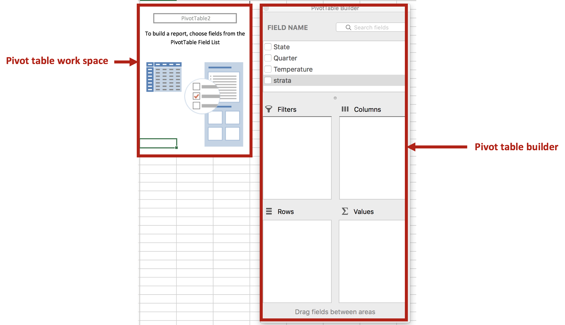
Excel will automatically create a new worksheet with a blank pivot table work space. You can use this work space to generate different tables using the powerful pivot table features.
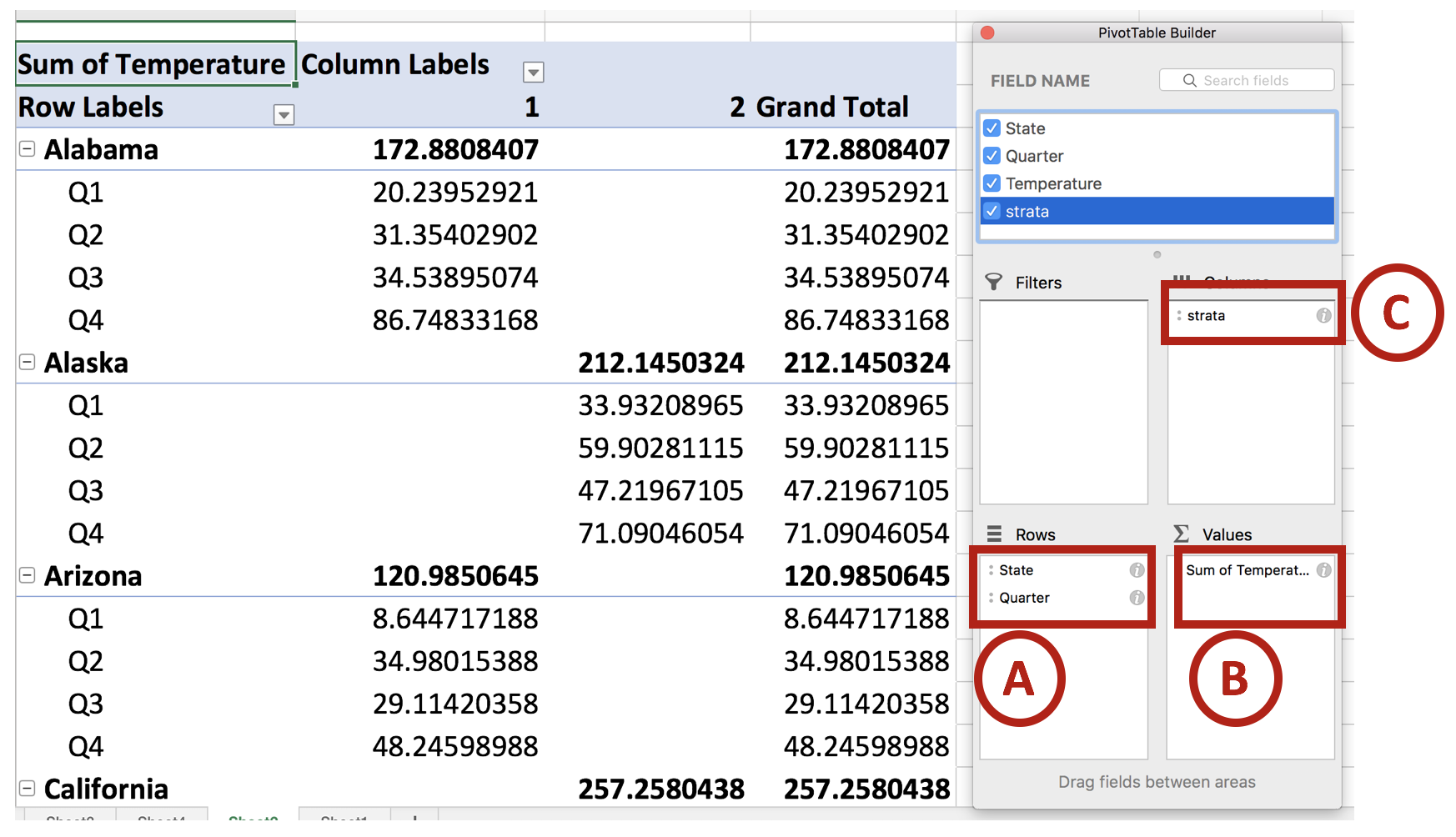
We will use the pivot table builder to generate the table we need for the panel chart. After you insert the pivot table into a new worksheet, move the State variable into the Row box followed by the Quarter variable. (This is denoted by A.) Move the Temperature variable into the Values box. (This is denoted by B.) Then move the Strata variable into the Columns box. (This is denoted by C.) Review your work with the following figure below.
Once you set up you pivot table, you should notice that the temperature values are staggered between the states. This is important for when you construct the line graphs for the panel charts.
Next, we will remove the Grand Total column. This isn’t important for us, so let’s right click the cell that contains the column header Grand Total and select Hide.
Then click on the Design tab on the ribbon and select Report Layout > Show in Tabular Form. This will change the design of the default pivot table.
Next, we are going to remove the total rows for each state. Right click on the first state (Alabama) and select Hide. You should notice that the total row for each state is now hidden. This updated pivot table design will make it easier to create panel charts.
You pivot table should look like the following:
Copy and paste this table and its values onto a blank section of the worksheet. Then highlight the data for the first four states and insert a line chart.
You will see the trend lines for the four states, which will be separated by the different time periods.
There are two colors for the alternating states. Change this to a single color (e.g. Blue). Then remove the gridlines, chart title, and the legend. The chart should look like the following:
The next part will be to include line partitions between each state, which will allow the eye to distinguish each line as separate trends for the states.
We will need to create a new dataset for the line partitions. To do that, count the number of time periods for one of the states (the time periods should be equivalent for all the states. In our case, there are four quarters for each state). In between Q4 and Q1, there is a gap. If you take all the quarters from Q1 and Q4 for Alabama to California, there are a total of 16 intervals. In between interval 4 and 5 is where we want to put first line partition. Interval 8 to 9 is where we want to put the second line partition, etc. For this example, the dataset should look like the following:
Select the chart and click on the Chart Design tab and click on Select Data.
The Select Data Source window will appear and list the previous data already used to generate the trend lines for each state. We will add a new dataset (A) and select the Y values from the dataset that was generated for the partitions (B).
This will create a line at the bottom of the chart area.
Right click on the line (A) and select Change Chart Type > X Y (Scatter) > Scatter (B).
Right click on the scatter and go to Format Data Series > Series Options > Plot Series On > Secondary Axis.
Select the Y-axis on the right side of the chart (A).
Then go to Format Axis > Axis Options and set the Maximum to 1.0.
Next, we will align the scatter points into the correct partition. Right click on the chart area and click on Select Data. Select Series 3 and go to the X values box. In the X values box, select the data in the Partition column.
The scatter points appear to be in the correct location. The next steps will involve including error bars for the partition lines and formatting.
Click on scatter points and select Chart Design in the Ribbon. Click on the Add Chart Element and select Error Bars > More Error Bars Options….
Format the error bars and remove the cap. Depending on where the scatter points are, you want to choose error bars that will cover the empty region. In our example, the scatter points are at the top, so having the “Minus” or “Both” direction options will work for us. We will leave it at “Both” for this example.
Click on the horizontal error bars and delete them.
Click on the scatter point and go to the Format Data Series. Go to the Fill & Line > Marker Options > None.
The chart should look like the following:
The remainder of this tutorial will be to make this aesthetically appealing.
We want to hide the secondary Y-axis, which can be done by hiding the line and change the font color to match the background. Then we want to change the size of the chart using the Chart Options.
We also changed the font to Helvetica (native to Apple products), resized the chart boxes, included a Vertical Y-title bar for the temperature axis, added a mean Temperature band using 60% transparency, change the color of the vertical error bars to a lighter gray, changed font size on the Y-axis, and moved the X-axis labels to the top. We repeated these steps for the final four states and carefully placed it below the first four states, using the grid to assist with alignment.
The final panel chart:
CONCLUSIONS
When you encounter a data set that can be separated into smaller graphics, consider using the small multiple principle or panel charts approach. It requires a little more work, but the results can provide a narrative that is easy to visualize and interpret. In our example, we start to notice different trends using different approaches to the small multiple principle. It’s best to experiment which ones work best for your needs. Here are some examples of small multiples that may inspire you: link1 and link2.
REFERENCES
1. Knaflic CN. Strategies for avoiding the spaghetti graph. Storytelling with data. http://www.storytellingwithdata.com/blog/2013/03/avoiding-spaghetti-graph. Published March 14, 2013. Accessed May 16, 2018.
2. Tufte ER. The Visual Display of Quantitative Information. Second. Cheshire, CT: Graphics Press, LLC.; 2001.


