opioids

Communicating data effectively with data visualizations: Part 22 (How to create a double axes figure in Excel)

INTRODUCTION

Displaying two types of information on a single figure is commonly done using double axes. Normally, you would use a single y-axis to reflect the outcome or metric of interest and a single x-axis for a standard set of categories (e.g., time). However, if the scales are different, leveraging a secondary axis can enhance and improve the visualization. In this article, we will demonstrate how to create a secondary axis using Excel.


MOTIVATING EXAMPLE

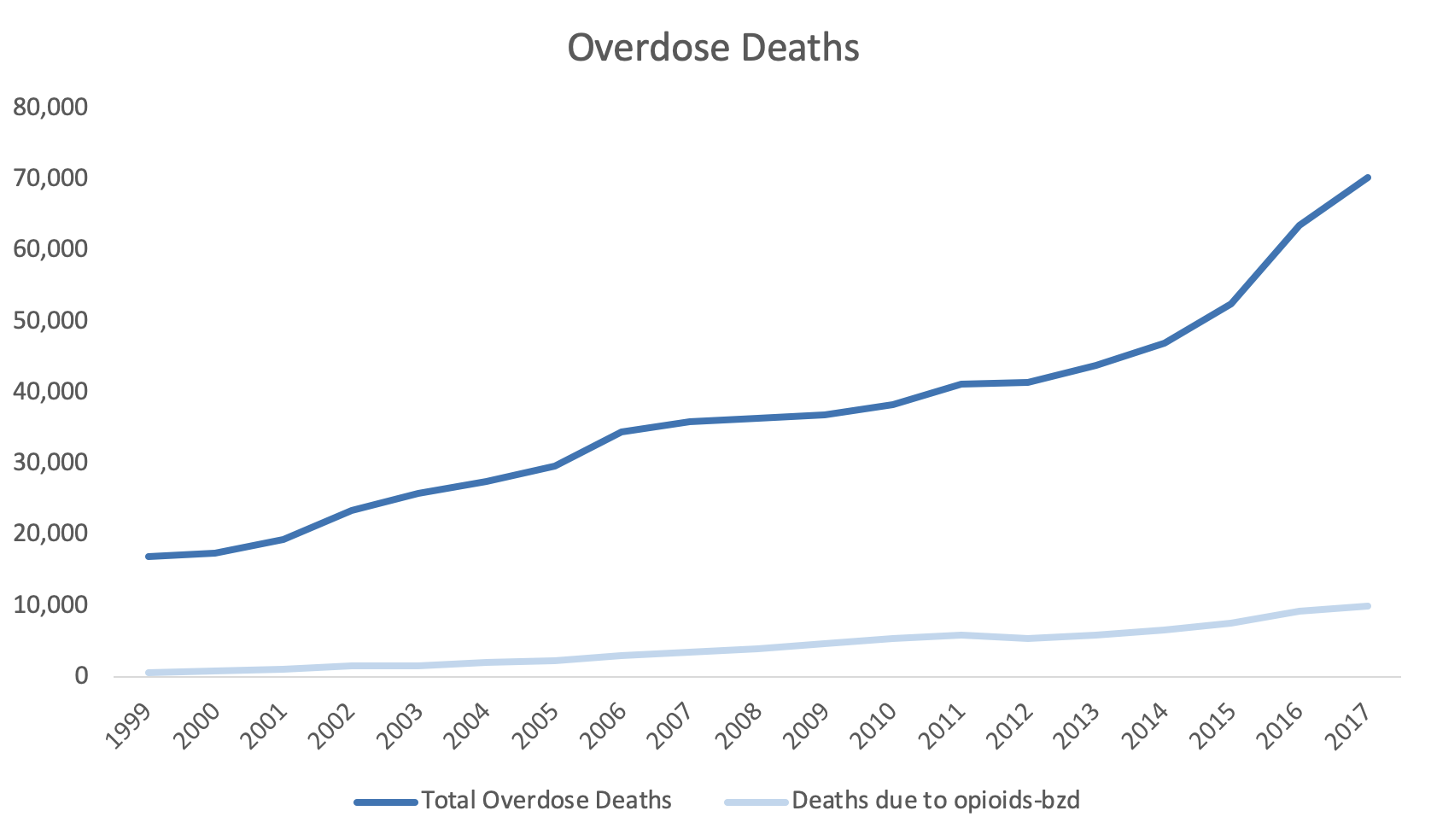
For example, the total overdose deaths are plotted on the y-axis and the year is plotted on the x-axis (Figure 1).

Figure 1. Total overdose deaths in the United States, 1999 to 2017.Source: https://www.drugabuse.gov/related-topics/trends-statistics/overdose-death-rates

Figure 1. Total overdose deaths in the United States, 1999 to 2017.

Source: https://www.drugabuse.gov/related-topics/trends-statistics/overdose-death-rates

Total overdose deaths in the United States (US) is large and growing. In 1999 it started at 16,849 deaths, but by 2019, that number rose to over seventy thousand. This is a large number and the scale that is used can impact how the viewer will synthesize this visualization.

However, if you wanted to add another line or data dimension such as the number of deaths due to opioids with a benzodiazepine prescription, that number may not be on the same scale as the total overdose deaths that’s currently represented by the y-axis. Figure 2 illustrates the Total Overdose Deaths and Overdose Deaths due to an Opioid-Benzodiazepine combination. Notice how the Opioid Deaths due to an Opioid-Benzodiazepine combination is plotted on the same scale as the Total Overdose Deaths. Using the same scale makes it difficult to discern the change in deaths associated with an Opioid-Benzodiazepine combination.

Figure 2. Overdose Deaths due to Opioids, 1999 to 2017.

Figure 2. Overdose Deaths due to Opioids, 1999 to 2017.

To improve this, we may consider using a secondary y-axis to correctly scale for the number of deaths due to opioids-benzodiazepine co-prescribing.


Step 1. Open the Excel document with the data, which is located here.

Step 2. Review the data. In this example, we have the total overdose deaths and the deaths associated with opioids-benzodiazepine co-prescribing from 1999 to 2017.


Step 3. Select the three columns and use the Excel Insert tab to select the line figure.

Figure 4.png

Step 4. Review the line graph.

The default line plot that is generated includes all the variables in a single y-axis. This is not what we want.

Figure 5.png

We need to correct this and select the correct axes for these variables.


Step 5. The Year variable needs to be on the x-axis.

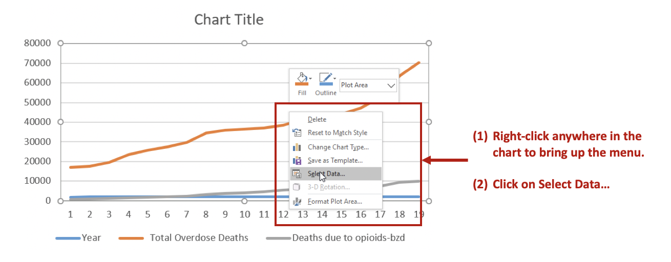
Right-click anywhere on the chart space. A menu of options will appear. You want to click on the Select Data… option to make changes to the data and how they are displayed on the chart.

Figure 6.png

Then Remove the Year variable from the Legend Entries (Series) panel. This will remove Year from being plotted on the y-axis. Next, you want to edit the Total Overdose Deaths in the Horizontal (Category) Axis Labels panel.

Figure 7.png

After clicking on Edit, you will be given a small window to select the range of data to display on the x-axis. Use the button in the Axis label range to select the Years 1999 to 2017. This will populate the x-axis with the years corresponding to the Total Overdose Deaths.

Figure 8.png

Step 6. Selecting the secondary y-axis.

Once the Year has been correctly specified, we can create a secondary y-axis to represent the Deaths due to opioids-bzd since these numbers are much smaller than the Total Overdose Deaths.

Right click on the line that represents Deaths due to opioids-bzd. Select the Format Data Series… option. This will give you a menu with the choice to use the Primary or Secondary axis. Select the Secondary axis.

Figure 9.png

This will generate a chart that will include two y-axes: (1) Total Overdose Deaths and (2) Deaths due to opioids-bzd.

Figure 10.png

You can format the figure to improve its appearance with Excel’s other functions. In this example, the line colors were changed to provide a better contrast, the y-axes were properly labelled, and the font colors matched those of the lines.

Figure 12.png

CONCLUSIONS

Using double axes can improve the narrative of your data visualization. Take advantage of this option when presenting data with the same x-axis, but different measures. In this example, the metric of interest was death, but the scales were different. Total Overdose Deaths were significantly larger than Deaths due to opioid-benzodiazepine co-prescribing. Therefore, to better visualize the increasing number of deaths due to opioid-benzodiazepine co-prescribing, a secondary y-axis was added.


SUPPLEMENTS

Data and Excel file used for this exercise are available here.

Communicating data effectively with data visualizations - Part 10 (Heat Maps)

BACKGROUND

A heat map is a data visualization tool that uses positioning and coloring to identify clusters and correlations in multivariable analysis. The most common type of heat map is a 2 x 2 matrix, where two variables are examined using the rows and columns (R x C) positions on a matrix. A heat map matrix helps us identify any patterns or similarities across the different dimensions. In a heat map, color is critical in denoting degrees of change. (Please see refer to the past blog on colors.)

For example, we can see the changes in opioid overdose rates across time for each state (Figure 1). As the rates increase, the cells are darker (indicated by the legend). All the states experience an increase in opioid overdose deaths, but State 1 is experiencing it faster than States 2 and 3.

In this tutorial, we will perform two methods to create heat maps. The first method will use the built in Excel conditional formatting rules and the second method will use VBA macros.

Figure 1. Heat map matrix.

Figure 1 - heatmap matrix.png

MOTIVATING EXAMPLE

We will continue to use the state-level drug overdose mortality data from the CDC.

https://www.cdc.gov/drugoverdose/data/statedeaths.html

Mortality rate is presented as the number of deaths per 100,000 population.

In this tutorial, we will develop a heat map using opioid overdose mortality from 2013 to 2016.

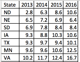
The data setup in Excel has State indicators as the rows and time indicators as the columns. We are visualizing the change in opioid overdose mortality from 2013 to 2016 for each state. Figure 2 illustrates the data structure for the first seven states.


Figure 2. Data structure for the first seven states.  

Figure 2 - Data structure.png


METHOD 1: CONDITIONAL FORMATTING RULES

Excel has a convenient tool that allow us to use conditional formatting to shade our heat map matrix.

Step 1: First highlight all the data.


Step 2: In the Excel Ribbon, select Conditional formatting and then New.

Figure 3 - conditional formatting.png

Step 3: Select “Format all cells based on their values” and change the Format Style to “3-Color scale.” Change the color to the different shades you are interested in using. (In this example, we used a blue base with varying degrees of shading.) Select percentile and then click “Ok.” The percentile will use the Median for each column to distinguish the middle category for the rates of opioid overdose mortality for each state.

Figure 4 - 3-color scale.png

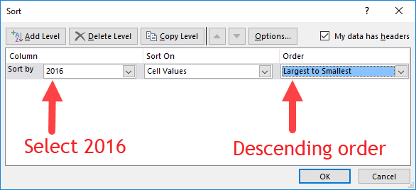
Step 4: Visually inspect the results. If there are no apparent pattern in the heat map, we will need to sort the rate of opioid overdose mortality for 2016 in descending order.

Figure 4 - Descending order.png

The heat map should look like the following:

 
Figure 6 - heat map example 1.png
 

There is a pattern emerging in regards to the rate of opioid overdose mortality across the different states. West Virginia has the highest opioid overdose mortality rate in 2016, but they also appear to have the highest from 2013 to 2015. The dark cell in 2016 indicates that West Virginia has exceeded the 50 deaths per 1000 population incidence rate. Other states also have high rates of opioid overdose mortality across 2013 to 2016, which continued to increase. The 2013 column is clearly lighter indicating that the opioid overdose mortality has increased over time up to the available data in 2016.


Step 5: We can improve this heat map by removing the numbers, which can be distracting. We need to select all the data and format the cells. Select only the numeric data and then format the number. Use the “Custom” category and enter the following: "";"";"";"". This will change the number values so that it doesn’t show in the cells.

Figure 7 - change the number format.png

Step 6: Change the column width and row height so that you have a nice square-like matrix for the final result. We used a column width of 5 and a row height of 30. (Only the first fifteen states are shown.)

The heat map can be used to quickly identify states with the highest opioid overdose mortality and the trends across time. The states with the highest rates of opioid overdose mortality are clustered at the top while the states with the lowest rates are clustered at the bottom.

We could also arrange this into regions of the US to further stratify the results (not shown).


METHOD 2: USING VBA MACROS FOR CONDITIONAL FORMATTING OF MORE THAN 3 CATEGORIES

Excel only allows us to choose up to 3-Color scales. If we wanted to use more than 3 color categories, we will need to use VBA macros.

But before we do, we need to think about the colors for the scales. Since we have more than 3 categories, we will need to figure out how to divide the colors.


COLOR CODES

We will need to determine the base color for our heat map. In this example, we will use a blue base-color and change the shading using the RGB color values. RGB colors are based on a system using a combination of three base colors (red, green, and blue) that can be used to change the intensity of the color from a range between 0 and 250. An example of an RGC color table can be found in the following site.

For this example, we used the following RGB color values where dark-navy denotes high rates of opioid overdose mortality (50 or more per 1000 population). However, you can change the values of these colors however you like.

Figure color codes.png

We will continue to use the blue color base and change the gradient using the RGB values.


VISUAL BASIC FOR APPLICATION (VBA) MACRO

The VBA macro comes from the site Excel For Beginners and written by Kristoff deCunha. We used the VBA code on the site, but modified it for this tutorial.

The VBA code is written in a way where any changes in the values will automatically update the color of the cell. Additionally, the code also sorts the 2016 opioid overdose mortality rate in descending order, adds thin-white continuous borders around the cells, and changes the font to Times New Roman.

Here are the VBA macros used for Method 2.


Macro 1 changes the font to Times New Roman.

‘Macro1
Sub ChangeFont()

Dim rng As Range
Set rng = Range("J1:N52")

With rng.Font
    .Name = "Times New Roman"
    .Size = 12
    .Strikethrough = False
    .Superscript = False
    .Subscript = False
    .OutlineFont = False
    .Shadow = False
    .Underline = xlUnderlineStyleNone
    .ThemeColor = xlThemeColorLight1
    .TintAndShade = 0
    .ThemeFont = xlThemeFontNone
End With

End Sub


Macro 2 changes the cell shading to the 6-Color scale (blue-base)

‘Macro2
Sub ChangeCellColor()


Dim rng As Range
Dim oCell As Range

Set rng = Range("K2:N52")

For Each oCell In rng
        Select Case oCell.Value
                 Case 50 To 100
                     oCell.Interior.Color = RGB(37, 54, 97)
                     oCell.Font.Bold = True
                     oCell.Font.Name = "Times New Roman"
                     oCell.HorizontalAlignment = xlCenter
                 Case 40 To 49.999
                     oCell.Interior.Color = RGB(56, 83, 145)
                     oCell.Font.Bold = True
                     oCell.Font.Name = "Times New Roman"
                     oCell.HorizontalAlignment = xlCenter
                 Case 30 To 39.999
                     oCell.Interior.Color = RGB(147, 168, 215)
                     oCell.Font.Bold = True
                     oCell.Font.Name = "Times New Roman"
                     oCell.HorizontalAlignment = xlCenter
                 Case 20 To 29.999
                     oCell.Interior.Color = RGB(183, 198, 228)
                     oCell.Font.Bold = True
                     oCell.Font.Name = "Times New Roman"
                     oCell.HorizontalAlignment = xlCenter
                 Case 10 To 19.999
                     oCell.Interior.Color = RGB(218, 225, 240)
                     oCell.Font.Bold = True
                     oCell.Font.Name = "Times New Roman"
                     oCell.HorizontalAlignment = xlCenter
                 Case 0 To 9.999
                     oCell.Interior.Color = RGB(230, 237, 253)
                     oCell.Font.Bold = True
                     oCell.Font.Name = "Times New Roman"
                     oCell.HorizontalAlignment = xlCenter
                  Case Else
                     oCell.Interior.ColorIndex = xlNone
         End Select
    Next oCell
    
End Sub


Macro 3 sorts the 2016 opioid overdose mortality rates in descending order.

‘Macro3
Sub SortColumn()

Dim DataRange As Range
Dim keyRange As Range
Set DataRange = Range("J1:N52")
Set keyRange = Range("N1")
DataRange.Sort Key1:=keyRange, Order1:=xlDescending

End Sub


Macro 4 hides the font from the heat map.

‘Macro4
Sub HideFont()
    
Dim rng As Range
Dim oCell As Range

Set rng = Range("K2:N52")

    For Each oCell In rng
        oCell.Font.Color = oCell.Interior.Color
    Next oCell
    
End Sub


Macro 5 creates thick white borders for each cell in the table.

‘Macro5
Sub WhiteOutlineCells()

    Dim rng As Range

    Set rng = Range("J1:N52")

    With rng.Borders
        .LineStyle = xlContinuous
        .Color = vbWhite
        .Weight = xlThick
    End With
    
End Sub

INSERTING DATA AND RUNNING MACRO

The five macros are assigned to a button in the Excel Macro-Enabled Workbook. Pressing the button will perform the task of creating a 6-Color scale heat map. Download the Excel Macro-Enabled Workbook here. This file will have the raw data and the macro-enabled worksheet for you to create a heat map.

Step 1: Copy the raw data from the “combined” worksheet.

Figure 9 - Copy Data.png

Step 2: Paste it in the worksheet “heatmap_2” starting on cell "J1".

Figure 10 - Copy onto J1.png

Step 3: Then press the “PressStart” button to run the macros. Your final heat map should look like the following:

Compare the heat map from Method 1 (3-Color scale) to the one generated by Method 2 (6-Color scale). The heat map with the 6-Color scale has a lighter pattern compared to the 3-Color scale heat map. The differences are dramatic. Depending on the granularity of the heat map you want, either one of these color scales would be fine. However, Method 2 requires some VBA coding.

* Not all states shown.


Conclusions

Heat maps allow us to observe patterns in the data. In our example, we notice that West Virginia has a high rate of opioid overdose mortality indicated by the clustering of dark cells from 2013 to 2016. Other states had similar patterns as West Virginia. Using heat maps provides a quick and easy interpretation of the changes in opioid overdose mortality across time and the states that are clustered together that have high rates of opioid overdose mortality.


REFERENCES

I used the following websites to help develop this tutorial.

Conditional formatting with more than 3 categories:
https://sites.google.com/site/excelforbeginners/Home/vba-codes/conditional-formatting-more-than-3-criterias
 
Changing the RGB color codes:
https://analysistabs.com/excel-vba/change-background-color-of-cell-range/
https://www.w3schools.com/colors/colors_rgb.asp

Excel color palette library:
http://dmcritchie.mvps.org/excel/colors.htm

Excellent site for VBA coding:
https://www.excel-easy.com/vba.html


Veterans Health Administration reduces opioid use with Academic Detailing

Recently, there have been several articles and blogs that highlight the success of the U.S. Department of Veterans Affairs (VA) Veterans Health Administration (VHA) in addressing the rising opioid epidemic, especially among veterans. Lin and colleagues reported that the VHA's Opioid Safety Initiative (OSI) was associated with a 16.1% reduction in high-dose opioid use [defined as 100 morphine equivalence (MEQ) or greater] twelve months after implementation in October 2013. Moreover, the dangerous combination of an opioid prescribed with a benzodiazepine was reduced by 20.7% across a similar time period. 

These results were, in part, affected by academic detailing, which provides one-on-one, unbiased educational outreach to providers in order to align their prescribing behaviors with the most current evidence-based practice. The former Interim Under Secretary of Health mandated that the VHA implement the National Academic Detailing Service (ADS) to address veterans' mental health and pain management by 2015. Since then, the ADS has been associated with reductions in high-dose opioid use and average MEQ over time. I recently presented some of these findings at the VA's HSR&D/QUERI meeting in Washington, DC on July 18-20, 2017. There was a greater reduction in high-dose opioid users in providers who received academic detailing compared to providers who did not receive academic detailing (58% versus 34%, respectively). Similarly, there was a greater reduction in the average MEQ per patient among providers who received academic detailing compared to those who did not (59% versus 31%, respectively). 

In the news, the HealthAffairs.org blog reported that "the VA health care system has implemented a comprehensive “Opioid Safety Initiative,” which uses provider-level ongoing feedback for high-risk opioid prescribing, academic detailing to improve use of opioids, a robust naloxone distribution program for at-risk veterans, and residential treatment programs for substance abuse." Similarly, watchdog.org reported that Matthew Gowan, a VA spokesman, stated that the OSI and ADS have been crucial in the reduction of opioid use in Tomah VA Medical Center since their implementation. 

Williams, Nunes, and Olfson argued that a "Cascade of Care" model is needed to address the opioid epidemic in the U.S. They stated that academic detailing along with motivational interviewing and family engagement are needed in order to assist providers to bridge any knowledge gaps and stigma associated with safe and proper opioid prescribing. In addition, Politico.com wrote that academic detailing provides providers with critical updates on pain management and opioid prescribing. 

Finally, an article by Carla K. Johnson of the Associated Press provided a "boots on the ground" perspective of academic detailing from the eyes of an academic detailer in Pennsylvania. In it, she follows Melissa Jones, an academic detailer, and wrote that "Evidence from New York City’s public health department and the Veterans Health Administration suggests Jones and others like her can reduce opioid prescribing, adapting a tried-and-true tactic from the pharmaceutical industry called detailing." In short, academic detailing has an important part to play in the overall mission to address the opioid epidemic. 

Despite these improvements in the VA's mission to reduce harmful opioid prescribing, it is uncertain whether reducing opioids will lead to a substitution effect or worse. Future studies will need to investigate any potential negative (and positive) consequences of these campaigns.