heat map

Communicating data effectively with data visualization: Part 39 (Heatmaps of COVID-19 deaths)

INTRODUCTION

I wanted to incorporate a heatmap that illustrated the death rates (per 100,000 population) across time in the United States. But I also wanted to show when the coronavirus pandemic 2019 (COVID-19) vaccine was introduced and how it impacted death rates. I thought that a heatmap would do a nice job of illustrating this.

The data visualization by Tynan DeBold and Dov Friedman from the Wall Street Journal has a great visualization on the impact of vaccines for various disease from the measles to smallpox on death rates (See figure below). This heatmap shows the number of measles cases per 100,000 population between 1920 and 2000. Each row represents a state or territory of the United States (U.S.). In this tutorial, we’ll create a similar heatmap for COVID-19 deaths.

Source: Tynan DeBold and Dov Friedman, Wall Street Journal (link)

I set out to create my own heat map with COVID-related death rates using data from the Centers for Disease Prevention and Protection (CDC). The CDC provides a dashboard to visualize the trends in death rates by states and U.S. territories (Compare Trends in COVID-19 Cases and Deaths in the US). However, the data was not compiled in an easy manner. You can only visualize 6 territories at a time. I was able to download all the data and compile this into a single file for this tutorial, which you can download here. Use the file with the *.xlsm extension, which supports macros.

TUTORIAL

Step 1. Download the Excel file with the data. Use the data from the “data” tab. Inspect the data. The columns represent the weekly death rate (7-day average number of deaths per 100,000 population). The rows represents the states and U.S. territories.

Step 2. Use the VBA macro. In a previous article, I explained how to create a heatmap with different gradient levels. We will use a modified version of the macro for this exercise.

This is the VBA macro that we’ll use (link). Don’t be intimidated by this. I’ll go over how to use this code

I start by determining the number of gradient levels for the heatmap. The average death rate was 0.35 per 100,000 population, so I generated 20 levels of gradient (0 to 0.999, 1.0 to 1.999, 2.0 to 2.999, etc). I wanted a “blue” shade for this heatmap, so I had to figure out the RGB scheme for each level. I identified the RGB color scheme using a gradient generator by ColorDesigner. RGB code uses three values to represents the main color on the spectrum (red, green, blue).

Once you have the RGB codes for the gradient levels, you can edit the VBA macro.

In the Developer tab, click on “Visual Basic.” Make sure that the Developer tab is viewable on the Ribbon. If it is not, then you can activate this by going to the File > Options > Customize Ribbon and activate it by entering a check by the Ribbon box.

The Visual Basic interface is a separate window that pops up.

In the “Sub ChangeCellColor()” macro, we’re going to include 20 gradient levels. It’s important to make sure the Range() includes the data that we’re interested in modifying. Since the first cell is in A1 and the last cell is in CZ61, the range is Range("A1:CZ61").

Then we include the 20 gradient levels by changing the Case statement with the corresponding RGB codes. As you modify each Case statement, make sure to change the value ranges for each statement. For example, if you want to apply the RGB code for (18, 123, 141), the death rate range is 1.8 to 1.8999999. You can do this for all the gradient levels.

Here is an example:

    Case 1.8 To 1.8999999
         oCell.Interior.Color = RGB(18, 23, 141)
         oCell.Font.Bold = True
         oCell.Font.Color = RGB(18, 23, 141)
         oCell.Font.Name = "Times New Roman"
         oCell.HorizontalAlignment = xlCenter

Case 1.8 to 1.8999999 denotes the range of the values in each cell (7-day average deaths per 100,000 population).

oCell.Interior.Color = RGB(18, 23, 141) denotes the RGB color scheme for our gradient

oCell.Font.Bold = True denotes that the font is bolded

oCell.Font.Color = RGB(18, 23, 141) denotes that the font color matches the cell color

oCell.Font.Name = "Times New Roman" denotes that the font is Times New Roman

oCell.HorizontalAlignment = xlCenter denotes that the value is aligned in the center

After you’ve adjusted your code, you can execute the macro. To execute the macro, go to the Ribbon and select “Macros.” The Macro window will appear with three macros. Select the “ChangeCellColor” macro and click “Run.” This should execute the macro, and you will notice that the data will start to change color to the corresponding gradient values.

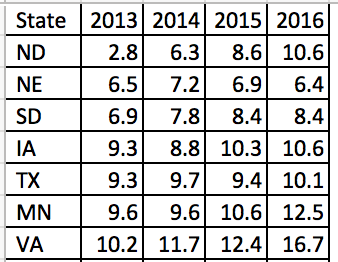
To sort by the last column, select the “SortColumn” macro and click “Run.”

To create white borders around the cells, select on the “WhiteOutlineCells” macro and click “Run.”

Step 4. Final touches. You can select the columns and change width to 2.

Once you have the correct cell sizes, you can start to add labels to the file. I included a line to delineate when the first vaccine was introduced and a line for when the president announced that COVID-19 was a national emergency. I also added labels to the bottom part of the table to indicate dates along the timeline. The rows represented the states and U.S. territories.

CONCLUSIONS

The number of deaths was high early in the pandemic in a few select places in the U.S. As the vaccine is introduced, the number of deaths reached a zenith around December 2020 before falling to low levels in February 2021. Then, the death rate started to increase around the beginning of July 2021. Based on the heatmap, the vaccine may have resulted in a decrease in deaths. But the death rate increased approximately 6 months later in what appears to be the beginning of a seasonal pattern. It is unclear whether the introduction of new variants causes the increased death rate, but there is speculation that it may be a contributor. This heatmap does not generate any claims to what is actually happening; it only provides a visual of the patterns that are reported across each U.S. state and territory.

REFERENCES

I took inspiration from the data visualization by Tynan DeBold and Dov Friedman from the Wall Street Journal.

Date for this exercise came from the CDC (link).  

A previous article on how to create heatmaps is available here.

I used the Gradient Generator by ColorDesigner to find out the RGB values for my gradient levels.

Communicating data effectively with data visualizations: Part 35 (Heat maps – COVID-19 Deaths by Week and State)

INTRODUCTION

With the COVID-19 pandemic entering its second year, the number of deaths in the United States (US), has total over 546 thousand deaths (data from March 26, 2021). Of note is the variation in death rates across US. CDC provides a daily update on the number of deaths reported by each state (and major cities) in the US, which is accessible through their portal. However, it can be difficult to visualize all these data; proper visualizations will assist the audience with interpretability and add to the narrative that the COVID-19 pandemic has been more severe is some states compared to others. The Economist provided some helpful data visualizations for Great Britain by using heat maps to report the deviations from the expected weekly death counts due to COVID-19. Here is an example.

* Source: The Economist – Tracking COVID-19 excess deaths across countries (link). This is for educational purposes only.

From this visualization, it is clear that all sectors of Britain were hit by COVID-19 at similar times. Some areas had higher deviations from the expected mortality rates, while other had lower deviations. Additionally, there appears to be another peak in the deviations from the expected number of deaths in late 2020. Using this example as a model, we can recreate this heat map for the US. Fortunately, The Economist has a GitHub portal with all the data for different countries including the US.

DATA

Data for this exercise is located the The Economist GitHub portal. We will use the “covid-19-excess-deaths-tracker,” which includes data on the deviation from the expected deaths (%). Data on the deviation from the expected deaths (%) for the US will be used to emulate the example from The Economist.


Heat map of deviations from the number expected death (%) for the US.

We will use Excel to create a heat map of the weekly deviations from the number of expected death because of COVID-19 in the US from January 2020 to February 2021.

Step 1. Inspect the data:

The data for this exercise is located here. Download and open the file. Review the data under the “exercise data” sheet. It should look like the following:

We will manipulate this data so copy and paste this into a new sheet.

Step 2. Add spaces:

One of the elements that The Economist added to their heat map were spaces between each state or territory.

This can be accomplished manually by inserted a row between each state or territory. However, when there are a lot of rows, this can be a burden. A systematic method includes a couple of columns (number and alternate) to create the spaces we need. These will represent the spaces between the states/territories.

Once you have created these, select the entire data set. Then sort them by “number” and then by “alternate”; see picture below:

You should have spaces between each state/territory now.

Step 3. Change column width and row height:

Select the columns and right click to change the width. Set the value to 2. Once you done this, the weekly deviations should look like the following:

Next, use the Filter feature in Excel to only select the “alternate” values  of 1. This should only show values for the “alternate” column that equal to 1. Select the rows where the column values are 1 and right-click. This will allow you to select “Row Height” so that you can change the value to 25. Please see the illustration on how to do this below:

Now that you’ve change the row height for the “alternate” column values for 1, we will change the row height for the “alternate” column values for 0 and 0.5 using the same method. The only difference is that the row height will be 5 instead of 25. See the illustration below on how to perform this step:

Step 4. Add condition formatting rules:

Now that the data column width and row height have been set properly, you can add the conditional formatting rules to change the color of the boxes to reflect the deviations from the number of expected death (%) due to COVID-19.

First, select all the data. Then go to the Home tab and select “Conditional Formatting.” Make sure to click on “New Rule...” Select the “3-Color Scale” because we will use the gradient levels to create our heat map. The darker color will denote the higher deviations and the lighter color will denote the low or no deviations from the number of expected deaths (%). Make sure to change the “Type” to “Number.” You can enter any values that work for you, but for this example, use “0”, “0.5”, and “1” for the “Minimum”, “Midpoint”, and “Maximum” types, respectively.

Next, with the data still selected, right-click on the data to open a window. Select “Format Cells” because we want to remove the values from the cells. In the Number tab, select “Custom” and enter the following: "";"";"";"". This will change the number values so that it doesn’t show in the cells.

The Excel file should start looking like a heat map. However, there are a few more features we can do to emulate the heat map on The Economist website.

Step 5. Adding borders to the heat map:

After formatting the cells so that the numbers are not visible, you can add borders to the heat map. Select the heat map area, right-click anywhere on the data and select “Format Cells”; you will select the “Border” tab and change the border color to white. Then apply the borders to the heat map.

Once you’ve applied the border color change, the heat map should look like the following:

Next, we will add a border to separate the states/territories from each other.

Use the “Filter” feature and select rows where the “alternate” values are 0.5. The rows will be very narrow since we set them to a value of 5 earlier. Now, select the data area including the state/territories column and right-click on the data. Select “Format Cells” and then change the border color to a light shade of gray and apply this to the top border. This will apply a light gray border to separate the states/territories from each other. See illustration below for how to perform this step.

Once you’ve added the border, the heat map should look like the following:

Step 6. Final steps:

In the last steps, you can change the font, hide some of the values, and add a label to identify the weekly deviations. For the final figure, I hid the “alternate” and “number” columns, and I hid the weekly labels. I replaced the weekly labels with a more informative timeline to based on quarters. I also rearranged the states/territories so that I had the United States at the top and some of the more active states/territories at the top (e.g., New York and New York City). This should be remarkably similar to the heat map developed by The Economist. The final figure can be downloaded from the following link.

CONCLUSIONS

Using the data from The Economist, we recreated their heat map for the US. We can visualize when the COVID-19-related deaths exceeded the expected all-cause mortality deaths on a weekly basis from January 2020 to February 2021. For example, New York City was hit with a high percentage of COVID-19 deaths around April 2020, which was also reported for The District of Columbia, New York State, and New Jersey. However, North Dakota, South Dakota, California, and Arizona were hit with high percentages of COVID-19 deaths that exceeded the expected number of deaths later in the year.

Heat maps provide us with a useful visual to compare and contrast different states/territories and the severity of COVID-19 deaths using simple tools provided by Excel.


REFERENCES

I used the lessons from a previous blog on developing heat maps (link).

Data on deviations from the number of expected deaths (%) in the US was provided by The Economist (link). However, I cleaned the data so that you can use it for your own exercise (link).

Communicating data effectively with data visualizations - Part 10 (Heat Maps)

BACKGROUND

A heat map is a data visualization tool that uses positioning and coloring to identify clusters and correlations in multivariable analysis. The most common type of heat map is a 2 x 2 matrix, where two variables are examined using the rows and columns (R x C) positions on a matrix. A heat map matrix helps us identify any patterns or similarities across the different dimensions. In a heat map, color is critical in denoting degrees of change. (Please see refer to the past blog on colors.)

For example, we can see the changes in opioid overdose rates across time for each state (Figure 1). As the rates increase, the cells are darker (indicated by the legend). All the states experience an increase in opioid overdose deaths, but State 1 is experiencing it faster than States 2 and 3.

In this tutorial, we will perform two methods to create heat maps. The first method will use the built in Excel conditional formatting rules and the second method will use VBA macros.

Figure 1. Heat map matrix.

Figure 1 - heatmap matrix.png

MOTIVATING EXAMPLE

We will continue to use the state-level drug overdose mortality data from the CDC.

https://www.cdc.gov/drugoverdose/data/statedeaths.html

Mortality rate is presented as the number of deaths per 100,000 population.

In this tutorial, we will develop a heat map using opioid overdose mortality from 2013 to 2016.

The data setup in Excel has State indicators as the rows and time indicators as the columns. We are visualizing the change in opioid overdose mortality from 2013 to 2016 for each state. Figure 2 illustrates the data structure for the first seven states.


Figure 2. Data structure for the first seven states.  

Figure 2 - Data structure.png


METHOD 1: CONDITIONAL FORMATTING RULES

Excel has a convenient tool that allow us to use conditional formatting to shade our heat map matrix.

Step 1: First highlight all the data.


Step 2: In the Excel Ribbon, select Conditional formatting and then New.

Figure 3 - conditional formatting.png

Step 3: Select “Format all cells based on their values” and change the Format Style to “3-Color scale.” Change the color to the different shades you are interested in using. (In this example, we used a blue base with varying degrees of shading.) Select percentile and then click “Ok.” The percentile will use the Median for each column to distinguish the middle category for the rates of opioid overdose mortality for each state.

Figure 4 - 3-color scale.png

Step 4: Visually inspect the results. If there are no apparent pattern in the heat map, we will need to sort the rate of opioid overdose mortality for 2016 in descending order.

Figure 4 - Descending order.png

The heat map should look like the following:

 
Figure 6 - heat map example 1.png
 

There is a pattern emerging in regards to the rate of opioid overdose mortality across the different states. West Virginia has the highest opioid overdose mortality rate in 2016, but they also appear to have the highest from 2013 to 2015. The dark cell in 2016 indicates that West Virginia has exceeded the 50 deaths per 1000 population incidence rate. Other states also have high rates of opioid overdose mortality across 2013 to 2016, which continued to increase. The 2013 column is clearly lighter indicating that the opioid overdose mortality has increased over time up to the available data in 2016.


Step 5: We can improve this heat map by removing the numbers, which can be distracting. We need to select all the data and format the cells. Select only the numeric data and then format the number. Use the “Custom” category and enter the following: "";"";"";"". This will change the number values so that it doesn’t show in the cells.

Figure 7 - change the number format.png

Step 6: Change the column width and row height so that you have a nice square-like matrix for the final result. We used a column width of 5 and a row height of 30. (Only the first fifteen states are shown.)

The heat map can be used to quickly identify states with the highest opioid overdose mortality and the trends across time. The states with the highest rates of opioid overdose mortality are clustered at the top while the states with the lowest rates are clustered at the bottom.

We could also arrange this into regions of the US to further stratify the results (not shown).


METHOD 2: USING VBA MACROS FOR CONDITIONAL FORMATTING OF MORE THAN 3 CATEGORIES

Excel only allows us to choose up to 3-Color scales. If we wanted to use more than 3 color categories, we will need to use VBA macros.

But before we do, we need to think about the colors for the scales. Since we have more than 3 categories, we will need to figure out how to divide the colors.


COLOR CODES

We will need to determine the base color for our heat map. In this example, we will use a blue base-color and change the shading using the RGB color values. RGB colors are based on a system using a combination of three base colors (red, green, and blue) that can be used to change the intensity of the color from a range between 0 and 250. An example of an RGC color table can be found in the following site.

For this example, we used the following RGB color values where dark-navy denotes high rates of opioid overdose mortality (50 or more per 1000 population). However, you can change the values of these colors however you like.

Figure color codes.png

We will continue to use the blue color base and change the gradient using the RGB values.


VISUAL BASIC FOR APPLICATION (VBA) MACRO

The VBA macro comes from the site Excel For Beginners and written by Kristoff deCunha. We used the VBA code on the site, but modified it for this tutorial.

The VBA code is written in a way where any changes in the values will automatically update the color of the cell. Additionally, the code also sorts the 2016 opioid overdose mortality rate in descending order, adds thin-white continuous borders around the cells, and changes the font to Times New Roman.

Here are the VBA macros used for Method 2.


Macro 1 changes the font to Times New Roman.

‘Macro1
Sub ChangeFont()

Dim rng As Range
Set rng = Range("J1:N52")

With rng.Font
    .Name = "Times New Roman"
    .Size = 12
    .Strikethrough = False
    .Superscript = False
    .Subscript = False
    .OutlineFont = False
    .Shadow = False
    .Underline = xlUnderlineStyleNone
    .ThemeColor = xlThemeColorLight1
    .TintAndShade = 0
    .ThemeFont = xlThemeFontNone
End With

End Sub


Macro 2 changes the cell shading to the 6-Color scale (blue-base)

‘Macro2
Sub ChangeCellColor()


Dim rng As Range
Dim oCell As Range

Set rng = Range("K2:N52")

For Each oCell In rng
        Select Case oCell.Value
                 Case 50 To 100
                     oCell.Interior.Color = RGB(37, 54, 97)
                     oCell.Font.Bold = True
                     oCell.Font.Name = "Times New Roman"
                     oCell.HorizontalAlignment = xlCenter
                 Case 40 To 49.999
                     oCell.Interior.Color = RGB(56, 83, 145)
                     oCell.Font.Bold = True
                     oCell.Font.Name = "Times New Roman"
                     oCell.HorizontalAlignment = xlCenter
                 Case 30 To 39.999
                     oCell.Interior.Color = RGB(147, 168, 215)
                     oCell.Font.Bold = True
                     oCell.Font.Name = "Times New Roman"
                     oCell.HorizontalAlignment = xlCenter
                 Case 20 To 29.999
                     oCell.Interior.Color = RGB(183, 198, 228)
                     oCell.Font.Bold = True
                     oCell.Font.Name = "Times New Roman"
                     oCell.HorizontalAlignment = xlCenter
                 Case 10 To 19.999
                     oCell.Interior.Color = RGB(218, 225, 240)
                     oCell.Font.Bold = True
                     oCell.Font.Name = "Times New Roman"
                     oCell.HorizontalAlignment = xlCenter
                 Case 0 To 9.999
                     oCell.Interior.Color = RGB(230, 237, 253)
                     oCell.Font.Bold = True
                     oCell.Font.Name = "Times New Roman"
                     oCell.HorizontalAlignment = xlCenter
                  Case Else
                     oCell.Interior.ColorIndex = xlNone
         End Select
    Next oCell
    
End Sub


Macro 3 sorts the 2016 opioid overdose mortality rates in descending order.

‘Macro3
Sub SortColumn()

Dim DataRange As Range
Dim keyRange As Range
Set DataRange = Range("J1:N52")
Set keyRange = Range("N1")
DataRange.Sort Key1:=keyRange, Order1:=xlDescending

End Sub


Macro 4 hides the font from the heat map.

‘Macro4
Sub HideFont()
    
Dim rng As Range
Dim oCell As Range

Set rng = Range("K2:N52")

    For Each oCell In rng
        oCell.Font.Color = oCell.Interior.Color
    Next oCell
    
End Sub


Macro 5 creates thick white borders for each cell in the table.

‘Macro5
Sub WhiteOutlineCells()

    Dim rng As Range

    Set rng = Range("J1:N52")

    With rng.Borders
        .LineStyle = xlContinuous
        .Color = vbWhite
        .Weight = xlThick
    End With
    
End Sub

INSERTING DATA AND RUNNING MACRO

The five macros are assigned to a button in the Excel Macro-Enabled Workbook. Pressing the button will perform the task of creating a 6-Color scale heat map. Download the Excel Macro-Enabled Workbook here. This file will have the raw data and the macro-enabled worksheet for you to create a heat map.

Step 1: Copy the raw data from the “combined” worksheet.

Figure 9 - Copy Data.png

Step 2: Paste it in the worksheet “heatmap_2” starting on cell "J1".

Figure 10 - Copy onto J1.png

Step 3: Then press the “PressStart” button to run the macros. Your final heat map should look like the following:

Compare the heat map from Method 1 (3-Color scale) to the one generated by Method 2 (6-Color scale). The heat map with the 6-Color scale has a lighter pattern compared to the 3-Color scale heat map. The differences are dramatic. Depending on the granularity of the heat map you want, either one of these color scales would be fine. However, Method 2 requires some VBA coding.

* Not all states shown.


Conclusions

Heat maps allow us to observe patterns in the data. In our example, we notice that West Virginia has a high rate of opioid overdose mortality indicated by the clustering of dark cells from 2013 to 2016. Other states had similar patterns as West Virginia. Using heat maps provides a quick and easy interpretation of the changes in opioid overdose mortality across time and the states that are clustered together that have high rates of opioid overdose mortality.


REFERENCES

I used the following websites to help develop this tutorial.

Conditional formatting with more than 3 categories:
https://sites.google.com/site/excelforbeginners/Home/vba-codes/conditional-formatting-more-than-3-criterias
 
Changing the RGB color codes:
https://analysistabs.com/excel-vba/change-background-color-of-cell-range/
https://www.w3schools.com/colors/colors_rgb.asp

Excel color palette library:
http://dmcritchie.mvps.org/excel/colors.htm

Excellent site for VBA coding:
https://www.excel-easy.com/vba.html