Cleveland dot plots

Reproduction number—COVID-19

BACKGROUND

As the COVID-19 pandemic, which began in December 2019, continues into its second year, public health measures have been put into place to mitigate its spread. At the time of writing this article, there have been over 4.5 million deaths and over 216 million cases due to COVID-19.[1] Surveillance of COVID-19 remains an important public health measure of understanding the spread and impact. Daily reports such as the John Hopkins COVID-19 dashboard provide end users with visual and statistical information about the surges in cases and deaths associated with COVID-19. However, one measure that is of great interest is the reproduction number or R0.


Reproduction number (R0) and effective reproduction number (Rt)

The reproduction number is the number of new cases that is directly caused by exposure to a single case.[2,3] Figure 1 provides a visual explanation of the basic reproduction number. However, the underlying assumption with R0 is that everyone in the population is susceptible to infection. With the introduction of vaccines, the R0 isn’t a good measure of the reproductive capabilities of COVID-19. Instead, the effective reproduction number (Rt) is used to provide a more realistic reproduction number based on the population being infected, recovered, or vaccinated. The Rt changes over time as the population susceptible to infection changes.

Figure 1. Basic reproduction number.

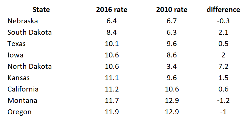
I wanted to create a figure that would highlight the changes associated with the Rt for each state in the United States. To do this, I downloaded the Rt data from the by Xihong Lin's Group in the Department of Biostatistics at the Harvard T.H. Chan School of Public Health. They have an amazing COVID-19 tracker dashboard that captures the changing patterns of Rt for each state. Then I created a Cleveland plot to show where the Rt was near the beginning of the pandemic and where it is currently (August 2021). (Note: I wrote a tutorial on creating Cleveland plots that you can review here.) Here is the final figure (because of the length of the figure, I cropped it to show the first 30 states or territories):


Figure 2. Effective reproduction number (Rt) for U.S. states and territories, April 17, 2020 (past) to August 14, 2021 (recent).

The blue dots denote the most recent effective reproduction number (14 August 2021) and the past dots denote the earliest effective reproduction number (17 April 2020).

It seems that some states have gotten worse in terms of increase effective reproduction number since the beginning of the pandemic. This could be due to lack of good data in the early phases of the pandemic. However, what is of concern is the high effective reproduction numbers in some states (Rt > 2), which indicates that the pandemic is still spreading at an alarming rate.

There were some missing data which are identified by a single dot (blue or red) or an empty field in the recent or past effective reproduction number. Rather than fill these in, I left them empty. There may be data in between the two time periods that I could have used, but I left those out.

One thing to mention is that this Cleveland plot only tells us one dimension of the effective reproduction number story (the difference between the most recent Rt and the earliest Rt). It doesn’t tell us much about how the effective reproduction number changes across time. For that, I direct your attention to the Lin’s Laboratory Group at Harvard, they have a great figure that shows the fluctuation of the effective reproduction number for the U.S. and its states/territories (see example):

Source: Lin’s Laboratory Group at Harvard (link). [last accessed on 30 August 2021].

CONCLUSIONS

The effective reproduction number provides us with some interesting patterns in spread of COVID-19 by states/territories. It seems to have worsened over time, but this could be due to poor data early in the pandemic. There are some issues with the us of effective reproduction number for policy decisions. Reporting delays can impact the estimates for the effective reproduction number. A technique called “nowcasting” is used to estimate the reproduction number.[3] But when I explored some of the work in this area, there appears to be a variety of methods for performing this technique. Despite this limitation, the effective reproduction number may be useful to evaluate public health policy decisions to reduce the spread of the COVID-19 pandemic.[4,5]


DATA SOURCE

I provided the link to the COVID-19 Spread Tracker from the Lin Lab at Harvard. You can also download a curated version of the data for this article from my Dropbox folder. The data are current as of 17 August 2021. If you’re interested in recreating this Cleveland plot, I recommend downloading the most recent data to see how much the effective reproduction number has changed.

REFERENCES

  1. Worldometeres.info. COVID Live Update: 217,770,381 Cases and 4,521,936 Deaths from the Coronavirus - Worldometer. Accessed August 30, 2021. https://www.worldometers.info/coronavirus/

  2. Lim J-S, Cho S-I, Ryu S, Pak S-I. Interpretation of the Basic and Effective Reproduction Number. J Prev Med Pub Health. 2020;53(6):405-408. doi:10.3961/jpmph.20.288

  3. Adam D. A guide to R — the pandemic’s misunderstood metric. Nature. 2020;583(7816):346-348. doi:10.1038/d41586-020-02009-w

  4. Inglesby TV. Public Health Measures and the Reproduction Number of SARS-CoV-2. JAMA. 2020;323(21):2186-2187. doi:10.1001/jama.2020.7878

  5. Pan A, Liu L, Wang C, et al. Association of Public Health Interventions With the Epidemiology of the COVID-19 Outbreak in Wuhan, China. JAMA. 2020;323(19):1915-1923. doi:10.1001/jama.2020.6130

Communicating data effectively with data visualizations - Part 9 (Cleveland Plots)

BACKGROUND

Visualizing change across two time points allows your audience to see the impact of a program’s impact. In a previous article, I demonstrated how you can use slope graphs to illustrate changes across two time points. However, there is a risk of the slope graphs becoming a tangled mess (or spaghetti plot) if too many comparisons are being made. An easier way to illustrated changes cross two time points for a large number of groups is with a Cleveland dot plot (or lollipop plot).

By using a horizontal line between two points arranged from most change to least change, your audience can quickly visualize the program’s impact and rank them according to the subject or group.


MOTIVATING EXAMPLE

We will continue to use the state-level drug overdose mortality data from the CDC.

https://www.cdc.gov/drugoverdose/data/statedeaths.html

Mortality rate is presented as the number of deaths per 100,000 population.

In a previous tutorial, we only looked at eight different states. In this tutorial, we will illustrate a change in all 50 states onto a single plot using a Cleveland plot.

Here is the data setup in Excel:

Figure 1 - example data.png

The difference is calculated as the difference in mortality rates between 2016 and 2010.

In Excel, select the first two rows (State and 2016 rate) and generate a horizontal bar chart. Make sure to sort the order of the 2016 rate from least to greatest.

Figure 1 a - select horizontal bar.png

The horizontal bar chart should look like the following:

Figure 2 - bar chart of us states.png

After you created the horizontal bar plot, you will need to add error bars. Select the Design tab > Add Chart Elements > Error Bars > More Error Bars Options:

figure 3 - adding error bards.png

In the Format Error Bars options, make sure to check Minus under Directions, No Cap under End Style, and Custom under Error Amount:

figure 4 - error bars format.png

Click Specify Value and then select the differences column for the Negative Error Value:

figure 5 - select the error bar values.png

On the bar chart, select the bars and then under the Format

figure 6 - no fill selection.png

The horizontal bar chart should have the fill remove and the error bars present and should look like the following:

figure 7 - error bars with differences and no fill.png

Select the error bar and go to the Format Error Bars option. Under the Joint type select Round and under the Begin Arrow Size select the Oval Arrow. This will add a circle on the one end of the error bar.

figure 8 - error join type round.png

You can also increase the size of the Oval Arrow by selecting a larger size from the Begin Arrow Size drop down.


After selecting the Oval Arrow for the Join Type and the Begin Arrow Type, your chart should look like the following:

figure 9 - error bars with rounded caps.png

The next steps will require you to add a second data series. Right-click on the chart area and select the 2010 mortality rates.

figure 10 - adding a series.png

After selecting the data, make sure to map the Horizontal Axis Labels to the corresponding states.

figure 10a - adding a series p2.png

Your chart should now include the second data series (2010 mortality rates) as horizontal bars.

figure 11 - data series2.png

In the next steps, you will add error bars to the 2010 mortality horizontal bars (similar to the error bars for the 2010 mortality rates data). Instead of adding error bars for the Minus, you will add error bars for the Plus.

figure 12 - horizontal bars series 2.png

Similar to the 2016 mortality rates data, you will remove the horizontal bars by selecting No fill and then setting the Series Overlap to 100%

figure 13 - series overlap.png

Select the error bars and then change the Begin Arrow Type to Oval and increase the size.

figure 14 - oval type series2.png

Your chart should now include two dots with lines between them for each state.

figure 15 - second dots are visitble.png

After a few more adjustments to the dot size and colors, the final Cleveland plot can look like the following:

Figure 1. Cleveland plot comparing the drug overdose mortality rates between 2010 and 2016.

figure 17 - final figure.png

The dots give us a good illustration of the magnitude of change in the drug overdose mortality rates between 2010 and 2016. Additionally, using the colored fonts help to map the drug overdose mortality values with the dots. For example, West Virginia had the highest drug overdose mortality rate in 2016 (blue dot) and a large increase in drug overdose mortality rates between 2010 (red dot) to 2016. Nebraska has the lowest drug overdose mortality rate in 2016 (blue dot) among the states, which was lower than in 2010 (red dot).


CONCLUSIONS

Cleveland plots can illustrate the change in drug overdose mortality rates between two time points for multiple groups without cluttering the chart space. Unlike slope graphs which can be difficult to distinguish between states, the Cleveland plot separates each state into their own rows allowing for a simple estimation of change across two time points. Moreover, it is also easier to see the magnitude in change in between 2010 and 2016. We recommend using Cleveland plots when you have a lot of groups (e.g., states) with an outcome that changes across two time points (2010 and 2016).


REFERENCES

I used the following websites to help develop this tutorial.

http://stephanieevergreen.com/lollipop/

https://policyviz.com/2016/02/04/lollipop_graph_in_excel/

https://zebrabi.com/lollipop-charts-excel/

https://peltiertech.com/dot-plots-microsoft-excel/


The following video provides step-by-step instructions in making a horizontal lollipop chart:

https://www.youtube.com/watch?v=tHa8eEb-LTg


The following website provides examples of lollipop charts:

https://www.r-graph-gallery.com/lollipop-plot/