
INTRODUCTION
Venn diagrams are useful visualizations that illustrate intersections between several groups. A common Venn diagram includes three transparent circles that overlap each other. In Figure 1, a Venn diagram with three groups denoted as A, B, and C has a total of 4 intersections (AB, AC, BC, and ABC).
Figure 1. Venn diagram with three groups and four intersections.

However, this can get more complicated when there are more than three groups or multiple interactions. Figure 2 illustrates a more complicated example.
Figure 2. Complicated Venn diagram.

How many interactions are there? It’s quite difficult to determine based on this figure. An alternative data visualization method to capture the complexity of interactions and overlaps illustrated by Figure 1 is called an UpSet diagram. Please go to the Gehlenborg Lab for more information about UpSet diagrams.
UpSet diagrams visualizes complex intersections as sets of a matrix where the columns represent the number of interactions across different sets of groups (rows).[1,2] Each set can represent a combination of interactions. This is a very useful way to see how many campaigns are delivered in a single academic detailing visit.
Academic detailers deliver educational outreach to providers using a combination of tools that include unbiased evidence-based educational materials, online clinical dashboards, and audit-and-feedback approaches.[3,4] However, a single academic detailing interaction can include several campaigns and key messages. Since each visit may incorporate several campaigns, there needs to be a mechanism to capture the different sets of combinations. From an operations perspective, monitoring the number of interactions is challenging, especially, when you want to capture workload for your staff or facility. Fortunately, UpSet diagrams, developed by researchers at the Department of Biomedical Informatics, Harvard Medical School and the Institute School of Computing, University of Utah, can easily capture these complex combinations of campaigns with each academic detailing visit.
Below is an example of an UpSet diagram that lists the different campaigns in the rows and the number of visits using the various combinations of campaigns (Figure 3). For example, there are 31 visits that include the Pain and OEND campaigns. Further, there are 119 visits that include the OUD and OEND campaigns. Notice how easy it was to visually see the different campaigns that were combined into a single visit. A single visit can be illustrated to show how many campaigns were involved. By using an UpSet diagram, you can visually capture which complex interactions were more frequent or infrequent.
These UpSet diagrams are useful ways to capture the complex nature of academic detailing and the various combinations of campaigns delivered.
Figure 3. Example UpSet diagram with several campaigns and the number of visits.
MOTIVATING EXAMPLE
Excel is unable to create UpSet diagrams with its current tools. Fortunately, the researchers at Harvard University and the University of Utah have created an UpSet R Shiny app that you can access online. All you need is your own set of data to upload. The R Shiny app will generate the UpSet figure and you can adjust the settings to get the figure you need.
The UpSet R Shiny app is located here.
When creating a data set, make sure that you save it as a *.CSV file with headers.
Use the following example dataset to upload onto the UpSet R Shiny app, which is located here.
After you open the UpSet R Shiny app in a browser, make sure that you are in the Option 1 tab. This is where you will see some instructions to upload the data you want to view the complex interactions for an academic detailing visit.
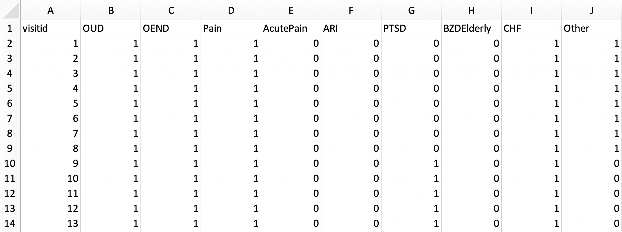
Browse for the file that contains the data on all the academic detailing visits with their campaigns. The data should be saved as a *.CSV file. We will use the pbmads_2.csv file. The data structure should have the each campaign as a binary variable (1 = YES, 0=NO) similar to how you would create a dummy variable.
Make sure to keep the columns separated using the “Comma” separator.
Then, click on “Plot” to see how the UpSet diagram appears in the R Shiny app.
After you click on Plot, you will see the app update and you should be able to view the Setting and Plot areas. The Setting area allows you to configure your plot. You can change the order of the plot and the type of ordering rules (e.g., Frequency and Degree). You can also change the size of the fonts using the Advanced section.
The Frequency order provides the largest number of visits in descending order.
The Degree order provides the campaigns with the most complex interactions or combinations in ascending order.
Based on these figures, you can easily discern the complexity of interactions academic detailing visits include into a single educational outreach. The most complex interaction are the visits that include the Opioid Use Disorder (OUD), Opioid Overdose Education and Naloxone Distribution (OEND), posttraumatic stress disorder (PTSD), Pain, and Other campaign topics (N=3). The individual solo campaign with the most visits is the OUD (alone) campaign with 175 visits.
CONCLUSIONS
UpSet diagrams make it easy to categorize the academic detailing visits into different combination categories. We can apply this method to other program monitoring metrics such the differences in these visit combinations across time and the number of attendees. Other additional areas where UpSet diagrams are useful include complex genetic markers. Try and think of ways where you can use this method to simplify complex Venn diagrams or complex interactions across different groups.
Since the UpSet R Shiny app has limited functionality, you can explore other features using R or Python to generate more complex UpSet diagrams. The UpSetR package is available for the R environment. The UpSetPlot package is available for Python.
You can access the GitHub site for UpSet diagrams here.
I encourage you to read the papers on UpSet diagrams by Conway and colleagues and Lex and colleagues: Paper 1 and Paper 2.
YouTube video on UpSet diagrams.
REFERENCES
1. Conway JR, Lex A, Gehlenborg N. UpSetR: an R package for the visualization of intersecting sets and their properties. Bioinforma Oxf Engl. 2017;33(18):2938-2940. doi:10.1093/bioinformatics/btx364
2. Lex A, Gehlenborg N, Strobelt H, Vuillemot R, Pfister H. UpSet: Visualization of Intersecting Sets. IEEE Trans Vis Comput Graph. 2014;20(12):1983-1992. doi:10.1109/TVCG.2014.2346248
3. Avorn J, Soumerai SB. Improving drug-therapy decisions through educational outreach. A randomized controlled trial of academically based “detailing.” N Engl J Med. 1983;308(24):1457-1463. doi:10.1056/NEJM198306163082406
4.Avorn J. Academic Detailing: “Marketing” the Best Evidence to Clinicians. JAMA. 2017;317(4):361-362. doi:10.1001/jama.2016.16036