INTRODUCTION
John Wilder Tukey (1915 to 2000) was a mathematician, statistician, and data visualization pioneer. He has been attributed with coining computer science terms such as “bit” (shortened version of binary digit) and “software.” However, Tukey is best remembered for his contributions to data visualizations.
Tukey developed the foundations for exploratory data analysis (EDA) which has taken root as a critical first step to understanding complexities of observations. According to Tukey, EDA was about hypothesis generation. Unlike confirmatory analysis, EDA uses data to identify potential hypothesis to explain observed phenomena and assist with selection of appropriate statistical tests. According to Tukey, data visualization plays an important role in EDA. Visualizing the data using his methods allows analysts to better understand the data. Tukey was responsible for developing innovative data visualizations including a new count tally system, stem-and-leaf displays, and box-and-whisker plot. This article will highlight several of Tukey’s innovative data visualizations that continue to be used in today’s data analysis world.
Source: https://alchetron.com/John-Tukey
“The greatest value of a picture is when it forces us to notice what we never expected to see.”
John W. Tukey
Exploratory Data Analysis (1977)
Count tally
Conventional counting tally uses the vertical “stroke” method where you have a single pencil stroke to denote a single count. On the fifth count, a diagonal line is sketched across the four vertical strokes. This can cause miscounts due to the difficulty of interpreting the strokes. Here are some errors that Tukey highlights from his textbook, Exploratory Data Analysis:
Source: Tukey JW. Exploratory Data Analysis. Pearson; 1st edition (January 1, 1977)
Tukey developed an innovative counting tally method that was more efficient than convention methods by using dots and lines to indicate counts. This method is considered easier to interpret without any miscounts, especially when the counting is performed quickly.
Stem-and-leaf display
Although histograms allow us to see whether our data are normally distributed, they do not provide much information. Tukey developed an innovative method to capture additional elements while visualizing the data’s distribution. This visualization is known as the stem-and-leaf display which provides data analysts both with descriptive information and the data distribution. He believed that the histogram left out critical information that the would be informative to the analyst. By using the stem-and-lead display, a data analyst can observe the raw values of the data and quickly identify the mode and outliers. The following is a figure taken from Tukey’s 1977 text Exploratory Data Analysis. The figure represents two different stem-and-leaf plots that display the same data. The “#” represents the frequency in each bin, which are ordered by the first number character of the value. For example, the value 16 is represented as 1 | 6.
Source: Tukey JW. Exploratory Data Analysis. Pearson; 1st edition (January 1, 1977)
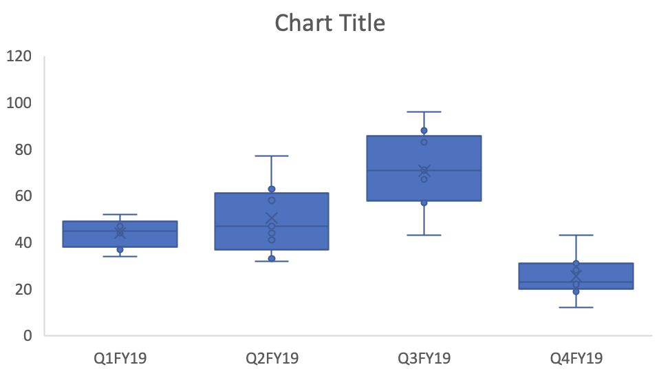
Box-and-whisker plots
Tukey discussed improving the box-and-whisker plot (also known as the box plot) by having the whisker length to be standardized at 1.5 times the interquartile range (IQR). This would allow analysts to identify the outliers that exceed this whisker length. In one example from his textbook, Tukey highlights the benefits of the box-and-whisker plot by measuring the elevations of states and volcanoes. The reader can easily identify the outliers as they are labeled (by Tukey’s hand) on the plots.
CONCLUSIONS
Tukey made significant contributions to mathematics, computer science, statistics, and data analysis. But his pursuit for efficient methods to display data has led to innovative methods of data visualizations that we continue to use. Data visualization, according to Tukey, was and important part of analysis from which we could generate hypothesis and select the appropriate inferential tests. He saw the world in a different way, which has helped us shed a little illumination on the mysteries of the world.
REFERENCE
1. Tukey JW. Exploratory Data Analysis. Pearson; 1st edition (January 1, 1977).