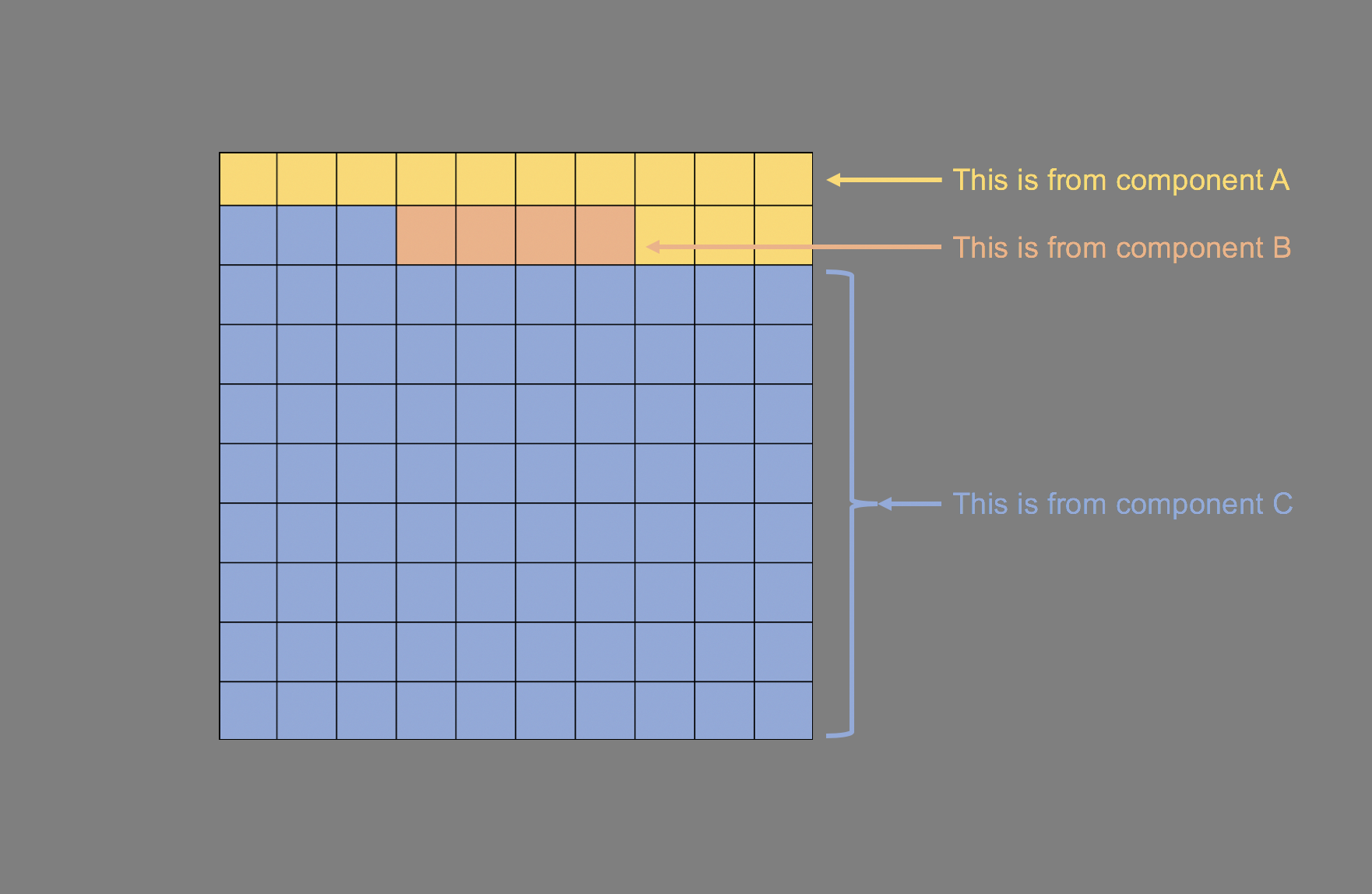
Based on the waffle charts, we can see that Investments (spending for noncommercial biomedical research and expenditures by health care establishments on structures and equipment) has decreased over time. Conversely, expenditures for Personal Health Care, Administration, and Health Activities have increased.
CONCLUSIONS
Using waffle charts is a better alternative to pie charts because we can discern the exact value of the parts that make up the whole. In this case, we can easily visualize the decrease in Investments when it comes to health expenditure spending in the US for each decade between 1965 to 2015.
You can re-create these findings using the Excel file located here.
REFERENCES
I used the following references to assist with the development of this article. They have been incredibly helpful in learning the methods and better understanding how to leverage the power of using waffle charts.
[1] Tufte ER. The Visual Display of Quantitative Information. 2001. Graphic Press. Cheshire. CT.
Everyday Office’s YouTube video
https://www.youtube.com/watch?v=HZe5SzgxlsQ
Michael Sandberg’s Data Visualization Blog
https://datavizblog.com/2014/09/09/dataviz-squaring-the-pie-chart-waffle-chart/
Robert Kosara’s Eagereyes Blog
https://eagereyes.org/techniques/pie-charts
Sumit Bansal’s Trump Excel: The Smart Way Blog
https://trumpexcel.com/waffle-chart-excel/
Jonathan Schwabish’s PolicyViz Blog provides another method to creating waffle charts using data validation
https://policyviz.com/2018/04/26/interactive-waffle-charts-in-excel/