Communicating data effectively with data visualization – Part 2 (Distortions, Scales, and Volume)

Introduction

It is tempting to “enhance” our data visuals in order to “spice-up” the narrative. Changing perspective, scale, and using unreasonable comparisons can “trick” the mind into thinking that an effect is real when it isn’t. Of course, a reasonable amount of creativity is needed in the narrative, it is important to consider what your best options are. According to Edward Tufte, the pioneer of data visualization, number (values) should be directly proportion to the numerical quantities represented. The graphic should not inflate the actual magnitude of that change. Moreover, Tufte also stated that our data visualization should avoid graphical distortions and ambiguity. Data should be shown in context and properly labelled to avoid ambiguity. Most importantly, we should avoid using “chart junk.”  

Goals

In this blog, we will use data from the Washington State Department of Health Adverse Event Report from 2016 to illustrate concepts of visual distortions, scales, and volume in designing your data visualization.

Motivating example

The Washington State Department of Health provides quarterly reports of serious adverse events that occur across 94 Acute Care Hospitals, 186 Ambulatory Surgical Facilities, 18 Child Birthing Centers, 8 Department of Corrections Medical Facilities, and 7 Psychiatric Hospitals. Figure 1 is a 3-dimensional bar chart of the frequency of serious adverse events that occurred in 2016.

Figure 1. Number of adverse events in Washington State (2016).

Figure 1.png

Excel generates this bar chart by default (we included the y-label title and chart title). There are two pieces of data used to make this bar chart: frequency and type of adverse events. However, this bar chart actually is illustrated in three dimensions. The lack of a third element makes 3-dimensional charts inappropriate. In fact, it doesn’t make sense to have this extra dimension to the bar chart. Figure 2 illustrates this principle. In the first two dimensions, you have data (frequency and type of adverse events) but the third dimension lacks any meaningful data. This is ambiguous and distorts the true meaning of the bar chart. Therefore, it is recommended that the third dimension is removed in favor of a 2-dimensional bar chart.  

Figure 2. Multiple dimensions of data visualization with a bar chart.

Figure 2.png

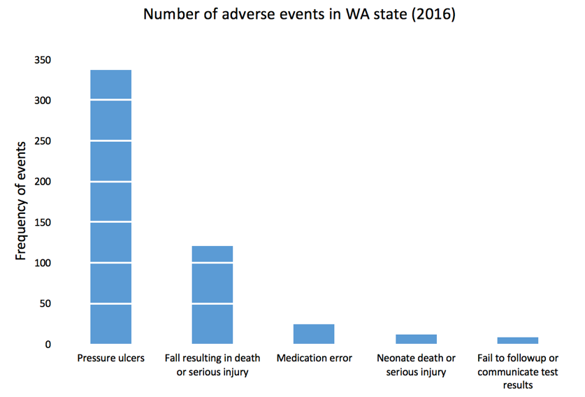
Figure 3 removes the unnecessary dimension and presents the frequency of adverse events without any ambiguity. We also remove the gridlines because they are considered a waste of ink that doesn’t provide more information about the data visualization (data-ink ratio).

Figure 3. Bar chart on the number of adverse events in WA state in 2016.

Figure 3.png

Figure 4 rearranges the types of adverse events in descending order. Ordering the types of serious adverse events in either ascending or descending order helps to see which categories have the most or least amount of adverse effects. Since there is no order in the categories (nominal categorical data), it’s reasonable to order them based by the frequency of events.

Figure 4. Bar chart with the types of adverse events in descending order.

Figure 4.png

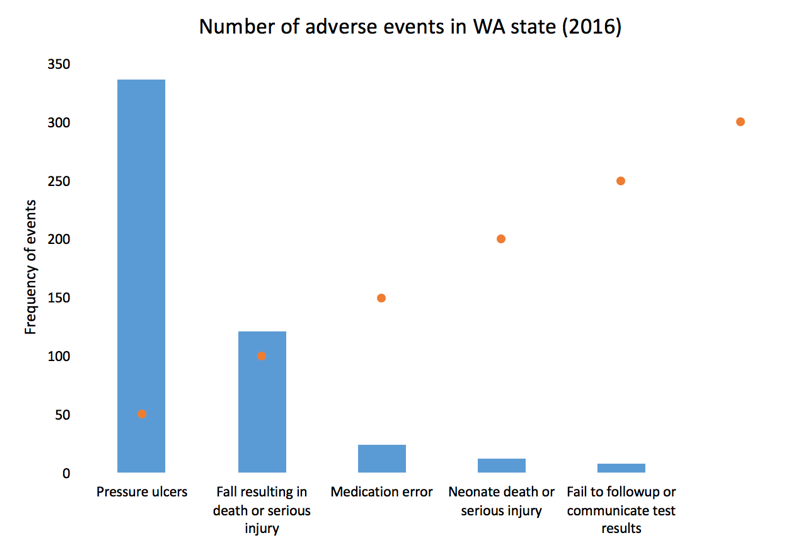
We can add gridlines to the bar chart to better enhance our ability to detect differences in the frequency of adverse events. Figure 5 illustrates the results after gridlines are added to separate counts of the bar chart into intervals of 50, which is easier to synthesize visually.  We also reduced the y-axis maximum limit from 400 to 350 to remove the empty space and increase our data-ink ratio.

Figure 5. Bar chart with gridlines.

Figure 5.png

Gridlines that overlay in front of the bar charts is not a feature in Excel. All gridlines are in the background (default), which do not achieve the effect in Figure 5. If you turn the gridlines on, you’ll see something similar to Figure 6 where the gridlines are in the background and do not overlay the bars in the chart. To achieve the look in Figure 5, you need to make a few additional modifications to the data and chart.

Figure 6. Bar chart with gridlines turned on.

Figure 6.png

Here is the setup for our data to include gridlines in front of the bar chart. We used a “5.5” for our x-axis because there are five types of adverse effects and we reserved the next x-axis bin as the location of our scatter plot values. You can always modify this based on the number of categories in the x-axis. Additionally, we chose to use a 50-count interval. 

Figure 7.png

After selecting the data, Excel will automatically incorporate these data into the current bar chart.

Figure 8.png

Right-click on the orange bars and change the chart type to scatter plot XY.

Figure 9.png

The scatter plot values will plot a point on each x-axis value.

Figure 10.png

Next, right-click on the plot area and click “Select data...” You may need to change the Series 2 data X-axis values to 5.5 by selecting the columns in your data. This is because Excel automatically plots the scatter plot using the x-values from Series1, which contains the data for the frequency of adverse events (not shown). 

Figure 11.png

When you click the box on the right, you will be prompted to select the data array. Select the left column of the data set and click “Ok.”

Figure 12.png

You bar chart should look like the following.

Figure 13.png

Left click on the dots for the scatter plot and the “More Error Bars Options.”

Figure 14.png

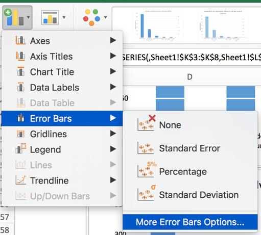
Make sure you are working on the horizontal error bars and select “Minus” for the Directions, “No Cap” for the End Style, and “Custom” for the Error Amount.

Figure 15.png

Specify a value for the “Negative Error Value” as 5. Then click “Ok.” Your plot should look like the following.

Figure 16.png

Now, you can change the width of the error bars, change the color of the error bars to white, and hide the scatter plot dots to get the chart in Figure 5. We used a navy blue color for the bars and a width of 1.5 for the error bars and increased by width by 15%.

After making additional changes to the font and color, our final bar chart can impress while yielding very useful information about the number of adverse events in WA state in 2016. You can easily discriminate the most common type of adverse events and quickly eyeball by how much. 

Figure 17.png

Conclusion

In this blog, we explained the rationale for not using dimensional bar charts with 2-dimensional data. We also provided instructions on how to create bar charts with gridlines that are informative and in front of the bars. In the next blog, we will discuss distortion and how it can generate ambiguity and confusion when not properly scaled.


References

Credit for creating the gridlines in front of the bars goes to Jon Peltier who wrote a tutorial on gridlines (https://peltiertech.com/column-chart-gridlines-cutting-through-bars/).

1.     Tufte ER. (2001) The Visual Display of Quantitative Information. Second Edition. Cheshire, CT. Graphics Press, LLC.

Communicating data effectively with data visualizations - Part 1 (Principles of Data Viz)

Introduction

Data visualization is a form of visual communication that takes quantitative information and displays it as a graphic, an abstraction of the real world. Effective data communication makes complex statistical analysis accessible without excessive mental burden. It is also used to identify patterns through data exploration. Unlike information visualization which includes catch-phrases such as “Infoviz” and “Infographics,” data visualization is intuitive, informative, and “pretty” while simultaneously focused on scientifically structured comparisons, analytic precision, and statistical inference. The challenge is compressing all the quantitative information into a single chart or graphic that provides a narrative or purpose that can be synthesized and acted on with very little mental effort.

There are a variety of data visualizations that can be used such as choropleths, heatmaps, scatter plots, and dot plots (this list is not all inclusive). The selection is dependent on the data, audience, and narrative. How complex is the analysis? Who are you presenting this information to? Why should the audience care?

The best way to present data effectively is with a good story. Your graphic should be able to tell a story based on the quantitative information. Every graphic you create should be a self-contained narrative of the data. This can be achieved using simple tools, but the creation of effective data visualization depends more on your ability to tell a good story. The purpose of this article is to highlight some important principles of data visualization, review common data visualizations, and develop a mechanism to select the most effective data visualization.

Principles of data visualization

Data visualization can be traced to several different schools of thought (e.g., Edward Tufte and William S. Cleveland), but the fundamental principles are similar and often overlap. Edward Tufte identified several key principles when developing data visualizations (Table 1).

Table 1. Tufte's principles for graphical integrity. *

Principle**

Description

Avoid chart junk

Inventive displays seldom generate interest. Rather, they generate visual noise.


Data-ink ratio

Use ink to show the data. Ink that does not contribute to the reporting of the data should be removed.


Numbers should be directly proportional to the numerical quantities represented

The "Lie Factor" is a proportion of the Size of the effect shown in the graphing / Size of the effect in the data. The graphic should not inflate the actual magnitude of the change.


Use small multiples and repeat

High quality information graphic portrays many numbers per square inch. Small multiple, comparative images work especially well for this. Examples include sparklines.


Avoid graphical distortions and ambiguity

Avoid distortions of numbers by graphic devices. Show data variation in context, and label them. Write out explanation of the data on the graphic itself. Properly label events in the data.


Multifunction

Information layers and architecture emerge best when data display elements serve multiple functions. Different readings at different levels of detail (micro-macro) serve this goal well. For example, the y-axis can be used to provide scale while calling out to important values by either coloring that value differently or enlarging it.


Show data variation, not design variation

Use scales that are similar and do not generate ambiguity. Be consistent in the data when displaying them as a graphic.


In time-series displays of money, deflated and standardized units of monetary measurement are nearly always better than nominal units

Properly adjust current due to inflation or population growth. We want to the currency in real purchasing power (value) rather than nominal purchasing power.


The number of information-carrying (variable) dimensions depicted should not exceed the number of dimensions in the data

Using graphics to show the proportional change of a metric can bias our perception due to the number of dimensions that are changing. If we look at a single metric such as budget, then we are only looking at a one-dimensional scale, meaning that when the budget increase, it only changes in one dimension. However, it is easy to use a display such as a 2-dimensional picture and scale it up according to the one-dimensional scale. For example, if we have a 2-dimensional graphic and we scale it according to an increase on a one-dimensional metric, the actual proportional increase in 4 times (2^2 = 4). If this was a 3-dimensional object, then the proportional increase in 8 (2^3 = 8).


Graphics must not quote data out of context

An accurate picture must report the totality of the effect. Showing only one piece of the data with graphics is just as bad as the data. Context is critical. In time-series analysis, it is imperative that the researcher provides an illustration of the overall trend including any changes in seasonality. Therefore, apply rational judgement when presenting data visualization. The use of comparison groups helps to answer any secular impacts that may not be captured when looking at data at a single point in time.


* From Tufte ER. (2001) The Visual Display of Quantitative Information. Second Edition. Cheshire, CT. Graphics Press, LLC.

** This table provides fundamental principles on graphical integrity and data graphics and is not all inclusive.

Figure 1. Box plots of MLB wins in the 2017 season. [click to enlarge]

Dot plots are simple graphics that use points (filled in circles) instead of line or bars on a simple scale. They convey the same information as bar charts, but use less ink to do so. The advantage they provide is that they reduce the junk of the bar charts which contain useless space that are uninformative. In Figure 2a, the dot plot provides the same information from the previous bar charts; however, there is a better sense of scale with the removal of the clutter introduced by the bar charts. Like the bar charts, use pastel colors to dampen the effect of the teams that are not the focus of the chart and use solid colors to bring out the teams with the most and least wins (Figure 2b). The minor grid lines do not provide any information about the data and should be removed (Figure 2c). Finally, Figure 2d takes the dot plots and use data values to provide the audience with the actual number of wins. This is also reinforced by the pastel and solid colors, which provide good contrast between the teams that have the most and least wins.

Figure 2. Dot plots of MLB wins in the 2017 season. [click to enlarge]

Line plots are graphics that use lines to illustrate a trend. A line plot would not be appropriate for the baseball wins example because the x-axis does not have any continuous scale, which is needed for line plots. Table 2 provides data on MLB players’ batting averages from 2013 to 2017. The table provides us with information across five years, but the order and rankings are difficult to determine.

Table 2. Batting averages of Major League Baseball players (2013-2017).

Players

2013

2014

2015

2016

2017

Yasiel Puig

0.319

0.296

0.255

0.263

0.260

Justin Turner

0.280

0.340

0.294

0.275

0.332

Michael Trout

0.323

0.287

0.299

0.315

0.329

Ichiro Suzuki

0.262

0.284

0.229

0.291

0.250

The table doesn’t do a good job illustrating the trends over time. Instead, it is a good reference that is searchable. When it comes to visually telling a story, the table doesn’t do a good job. Converting this table to several line plots can help illustrate the changes in each players’ batting averages over time. Figure 3a trends each player’s batting averages, but the clutter makes it difficult to identify any important patterns. For graphics that use a time interval (or continuous interval) on the x-axis, it is useful to truncate the y-axis to see any incremental changes in the trend.

Figure 3b truncates the batting average from 0 to 0.360 to 0.200 to 0.360. Now the changes in batting average is more discernable from this truncated y-axis. It’s clear that Yasiel Puig’s batting average declined from 2013, but Justin Turner’s batting average improved. However, this still feels cluttered. The different lines and colors make it hard tell that Justin Turner was improving. In fact, it seems like all the players except for Yasiel Puig were improving. To make sense of the clutter, let’s assume that we were interested in the player who had the most improvement from 2013. Calculating the percent change between 2013 and 2017 and then putting it on the graphic provides us with some metric to distinguish Justin Turner from the rest of the other players.

Figure 3c adds the percent change in batting averages from 2013 to 2017 with the player’s name. The legend was removed because it didn’t contribute much to the graphic once the names were adjacent to each line. Despite these modifications, it’s not easy to distinguish the improvement in batting averages for Justin Turner. There are too many competing colors, which distract the focus from Justin Turner’s improvement.

Figure 3d dampens the non-critical lines using a single pastel color and matching the to the trend lines, which highlights Justin Turner’s trend line, the only one with color. This technique draws your attention to Justin Turner’s trend while providing details about the change in trend and the player associated with that change.

Figure 3. Line plots of MLB players’ batting averages (2013-2017). [click to enlarge]

Summary

So far, basic principles and examples of data visualization were presented in this article, which is part of an on-going series on data visualization. Since this is a primer on data visualizations, you should review existing graphics and try to apply some of these principles. Web-based data visualizations are prevalent and can be found in places such as the R-Shiny gallery and Tableau gallery. As you start to explore different data visualizations, you’ll discover many creative and useful tools. Next issue, we’ll discuss other data visualization graphics that will reflect the Tufte’s principles for graphical integrity and excellence.

References

Tufte ER. (2001) The Visual Display of Quantitative Information. Second Edition. Cheshire, CT. Graphics Press, LLC.

Knaflic CN. (2015) Storytelling with Data: A Data Visualization Guide for Business Professionals. Hoboken, New York. John Wiley & Sons, Inc.

Veterans Health Administration reduces opioid use with Academic Detailing

Recently, there have been several articles and blogs that highlight the success of the U.S. Department of Veterans Affairs (VA) Veterans Health Administration (VHA) in addressing the rising opioid epidemic, especially among veterans. Lin and colleagues reported that the VHA's Opioid Safety Initiative (OSI) was associated with a 16.1% reduction in high-dose opioid use [defined as 100 morphine equivalence (MEQ) or greater] twelve months after implementation in October 2013. Moreover, the dangerous combination of an opioid prescribed with a benzodiazepine was reduced by 20.7% across a similar time period. 

These results were, in part, affected by academic detailing, which provides one-on-one, unbiased educational outreach to providers in order to align their prescribing behaviors with the most current evidence-based practice. The former Interim Under Secretary of Health mandated that the VHA implement the National Academic Detailing Service (ADS) to address veterans' mental health and pain management by 2015. Since then, the ADS has been associated with reductions in high-dose opioid use and average MEQ over time. I recently presented some of these findings at the VA's HSR&D/QUERI meeting in Washington, DC on July 18-20, 2017. There was a greater reduction in high-dose opioid users in providers who received academic detailing compared to providers who did not receive academic detailing (58% versus 34%, respectively). Similarly, there was a greater reduction in the average MEQ per patient among providers who received academic detailing compared to those who did not (59% versus 31%, respectively). 

In the news, the HealthAffairs.org blog reported that "the VA health care system has implemented a comprehensive “Opioid Safety Initiative,” which uses provider-level ongoing feedback for high-risk opioid prescribing, academic detailing to improve use of opioids, a robust naloxone distribution program for at-risk veterans, and residential treatment programs for substance abuse." Similarly, watchdog.org reported that Matthew Gowan, a VA spokesman, stated that the OSI and ADS have been crucial in the reduction of opioid use in Tomah VA Medical Center since their implementation. 

Williams, Nunes, and Olfson argued that a "Cascade of Care" model is needed to address the opioid epidemic in the U.S. They stated that academic detailing along with motivational interviewing and family engagement are needed in order to assist providers to bridge any knowledge gaps and stigma associated with safe and proper opioid prescribing. In addition, Politico.com wrote that academic detailing provides providers with critical updates on pain management and opioid prescribing. 

Finally, an article by Carla K. Johnson of the Associated Press provided a "boots on the ground" perspective of academic detailing from the eyes of an academic detailer in Pennsylvania. In it, she follows Melissa Jones, an academic detailer, and wrote that "Evidence from New York City’s public health department and the Veterans Health Administration suggests Jones and others like her can reduce opioid prescribing, adapting a tried-and-true tactic from the pharmaceutical industry called detailing." In short, academic detailing has an important part to play in the overall mission to address the opioid epidemic. 

Despite these improvements in the VA's mission to reduce harmful opioid prescribing, it is uncertain whether reducing opioids will lead to a substitution effect or worse. Future studies will need to investigate any potential negative (and positive) consequences of these campaigns. 

Illustrating Value, Prioritizing Evaluation, Saving Lives

I recently co-authored an article with Melissa LD Christopher that is now posted on the National Resource Center for Academic Detailing (NaRCAD). Although the goal was to highlight the importance of performing program evaluations, the article also reports some of our findings with the Veterans Health Administration National Academic Detailing Service's impact on naloxone distribution.

In a retrospective, repeated measures cohort study, we reported that providers who were exposed to academic detailing had a greater rate of naloxone distribution compared to providers who were unexposed to academic detailing. This difference-in-differences estimation was significant at the alpha level of 0.05. The remarkable feature of our report is that academic detailing had a significant association with naloxone distribution. However, due to selection bias, which was not taken into account in our preliminary analysis, these findings may be limited.

In order to address selection bias, I will use a regression discontinuity design, which can mitigate selection bias and yield a causal interpretation. An important element of regression discontinuity design is the selection of a running (treatment assignment) variable. If the running variable has a distinct discontinuity for treatment assignment at a certain cut-off, it is considered a "sharp" regression discontinuity. However, if the probability of treatment assignment is not distinct, then it is considered a "fuzzy" regression discontinuity.

Empirical Bayes estimates

Recently, my classmate asked me how to perform empirical Bayesian shrinkage, a form of estimation that tries to adjust your sample mean to the grand mean by incorporating more variables. I haven't done this as part of my regular work so I had to review my past class notes.

I forgot how useful empirical Bayes estimates were and wanted to document what I discovered. In my research, I discovered an informative guide by David Robinson who used baseball statistics as a motivating example to explain empirical Bayesian shrinkage on his blog.

In addition, Nicolas Lartillot wrote a great summary of empirical Bayes estimation and Stein's paradox on his blog.