Statistics & Probability

Survival analysis in R

I wrote a tutorial on survival analysis using R, which is located on my RPubs page. The R Markdown code is located on my GitHub site.

I provide an introduction to survivor and hazard functions, Kaplan-Meier curves, and Cox proportional hazards model.

R tutorials on confounding/interaction and linear regression model - Updates

Last year, I created several tutorials on how to use R for identifying confounding/interaction and visualizing linear regression models. I updated these tutorials recently to address some errors and mistakes. They have received new hyperlinks:

R tutorial on confounding and interactions using the epitool and epiR packages is located on my RPubs page here. The R Markdown code is located on my GitHub page here.

R tutorial on linear regression model is located on my RPubs page here. The R Markdown code is located on my GitHub page here.

Sample size estimation and Power analysis in R

I wrote a tutorial on how to perform sample size estimations and power analysis using R “pwr” package. These are simple examples that will hopefully lead to more complicated estimations. The tutorial is available on RPubs (link). The R Markdown code is available on my Github site (link).

Logistic regression in R - Part 2 (Goodness of fit tests)

In a previous tutorial, I discussed how to perform logistic regression using R. I wrote a follow-up tutorial on how to conduct goodness of fit tests for logistic regression models in R and posted it on RPubs. The R Markdown code is available on my Github site.

I’ve learned how to assess model fit using Pearson correlations, deviance, and modified Hosmer-Lemeshow Goodness Of Fit (GOF) tests. I think these are important tools when assessing the fit of a logistic regression model. However, I wanted to focus on the HL GOF tests for this tutorial because there are a lot of nuances that I learned and wanted to share.

Additionally, I added the usefulness of visualizing whether the model over- or under-predicts the actual observed data using the calibration plot in R.

Logistic regression in R

I wrote a tutorial on how to construct logistic regression models in R. This tutorial was published on RPubs (link). I go through the use of the glm() command to perform a crude logistic regression model and a multivariable logistic regression model. The data (diabetes.csv) that I used for the motivating example is located here.

The RMarkdown code I used to create the tutorial is located on my GitHub site (link).

Visualizing linear regression models using R - Part 1

I wrote a tutorial on how to visualize linear regression models using R. In the tutorial I used the lm() command and the predict3d package to generate the models and visualize them using R. You can view the RPubs tutorial here. (NOTE: on 30 January 2022, I updated this tutorial and it can be found in my RPubs page here.) I created this tutorial using R Markdown, and the codes are available on my GitHub site (link).

Communicating data effectively with data visualizations—Part 18 (Histograms)

BACKGROUND

Inspecting your data is an important part of data analysis preparation. Data, like all things, should behave according to some reasonable expectation. For example, if we randomly sampled a group of people in the U.S., we would reasonably expect to get 50% males and 50% females. Similarly, if we examined the age distribution of this sample, we would expect to have a normal distribution.

At the macro level, we may only be interested if the mean and standard deviations are representative of the population distribution. Since we sample from the population (randomly), we would expect to get similar means (and medians). This can be accomplished using simple Excel functions (or commands in statistical packages) to generate a descriptive summary. Table 1 describes the summary statistics for the total fat consumed by a sample of 8,327 responders to the National Health and Nutrition Examination Survey (NHANES) survey.

TABLE 1.png

We can see that the mean and the median are different, which is an indicator that the distribution is not normal. However, we may be interested in learning more about the distribution or behavior of this variable. Are there any outliers? How skewed is the distribution?

HISTOGRAMS

To visualize this, we will need to generate a histogram. A histogram is a visual representation (bars) of the distribution of data (usually continuous). It uses spacings called “bins” to count the number of times a value falls into that bin. A histogram looks like a bar chart, but the key difference is that in the histogram the adjacent bars are touching each other rather than having a space between them. Another difference is that histograms plot the frequency (or density) of a value or a range of values for a continuous data type; whereas, bar charts plot the count of a discrete data type (Figure 1).

Figure 1. Comparisons between histogram and bar chart.

Keep in mind that the number of bins for histograms should be just enough to make out the distribution and not too small to be too much information. This is Grice’s maxim of quantity where data are presented in an informative manner without overwhelming the audience with too much information.[1] Creating smaller bins to increase the resolution of the histogram is unnecessary when all you want is a general visualization of the data’s distribution.


MOTIVATING EXAMPLE

We will use data from the NHANES survey (2015-2016) to generate a histogram in Excel. The data can be downloaded from my Dropbox folder here. I cleaned the file so that all missing data were dropped. In total, there are three variables:

·      seqn = subject identifier

·      drqsdiet = special diet (Yes/No/Don’t know)

·      dr1ttfat = amount of total fat (gm) consumed

We will create a histogram to visualize the distribution of total fat consumed by the subjects. To start, let’s select the data and insert a histogram chart from the Insert Tab.

A histogram will be inserted near where your data are located on the worksheet. Excel automatically selects the bin sizes for you. But you can customize this to your needs.

Figure 3 -histogram.png

Right click anywhere x-axis and select Format Axis. You should see a column on the right side appear with options to modify the bin sizes.

You can modify the bin width, number of bins, the overflow bin, and underflow bin.

The bin width can be larger or smaller depending on how much resolution you want. You should balance this out with the appropriate number of bins you want to show. According Grice’s maxim of quantity, you don’t want to overwhelm your audience. In Excel, you can only modify either the bin width or the number of bins; never both.

The overflow bin indicates what the last bin should be. If anything is over the overflow bin value (X), then Excel will collapse those frequencies into that last bin. For example, if I wanted the overflow bin to be 137 grams or greater, I enter “137” into the overflow bin field. You can do the same thing on the other end of the x-axis with the underflow bin value.

Once you’ve figure out how to change the number of bins, let’s change the number of bins from 66 to 100, 75, 50, and 25 to observe how the histogram changes.

Notice that the histogram with a bin size of 100 is really fine whereas the bin size of 25 is blocky. We can tell from all of these figures that there is a right skew to the distribution due to a few outliers. There are 3 subjects who consume more than 400 grams of total fat compared to 19 subjects who consume between 300 and 399 grams of total fat. The higher resolution doesn’t really help us determine that the total fat consumption is right skewed compared to the figures with bin sizes of 75 and 50. If I were presenting to an audience or publishing an appendix, I would select either the figure with a bin size of 75 or 50. These two histograms illustrate the peak at the mean and the right-skewed distribution without violating Grice’s maxim of quantity. However, different situations will require you to make different choices, so I encourage you to explore the design features on Excels’ histogram.

STEM-AND-LEAF HISTOGRAM

The stem-and-leaf display is an alternative histogram that uses the prefix of number to assign positions into the bins. The following figure is a randomly selected number of subjects from our NHANES data. The first subject consumed 14 grams of total fat which is indicated by the 1* | 4. The 1* represents the first digit of “14” and the “|” separates the next digit. Similarly, there is one subject who consumed 22 grams of total fat indicated by the 2* | 2 and another subject consumed 24 grams of total fat (2* | 4).

 
Figure 7 - stem-and-leaf.png
 

CONCLUSIONS

Histograms are a great visualization tool to quickly check whether your continuous data are normally distributed. You can identify whether the mean is close to the median or whether there are left or right skewness to your data. Moreover, you can change the bin sizes of a histogram to become more refined or less so. But according to Grice’s maxim of quantity, it is best to present enough data that will get the information across to your audience without overwhelming them with unnecessary details.


REFERENCES

Grice, H. P. Logic and Conversation.  In Cole P. and Morgan J. (Eds), Syntax and Semantics: Vol 3, Speech Acts. Academic Press, New York, pp.43-58, 1975.

Cobb-Douglas production function and costs minimization problem

Update 2: This article was updated on 12 August 2023 when Dimanjan Dahal (Twitter account) identified a better way to present the Lagrangian functions. I updated this to better reflect the minimization problem and set the partial derivative solution to 0. Thank you, Dimanhan.

Update 1: This article was updated on 11 October 2021 when an anonymous reader identified an error with the example used at the end. The error was the negative value generated for the output elasticity of capital. In the previous example, I used R to generate a set of random numbers that were used in a regression model. The beta coefficient generated a negative value which was used in the linear form of the Cobb-Douglass equation. Since the output of elasticity should be between the values of 0 and 1, this negative coefficient should not be possible. Hence, I’ve updated the data frame used in the example to avoid this issue. Appreciation goes out to the anonymous reader who identified this error.

INTRODUCTION

The Cobb-Douglas (CD) production function is an economic production function with two or more variables (inputs) that describes the output of a firm. Typical inputs include labor (L) and capital (K). It is similarly used to describe utility maximization through the following function [U(x)]. However, in this example, we will learn how to answer a minimization problem subject to (s.t.) the CD production function as a constraint.

The functional form of the CD production function:

 
Figure1.png
 

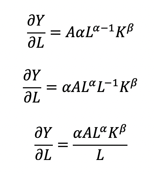
where the output Y is a function of labor (L) and capital (K), A is the total factor productivity and is otherwise a constant, L denotes labor, K denotes capital, alpha represents the output elasticity of labor, beta represents the output elasticity of capital, and (alpha + beta = 1) represents the constant returns to scale (CRS). The partial derivative of the CD function with respect to (w.r.t) labor (L) is:

 
Figure2.png
 

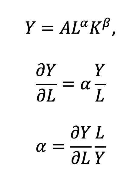
Recall that quantity produced is based on the labor and capital; therefore, we can solve for alpha:

 
Figure3.png
 

This will yield the marginal product of labor (L). If alpha = 2, then a 10% increase in labor (L) will result in a 20% increase in output (Y).

The partial derivative of the CD function with respect to (w.r.t) labor (K) is:

 
Figure4.png
 

This will yield the marginal product of capital (K).

The CD production function can be converted to a linear model by taking the logarithm of both sides of the equation:

 
Figure5.png
 

This will allow for OLS regression methods, which is commonly used in economics to understand the association between inputs (L and K) on production (Y).

However, what happens when we are interested in the marginal cost with respect to (w.r.t.) production (Y)? This becomes a constraint (cost) minimization problem where the firm can control how much L and K they will use. In other words, we want to minimize the cost subject to (s.t.) the output

 
Figure6.png
 

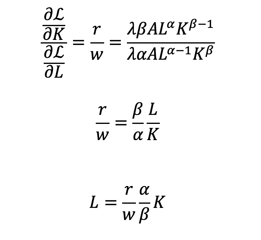
Cost becomes a function of wage (w), the amount of labor (L), price of capital (r), and the amount of capital (K). To determine the optimal amount of inputs (L and K), we solve this minimization constraint using the Lagrange multiplier method:


Solve for L

 
Figure8.png
 

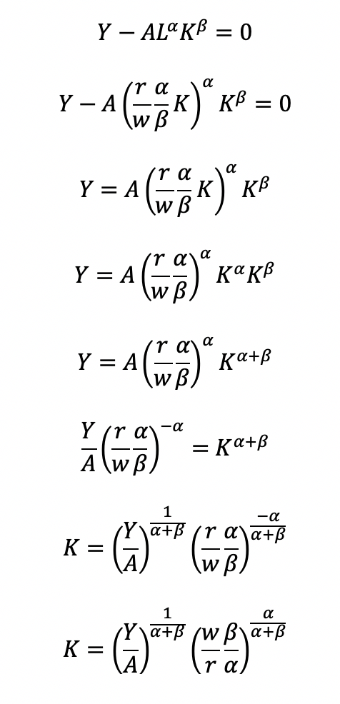
Substitute L in the constraint term (CD production function) in order to solve for K

 
Figure9.png
 

Now, we can completely solve for L (as a function of Y, A, w, and r) by substituting for K

 
Figure10.png
 

Substitute L and K into the cost minimization problem

 
Figure11.png
 

Simplify

 
Figure12.png
 

Final cost function

 
Figure13.png
 

Let’s see how we can use the results from a regression model to give us information about the total costs w.r.t. to the quantity produced.

Recall the linear form of the Cobb-Douglas production function:

 
Figure14.png
 

I simulated some data where we have the capital, labor, and quantity produced in R.

## Use the following libraries: library(jtools) library(broom) library(ggstance) library(broom.mixed) ## Generate random data for the data frame (cddata) set.seed(1234) production <- sample(100:600, 30, replace=TRUE) labor <- sample(50:350, 30, replace=TRUE) capital <- sample(6000:7000, 30, replace=TRUE) ## Cost function parameters: wage and price constants wage <- 35.00 price <- 30.00 ## Set up the data frame (cddata): cddata <- data.frame(production = production, labor = labor, capital = capital, wage = wage, price = price) ## Name rows using some timeline from 1988 to 2017 (30 years for 30 observations for each variable): row.names(cddata) <- 1988:2017

Then I perform a regression model using OLS

## Setting up the model, where log(a) is eliminated due to it being the intercept. cd.lm <- lm(formula = log(production) ~ log(labor) + log(capital), data = cddata) summary(cd.lm) Residuals: Min 1Q Median 3Q Max -0.96586 -0.25176 0.06148 0.37513 0.67433 Coefficients: Estimate Std. Error t value Pr(>|t|) (Intercept) 4.44637 17.41733 0.255 0.800 log(labor) 0.14373 0.23595 0.609 0.548 log(capital) 0.05581 2.00672 0.028 0.978 Residual standard error: 0.5065 on 27 degrees of freedom Multiple R-squared: 0.01414, Adjusted R-squared: -0.05888 F-statistic: 0.1937 on 2 and 27 DF, p-value: 0.8251

After running the model, I stored the coefficients for use later in the production function.

## Store the coefficients
coeff <- coef(cd.lm)

## Assign the values to the production function parameters where Y = AL^(alpha)K^(beta)
intercept <- coeff[1]
alpha <- coeff[2]
beta <- coeff[3]

From the parameters, we can get A (intercept), alpha (log(labor)), and beta (log(capital)).

 
linear form of CD function.jpg
 

This will give us the quantity produced (Y) for given data on labor (L) and capital (K).

We can get the total costs (C) based on the quantity produced (Y) using the cost function:

 
Figure16.png
 

I set up my R code so that I have the intercept, alpha, beta, labor, wage, and price of the capital set up. I estimated each part of the cost function separately and then multiply the parts at the end.

## Cost
PartA <- (production / intercept)^(1 / alpha + beta)
PartB <- wage^(alpha / alpha + beta)
PartC <- price^(beta / alpha + beta)
PartD <- as.complex(alpha / beta )^(beta / alpha + beta) + as.complex(beta/ alpha)^(alpha / alpha + beta)

costs <- PartA * PartB * PartC * PartD
Note: R has a problem with performing complex operations with exponents that were defined using arrays or vectors. If you try to compute something like x^{alpha}, you will get an error where the value is “NaN.” I don’t have a complete understanding of the problem, but the solution is to make sure your root or base term is preceded by “as.complex(x)” to resolve the issue.

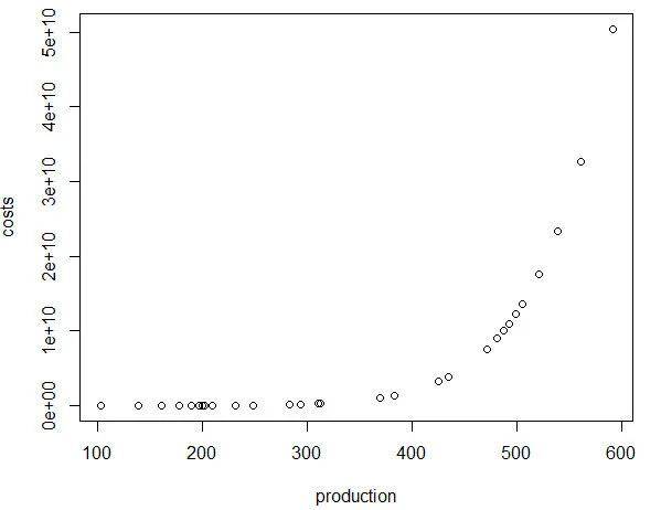
I plot the relationship between quantity produced and cost. In other words, this tells us the lowest costs needed to produce the quantities on the plot.

plot(production, costs)
 
cost production curve.jpg
 

CONCLUSIONS

Using the Cobb-Douglas production function and the cost minimization approach, we were able to find the optimal conditions for the cost function and plot the outcome relative to the quantity produced. As production increases, the minimum cost needed increases in a non-linear, exponential fashion, which makes sense given that Y (quantity produced) is in the numerator on the right-hand side of the cost function and positively related to the cost.

This was a fun exercise that made me think about the usefulness of the Cobb-Douglas production function, which I learned to optimize multiple times in my Economics courses. I was excited to find a pleasant utility for it using simulated data and will probably explore more exercises like this in the future.

REFERENCEs

I used a lot of resources to write this blog, which are provided below.

A site dedicated to the discussion of economics called EconomicsDiscussion.net was a great resource.

These papers were incredibly helpful in preparing the example in R:

  • Lin CP. The application of Cobb-Douglas production cost functions to construction firms in Japan and Taiwan. Review of Pacific Basin Financial Markets and Policies Vol. 5, No. 1 (2002): 111–128.

  • Larriviere JB, Sandler R. A student friendly illustration and project: empirical testing of the Cobb-Douglas production function using major league baseball. Journal of Economics and Economic Education Research, Volume 13, Number 3, 2012: 81-92

  • Hu, ZH. Reliable Optimal Production Control with Cobb-Douglas Model. Reliable Computing. 1998; 4(1): 63-69.

I encountered some issues regarding complex numbers in R. Fortunately, I found some great resources about it.

  • I found a great discussion about R’s calculation of exponents and “NaN” results and why complex numbers can mess up your math in R.

  • Another good site (R Tutorial: An Introduction to Statistics) explaining complex numbers in R.

  • John Myles White wrote a nice article about complex numbers in R.

Acknowledgements: I would like to thank the user who reached out to me about the coefficient errors for the output elasticity of capital. This helps me to learn my mistakes and correct them. Without the support and guidance from the community, I would not achieve my own goals of being a lifelong learner. Thank you.

Is my d20 killing me? – using the chi square test to determine if dice rolls are bias

BACKGROUND

Every Tuesdays, my friends and I enjoy playing role playing games (RPGs), especially table top RPGs such as Dungeons & Dragons (D&D). Every week, we get together and pull out our laptops, character sheets, and review our previous notes to return to the fictional fantasy worlds we created (or were created for us) and do battle, solve mysteries, and tell stories over some ciders (and Le Croix). This ritual is important because it allows us to disconnect from the real world and allow our imaginations to run wild. After every session, we think about the various actions that took place and review how things would have been different if the roll of a dice went a different way.

I first started playing D&D Second Edition when I was a kid after I was exposed to it at a comic book store (Golden Apple Comics in Los Angeles). I still remember the strange colorful dice rolling on a table top mat and people scratching away at paper using stats that I wasn’t familiar with. In high school, my friends and I would play different campaigns from the D&D and Forgotten Realms worlds, creating characters based on rule books using statistics and probabilities. The key ingredient with any adventure is having your fate determined by a single dice roll. The iconic dice in RPG is the d20 or the 20-sided dice. A d20 dice is usually used to determine whether you “hit” your opponent, use your skills to identify if a trap has been set or whether or not you can charm your way out of an unnecessary fight. Often times than not, there is the chance that a critical fail (a d20 roll of 1) can occur. When this happens, you fail to hit your opponent and trip over yourself during combat, miss the trap and activate it killing someone in your party, or pissing off the non-playable character (NPC) and having them attack you. Not only will something go wrong, it will go wrong spectacularly. So, it’s only natural that we look at the d20 that was rolled and ask, “Is my d20 killing me?”

Luckily, there is a statistical test that we can use to answer this common question.


CHI SQUARE TEST

The chi square test is one of the most common statistical tests performed in sciences. In its simplest form, the chi square test is used to detect whether the observed frequencies are different from the expected frequencies across different categories. For example, in a 6-sided dice, the probability that the number 6 will land is 16.7% or 1/6. This is true for every value of the 6-sided dice if it was unbiased.

Figure 1.png

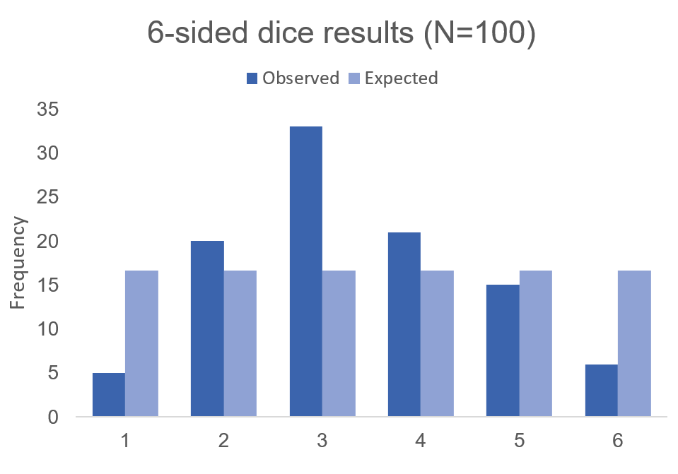
But what if the dice was biased? Suppose we roll the 6-sided dice 100 times and we get the following results:

Figure 2.png

Visually, we can see that there is some bias with this 6-sided dice. We don’t know what the bias is, but there is a something causing this dice to roll a “3” more times than it should (approximately 2 more times than normal). Alternatively, this 6-sided dice is rolling a value of “1” less times than it should (approximately 70% less likely compared to the expected frequency).

Figure 3.png

Using these data, we can perform a chi-squared test.

First, we use  the following formula:

 
Chi square.png
 

where O is the observed frequency for position i and E is the expected frequency for position i.

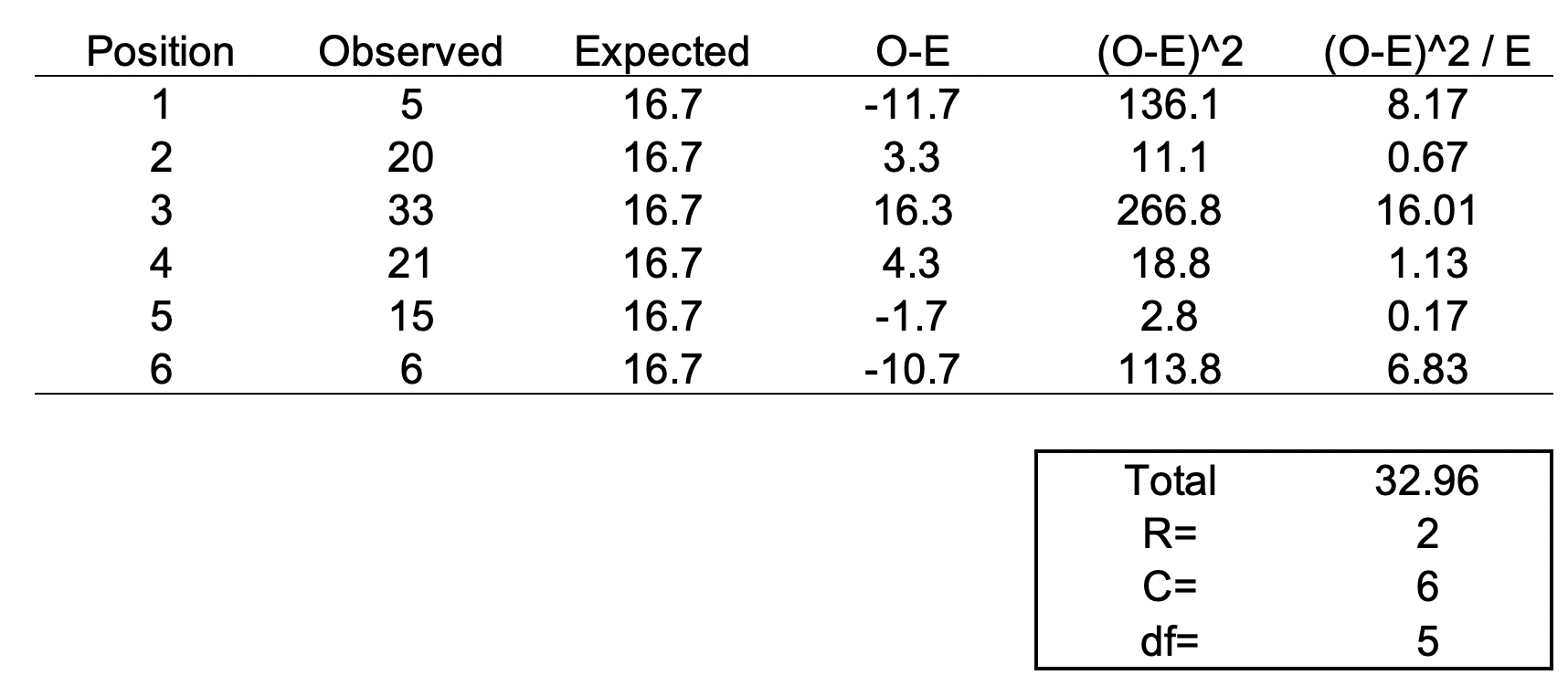
We need another piece of information, degrees of freedom. To estimate the degrees of freedom, we use the following equation: df = (R-1) * (C-1), where R = number of rows and C = number of columns. For the 6-sided dice, the df = (2-1) * (6-1) = 5

We can set up the formula using the following table.

Figure 4.png

The total value of 32.96 is the chi square statistic. We will need to use the chi square distribution table to determine the p-value. Next, we need to use a chi square table like the one shown below.

Figure 5.png

So, with a degree of freedom of 5 and a chi square statistic of 32.96, the probability of a more extreme test statistics than the one observed is less 1% assuming that there were no differences. In other words, the dice is definitely bias at the type I error of 5%. I should throw away this dice.


MOTIVATING EXAMPLE

Now, let’s do this for a 20-sided dice. I’m not going to actually roll the dice 100 times, but I will generate a simulation.

> #######################################################################
> ## Simulate a d20 dice roll with 100 trials
> #######################################################################
> sims <- sample(x = 1:20, size=100, replace=TRUE)
> 
> ## Generate frequency table
> table(sims)
sims
 1  2  3  4  5  6  7  8  9 10 11 12 13 14 15 16 17 18 19 20 
 6  8  2  2  3  2  2  6  7  3  4  8  8  6  3  7  7  4  5  7 
> 
> ## Generate probability table
> prob <- table(sims) / length(sims)
> 
> ## Plot the frequency of the rolls
> plot(table(sims), xlab = 'd20 rolls', ylab = 'Frequency', main = 'Frequency of events for each possible d20 roll (Trials=100)')
> 
> ## Plot the probability of the rolls
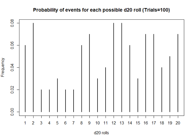
> plot(prob, xlab = 'd20 rolls', ylab = 'Frequency', main = 'Probability of events for each possible d20 roll (Trials=100)')
> 
> ## Perform chi square test
> chi2 <- chisq.test(table(sims))
> chi2

    Chi-squared test for given probabilities

data:  table(sims)
X-squared = 19.2, df = 19, p-value = 0.4441
Figure 6.png

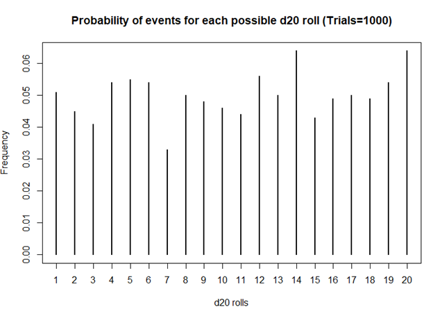
Based on this first simulation run of 100 rolls, the dice is fairly unbiased.
Let’s try 1000 rolls.

> #######################################################################
> ## Simulate a d20 dice roll with 1000 trials
> #######################################################################
> sims <- sample(x = 1:20, size=1000, replace=TRUE)
> 
> ## Generate frequency table
> table(sims)
sims
 1  2  3  4  5  6  7  8  9 10 11 12 13 14 15 16 17 18 19 20 
51 45 41 54 55 54 33 50 48 46 44 56 50 64 43 49 50 49 54 64 
> 
> ## Generate probability table
> prob <- table(sims) / length(sims)
> 
> ## Plot the frequency of the rolls
> plot(table(sims), xlab = 'd20 rolls', ylab = 'Frequency', main = 'Frequency of events for each possible d20 roll (Trails = 1000)')
> 
> ## Plot the probability of the rolls
> plot(prob, xlab = 'd20 rolls', ylab = 'Frequency', main = 'Probability of events for each possible d20 roll (Trials=1000)')
> 
> ## Perform chi square test
> chi2 <- chisq.test(table(sims))
> chi2

    Chi-squared test for given probabilities

data:  table(sims)
X-squared = 20.08, df = 19, p-value = 0.3898
Figure 7.png

Still unbiased. But notice how the frequencies for each value of the d20 dice is starting to have similar frequencies. Unlike the previous frequency figure where there were more fluctuations, you see less of it with more rolls.
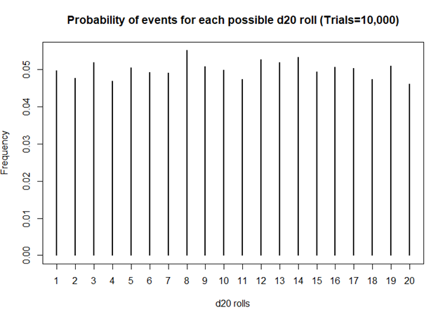
How about 10,000 rolls?

> #######################################################################
> ## Simulate a d20 dice roll with 10,000 trials
> #######################################################################
> sims <- sample(x = 1:20, size=10000, replace=TRUE)
> 
> ## Generate frequency table
> table(sims)
sims
  1   2   3   4   5   6   7   8   9  10  11  12  13  14  15  16  17  18  19  20 
496 477 518 469 504 492 491 551 507 499 474 527 519 532 493 506 503 473 509 460 
> 
> ## Generate probability table
> prob <- table(sims) / length(sims)
> 
> ## Plot the frequency of the rolls
> plot(table(sims), xlab = 'd20 rolls', ylab = 'Frequency', main = 'Frequency of events for each possible d20 roll (Trails = 10,000)')
> 
> ## Plot the probability of the rolls
> plot(prob, xlab = 'd20 rolls', ylab = 'Frequency', main = 'Probability of events for each possible d20 roll (Trials=10,000)')
> 
> ## Perform chi square test
> chi2 <- chisq.test(table(sims))
> chi2

    Chi-squared test for given probabilities

data:  table(sims)
X-squared = 19.872, df = 19, p-value = 0.4023
Figure 8.png

Definitely smoother. As we perform more and more rolls of the d20, we get a nearly equal number of rolls for each value.


A BIASED EXAMPLE: IS MY D20 TRYING TO KILL ME?

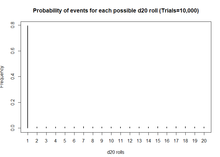
What if the dice was actually bias? What then? Let’s use another d20 dice and simulate the probability that the roll will be a critical fail 80% of the time.

> #######################################################################
> ## Simulate a d20 dice roll with 10000 trials -- BIASED sample
> ## This is a biased d20 where the number 1 has an 80% probability of hitting.
> #######################################################################
> sims <- sample(x = 1:20, size=10000, prob=c(0.8, 0.01052632, 0.01052632, 0.01052632, 0.01052632, 0.01052632, 0.01052632, 0.01052632, 0.01052632, 0.01052632, 0.01052632, 0.01052632, 0.01052632, 0.01052632, 0.01052632, 0.01052632, 0.01052632, 0.01052632, 0.01052632, 0.01052632), replace=TRUE)
> 
> ## Generate frequency table
> table(sims)
sims
   1    2    3    4    5    6    7    8    9   10   11   12   13   14   15   16   17   18   19   20 
7952   99  104  111  111  104  120  109   98   93  107   99  107  110  116  109  118  122  104  107 
> 
> ## Generate probability table
> prob <- table(sims) / length(sims)
> 
> ## Plot the frequency of the rolls
> plot(table(sims), xlab = 'd20 rolls', ylab = 'Frequency', main = 'Frequency of events for each possible d20 roll (Trials=10,000)')
> 
> ## Plot the probability of the rolls
> plot(prob, xlab = 'd20 rolls', ylab = 'Frequency', main = 'Probability of events for each possible d20 roll (Trials=10,000)')
> 
> ## Perform chi square test
> chi2 <- chisq.test(table(sims))
> chi2

    Chi-squared test for given probabilities

data:  table(sims)
X-squared = 116910, df = 19, p-value < 2.2e-16
Figure 9.png

Wow! This d20 is really biased! At a statistical significance threshold that is less than 5%, the very small P-value (P<2.2 x 10^-16) indicates that this d20 is statistically biased from from a fair d20. Maybe that’s why I have more critical fails than any member in my party. I definitely will not be using this dice in the future.


CONCLUSIONS

The chi square test has a lot of usefulness in explaining the bias with anything that provides frequencies of rolls or events. You can use the chi square test for a variety of things such as the fairness of a coin, the differences in the frequency of male and female across different character classes, and determine whether the actual observations matches what you expected. So, when you’re playing D&D with your friends and you suspect that your d20 is rolling a critical fail more often than naught, you may want to run a little experient using the chi square test.

The R code can be found on my GitHub site.


REFERENCES

I had help writing this blog. The codes for the chi square simulation came from Francis J. DiTraglia, Assistant Professor of Economics from the University of Pennsylvania. His website is here. The page where I found his codes is here.

For those interested in probability and games, you should check out this great resource from the Mathematics Assessment Resource Service at the University of Nottingham & UC Berkeley. It uses mathematics to design several games of chance. Fun to do in between campaigns.

And for those who want a more academic presentation on RPGs, Paul Mason wrote an incredible piece that can be found here. Citation: Mason, Paul. 2012. "A History of RPGs: Made by Fans; Played by Fans." Transformative Works and Cultures, no. 11. http://dx.doi.org/10.3983/twc.2012.0444