Communicating data effectively with data visualizations: Part 21 [Examples of famous (and infamous) data visualizations]

FAMOUS (AND INFAMOUS) DATA VISUALIZATIONS

Modern data visualization has a relatively young history compared to other forms of science (e.g., physics, mathematics, chemistry, biology, etc). However, it’s existence can arguably be more historic. Throughout history, we have examples of data visualizations that helped us understand communicable diseases, wartime operations, and the diffusion of technology. Each of these are important in their own respective fields, but making them comprehensive and intuitive would be nearly impossible without creative data visualizations. This article will review several key historical data visualizations from the cholera outbreak to the dawn of the internet and their impact on our society.

JOHN SNOW AND THE CHOLERA OUTBREAK

In the 19th century, little was known about the transmission of disease. The discovery of the germ theory of disease was still in the horizon, and medical knowledge and understanding of its significance had yet to make its way into public health policy. This was true for London during the cholera outbreak of 1854.[1]

John Snow (1813-1858) was an English obstetrician who is considered one of the founders of epidemiology, the study of health and diseases in populations. At the time, diseases were thought to have spread through the air, popularly known as the miasma theory. Snow was one of the first to reject this theory and believed instead that cholera was due to contaminated water that when drunk caused a viscous cycle of diarrhea and dysentery that ultimately led to death. This belief was further supported when Snow discovered that sewage was dumped directly into the Thames River where the city got their drinking water supply. But to prove his theory, Snow had to chart out the outbreak of cholera in Soho, one the London’s suburbs.

Snow meticulously went to the homes of cholera infected patients and learned where they received their drinking water supply. He mapped his findings onto a grid of the city and observed that clusters of outbreaks occurred around specific points in the suburbs, mainly the water pumps (Figure 1).

Figure 1. John Snow’s map of cholera outbreak in Soho, London, 1854.

Source: John Snow - Published by C.F. Cheffins, Lith, Southhampton Buildings, London, England, 1854 in Snow, John. On the Mode of Communication of Cholera, 2nd Ed, John Churchill, New Burlington Street, London, England, 1855. (This image was originally from en.wikipedia; description page is/was here. Image copied from http://matrix.msu.edu/~johnsnow/images/online_companion/chapter_images/fig12-5.jpg)

Snow also noticed that a large cluster of cholera cases occurred in households near the Broad Street pump (Figure 2). In Figure 2, each bar stack represents the number of cholera cases. In particular, the large number of cholera cases near the Broad Street pump provided further evidence that the drinking water supply was contaminated and was the source of the outbreak.

Figure 2. John Snow’s map of cholera outbreaks near the Broad Street pump.

To prove his point, John Snow had the Broad Street pump handle removed and water delivered from another source, further away from the contaminated Thames River. As he predicted, the incidence of cholera dropped rapidly and the outbreak was mitigated.

This was an early example of using data visualization for real-time surveillance of an outbreak that led to a public health intervention. Clusters of cases within the proximity of the hypothesized contamination source effectively illustrated the benefits of geospatial data visualization of the cholera outcomes in the Soho suburbs of London. Today, we rely on spatial data analysis to monitor the influenza epidemic as well as several other diseases, which will help us to quickly react and contain potential outbreaks.

Napoleon’s Russian campaign of 1812

During the Summer of 1812, Napoleon Bonaparte raised over 422,000 troops and personnel to invade Russia. This was in response to the Russian tsar’s, Alexander I, decision to leave the French-led trade union, which undermined Napoleon’s ideologies for an economically strong centralized Europe.

Charles Joseph Minard (1781-1870) illustrated Napoleon’s doomed campaign of 1812 in a graph that famously shows the decline of the once Grande Armée as it began in the Summer to its fall in the early Winter (Figure 3). The graph tells two stories. The first is the start of the campaign which began in the Summer of 1812 and is displayed by the brown line going from Left to Right. The width of the line represents the size of Napoleon’s army at the beginning of the campaign, which numbered approximately 422,000 strong (troops and personnel). Also displayed is the route the army took to reach Moscow. During the journey, the width of the brown line thins representing the attrition of troops due to desertions and causalities. When Napoleon reached Moscow (represented in the right part of the graph) he only had a small fraction of his original strength (approximately 100,000 troops).

On the return trip, represented by the black line, the width of the line thins considerably and is correlated with the rapid drop in temperature, which is represented by the bottom chart. Desertions, casualties, and the weather reduced Napoleon’s army to approximately 10,000 troops and personnel (less than 3 percent of his original strength) by the time he reached the Neman River.

Figure 3. Charles J. Minard’s graph depicted Napoleon’s Grande Armée ill-fated Russian Campaign of 1812.

Source: Charles Joseph Minard's famous graph showing the decreasing size of the Grande Armée as it marches to Moscow (brown line, from left to right) and back (black line, from right to left) with the size of the army equal to the width of the line. Temperature is plotted on the lower graph for the return journey (multiply Réaumur temperatures by 1¼ to get Celsius, e.g. −30 °R = −37.5 °C). Published November 20, 1869. (This image was originally from en.wikipedia; description page is/was here. Image copied from https://en.wikipedia.org/wiki/French_invasion_of_Russia#/media/File:Minard.png)

Minard’s graph shows many data elements highlighting the potential for multiple dimensions incorporated onto a two-dimensional canvas. The lines (both brown and black) denote the route of the army and its strength. At the very bottom of the graph, the temperature of the return journey dropped to below freezing temperatures highlighting the misery of the French troops during the long retreat to France (Figure 4). The creative use of space allowed Minard to include many data dimensions to tell the horribly tragic story of Napoleon’s disastrous Russian campaign. To date, Minard’s graphic is a reminder of the devastating defeat of Napoleon’s ambitions in Europe and the effective use of data visualizations to tell a compelling story.[2]

Figure 4. Temperatures on the return journey (Right to Left).

CARNA BOTNET MAP

In what is now called the Internet Census of 2012, an anonymous hacker produced one of the most important and invaluable data visualization of the diffusion of internet traffic across the globe.[3] Using a botnet and taking advantage of vulnerabilities in network systems, this anonymous hacker was able to penetrate the securities of these networks and then ping these IP addresses to yield a census of active internet networks across the world. The botnet was called Carna, named after the Roman goddess of the door hinge (but she is also known as the goddess of the body). The Carna botnet captured over 1.3 billion IP addresses in the world.

The Carna botnet map is an animated Graphic Interchange Format (GIF) file that provides a 24-hour cycle of internet use around the globe (Figure 5). It was first published sometime in June to October 2012 by the anonymous hacker who wanted to illustrate internet use around the world with all the data that was available. To this day, no one knows the identity of the hacker.

Figure 5. 24-hour world map of IP addresses observed using IP ping requests.

Source: World map of 24 hour relative average utilization of IPv4 addresses observed using ICMP ping requests. Carna Botnet, * Internet Census 2012: Port scanning /0 using insecure embedded devices, Carna Botnet, June - October 2012. 16 March 2013.

The author of this animated GIF uses colors and contrast ratio effectively to deliver a powerful narrative of the daily cycle of internet use. The warm colors represent internet usage during the day and the cool colors represent internet usage after sunset. The nightly cycle moves from Right to Left giving the impression that the world is rotating from being asleep to being awake. More importantly, the image of the world provides the audience with a reference that is recognizable and easy to understand. The data that were used to generate this animated GIF continue to be used by researchers to study their implications on internet security and ethics.[4,5]

It is highly recommended that you download and view the GIF on your own to appreciate the animation.

CONCLUSIONS

Data visualization is an effective tool to tell complicated stories; sometimes, it’s the only way. Historically, we have been doing this without the aid of personal computers and visual software. In most cases, data visualization was something that was done by hand and carefully illustrated like a piece of art. In these examples, stories from the cholera outbreak, failed military ambition, and an illegal comprehensive internet census have provided us with a better understanding of how our world operates and the impact of these data on our society.

REFERENCES

  1. Johnson S. The Ghost Map: The Story of London’s Most Terrifying Epidemic—And How It Changed Science, Cities and the Modern World. New York, NY, USA: Riverhead Books; 2006.

  2. Joyce H. Minard and Napoleon’s march on Moscow. Significance. 2008;5(3):133-134. doi:10.1111/j.1740-9713.2008.00311.x

  3. Internet Census 2012. http://census2012.sourceforge.net/paper.html. Accessed December 12, 2019.

  4. Krenc T, Hohlfeld O, Feldmann A. An Internet Census Taken by an Illegal Botnet: A Qualitative Assessment of Published Measurements. SIGCOMM Comput Commun Rev. 2014;44(3):103–111. doi:10.1145/2656877.2656893

  5. Dittrich D, Carpenter K, Karir M. The Internet Census 2012 Dataset: An Ethical Analysis. IEEE Technology and Society Magazine. June 2015:40-46. doi:10.1109/MTS.2015.2425592

Communicating data effectively with data visualizations: Part 20 (Enhance your data visualization with labels and contrast)

USING LABELS TO ENHANCE YOUR DATA VISUALIZATIONS

Labeling objects (data points, categories, axes, etc.) in your data visualizations is an important part of telling a good story. Without proper labels the figures in your presentation will leave out important elements of the narrative. Labels provide information about the data points or the categories in the figure. We normally use labels to provide information about the axes of the figure (e.g., horizontal and vertical). This is crucial because it tells our audience what the data visualization is measuring. But labels can also be used to provide a richer and informative description of your data visualization that enhances the narrative of your data-driven story.

Take a look at the two figures below. Which one tells you a better story?

The obvious answer is the right figure because it contains labels for the lines that reflect the sales of hardware and software products between 2010 and 2019. We easily see the sales growth from 2010 to 2019 because the labels identify these two products. Additionally, the labels are color coordinated with the line colors so that these are explicitly clear what lines the labels represent. Without these labels, we would have no idea what the lines represent.

Take a look at the next set of figures, what’s different about them? Are they better than the figures above?

The figure on the left removes the Y-axis and tells us that the growth of hardware sales was greater than software. However, we don’t know the magnitude of the difference in the sales. The figure on the right is more efficient in presenting the hardware and software sales because it includes the values from 2010 to 2019. In other words, the right figure removes the unnecessary values from the X-axis and provides the values that are relevant, in particular, those from 2010 and 2019. (This is a return to Tufte’s principle of the data-ink ratio where we want to maximize the information the ink provides in terms of the data.)  


CONTRAST RATIO

According to the Web Content Accessibility Guidelines (WCAG), the minimum contrast ratio between the text and background is 4.5:1. This meets Section 508 requirements from the Rehabilitation Act (29 U.S.C. 794d) that was amended by the Workforce Rehabilitation Act of 1973, which requires that all electronic content purchased by any Federal Agency be accessible to people with disabilities. These requirements are in place to assist those who have difficulties seeing the full color spectrum.

Take a look at the following figures below. Which one has a better contrast ratio?

The left figure has a contrast ratio of 2.35:1, which is below Section 508 requirements. The right figure has a contrast ratio of 7.36:1, which is above Section 508 requirements. It’s clear that the data labels are much easier to see in the right figure compared to the left figure. Having a good contrast ratio is critical to telling your narrative with data, but it is also a considerable advantage when presenting using slides where colors can be washed out by different projectors or bright rooms. Make sure to use high contrast ratio to have your data be more effective for your audience. (Note: For large-scale text (≥ 18 point font or ≥ 14 bold point font), you can use a contrast ratio of 3:1.)

You can check the contrast ratio using online tools such as the one here (developed by WebAIM). However, you will need to get the hex triplet color number from your data visualization. The hex triplet is a six-digit hexadecimal code used for web-based design and reflects the 24-bit RGB color spectrum.

To get the hex triplet color number from your data visualization in Excel (we are using Excel as an example, but this can work with other products that use a color palette), go to color format window and select the “More Colors…” option.

Use the eye dropper to select the color from your file (e.g., Excel, Word). The hex triplet color number will automatically populate in the “Hex Color #” field. Use this on the following website to determine the contrast ratio. (Remember, you want to have a contrast ratio of ≥ 4.5:1.)


CONSISTENCY

Labels should be consistent throughout your data visualization. If you decide to use Arial font in your labels, make sure that you consistently use them for the same label type.

Compare the two figures below. The figure in the bottom panel uses different fonts for the data labels, but the figure in the top panel has a font that is consistent. Having different fonts can be distracting, so it’s best to be consistent with the font (and size) that you use in your data visualizations.

Another point about consistency is the case rule for labels. Normal sentence case is the preferred method for providing labels according to the US Data Visualization Standards. However, I believe you are the best judge for when to use sentence case or other case rules for your data visualizations.

Compare the two figures below. The left figure has a legend that uses a sentence case where each word is capitalized (e.g., “Prevalence Of Deaths in 2015”). The right figure’s legend uses a normal sentence case (e.g.,  “Prevalence of deaths in 2015”). Which is better?

For me, having each word capitalized looks awkward (see below). I prefer to use a legend with a normal sentence case, but you may choose to use something different. I encourage you to experiment and find the right rules for your specific scenarios.


The top panel has the sentence case where all the words are capitalized. The bottom panel has normal sentence case.


CONCLUSIONS

Including data labels can enhance your data visualizations and strengthen your narrative. But you need to make sure that you are consistent and apply high contrast to be effective with your presentation. In this article, we introduce the importance of using the correct contrast ratios according to the WCAG and standardizing your font style. However, it is also important to incorporate your own creativity into your data visualization. Some rules should be broken in order to improv the narrative. So, be adventurous!


REFERENCES

WebAIM is a site that provides a contrast ratio tool, that checks the contrast ratio for your projects. WebAIM a non-profit organization that is based at the Center for Persons with Disabilities in the University of Utah. Their mission is to “…empower organizations to make their web content accessible to people with disabilities.”

The US Data Visualization Standards (DVS) is a great site for rules that the US Government uses for their data visualizations and web tools.

Web Content Accessibility Guidelines are a great resource for learning more about standardizing your data visualization. Although the WCAG was meant for web content and design, it can be generalized to your presentations, publications, and other data visualization tools.

Communicating data effectively with data visualizations—Part 19 (Doughnut charts)

INTRODUCTION

When comparing proportions or prevalence, the pie chart has been used as a favorite among Excel users due to its ease and familiarity. However, Tufte and other data visualization pioneers lament its use and recommend other graphical representations as alternatives.1 Doughnut charts are similar to pie charts except that the center is removed. Unlike pie charts which do not provide a good comparison of the proportional slices to one another, the doughnut chart focuses on the use of the length of the arcs for comparisons, which limit the potential for errors. By comparing the arc’s length of a doughnut chart to each other, you avoid the problem of comparing proportions between the slices in a pie chart.


MOTIVATING EXAMPLE

We will use data from the Centers for Disease Prevention and Control (CDC) to illustrate the number of tobacco products used among Middle and High-School students in the United States. You can download the Excel document here.

Source: Flavored Tobacco Product Use Among Middle and High School Students—United States, 2014–2018. url: link [Accessed on 17 October 2019]

Source: Flavored Tobacco Product Use Among Middle and High School Students—United States, 2014–2018. url: link [Accessed on 17 October 2019]

In 2018, there were 73.98 students per 100 population who reported using e-cigarettes. This was followed by a vastly lower prevalence of 28.66 students per 100 population who reported using Menthol cigarettes and 26.63 students per 100 population who reported using cigars. The CDC undertook this investigation to assess the types of tobacco products used by students. Based on this data, e-cigarettes appears to be a popular tobacco product. 

We will generate a doughnut chart to illustrate the prevalence of different tobacco product use in students.

CREATING A DOUGHNUT CHART

We want to create a side-by-side comparison between the different types of tobacco use in students using the prevalence, number of students per 100 population. This will allow us to make easy comparisons using the circumference of the doughnut charts.


Step 1. Set up the data

Since the prevalence is the number of students per 100 population, we can define our denominator as 100. Therefore, if 73.98 students reported using e-cigarettes, then 26.02 students did not (100 – 73.98). The table below provides the calculations to estimate the remainder column.

Figure 2.png

Once the remainder column has been calculated, we can Insert the doughnut chart onto our Excel worksheet.

Step 2. Insert donut chart

Select the prevalence and remainder data for the e-cigarette row.

Figure 3.png

Then Insert the doughnut chart using the Excel ribbon.

Once you select the doughnut chart, Excel will generate a default chart for you.

 
Figure 5.png
 

Step 3. Change the size of the doughnut chart

The default size is not balanced. We want to make the height and width the same size. To do that, we start by clicking on the Format tab and then going to the dimensions box to change the defaults to 4 inches by 4 inches.

Step 4. Change the size of the doughnut ring

The current doughnut ring is too thin. We can change this by right-clicking on the doughnut and selecting the Format Data Series. It will open a window with options to modify Doughnut Hole Size. Change this from the default to 65%. 

Step 5. Add data labels

To add data labels, right-click on the doughnut and select Add Data Labels. The data labels will populate both segments of the doughnut.

Step 6. Change font size and color palette

We can improve the aesthetics of the doughnut chart by increasing the font size and changing the color palette. In this example, I changed the font to Arial size 14 and I used the Blue Monochromatic Palette #1.

 
Figure 9.png
 

Repeat this for the other types of tobacco use and you can generate a series of doughnut charts that are easily comparable to each other.

CONCLUSIONS

Doughnut charts are better alternatives to pie charts because they use the arc of the circle to represent the proportion of the population. You can navigate through the differences quickly with the doughnut charts and see how different the prevalence of e-cigarettes are compared to other forms of tobacco use. This indicates that there is a huge popularity among students to use e-cigarettes as a favorite tobacco product. The implications of students using e-cigarettes let along any type of tobacco products are under investigation, but the data reported here highlight the popularity of e-cigarettes among students in the United States.  


REFERENCE

  1. Tufte ER. The Visual Display of Quantitative Information. Second. Cheshire, CT: Graphics Press, LLC.; 2001.

Biography: Florence Nightingale

INTRODUCTION

Although data visualization has established itself as an important part of any scientific report and presentation, it has largely depended on the contributions of unique individuals. Several of these individuals have been mentioned throughout this data visualization series such as Edward R. Tufte, William S. Cleveland, and Cole Nussbaumer Knaflic. Each of these individuals have advanced the field of data visualization by sharing their philosophy and style to improve how data can be visualized easily and thoughtfully. But one person in history made the greatest advancements with data visualization in a time when war and public health became important partners in improving health care—Florence Nightingale.

Source: Duyckinick, Evert A. Portrait Gallery of Eminent Men and Women in Europe and America. New York: Johnson, Wilson & Company, 1873. [Link]

Source: Duyckinick, Evert A. Portrait Gallery of Eminent Men and Women in Europe and America. New York: Johnson, Wilson & Company, 1873. [Link]

CAREER

Florence Nightingale (1820–1910) was a nurse, statistician, and social reformer who is famously known for treating British troops during the Crimean War. During the conflict where nations from Britain, France, Sardinia, Russia, and the Ottoman Empire mobilized for war between 1853-1856, more than 21,000 British troops died; only 5,000 deaths were attributable to actual battle. Most troops died not because of combat, but due to common camp diseases such as cholera, dysentery, and typhoid. Nightingale’s reforms helped to reduce non-combat related mortality in the British Army and earned her the accolade of Henry Wadsworth Longfellow who immortalized to her as “The Lady with the Lamp” in one of his poems.

When she was appointed Superintendent of the Female Nurses in the Hospitals in the East by Sydney Herbert, the Secretary of War, in 1854, she brought with her a team of 38 volunteer nurses and an innovative and determined mind.[1] Armed with her classical training and determination to get thing done, Nightingale began implementing reforms in the British Military Hospital Barracks. She instituted sterilized laundry and hand washing sanitation protocols, raised funds, and improved hospital administration. Moreover, during her tour in the Crimean War, Nightingale collected an impressive collection of data about mortality in the army, which were later used in several reports to the Royal Commission on the Health of the Army and Queen Victoria.

When Nightingale returned from the war, she created the Nightingale Training School at St Thomas’ Hospital (now called the Florence Nightingale Faculty of Nursing and Midwifery and & Palliative Care at King’s College London) to train a new generation of nurses using her ideas and philosophies in 1860.


DATA VISUALIZATION

In addition to her accomplishments in nursing, public health, and social reform, Nightingale has been hailed as a pioneer in using statistics and data visualization to maximum effect and changed policies regarding how soldiers were cared for in military hospitals. Using data she collected, Nightingale went about describing them in visual detail. She is famous for creating a new type of diagram that was meant to fuel the narrative she was arguing called the Nightingale rose or wedge diagram (Figure 1). (Other names for the rose diagram include the coxcomb and polar area diagrams.)

Figure 1. Florence Nightingale rose diagram illustrated the causes of death in the British Army. 1858. Source: [Link]

The rose diagrams were generated using the following table from Nightingales report to the Royal Commission on the Health of the Army (Figure 2). The rose diagram takes advantage of the radii of the segments or petals in addition to their length from the center to generate areas that reflected the scale and size of the different months. Each petal (segment) represented a a month and the estimated mortality rate (deaths per 1000 population). From each petal of the rose diagram, a reader can discern the scale of the mortality by month relative to other months based on the area. This type of visual aid prompted to military to review how the soldiers were being treated and reformed how the military operated.

Figure 2. Estimated Average Monthly Strength of the Army; and the deaths and Annual Rate of Mortality per 1000 in each month, from April 1854, to March 1856.

Source: Mortality of the British Army, At Home, At Home and Abroad, and During the Russian War, As Compared with the Mortality of the Civil Population in England. 1858. Harrison and Sons, St. Martin's Lane. [Link] [Accessed September 11, 2019].

Source: Mortality of the British Army, At Home, At Home and Abroad, and During the Russian War, As Compared with the Mortality of the Civil Population in England. 1858. Harrison and Sons, St. Martin's Lane. [Link] [Accessed September 11, 2019].

Legacy

Nightingale was relentless in her pursuits; she stood up and challenged the establishment of British male dominance in the military and at the hospitals. In doing so, she brought about reform that saved lives and changed the way we used and viewed data. Among her many accomplishments, she was the first female member of the Royal Statistical Society and an honorary member of the American Statistical Association. In her book, Nightingale extolled the partnership between people and government in establishing public health measures as necessary and ethical:

Let the people only see how much they can do for themselves in improving their surface drainage, in keeping their water supply free from pollution, in cleansing inside and out.

Let the Government see how much they can do for the people in introducing and stimulating better agriculture; irrigation, combined with drainage works in water-logged districts; for the two must never be separated there.

There is not a country in the world for which so much might be done as for India.

There is not a country in the world for which there is so much hope.

Only let us do it.

— Florence Nightingale [2]

It only seems fitting that Florence Nightingale has been immortalized by Henry Wadsworth Longfellow in his poem “Santa Filomena”:

A lady with a lamp shall stand
In the great history of the land,
A noble type of good,
Heroic womanhood.

REFERENCES

1. Fee E, Garofalo ME. Florence Nightingale and the Crimean War. Am J Public Health. 2010 September; 100(9): 1591. [Link]

2. Nightingale F. Life and Death in India. 1874. Spottiswoode & Co. New Street Square, London. [Link] [Accessed: September 10, 2019].

There are countless articles and sites on Florence Nightingale that you can find online. However, I found the following to be helpful in writing this article:

Andrews RJ. Florence Nightingale is a Design Hero. July 15, 2019. [Link] [Accessed: September 10, 2019].

Mathematics of Florence Nightingales’ rose diagram. [Link] [Accessed: September 11, 2019]


Communicating data effectively with data visualizations—Part 18 (Histograms)

BACKGROUND

Inspecting your data is an important part of data analysis preparation. Data, like all things, should behave according to some reasonable expectation. For example, if we randomly sampled a group of people in the U.S., we would reasonably expect to get 50% males and 50% females. Similarly, if we examined the age distribution of this sample, we would expect to have a normal distribution.

At the macro level, we may only be interested if the mean and standard deviations are representative of the population distribution. Since we sample from the population (randomly), we would expect to get similar means (and medians). This can be accomplished using simple Excel functions (or commands in statistical packages) to generate a descriptive summary. Table 1 describes the summary statistics for the total fat consumed by a sample of 8,327 responders to the National Health and Nutrition Examination Survey (NHANES) survey.

TABLE 1.png

We can see that the mean and the median are different, which is an indicator that the distribution is not normal. However, we may be interested in learning more about the distribution or behavior of this variable. Are there any outliers? How skewed is the distribution?

HISTOGRAMS

To visualize this, we will need to generate a histogram. A histogram is a visual representation (bars) of the distribution of data (usually continuous). It uses spacings called “bins” to count the number of times a value falls into that bin. A histogram looks like a bar chart, but the key difference is that in the histogram the adjacent bars are touching each other rather than having a space between them. Another difference is that histograms plot the frequency (or density) of a value or a range of values for a continuous data type; whereas, bar charts plot the count of a discrete data type (Figure 1).

Figure 1. Comparisons between histogram and bar chart.

Keep in mind that the number of bins for histograms should be just enough to make out the distribution and not too small to be too much information. This is Grice’s maxim of quantity where data are presented in an informative manner without overwhelming the audience with too much information.[1] Creating smaller bins to increase the resolution of the histogram is unnecessary when all you want is a general visualization of the data’s distribution.


MOTIVATING EXAMPLE

We will use data from the NHANES survey (2015-2016) to generate a histogram in Excel. The data can be downloaded from my Dropbox folder here. I cleaned the file so that all missing data were dropped. In total, there are three variables:

·      seqn = subject identifier

·      drqsdiet = special diet (Yes/No/Don’t know)

·      dr1ttfat = amount of total fat (gm) consumed

We will create a histogram to visualize the distribution of total fat consumed by the subjects. To start, let’s select the data and insert a histogram chart from the Insert Tab.

A histogram will be inserted near where your data are located on the worksheet. Excel automatically selects the bin sizes for you. But you can customize this to your needs.

Figure 3 -histogram.png

Right click anywhere x-axis and select Format Axis. You should see a column on the right side appear with options to modify the bin sizes.

You can modify the bin width, number of bins, the overflow bin, and underflow bin.

The bin width can be larger or smaller depending on how much resolution you want. You should balance this out with the appropriate number of bins you want to show. According Grice’s maxim of quantity, you don’t want to overwhelm your audience. In Excel, you can only modify either the bin width or the number of bins; never both.

The overflow bin indicates what the last bin should be. If anything is over the overflow bin value (X), then Excel will collapse those frequencies into that last bin. For example, if I wanted the overflow bin to be 137 grams or greater, I enter “137” into the overflow bin field. You can do the same thing on the other end of the x-axis with the underflow bin value.

Once you’ve figure out how to change the number of bins, let’s change the number of bins from 66 to 100, 75, 50, and 25 to observe how the histogram changes.

Notice that the histogram with a bin size of 100 is really fine whereas the bin size of 25 is blocky. We can tell from all of these figures that there is a right skew to the distribution due to a few outliers. There are 3 subjects who consume more than 400 grams of total fat compared to 19 subjects who consume between 300 and 399 grams of total fat. The higher resolution doesn’t really help us determine that the total fat consumption is right skewed compared to the figures with bin sizes of 75 and 50. If I were presenting to an audience or publishing an appendix, I would select either the figure with a bin size of 75 or 50. These two histograms illustrate the peak at the mean and the right-skewed distribution without violating Grice’s maxim of quantity. However, different situations will require you to make different choices, so I encourage you to explore the design features on Excels’ histogram.

STEM-AND-LEAF HISTOGRAM

The stem-and-leaf display is an alternative histogram that uses the prefix of number to assign positions into the bins. The following figure is a randomly selected number of subjects from our NHANES data. The first subject consumed 14 grams of total fat which is indicated by the 1* | 4. The 1* represents the first digit of “14” and the “|” separates the next digit. Similarly, there is one subject who consumed 22 grams of total fat indicated by the 2* | 2 and another subject consumed 24 grams of total fat (2* | 4).

 
Figure 7 - stem-and-leaf.png
 

CONCLUSIONS

Histograms are a great visualization tool to quickly check whether your continuous data are normally distributed. You can identify whether the mean is close to the median or whether there are left or right skewness to your data. Moreover, you can change the bin sizes of a histogram to become more refined or less so. But according to Grice’s maxim of quantity, it is best to present enough data that will get the information across to your audience without overwhelming them with unnecessary details.


REFERENCES

Grice, H. P. Logic and Conversation.  In Cole P. and Morgan J. (Eds), Syntax and Semantics: Vol 3, Speech Acts. Academic Press, New York, pp.43-58, 1975.

Communicating data effectively with data visualization – Part 17 (Multivariate Dimensions)

MULTI-DIMENSIONAL DATA VISUALIZATIONS

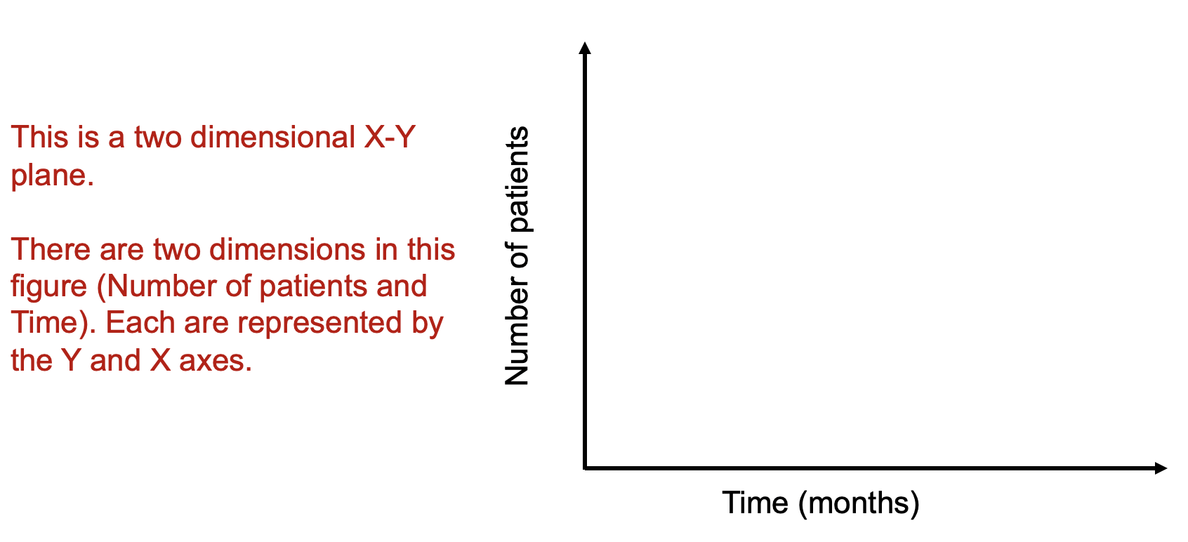
Data visualizations can improve how we see complex data, in particular, where multiple dimensions are involved. For instance, in an X-Y plan, we can have the months on the X-axis and the number of patients on the Y-axis (Figure 1). Let’s imagine that number of patients represents some outcome you are interested in (e.g., number of patients who has 5+ prescription medications). Time and the number of patients are dimensions on this two dimensional plan.


Figure 1. Two-dimensional X-Y axes figure.

Figure 1.png

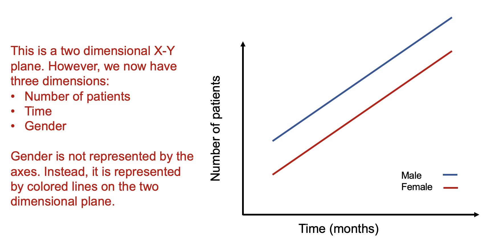
As a rule, whenever you want to display multiple dimensions, each dimension needs to be represented onto a single figure, which is challenging given that a figure is normally on a two-dimensional plane. What if we wanted to have a figure with more than two dimensions? What if we wanted to have a figure with months on the X-axis, number of patients on the Y-axis, and include a third dimension denoting different genders? How would we go about doing that? Figure 2 illustrates how we can do this by adding lines and labeling them using different colors.


Figure 2. Figure with three dimensions.

Figure 2.png

Figure 2 is able to capture three dimensions of data into a single two dimensional figure. The number of patients is captured in the Y-axis and the time in months is captured in the X-axis. Gender is represented by the colored lines that show the difference in the relationship between number of patients and time associated with males and females.

Alternatively, we use the color blue for the following conditions:

E[Y | male]


We use the color red for the following conditions:

E[Y | female]


The legend providers additional clarification that the different line colors denote the gender types. It is critical to include clear and intuitive legends so that your readers will immediately recognize their reference and label. Without a legend, your audience will have to guess what color belongs to what gender type.

How about adding another dimension such as age? This would increase the number of dimensions on this figure from three to four. For example, what if we wanted to see how being older (80+ years) impacted the relationship between the number of patients and time across genders? Well, this can be accomplished by using different types of lines (e.g., dotted lines and dashed lines).

Figure 3 illustrates how using different types of lines (dotted for the 80+ year old patient and dashed for the <80 year old patient) can provide a visual accounting of the differences across genders and across age in terms of the number of patients and months. The legend provides additional clarification as to the age groups associated with the different line types.


Figure 3. Figure with four dimensions.

Figure 3.png

Alternatively, we continue to use the color blue for the following conditions but add different line types for the age groups:

E[Y | 80+years & male] (dotted lines)

E[Y | <80 years & male] (dashed lines)


Similarly, we continue to use the color red for the following conditions but add different line types for the age groups:

E[Y | 80+years & female] (dotted lines)

E[Y | <80 years & female] (dashed lines)

Using colors and line types allow us to capture multiple dimensions onto a two dimensional figure. We essentially are showing a stratified descriptive analysis of the age groups nested within each gender and their relationships between the number of patients and time (months).

How about adding a fifth dimension? How could one do that?

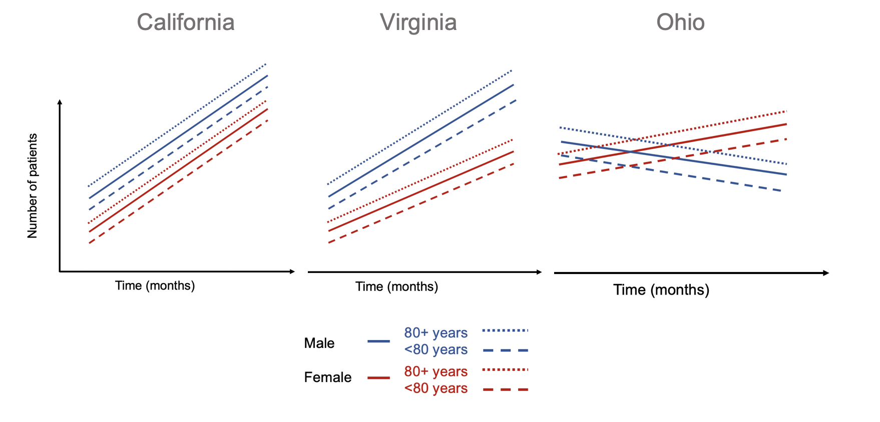
A simple way to introduce a fifth dimension is to use the concept of small multiples by Edward Tufte.[1] Tufte uses small multiples to include additional dimensions. Figure 4 illustrates how we can leverage small multiples to look at the differences in the relationships between number of patient and time for different genders and age groups across different states.


Figure 4. Small multiples of states with differing patterns of number of patients and time for different genders and age groups.

Figure 4.png

Using small multiples allow us to compare the differences in the association between number of patients and months across different states stratified by gender and age groups. The number of patients increased across time for all gender and age groups in California. Similar patterns are observed in Virginia, but the rate of increase in the number of patients across time is lower in the female group and age cohorts. In Ohio, different patterns are observed compared to California and Virginia. Males and their associated age groups have a decreasing number of patients across time. Conversely, females and their age cohorts have a positive correlation between the number of patients and time.


CONCLUSIONS

Adding dimensions can improve the figure you design by incorporating complex relationships across different data characteristics. In our example, we demonstrate how we can integrate dive dimensions of data to a two-dimensional figure that tell us information about the association between the outcomes (number of patients) with time (months) across states stratified by gender and age groups. Be creative with how you integrate multiple dimensions into a figure. Ask yourself if this is something that will help improve the story the figure is conveying. There are times when a simple figure will do. But when you have a lot of data and want to tell a story, consider adding dimensions to the figure to get a narrative that will excite and capture your audience’s attention.


REFERENCES

  1. Tufte ER. The Visual Display of Quantitative Information. Second. Cheshire, CT: Graphics Press, LLC.; 2001.

Communicating data effectively with data visualization – Part 16 (UpSet diagrams)

INTRODUCTION

Venn diagrams are useful visualizations that illustrate intersections between several groups. A common Venn diagram includes three transparent circles that overlap each other. In Figure 1, a Venn diagram with three groups denoted as A, B, and C has a total of 4 intersections (AB, AC, BC, and ABC).

Figure 1. Venn diagram with three groups and four intersections.

 
Figure 1.png
 

However, this can get more complicated when there are more than three groups or multiple interactions. Figure 2 illustrates a more complicated example.

Figure 2. Complicated Venn diagram.

 
Figure 2.png
 

How many interactions are there? It’s quite difficult to determine based on this figure. An alternative data visualization method to capture the complexity of interactions and overlaps illustrated by Figure 1 is called an UpSet diagram. Please go to the Gehlenborg Lab for more information about UpSet diagrams.

UpSet diagrams visualizes complex intersections as sets of a matrix where the columns represent the number of interactions across different sets of groups (rows).[1,2] Each set can represent a combination of interactions. This is a very useful way to see how many campaigns are delivered in a single academic detailing visit.

Academic detailers deliver educational outreach to providers using a combination of tools that include unbiased evidence-based educational materials, online clinical dashboards, and audit-and-feedback approaches.[3,4] However, a single academic detailing interaction can include several campaigns and key messages. Since each visit may incorporate several campaigns, there needs to be a mechanism to capture the different sets of combinations. From an operations perspective, monitoring the number of interactions is challenging, especially, when you want to capture workload for your staff or facility. Fortunately, UpSet diagrams, developed by researchers at the Department of Biomedical Informatics, Harvard Medical School and the Institute School of Computing, University of Utah, can easily capture these complex combinations of campaigns with each academic detailing visit.

Below is an example of an UpSet diagram that lists the different campaigns in the rows and the number of visits using the various combinations of campaigns (Figure 3). For example, there are 31 visits that include the Pain and OEND campaigns. Further, there are 119 visits that include the OUD and OEND campaigns. Notice how easy it was to visually see the different campaigns that were combined into a single visit. A single visit can be illustrated to show how many campaigns were involved. By using an UpSet diagram, you can visually capture which complex interactions were more frequent or infrequent.

These UpSet diagrams are useful ways to capture the complex nature of academic detailing and the various combinations of campaigns delivered.

Figure 3. Example UpSet diagram with several campaigns and the number of visits.  

MOTIVATING EXAMPLE

Excel is unable to create UpSet diagrams with its current tools. Fortunately, the researchers at Harvard University and the University of Utah have created an UpSet R Shiny app that you can access online. All you need is your own set of data to upload. The R Shiny app will generate the UpSet figure and you can adjust the settings to get the figure you need.

The UpSet R Shiny app is located here.

When creating a data set, make sure that you save it as a *.CSV file with headers.

Use the following example dataset to upload onto the UpSet R Shiny app, which is located here.

After you open the UpSet R Shiny app in a browser, make sure that you are in the Option 1 tab. This is where you will see some instructions to upload the data you want to view the complex interactions for an academic detailing visit.

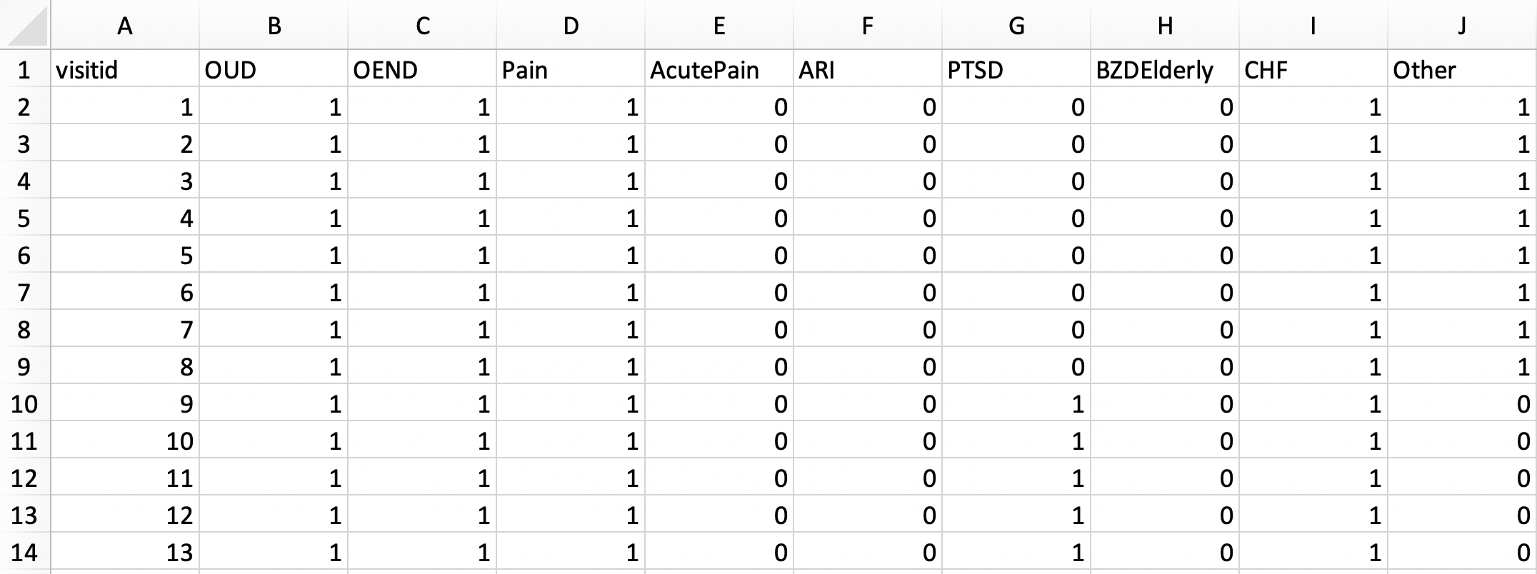
Browse for the file that contains the data on all the academic detailing visits with their campaigns. The data should be saved as a *.CSV file. We will use the pbmads_2.csv file. The data structure should have the each campaign as a binary variable (1 = YES, 0=NO) similar to how you would create a dummy variable.

Figure 4_1.png

Make sure to keep the columns separated using the “Comma” separator.

Then, click on “Plot” to see how the UpSet diagram appears in the R Shiny app.

After you click on Plot, you will see the app update and you should be able to view the Setting and Plot areas. The Setting area allows you to configure your plot. You can change the order of the plot and the type of ordering rules (e.g., Frequency and Degree). You can also change the size of the fonts using the Advanced section.

The Frequency order provides the largest number of visits in descending order.

The Degree order provides the campaigns with the most complex interactions or combinations in ascending order. 

Based on these figures, you can easily discern the complexity of interactions academic detailing visits include into a single educational outreach. The most complex interaction are the visits that include the Opioid Use Disorder (OUD), Opioid Overdose Education and Naloxone Distribution (OEND), posttraumatic stress disorder (PTSD), Pain, and Other campaign topics (N=3). The individual solo campaign with the most visits is the OUD (alone) campaign with 175 visits.


CONCLUSIONS

UpSet diagrams make it easy to categorize the academic detailing visits into different combination categories. We can apply this method to other program monitoring metrics such the differences in these visit combinations across time and the number of attendees. Other additional areas where UpSet diagrams are useful include complex genetic markers. Try and think of ways where you can use this method to simplify complex Venn diagrams or complex interactions across different groups.

Since the UpSet R Shiny app has limited functionality, you can explore other features using R or Python to generate more complex UpSet diagrams. The UpSetR package is available for the R environment. The UpSetPlot package is available for Python.

You can access the GitHub site for UpSet diagrams here.

I encourage you to read the papers on UpSet diagrams by Conway and colleagues and Lex and colleagues: Paper 1 and Paper 2.

YouTube video on UpSet diagrams.


REFERENCES

1. Conway JR, Lex A, Gehlenborg N. UpSetR: an R package for the visualization of intersecting sets and their properties. Bioinforma Oxf Engl. 2017;33(18):2938-2940. doi:10.1093/bioinformatics/btx364

2. Lex A, Gehlenborg N, Strobelt H, Vuillemot R, Pfister H. UpSet: Visualization of Intersecting Sets. IEEE Trans Vis Comput Graph. 2014;20(12):1983-1992. doi:10.1109/TVCG.2014.2346248

3. Avorn J, Soumerai SB. Improving drug-therapy decisions through educational outreach. A randomized controlled trial of academically based “detailing.” N Engl J Med. 1983;308(24):1457-1463. doi:10.1056/NEJM198306163082406

4.Avorn J. Academic Detailing: “Marketing” the Best Evidence to Clinicians. JAMA. 2017;317(4):361-362. doi:10.1001/jama.2016.16036


Communicating data effectively with data visualization – Part 15 (Diverging Stacked Bar Chart for Likert scales)

BACKGROUND

Surveys or questionnaires are used to capture respondent’s perceptions about any number of products, ideas, or subjects. You can ask someone how they are feeling to how much they agree with a particular statement. Or you can ask someone if they are satisfied with a product or service they recently received. Items (or questions) in surveys can solicit these types of responses. Free response questions allow the respondents to write their responses in an unstructured manner as long as it answers the question or purpose of the survey. But most surveys ask questions that require a specific response using multiple choice, ratings scale, or Likert scales.

In this article, we will discuss the Likert-type scale and how we can visualize this using Excel.


LIKERT-TYPE SCALE

The Likert scale was first developed by Rensis Likert, who was a psychologist in the early 20th Century. He developed the 5-point Likert scale as part of his PhD dissertation in order to capture peoples’ ratings of international affairs. The Likert scale is unique because it provides a rating that is ordered sequentially (Positively to Negatively or Agreement to Disagreement).


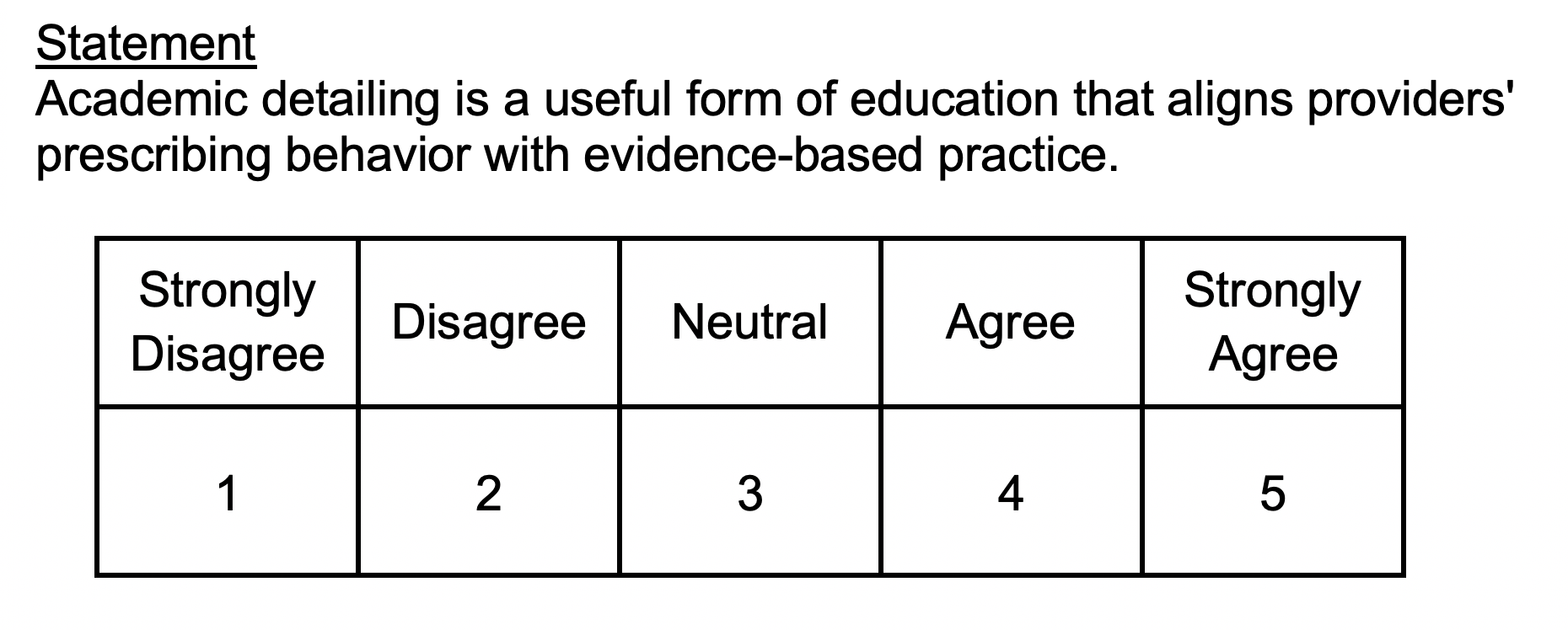
Figure 1. Example of a 5-point Likert scale.

Figure 1.png

The 5-point Likert scale is quite common in psychometric research. A statement is usually provided and the participant is asked to rate their level of agreement. Notice how the scale is ordered sequentially from Strongly Disagree in the left of the scale and Strongly Agree to the right of the scale. This is an important feature of Likert-type scales with an added convenience, higher values are associated with higher agreements. You can reverse this as well, but we will keep the order for the remainder of this article.


VISUALIZE THE LIKERT-TYPE SCALE

There are many ways to visualize a Likert scale. We can use pie or bar charts to capture the different responses to a Likert-type question or statement.


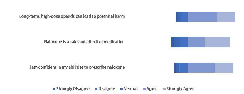
Figure 2. Bar and Pie charts used to visualize Likert scale responses.

Figure 2.png

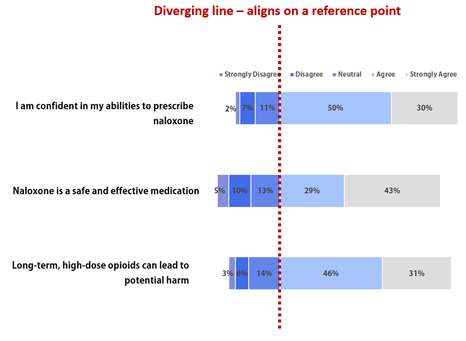
However, the best way to visualize Likert scales is to build a Diverging Stacked Bar Chart.

Figure 3. Diverging stacked bar chart using a set of hypothetical data for three statements.

Figure 3-1.png

The red dotted line in Figure 3 represents the divergent point where the stacked horizontal bar chart aligns. This is effective when you want to suggest that certain set of ranked responses are more important than the other. In this example, Strongly Agree and Agree are given more precedence than the other ranks. Rightly so, since a majority of the responses were Strongly Agree or Agree.


MOTIVATING EXAMPLE

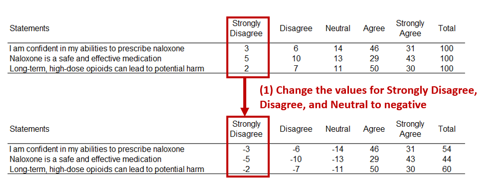
Let’s assume that we administered a survey with three questions. The results are as follows:

Figure 4.png

We have a 5-point Likert scale with responses in all the different ranks. A majority of the responses were either Strongly Agree or Agree, so we’ll create a diverging point with these two ranks.


TUTORIAL

The Excel file for the tutorial is located here.

There are two ways to create this diverging stacked bar chart.

Method 1: I learned how to create diverging stacked bar charts from Stephanie Evergreen’s blog Evergreendata.  I got her method step-by-step and then go over an alternative method.

Part 1.1 Estimate the buffers at the end of the stacks.

First, change the values to percentages (Step 1). Then, determine where the divergence will occur (Step 2). For our example, the divergence is between Neutral and Agree.

The next step involves estimating the values at the ends of the stacked bar chart. There are two ends, left and right (Steps 3 and 4). Once the buffers have been estimated, we will plot the stacked bar chart.

Part 1.2. Plot the divergence stacked bar chart.

First, select all the data (Step1). Then Select the 100% Stacked Bar Chart from the Insert tab (Step 2). This should generate a default stacked bar chart (Step 3).

Right-click on the any area in the chart and click on the “Select data…” to change the data arrangement (Step 4). Select the “Switch row/column” to change the Y-X arrangement of the data.

Once you switch the rows and column, the chart will change and look like the one below.

Now, we want to remove the color of the buffers at the ends of the stacked bar (Step 7). Right-click the left end of the stack and select “No Fill” (Step 8). Repeat this for the right end of the stack.

The diverging stacked bar chart should resemble the figure we presented at the beginning of this article.

Figure 11.png

Removing the buffer labels from the legend, deleting the grid lines, changing the font (Adobe Gothic Standard B), and changing the stacked bars colors can improve the figure.

Figure 12.png

The challenge with this chart is the labels on the axis. The statements are too far to the left of the diverging stacked bar chart. To fix this, delete the labels on the left and insert text boxes with the statements.

Figure 13.png

Remove the borders, right alignment with the statements, and add labels. We should be very close to the figure we presented above.

Figure 14.png

Here is the final diverging stacked bar chart.

Figure 3.png

Method 2: I learned this other method from John Peltier at his Peltier Tech Blog.

This method requires you to create a divergent point based on distance. For instance, if you want to make sure that you have the divergent point where the responses are at Strongly Agree and Agree. So, subtract the distance from that point.

Figure 14-5.png

First, change all the values left of the divergent point to negative (Step 1).

Figure 15.png

Then rearrange the order of responses so that the furthest rank is closest to the divergent point (Step 2).

The select the data (Step 3), Insert a 100% Stacked Bar Chart (Step 4), and then Visualize the chart (Step 5).

Right-click anywhere in the chart area and click “Select Date…” (Step 6). Then Switch row and column (Step 7).

You will get the chart on the left below. However, this is not complete. Right-click on the Y-axis (Step 8) and the Format Axis (Step 9).

Change the label position for “Low” (Step 10) and then review the chart. Notice where the divergent point is located at. This is the same as the previous stacked bar chart that was constructed using Method 1.

Now, you can change the colors, delete the gridlines, remove the X-axis to create a plot below. Notice that there are some values that are negative. That’s because of the data we rearranged earlier to generate the distance from the divergent point. To fix this, you will need to manually change the values.

Figure 21.png

After manually change the values, your plot will look similar to the one below.

Figure 22.png

Conclusions

Visualizing the Likert scale using horizontal diverging stacked bar charts is a good method to see how the participants respond to questions or statements on a survey or questionnaire. However, not all Likert-type scales will necessarily need a diverging stacked bar chart to illustrate its point. You can also use a conventional stacked bar chart, which we will discuss in a future article.

The Excel file for this tutorial is located here.


REFERENCES

I used the following references to help write this article.

Stephanie Evergreen’s blog Evergreendata is an excellent resource for learning about other data visualization methods.

John Peltier’s blot  Peltier Tech Blog is another wonderful resource where you can learn more about Excel charts and data visualization.

The following paper provides details on how to create diverging stacked bar charts using R.

Heiberger RM, Robbins NB. Design of diverging stacked bar charts for Likert scales and other applications. Journal of Statistical Software. 2014;57(5): 1-32. https://www.jstatsoft.org/article/view/v057i05/v57i05.pdf

Communicating data effectively with data visualization – Part 14 (Gantt Charts)

INTRODUCTION

A useful calendar can be helpful in scheduling your meetings, avoiding conflicts, and remembering important dates. Applying data visualization to a calendar can help to identify key events throughout the day, week, or month. Here is an example of a color-coded calendar for a single person from Sadiq Javer from BoostSolutions.

Figure 1 - exampel calendar.png

Each meeting or event is color coded to indicate a particular category. For a single user, this is sufficient to manage a complex day, week, or month. However, if you are a project manager or lead, managing the calendars of a group or team, this task can be challenging.

A solution is to use a Gantt chart to organize the calendars of several members in your team. Gantt chart is a type of bar chart that provides a longitudinal visualization of schedules and timelines. It was invented by Henry Gantt who is known for his work on scientific management. Gantt charts are useful for project management and can illustrate major deadlines or milestones in the project’s life cycle.

Conveniently, the same tools used for project management can be applied to managing schedules for multiple team members in a group. In this article, we will apply the Gantt chart to managing a team’s schedule using Excel.

MOTIVATING EXAMPLE

We will create a Gantt chart using a hypothetical team’s schedule to visualize their and vacations.

Download the Excel sheet here.

Suppose we have a team who will be taking vacation in the upcoming calendar year (2019). There are several important dates that the Team will need to block for meetings. In order to avoid conflicts, a Gantt chart is used to plan an efficient annual schedule.

Here is a figure of our Gantt chart.

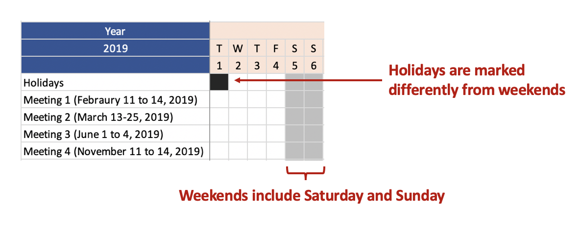
The Gantt chart blocks weekend and holidays so that the manager can easily see the entire 7-day week. Each column represents a day nested in a 7-day week. The months are color coded to identify when it begins and ends. Each staff has a unique color to identify their days off, and the Team meeting is highlighted in red to indicate the critical meeting dates.


TUTORIAL

You can use any version of Excel to build the Gantt chart. After opening a new Excel sheet, follow these steps.

Step 1. Resize the column’s width:

Figure 3.png

Resizing the column’s width to 2.33 seems to give an efficient size cell for the days.

Step 2. Assigning days and months:

In our example, each column represents one day. Therefore, we can assign 7 days into a week. Since the month starts on different days, we make sure to start with the correct day in our calendar. In 2019, January begins on Tuesday, therefore, our Gantt chart will start on Tuesday.

Figure 4.png

Step 3. Highlight the weekends and holidays:

Hopefully, your team doesn’t have to work on the weekends. However, there are exceptions. Clinicians work on the weekends, so your Gantt chart may need an indicator for differential pay (if it is part of the benefits). In our example, we will assume that no one from the team works on the weekends.

The holidays are highlight with a different color from the weekend

Figure 5.png

Step 4. Include the team members and Meetings to the Gantt chart.

Once you block out the holidays and weekends, you can start entering information on meetings and team members’ vacations. Different colors were used for the meetings and individual team members to provide easy visualization.

Figure 6.png

CONCLUSIONS

The final Gantt chart should be able to help you organize your team’s schedule while making sure that there are no conflicts with important team meetings or deadlines. Although Gantt charts were designed for project management, it can also be used to efficiently manage a team’s complex schedule.

You can download the Excel exercise at this link.

REFERENCES

I used the following references to assist me with this tutorial.

Sadiq Javer’s article on Gantt charts published on the Boostsoultions.com website.

Wikipedia’s page on Gantt charts, Henry Gantt, and Scientific Management.

Communicating data effectively with data visualization - Part 13 (Box and Whisker Diagrams)

BACKGROUND

Box plot (box and whisker diagram) is a great way to display distribution of a continuous (e.g., interval) data variable. A typical box plot will contain the mean, median, interquartile values, and the minimum and maximum values. Figure 1 illustrates these elements on a box plot. Up until recently, Microsoft Excel did not have an option to graph box plots. However, in the 2016 version of Microsoft Excel, box plots were added as part of the statistical features.

Figure 1. Example of a box plot (box and whisker diagram (Figure 1).

 
Figure 1.png
 

MOTIVATING EXAMPLE

We will use data that was randomly generated to create box plots across four hypothetical quarters (Q1FY19, Q2FY19, Q3FY19, and Q4FY19). The data will contact the number of visits to the doctor from several outpatient specialty clinic. Here is what the data looks like from the first two sites. Data for the example can be found here.

 
Figure 2.png
 

Site 1 has 45 visits in Q1FY19 and Site 2 has 44 visits in Q1FY19. To create the box plots, we need to use the long format which uses multiple rows for each site.


EXERCISE

In this article, we will generate box plots that will visualize the average number of visits and its distribution across quarters.

Figure 3.png

After clicking on the Box and Whisker plot, you will need to select the data that will be used to generate the box plots across the quarters.  

Figure 4.png
Figure 5.png
Figure 6.png

Click “OK” and the default box plot will look like Figure 2.  

Figure 2. Default box plot generated by Excel 2016.

Figure 7.png

After a few changes to the color and labels, our box plot can be improved (Figure 3).

Figure 3. Updated box plots.

Figure 8.png

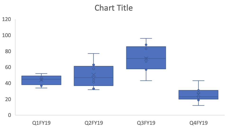
These box plots give us an idea of the changes in the number of visits across quarters including the distribution of the data. For each box plots, the mean indicated by the “X” is not too different from the median (indicated by the solid horizontal line).  However, there is greater variation in the distribution of the number of visits in Q2FY19 and Q3FY19 compared to Q1FY19 and Q4FY19. We can see that there was an increase in the number of visits, on average, between Q1FY19 and Q3FY19, but this drop significantly in Q4FY19. This may be due to some kind of change (e.g., seasonal variation) and should be explored.


Conclusions

The box plot provides us with a nice data visualization of the mean number of visits across quarters including the variation and distribution of the data. Plotting these in Microsoft Excel 2016 will allow you to explore your data and motivate you to explore and generate some explanation or hypothesis for their behavior.

References

I used several online references to write this article.

The Dummies series provide a good illustration of the box plot elements, which can be located here.  

I watched this YouTube video by stickpet on how to use Microsoft Excel 2016 to generate box plots.