Data visualization

Communicating data effectively with data visualizations: Part 28 (Scatter plot)

INTRODUCTION

Between 1918 to 1919, the influenza pandemic (also known as the “Spanish Flu”) raged across the world and caused over 40 million deaths. Cities in the United States enacted nonpharmaceutical interventions (e.g., social distancing, shelter-in-place mandates) to reduce the transmission of the influenza pandemic, overall and peak attack rates, and the number of deaths. Some of the cities were successful in mitigating the calamity associated with the pandemic, but others were not. The experiences that these cities learned in the past yield important insight for policy makers today to tackle the current COVID-19 pandemic.

Markel and colleagues (2007) reported on the impact of nonpharmaceutical interventions enacted by cities in the United States and their effect that they had on mitigating the influenza pandemic of 1918 to 1919.[1] Briefly, their report highlights that cities that implemented these public health interventions early had greater delays in the time to reaching peak mortality, lower peak mortality rates, and lower total mortality.

We will recreate one of the figures (Figure 1c) in this manuscript using Excel and the data provided.

Figure from the study that we will recreate.[1]*

(*This figure is used for educational purposes only.)

DATA

Data for this tutorial come directly from the study’s Table 1. We will use the Public Health Response (days) in the X-axis and the Excess Pneumonia and Influenza Mortality rate (deaths per 100,000 population). You can download the data from the following link.

Step 1. Get the data

Download the data from this link. Data has been cleaned specifically for this tutorial.

Step 2. Insert a scatter plot chart

After downloading the data, open the Excel file. Look for the column that contains the Public health response time, days; this will be the data for the X-axis. Now, look for the column that contains the Excess pneumonia and influenza mortality, deaths / 100,000 population; this is the data for the Y-axis.

In Excel, insert the Scatter plot by selecting the Scatter option in the Charts tab.

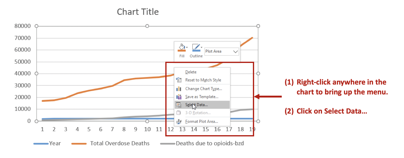
Step 3. Select the data for the Scatter plot

An empty figure will appear. Right-click in any area in the empty figure and you should be able to click on “Select Data”. From there, click on “Add” to add data and select the appropriate data for the X-axis values and the Y-axis values.

Clicking “OK” will generate a scatter plot of the excess deaths across the time the public health responded to the pandemic.

Step 5. Adjust the axes

First, we want to move the Y-axis so that it is flushed with the left side of the chart instead of intersecting at zero on the X-axis.

This will change the Y-axis position from its intersection on the X-axis = 0 to X-axis = -15.

Step 5. Change the color of the scatter

To finalize the scatter plot, change the color and size of the scatter.


FINAL SCATTER PLOT

Once all the adjustments have been made, we can add some data labels for some of the select cities, which were also highlighted with a different color.

CONCLUSION

After recreating the figure from the paper by Markel and colleagues,[1] it is clear that as public health response is delayed, there is a general trend for excess deaths due to the influenza pandemic to increase. Although other types of interventions occurred during this pandemic, the findings from Markel and colleague provides some empirical evidence that early public health measures have significant contributions in terms of mitigating the excess deaths due to the influenza pandemic. Policy makers can use the lessons from the past to inform them about the effectiveness of public health nonpharmaceutical interventions in delaying or reducing the mortality of the current COVID-19 pandemic.

REFERENCE

  1. Markel H, Lipman HB, Navarro JA, et al. Nonpharmaceutical Interventions Implemented by US Cities During the 1918-1919 Influenza Pandemic. JAMA. 2007;298(6):644-654. doi:10.1001/jama.298.6.644

Communicating data effectively with data visualizations: Part 27 (Building a COVID-19 surveillance dashboard using Power BI)

INTRODUCTION

With the advent of the COVID-19 pandemic, several high-profile dashboards have been created using data from around the world. Since Power BI is a new tool, I thought it would be a good opportunity to develop a simple COVID-19 dashboard using it using existing data.

We will use this opportunity to create the following dashboard:

DATA

Data for this tutorial came from Our World in Data (OWID) GitHub site. You can download a version of the data that focuses on the United States from my Dropbox folder. There are a lot of variables in this dataset; however, the codebook for all of the variables is located here.


POWER BI TUTORIAL

Step 1. Download data

The data for the United States is located here. Download this to a convenient location.


Step 2. Loading the data into Power BI

When you start Power BI, select the “Get data.” Make sure you click on the Excel format and then click on “Connect.” Locate the data where you saved it and then in the Navigator window, select “Sheet 1.” Make sure to Load the data to complete the process.

Step 3. Plotting total deaths

In the Visualizations panel, select the link chart. In the Fields panel, you can select the “data” variable. However, we will not use the built-in hierarchy. Instead, we will use the date order (e.g., January 1, 2020; January 2, 2020; January 3, 2020; etc).

After you have selected the date for the X-axis, the next variable is the Total Deaths.

Step 4. Change the labels

The current visualization uses the default labels. However, we can change these in the Visualization panel.

To change the name of the visual, you will need to use the Format option

Once you’ve done these steps, the first visualization should be nearly complete. Additional edits to the visualization can be done using the Format (paint roller icon) such as the background color and line color.

Step 6. Include the Card text

You can add additional visualization such as the number of deaths using the card feature in the Visualization panel.

Step 7. Repeat steps for the other visualizations

You can repeat these steps for the other COVID-19 metrics (e.g., new deaths, total cases, and number of new cases).

Once you have added all the visualizations to your dashboard, you will hopefully get something like the example below.

CONCLUSIONS

Power BI makes it very convenient to build dashboards using available data. Other software are also available, so I would recommend exploring them. However, I would also encourage you to explore other dashboards that are created using Power BI; Microsoft has a library of great examples. By using the methods presented in this tutorial, you can build other dashboards using different types of data.

Files used in this tutorial are available here.

REFERENCES

Data for this tutorial came from the Our World in Data GitHub site.


Communicating data effectively with data visualizations: Part 26 (COVID-19 choropleth)

INTRODUCTION

Power BI is a useful tool that allows you to build dashboards and data visuals. One ability that makes Power BI unique is its mapping feature. Although there are pre-built map functions in Power BI, better and easier applications are available through their AppSource store. This tutorial will go over how to create a choropleth of the most recent COVID-19 pandemic using the incidence rate (dated June 21, 2020) for the United States (US) using Power BI and the Drilldown Choropleth application.


DATA

You will need to download two types of data: (1) COVID-19 incidence rate for each county in the United States (You can download the Excel file from this Dropbox link) and (2) Shape files for the United States. Fortunately, there are many sources of shape files for the United States, and I have made one available using the Albers USA projection, which has the state of Alaska and Hawaii in the lower left corner of the map. You can use the link to the map shape file here. Data for the shape files comes from the US Census. [I downloaded the ZIP file and converted the SHP files to TopoJSON using the following conversion tool (Mapshaper.org).] The COVID-19 data contains US county codes called the Federal Information Processing Standard Publication (FIPS), a 5-digit code that identifies counties. Incidence rate is defined as the number of confirmed cases per 100,000 persons.

Albers US projection

POWER BI TUTORIAL

For this tutorial, you will need to have Power BI installed on your desktop to re-create this choropleth.


Step 1. Get the data

When you start Power BI, you will see a start screen that allows you to select the data you need. Since the COVID-19 incidence rates for the US data are saved as an Excel file, you will need to select Excel as the data type and then connect to the data.

After clicking “Connect,” the Navigator will open. Select Sheet 1 containing the data. Notice that there are two variables (FIPS1 and FIPS). These are the data that will be used to pair the incidence rate to the US county code. The FIPS code has a “0” in front of some of the county code (e.g., 05001) for a total of 5 digits. However, notice that these are in numeric format so the preceding “0” is missing. To remedy this, we need transform the data. Make sure to select “Transform Data” from the Navigator screen.

After selection “Transform,” you will need to change the FIPS variable from numeric to text.

You will be asked to either “Replace” or “Add New Step;” make sure that you select “Replace.” This will replace the numeric data to text, which is what we want for the FIPS variable. Check the data after you do this; notice that the “0” is now preceding values that are less than 5 digits. (FIPS code is a 5-digit county code.) After the data has been transformed, select “Close & Apply” to finalize the data. This will load the data into Power BI, which you will use to build the choropleth.


Step 2. Download and Install “Drilldown Choropleth” app

Power BI allows you to download apps from the AppSource store. Click on the “…” and select “Get more visuals.” This will open the AppSource store where you can type the name of the app you want.

Step 3. Enter data into the Drilldown Choropleth app

After you install the Drilldown Choropleth, an icon will appear in your Visualization panel. Click on this icon (Drilldown Choropleth); this will open up options in the Visualization panel. There are two important fields (“Location” and “Values”). Click and drag the FIPS variable into the “Location” field and the Incidence_Rate variable into the “Values” field.

Next, click on the Paint roll icon to open the Drilldown Choropleth options. Expand the “Shape” option to change the “Projection” to “albersUSA” and then enter the link to the TopoJSON shape file for the United States counties. The TopoJSON link is here: https://raw.githubusercontent.com/mbounthavong/Maps/master/c_03mr20.json


After entering the projection type and the TopoJSON link, you can make changes to the color of the choropleth. Since this is a choropleth, you will need to enter values for the Minimum, Center, and Maximum colors. This will generate a gradient where the darker colors reflect high incidence rates and the lighter colors reflect low incidence rates of COVID-19.

Finally, you can change the size of the visual and save it. Since there are a lot of data being processed, updating the choropleth will take a few minutes. With a little patience, you will generate a suitable choropleth of the COVID-19 incidence across US counties for June 21, 2020.

CONCLUSIONS

Power BI allows us to create visually spectacular choropleths. Additionally, it allows us to create choropleths that are interactive. You can hover over each shape and see the incidence rate per county. However, there are limitations. Inserting a legend to describe what the colors represent is not easily possible (I was unable to solve this problem). There are roundabout ways to get the legend inserted into this choropleth, but it will require additional software (as far as I know). There is potential for the Drilldown Choropleth app to improve by adding an easy way to include functionalities for legends and labels. Despite this limitation, Power BI allows us to create these choropleths without having to resort to more complex programming in R or Python.

Files used in this tutorial are available here.

REFERENCES

Mapshaper.org (link: https://mapshaper.org/)

US Census Cartographic files (link: https://www.census.gov/geographies/mapping-files/time-series/geo/carto-boundary-file.html)

COVID-19 data come from the Johns Hopkins GitHub site (link: https://github.com/CSSEGISandData/COVID-19/blob/master/csse_covid_19_data/csse_covid_19_daily_reports/06-21-2020.csv)


Communicating data effectively with data visualizations: Part 25 (Moving averages)

INTRODUCTION

As the severe acute respiratory syndrome coronavirus 2 (SARS-CoV-2) continues around the world, data visualization experts have provided stunning visuals of the pandemic’s terrifying impact on public health. Several of these include a moving average metric that smooths the curves of the pandemic’s mortality data. Common moving averages presented by several of these visualizations include the 5-day average daily deaths and the 7-day average daily deaths. Information Is Beautiful presents mortality on a 7-day moving average while  International SOS presents the average daily deaths as 5-day moving averages.

Figure 1. 7-day moving average daily deaths by Information Is Beautiful (Last updated on 19 May 2020).

MOTIVATING EXAMPLE

In this article, we will replicate the 5-day and 7-day (moving) average daily deaths due to SARS-CoV-2 using data from the European Centre for Disease Control and Prevention (ECDC)1 or from the Our World in Data’s GitHub site.2 Due to the changing nature of SARS-CoV-2 data, this exercise will have used data that would ultimately be updated in the future. Please visit the ECDC or the Our World in Data site to download the most recent SARS-CoV-2 data.

We will download data from the Our World in Data’s GitHub site and then use Excel to recreate this plot for the United States (US).

Step 1. Download data from the OWID Covid-19 GitHub site

You can download the raw data for all the countries from the OWID’s site here. However, you can also download the cleaned data for this article (parsed for the United States) from my Dropbox folder here (I cleaned the data and prepared them for use in Excel).

The data has the following format:

Figure 2.png

We are interested in the new_deaths column, which is the number of new confirmed deaths by day. The moving average will estimate the average daily deaths across either 5-day or 7-day time periods.

Step 2. Add columns for the 5-day and 7-day moving average.

When you load the data into Excel, you will need to create two columns; one for the 5-day average daily death and another for the 7-day average daily deaths. I used MAD_5 for 5-day moving average daily deaths and MAD_7 for 7-day moving average daily deaths.

Figure 3.png

Step 3. Activate the Analysis ToolPak

Excel has a tool that will perform simple analysis; however, you may need to activate this if it is not on the ribbon.

Once the Options selection has been selected, you can navigate to the Add-in option and open the window to select the Analysis ToolPak. You only need the Analysis ToolPak for this exercise, but it is a good idea to explore the other tools available (e.g., Solver).

Step 4. Estimate the moving average

Once the Analysis ToolPak is activated, return to your main worksheet with the new data columns. Start by selecting the cell where you want the first moving average value to be calculated. Then select the Data Analysis add-in. This will open a window with different Analysis Tools. Select the Moving Average tool.

Once you click “Ok,” you will be asked for several elements to calculate the moving average. You will need to select the Input Range, the number of days needed for calculating the moving average, and the Output Range. After selecting the appropriate information, you can click “Ok” to generate the moving average. Do these steps for the 5-Day and 7-Day moving average daily deaths.

Step 5. Generate the line graph

Now that the average daily deaths are calculated for 5-day and 7-day moving averages, you can generate a line graph that resembles Figure 1.  

Insert a line graph onto the Excel worksheet. Right click on any empty area of the line graph; this will open up the edit options.

You can make edits to the figure like entering the data to create the line graph. The Series values is the set of numbers that you calculated for the 5-day average daily deaths.

Once you have selected the data for the Series values, you can edit the x-axis label. Currently, the x-axis defaults to a sequence of 1, 2, 3, …, n. You want this to reflect the dates which are on the B column. Click on Edit and select the dates on the B column to properly relabel the x-axis.

This will generate the first line graph with the 5-day average daily deaths visualization.

Step 6. Finalize the figure

After adding the 5-day average daily deaths, go ahead and repeat these steps for the 7-day average daily deaths. Using Excel’s format feature, you can make changes to the figure’s size, height, and colors. To replicate Figure 1, you will need to change the y-axis to a logarithmic scale.

After changing the scale on the y-axis and adding the 7-day average daily deaths, you should get a figure similar to the one below.

You can also present this without the logarithmic scale.

CONCLUSIONS

The moving average daily deaths smooths the line plots and provide a trend that is easy to understand and interpret. The major difference between these moving average plots and the mortality curves (see previous blog) is the ability to see the decline in daily deaths. The average daily deaths curve allows us to see the decline in the amount of deaths on a moving average. Mortality curves don’t do that since they are based on the total amount of deaths. Despite the differences in plots, both the moving average daily deaths and mortality curves provide critical visual information about the current SARS-CoV-2 trends.

You can download the data and complete exercise here.

REFERENCES

  1. European Centre for Disease Control and Prevention. Download today’s data on the geographic distribution of COVID-19 cases worldwide. European Centre for Disease Prevention and Control. Published April 18, 2020. Accessed May 19, 2020. https://www.ecdc.europa.eu/en/publications-data/download-todays-data-geographic-distribution-covid-19-cases-worldwide

  2. Our World in Data. GitHub: Owid/Covid-19-Data. Our World in Data; 2020. Accessed May 19, 2020. https://github.com/owid/covid-19-data

Communicating data effectively with data visualizations: Part 24 (Mortality Curves)

INTRODUCTION

The continual threat of infection by severe acute respiratory syndrome coronavirus 2 (SARS-CoV-2) has ground the world to a metaphysical stop. Economies appear to be under threat of a long recession, political debates have delayed needed relief to citizens, lack of N95 masks for healthcare workers place them at greater risk for doing their jobs, and mortality has increased world-wide. We are undoubtedly experiencing an seminal period in the 21st Century and data analysts have rushed to develop stunning visuals and dashboards such as the ones developed by Johns Hopkins University, “Our World in Data”,1 and the Centers for Disease Control and Prevention to feature the impact the SARS-CoV-2 is having on our world.


MOTIVATING EXAMPLE

In this article, we will replicate the total deaths due to SARS-CoV-2 using data from the European Centre for Disease Control and Prevention (ECDC)2 or from the Our World in Data’s GitHub site.3 Due to the changing nature of SARS-CoV-2 data, this exercise will have used data that would ultimately be updated in the future. Please visit the ECDC site to download the most recent SARS-CoV-2 data.

The figure we will replicate is one posted on the “Our World in Data” website and looks like the following:

Source: Our World in Data. Total confirmed COVID-19 deaths: How rapidly are they increasing? URL: https://ourworldindata.org/grapher/covid-confirmed-deaths-since-5th-death [last accessed: 17 April 2020].

We will download data from the ECDC and then use Excel to recreate this plot for several countries (we won’t create plots for all the countries, but you can feel free to do so by taking advantage of the available data).

Step 1. Download data from the ECDC.

You can download the raw data from the ECDC’s site here. Alternatively, you can also download the cleaned data for this article here (I cleaned the data and prepared them for use in Excel).

The data has the following format:

Figure 2.png

Each column represents a country and the rows represents the total number of deaths for each day after the 5th confirmed death.


Step 2. Select all of the data and insert a line chart.

Once all the data have been downloaded, select all of them. Insert a line chart and Excel will automatically generate a figure for you. This figure will need to be edited further, but Excel does a good job of plotting the total number of deaths along the X-axis (time).

Right-click in the chart region and click on the Select Data option. You want to de-select the “Days since the 5th total confirmed death” because this is not the value of interest. Rather, this represents the values for the X-axis (time).

Once you de-select the “Days since the 5th total confirmed death,” your line chart should look like the following figure.

Step 3. Changing the scale on the Y-axis.

In the figure from the Our World in Data, the values for total deaths are plotted using a log-scale. When Excel generates the line chart, it automatically uses the continuous scale on the Y-axis. To change this, you need to right-click on the Y-axis and then select Format Axis...

Once you make the changes to the Y-axis scale, the line chart should now look similar to the one from Our World in Data.

Step 4. Adding the axes labels and formatting the lines.

Once the line chart’s Y-axis has been transformed into a log-scale, you can make changes to the axes labels and the line formatting. Select the Design tab to made changes to the Y-axis label. Select the Add Chart Element to open the drop-down menu, then select the Axis Title followed by the Primary Vertical option. This will allow you to make changes to the Y-axis label.

Change the Y-axis label to read, “Log number of COVID-19 deaths.” Do the same thing for the X-axis label, but change it to read “Days since 5th death occurred.” Your figure should look like the following.

You can make the lines thinner by right-clicking on one of them (e.g., China), opening up the options. Select Format Data Series… and then adjusting the Width to be 1.5 points. This will make the line easier to see without having to take up space with the thicker lines.

Repeat this process for all the lines in the chart. Once you have completed that, the line chart should look like the following.

Step 5. Now all that’s left is changing some of the aesthetics.

The final line chart replicates the figure from Our World in Data and provides the references line for a doubling in the number of deaths for each country. The reference line (“Doubling every 5 days”) was creating using a base of 10 on a log-scale to replicate a doubling of that value every 5 days. The reference line was also placed on a secondary axis to create a continuous line (since creating a line on the same scale as the other countries would have yielded gaps because we’re doubling deaths every 5 days). In the Design tab, you can add the secondary horizontal axis to match that of the primary horizontal axis (time). The secondary vertical and horizontal axes had their font color changed to white to hide them from view and to clean the final figure.

Gridlines were added along with the label for the reference line, which indicates to point where the total confirmed SARS-CoV-2 deaths are doubling every five days.

Here is the final chart after some formatting changes were made.

Conclusions

Although we plotted total deaths from SARS-CoV-19 from existing data, these were limited to five countries. More countries can be added using the available data, and it is encouraged that you try to plot all the other countries as an exercise. The reference line provides us with the doubling of deaths on a log-scale and carefully provides the readers with a threshold where certain doubling of deaths would be reported. China seems to have controlled their total number of deaths, but there is a spike at the end of day 87 that shows an increase in deaths. This may be due to reporting error or a change in the definitions of death. The US, including the other European countries, are trailing the rest of the world in containing the SARA-CoV-2 pandemic. Hopefully, this type of data visualization will help inform decision makers to develop policies that would mitigate the impact of SARS-CoV-19 on mortality any parts of the world.

You can download the data and complete exercise here.

References

  1. Roser M, Ritchie H, Ortiz-Ospina E, Hasell J. Coronavirus Disease (COVID-19) – Statistics and Research. Our World Data. March 2020. https://ourworldindata.org/coronavirus. Accessed April 17, 2020.

  2. European Centre for Disease Control and Prevention. Download today’s data on the geographic distribution of COVID-19 cases worldwide. European Centre for Disease Prevention and Control. https://www.ecdc.europa.eu/en/publications-data/download-todays-data-geographic-distribution-covid-19-cases-worldwide. Published April 18, 2020. Accessed April 18, 2020.

  3. Our World in Data. GitHub: Owid/Covid-19-Data. Our World in Data; 2020. https://github.com/owid/covid-19-data. Accessed April 18, 2020.

Communicating data effectively with data visualizations: Part 23 (Epidemic Curves)

INTRODUCTION

In December 2019, a novel strain of coronavirus was detected in Wuhan, the capital city of the Hubei province in China. This coronavirus was designated as severe acute respiratory syndrome coronavirus 2 (SARS-CoV-2). This current iteration of the coronavirus has many similar characteristics to its earlier ancestor SARS-CoV-1,[1] which was first detected in 2003 and known simply as SARS. According to a recent study, clinical characteristics of patients in China who were infected with SARS-CoV-2 included fever (up to 88.7% who were hospitalized) and cough (67.8%).[2] The median age of patients infected was 47.0 years (IQR: 35.0-58.0) with a large distribution of 58.3% over the age of 50 years having severe symptoms. Additionally, the case fatality rate was reported to be 1.4%.

In January 2020, the World Health Organization (WHO) in regards to the SARS-CoV-2 outbreak declared a global health emergency.[3] Regardless, as SARS-CoV-2 spread across the globe into a pandemic, many countries started to report the attributable number of cases and deaths. According to the WHO, the global total of confirmed cases is at 191,127 and global deaths is at 7,807 (as reported on March 18, 2020).[4]

One of the most important tools in understanding the SARS-CoV-2 epidemic course is the epidemic curve. Epidemic curves allow epidemiologists to visualize the progression of an outbreak by surveilling the number of cases across time.[5] The epidemic curve informs epidemiologists about the pattern of the outbreak’s spread, magnitude, time to exposure, and outliers. Moreover, the epidemic curve is constantly updated as more data become available.

As the SARS-CoV-2 pandemic spreads to other countries, many data visualizations have been developed to help educate and inform people. Johns Hopkins University has developed a real-time dashboard with epidemic curves on the SARS-CoV-2 pandemic that is an excellent source of global cases and mortality. The Centers for Disease Control and Prevention (CDC) also has a series of data visualizations on the SARS-CoV-2 outbreak in the United States including an epidemic curve.

This article will review the features of an epidemic curve and provide a tutorial on creating one based on the available data from the CDC on the SARS-CoV-2 outbreak in the United States.

EPIDEMIC CURVE

When an outbreak happens, there is an urgency to determine when it first occurred. Epidemiologists carefully, collect data to determine who patient zero is and when the case was first identified. This gives them a starting point for when the outbreak occurred. Epidemic curves provide information on the outbreaks’ spread, magnitude, incubation period, outliers, and time trend. Key features of the epidemic curve include the number of cases on the Y-axis and the date of illness on the X-axis. Figure 1 illustrates the key features of the epidemic curve for a point-source outbreak.

Figure 1. Key features of the epidemic curve for a point-source outbreak.

Epidemic curves can tell us information about the outbreak’s pattern of spread. Figure 1 illustrates the pattern of spread for a point-source outbreak. In a point-source outbreak, a single source of contamination affects a group of people at a single event (e.g., rotten potato salad at a dinner party). Other patterns include continuous-source and propagated-source outbreaks. Continuous-source outbreak occurs when the group of people are exposed to a source of contamination for a period of time (e.g., lead poisoning in children). Propagated-source outbreak occurs when the contamination is spread from person-to-person (e.g., flu). The SARS-CoV-2 is an example of a mixed-source outbreak where the early outbreak was due to a common-source (e.g., possibly from zoonotic transmission from animal to human) followed by a propagated-source outbreak where the virus is spread from person-to-person via air droplets or physical contact.[6] Based on a recent study, the mean incubation period for SARS-CoV-2 is 5.1 days (95% CI: 4.5 to 5.8 days).[6]


Motivating example

The SARS-CoV-2 outbreak in the United States was first reported in January 14, 2020. Data on the number of cases can be downloaded from the CDC’s SARS-CoV-2 surveillance site (Note: CDC data are updated daily; hence, the data for this exercise will not reflect these changes). We will use these data to create an epidemic curve of the SARS-CoV-2 outbreak in the United States using Excel. You can download the data files used in this exercise here.

The data are arranged in a wide format where the date (time) is represented by columns and the number of cases is represented by rows. This makes it much easier to generate the epidemic curve in Excel.

Step 1. Highlight the data and Insert a bar chart.

Select the data and insert a clustered column chart. The default version will provide a simple epidemic curve. However, we want to remove the spaces between the bars. To do that, we will need to format the

Step 2. Changing the size of the bars.

To change the size of the bars, we need to right-click one of them to bring up the editing menu. Then we select the Format Data Series… to bring up the options. We set the Gap Width of the bars to 0% so that their sides are in contact with each other. But to distinguish them, we can change the outline’s color to White. Increasing the width of the border’s color will increase gaps between each bar.

After a few more changes (e.g., color and labels), the final epidemic curve will represent the CDC’s data on SARS-CoV-2 on March 18, 2020 (Figure 2). Since data are constantly changing and require validation during an outbreak, this epidemic curve will eventually change. It is recommended that you constantly update this exercise’s data in order to have the most recent, accurate, and valid data from the CDC on SARS-CoV-2. You can also compare your findings to those of the CDC at their website.

Figure 2. Cases of SARS-CoV-2 in the United States.

Conclusions

Epidemic curves are helpful in understanding a disease outbreak in a community. They provide us with a visual representation of the outbreak’s magnitude, pattern, and time period, which will allow us to implement public health policy to stem, reduce, and eventually eradicate the contagion from our population. Although this is a short introduction on epidemic curves, it will, hopefully, be enough for you to review and interpret other epidemic curves in the news or literature.

Files related to this exercise are available here.

References

  1. van Doremalen N, Bushmaker T, Morris DH, et al. Aerosol and Surface Stability of SARS-CoV-2 as Compared with SARS-CoV-1. N Engl J Med. 2020;0(0):null. doi:10.1056/NEJMc2004973

  2. Guan W, Ni Z, Hu Y, et al. Clinical Characteristics of Coronavirus Disease 2019 in China. N Engl J Med. 2020;0(0):null. doi:10.1056/NEJMoa2002032

  3. World Health Organization. Statement on the second meeting of the International Health Regulations (2005) Emergency Committee regarding the outbreak of novel coronavirus (2019-nCoV). https://www.who.int/news-room/detail/30-01-2020-statement-on-the-second-meeting-of-the-international-health-regulations-(2005)-emergency-committee-regarding-the-outbreak-of-novel-coronavirus-(2019-ncov). Accessed March 19, 2020.

  4. World Health Organization. Coronavirus Disease 2019 (COVID-19) Situation Report –58.; 2020. https://www.who.int/docs/default-source/coronaviruse/situation-reports/20200318-sitrep-58-covid-19.pdf?sfvrsn=20876712_2. Accessed March 19, 2020.

  5. Centers for Disease Control and Prevention. Interpretation of Epidemic (Epi) Curves during Ongoing Outbreak Investigations | Foodborne Outbreaks | Food Safety | CDC. https://www.cdc.gov/foodsafety/outbreaks/investigating-outbreaks/epi-curves.html. Published November 16, 2018. Accessed March 19, 2020.

  6. Lauer SA, Grantz KH, Bi Q, et al. The Incubation Period of Coronavirus Disease 2019 (COVID-19) From Publicly Reported Confirmed Cases: Estimation and Application. Ann Intern Med. March 2020. doi:10.7326/M20-0504

Communicating data effectively with data visualizations: Part 22 (How to create a double axes figure in Excel)

INTRODUCTION

Displaying two types of information on a single figure is commonly done using double axes. Normally, you would use a single y-axis to reflect the outcome or metric of interest and a single x-axis for a standard set of categories (e.g., time). However, if the scales are different, leveraging a secondary axis can enhance and improve the visualization. In this article, we will demonstrate how to create a secondary axis using Excel.


MOTIVATING EXAMPLE

For example, the total overdose deaths are plotted on the y-axis and the year is plotted on the x-axis (Figure 1).

Figure 1. Total overdose deaths in the United States, 1999 to 2017.Source: https://www.drugabuse.gov/related-topics/trends-statistics/overdose-death-rates

Figure 1. Total overdose deaths in the United States, 1999 to 2017.

Source: https://www.drugabuse.gov/related-topics/trends-statistics/overdose-death-rates

Total overdose deaths in the United States (US) is large and growing. In 1999 it started at 16,849 deaths, but by 2019, that number rose to over seventy thousand. This is a large number and the scale that is used can impact how the viewer will synthesize this visualization.

However, if you wanted to add another line or data dimension such as the number of deaths due to opioids with a benzodiazepine prescription, that number may not be on the same scale as the total overdose deaths that’s currently represented by the y-axis. Figure 2 illustrates the Total Overdose Deaths and Overdose Deaths due to an Opioid-Benzodiazepine combination. Notice how the Opioid Deaths due to an Opioid-Benzodiazepine combination is plotted on the same scale as the Total Overdose Deaths. Using the same scale makes it difficult to discern the change in deaths associated with an Opioid-Benzodiazepine combination.

Figure 2. Overdose Deaths due to Opioids, 1999 to 2017.

Figure 2. Overdose Deaths due to Opioids, 1999 to 2017.

To improve this, we may consider using a secondary y-axis to correctly scale for the number of deaths due to opioids-benzodiazepine co-prescribing.


Step 1. Open the Excel document with the data, which is located here.

Step 2. Review the data. In this example, we have the total overdose deaths and the deaths associated with opioids-benzodiazepine co-prescribing from 1999 to 2017.


Step 3. Select the three columns and use the Excel Insert tab to select the line figure.

Figure 4.png

Step 4. Review the line graph.

The default line plot that is generated includes all the variables in a single y-axis. This is not what we want.

Figure 5.png

We need to correct this and select the correct axes for these variables.


Step 5. The Year variable needs to be on the x-axis.

Right-click anywhere on the chart space. A menu of options will appear. You want to click on the Select Data… option to make changes to the data and how they are displayed on the chart.

Figure 6.png

Then Remove the Year variable from the Legend Entries (Series) panel. This will remove Year from being plotted on the y-axis. Next, you want to edit the Total Overdose Deaths in the Horizontal (Category) Axis Labels panel.

Figure 7.png

After clicking on Edit, you will be given a small window to select the range of data to display on the x-axis. Use the button in the Axis label range to select the Years 1999 to 2017. This will populate the x-axis with the years corresponding to the Total Overdose Deaths.

Figure 8.png

Step 6. Selecting the secondary y-axis.

Once the Year has been correctly specified, we can create a secondary y-axis to represent the Deaths due to opioids-bzd since these numbers are much smaller than the Total Overdose Deaths.

Right click on the line that represents Deaths due to opioids-bzd. Select the Format Data Series… option. This will give you a menu with the choice to use the Primary or Secondary axis. Select the Secondary axis.

Figure 9.png

This will generate a chart that will include two y-axes: (1) Total Overdose Deaths and (2) Deaths due to opioids-bzd.

Figure 10.png

You can format the figure to improve its appearance with Excel’s other functions. In this example, the line colors were changed to provide a better contrast, the y-axes were properly labelled, and the font colors matched those of the lines.

Figure 12.png

CONCLUSIONS

Using double axes can improve the narrative of your data visualization. Take advantage of this option when presenting data with the same x-axis, but different measures. In this example, the metric of interest was death, but the scales were different. Total Overdose Deaths were significantly larger than Deaths due to opioid-benzodiazepine co-prescribing. Therefore, to better visualize the increasing number of deaths due to opioid-benzodiazepine co-prescribing, a secondary y-axis was added.


SUPPLEMENTS

Data and Excel file used for this exercise are available here.

Communicating data effectively with data visualizations: Part 21 [Examples of famous (and infamous) data visualizations]

FAMOUS (AND INFAMOUS) DATA VISUALIZATIONS

Modern data visualization has a relatively young history compared to other forms of science (e.g., physics, mathematics, chemistry, biology, etc). However, it’s existence can arguably be more historic. Throughout history, we have examples of data visualizations that helped us understand communicable diseases, wartime operations, and the diffusion of technology. Each of these are important in their own respective fields, but making them comprehensive and intuitive would be nearly impossible without creative data visualizations. This article will review several key historical data visualizations from the cholera outbreak to the dawn of the internet and their impact on our society.

JOHN SNOW AND THE CHOLERA OUTBREAK

In the 19th century, little was known about the transmission of disease. The discovery of the germ theory of disease was still in the horizon, and medical knowledge and understanding of its significance had yet to make its way into public health policy. This was true for London during the cholera outbreak of 1854.[1]

John Snow (1813-1858) was an English obstetrician who is considered one of the founders of epidemiology, the study of health and diseases in populations. At the time, diseases were thought to have spread through the air, popularly known as the miasma theory. Snow was one of the first to reject this theory and believed instead that cholera was due to contaminated water that when drunk caused a viscous cycle of diarrhea and dysentery that ultimately led to death. This belief was further supported when Snow discovered that sewage was dumped directly into the Thames River where the city got their drinking water supply. But to prove his theory, Snow had to chart out the outbreak of cholera in Soho, one the London’s suburbs.

Snow meticulously went to the homes of cholera infected patients and learned where they received their drinking water supply. He mapped his findings onto a grid of the city and observed that clusters of outbreaks occurred around specific points in the suburbs, mainly the water pumps (Figure 1).

Figure 1. John Snow’s map of cholera outbreak in Soho, London, 1854.

Source: John Snow - Published by C.F. Cheffins, Lith, Southhampton Buildings, London, England, 1854 in Snow, John. On the Mode of Communication of Cholera, 2nd Ed, John Churchill, New Burlington Street, London, England, 1855. (This image was originally from en.wikipedia; description page is/was here. Image copied from http://matrix.msu.edu/~johnsnow/images/online_companion/chapter_images/fig12-5.jpg)

Snow also noticed that a large cluster of cholera cases occurred in households near the Broad Street pump (Figure 2). In Figure 2, each bar stack represents the number of cholera cases. In particular, the large number of cholera cases near the Broad Street pump provided further evidence that the drinking water supply was contaminated and was the source of the outbreak.

Figure 2. John Snow’s map of cholera outbreaks near the Broad Street pump.

To prove his point, John Snow had the Broad Street pump handle removed and water delivered from another source, further away from the contaminated Thames River. As he predicted, the incidence of cholera dropped rapidly and the outbreak was mitigated.

This was an early example of using data visualization for real-time surveillance of an outbreak that led to a public health intervention. Clusters of cases within the proximity of the hypothesized contamination source effectively illustrated the benefits of geospatial data visualization of the cholera outcomes in the Soho suburbs of London. Today, we rely on spatial data analysis to monitor the influenza epidemic as well as several other diseases, which will help us to quickly react and contain potential outbreaks.

Napoleon’s Russian campaign of 1812

During the Summer of 1812, Napoleon Bonaparte raised over 422,000 troops and personnel to invade Russia. This was in response to the Russian tsar’s, Alexander I, decision to leave the French-led trade union, which undermined Napoleon’s ideologies for an economically strong centralized Europe.

Charles Joseph Minard (1781-1870) illustrated Napoleon’s doomed campaign of 1812 in a graph that famously shows the decline of the once Grande Armée as it began in the Summer to its fall in the early Winter (Figure 3). The graph tells two stories. The first is the start of the campaign which began in the Summer of 1812 and is displayed by the brown line going from Left to Right. The width of the line represents the size of Napoleon’s army at the beginning of the campaign, which numbered approximately 422,000 strong (troops and personnel). Also displayed is the route the army took to reach Moscow. During the journey, the width of the brown line thins representing the attrition of troops due to desertions and causalities. When Napoleon reached Moscow (represented in the right part of the graph) he only had a small fraction of his original strength (approximately 100,000 troops).

On the return trip, represented by the black line, the width of the line thins considerably and is correlated with the rapid drop in temperature, which is represented by the bottom chart. Desertions, casualties, and the weather reduced Napoleon’s army to approximately 10,000 troops and personnel (less than 3 percent of his original strength) by the time he reached the Neman River.

Figure 3. Charles J. Minard’s graph depicted Napoleon’s Grande Armée ill-fated Russian Campaign of 1812.

Source: Charles Joseph Minard's famous graph showing the decreasing size of the Grande Armée as it marches to Moscow (brown line, from left to right) and back (black line, from right to left) with the size of the army equal to the width of the line. Temperature is plotted on the lower graph for the return journey (multiply Réaumur temperatures by 1¼ to get Celsius, e.g. −30 °R = −37.5 °C). Published November 20, 1869. (This image was originally from en.wikipedia; description page is/was here. Image copied from https://en.wikipedia.org/wiki/French_invasion_of_Russia#/media/File:Minard.png)

Minard’s graph shows many data elements highlighting the potential for multiple dimensions incorporated onto a two-dimensional canvas. The lines (both brown and black) denote the route of the army and its strength. At the very bottom of the graph, the temperature of the return journey dropped to below freezing temperatures highlighting the misery of the French troops during the long retreat to France (Figure 4). The creative use of space allowed Minard to include many data dimensions to tell the horribly tragic story of Napoleon’s disastrous Russian campaign. To date, Minard’s graphic is a reminder of the devastating defeat of Napoleon’s ambitions in Europe and the effective use of data visualizations to tell a compelling story.[2]

Figure 4. Temperatures on the return journey (Right to Left).

CARNA BOTNET MAP

In what is now called the Internet Census of 2012, an anonymous hacker produced one of the most important and invaluable data visualization of the diffusion of internet traffic across the globe.[3] Using a botnet and taking advantage of vulnerabilities in network systems, this anonymous hacker was able to penetrate the securities of these networks and then ping these IP addresses to yield a census of active internet networks across the world. The botnet was called Carna, named after the Roman goddess of the door hinge (but she is also known as the goddess of the body). The Carna botnet captured over 1.3 billion IP addresses in the world.

The Carna botnet map is an animated Graphic Interchange Format (GIF) file that provides a 24-hour cycle of internet use around the globe (Figure 5). It was first published sometime in June to October 2012 by the anonymous hacker who wanted to illustrate internet use around the world with all the data that was available. To this day, no one knows the identity of the hacker.

Figure 5. 24-hour world map of IP addresses observed using IP ping requests.

Source: World map of 24 hour relative average utilization of IPv4 addresses observed using ICMP ping requests. Carna Botnet, * Internet Census 2012: Port scanning /0 using insecure embedded devices, Carna Botnet, June - October 2012. 16 March 2013.

The author of this animated GIF uses colors and contrast ratio effectively to deliver a powerful narrative of the daily cycle of internet use. The warm colors represent internet usage during the day and the cool colors represent internet usage after sunset. The nightly cycle moves from Right to Left giving the impression that the world is rotating from being asleep to being awake. More importantly, the image of the world provides the audience with a reference that is recognizable and easy to understand. The data that were used to generate this animated GIF continue to be used by researchers to study their implications on internet security and ethics.[4,5]

It is highly recommended that you download and view the GIF on your own to appreciate the animation.

CONCLUSIONS

Data visualization is an effective tool to tell complicated stories; sometimes, it’s the only way. Historically, we have been doing this without the aid of personal computers and visual software. In most cases, data visualization was something that was done by hand and carefully illustrated like a piece of art. In these examples, stories from the cholera outbreak, failed military ambition, and an illegal comprehensive internet census have provided us with a better understanding of how our world operates and the impact of these data on our society.

REFERENCES

  1. Johnson S. The Ghost Map: The Story of London’s Most Terrifying Epidemic—And How It Changed Science, Cities and the Modern World. New York, NY, USA: Riverhead Books; 2006.

  2. Joyce H. Minard and Napoleon’s march on Moscow. Significance. 2008;5(3):133-134. doi:10.1111/j.1740-9713.2008.00311.x

  3. Internet Census 2012. http://census2012.sourceforge.net/paper.html. Accessed December 12, 2019.

  4. Krenc T, Hohlfeld O, Feldmann A. An Internet Census Taken by an Illegal Botnet: A Qualitative Assessment of Published Measurements. SIGCOMM Comput Commun Rev. 2014;44(3):103–111. doi:10.1145/2656877.2656893

  5. Dittrich D, Carpenter K, Karir M. The Internet Census 2012 Dataset: An Ethical Analysis. IEEE Technology and Society Magazine. June 2015:40-46. doi:10.1109/MTS.2015.2425592

Communicating data effectively with data visualizations: Part 20 (Enhance your data visualization with labels and contrast)

USING LABELS TO ENHANCE YOUR DATA VISUALIZATIONS

Labeling objects (data points, categories, axes, etc.) in your data visualizations is an important part of telling a good story. Without proper labels the figures in your presentation will leave out important elements of the narrative. Labels provide information about the data points or the categories in the figure. We normally use labels to provide information about the axes of the figure (e.g., horizontal and vertical). This is crucial because it tells our audience what the data visualization is measuring. But labels can also be used to provide a richer and informative description of your data visualization that enhances the narrative of your data-driven story.

Take a look at the two figures below. Which one tells you a better story?

The obvious answer is the right figure because it contains labels for the lines that reflect the sales of hardware and software products between 2010 and 2019. We easily see the sales growth from 2010 to 2019 because the labels identify these two products. Additionally, the labels are color coordinated with the line colors so that these are explicitly clear what lines the labels represent. Without these labels, we would have no idea what the lines represent.

Take a look at the next set of figures, what’s different about them? Are they better than the figures above?

The figure on the left removes the Y-axis and tells us that the growth of hardware sales was greater than software. However, we don’t know the magnitude of the difference in the sales. The figure on the right is more efficient in presenting the hardware and software sales because it includes the values from 2010 to 2019. In other words, the right figure removes the unnecessary values from the X-axis and provides the values that are relevant, in particular, those from 2010 and 2019. (This is a return to Tufte’s principle of the data-ink ratio where we want to maximize the information the ink provides in terms of the data.)  


CONTRAST RATIO

According to the Web Content Accessibility Guidelines (WCAG), the minimum contrast ratio between the text and background is 4.5:1. This meets Section 508 requirements from the Rehabilitation Act (29 U.S.C. 794d) that was amended by the Workforce Rehabilitation Act of 1973, which requires that all electronic content purchased by any Federal Agency be accessible to people with disabilities. These requirements are in place to assist those who have difficulties seeing the full color spectrum.

Take a look at the following figures below. Which one has a better contrast ratio?

The left figure has a contrast ratio of 2.35:1, which is below Section 508 requirements. The right figure has a contrast ratio of 7.36:1, which is above Section 508 requirements. It’s clear that the data labels are much easier to see in the right figure compared to the left figure. Having a good contrast ratio is critical to telling your narrative with data, but it is also a considerable advantage when presenting using slides where colors can be washed out by different projectors or bright rooms. Make sure to use high contrast ratio to have your data be more effective for your audience. (Note: For large-scale text (≥ 18 point font or ≥ 14 bold point font), you can use a contrast ratio of 3:1.)

You can check the contrast ratio using online tools such as the one here (developed by WebAIM). However, you will need to get the hex triplet color number from your data visualization. The hex triplet is a six-digit hexadecimal code used for web-based design and reflects the 24-bit RGB color spectrum.

To get the hex triplet color number from your data visualization in Excel (we are using Excel as an example, but this can work with other products that use a color palette), go to color format window and select the “More Colors…” option.

Use the eye dropper to select the color from your file (e.g., Excel, Word). The hex triplet color number will automatically populate in the “Hex Color #” field. Use this on the following website to determine the contrast ratio. (Remember, you want to have a contrast ratio of ≥ 4.5:1.)


CONSISTENCY

Labels should be consistent throughout your data visualization. If you decide to use Arial font in your labels, make sure that you consistently use them for the same label type.

Compare the two figures below. The figure in the bottom panel uses different fonts for the data labels, but the figure in the top panel has a font that is consistent. Having different fonts can be distracting, so it’s best to be consistent with the font (and size) that you use in your data visualizations.

Another point about consistency is the case rule for labels. Normal sentence case is the preferred method for providing labels according to the US Data Visualization Standards. However, I believe you are the best judge for when to use sentence case or other case rules for your data visualizations.

Compare the two figures below. The left figure has a legend that uses a sentence case where each word is capitalized (e.g., “Prevalence Of Deaths in 2015”). The right figure’s legend uses a normal sentence case (e.g.,  “Prevalence of deaths in 2015”). Which is better?

For me, having each word capitalized looks awkward (see below). I prefer to use a legend with a normal sentence case, but you may choose to use something different. I encourage you to experiment and find the right rules for your specific scenarios.


The top panel has the sentence case where all the words are capitalized. The bottom panel has normal sentence case.


CONCLUSIONS

Including data labels can enhance your data visualizations and strengthen your narrative. But you need to make sure that you are consistent and apply high contrast to be effective with your presentation. In this article, we introduce the importance of using the correct contrast ratios according to the WCAG and standardizing your font style. However, it is also important to incorporate your own creativity into your data visualization. Some rules should be broken in order to improv the narrative. So, be adventurous!


REFERENCES

WebAIM is a site that provides a contrast ratio tool, that checks the contrast ratio for your projects. WebAIM a non-profit organization that is based at the Center for Persons with Disabilities in the University of Utah. Their mission is to “…empower organizations to make their web content accessible to people with disabilities.”

The US Data Visualization Standards (DVS) is a great site for rules that the US Government uses for their data visualizations and web tools.

Web Content Accessibility Guidelines are a great resource for learning more about standardizing your data visualization. Although the WCAG was meant for web content and design, it can be generalized to your presentations, publications, and other data visualization tools.

Communicating data effectively with data visualizations—Part 19 (Doughnut charts)

INTRODUCTION

When comparing proportions or prevalence, the pie chart has been used as a favorite among Excel users due to its ease and familiarity. However, Tufte and other data visualization pioneers lament its use and recommend other graphical representations as alternatives.1 Doughnut charts are similar to pie charts except that the center is removed. Unlike pie charts which do not provide a good comparison of the proportional slices to one another, the doughnut chart focuses on the use of the length of the arcs for comparisons, which limit the potential for errors. By comparing the arc’s length of a doughnut chart to each other, you avoid the problem of comparing proportions between the slices in a pie chart.


MOTIVATING EXAMPLE

We will use data from the Centers for Disease Prevention and Control (CDC) to illustrate the number of tobacco products used among Middle and High-School students in the United States. You can download the Excel document here.

Source: Flavored Tobacco Product Use Among Middle and High School Students—United States, 2014–2018. url: link [Accessed on 17 October 2019]

Source: Flavored Tobacco Product Use Among Middle and High School Students—United States, 2014–2018. url: link [Accessed on 17 October 2019]

In 2018, there were 73.98 students per 100 population who reported using e-cigarettes. This was followed by a vastly lower prevalence of 28.66 students per 100 population who reported using Menthol cigarettes and 26.63 students per 100 population who reported using cigars. The CDC undertook this investigation to assess the types of tobacco products used by students. Based on this data, e-cigarettes appears to be a popular tobacco product. 

We will generate a doughnut chart to illustrate the prevalence of different tobacco product use in students.

CREATING A DOUGHNUT CHART

We want to create a side-by-side comparison between the different types of tobacco use in students using the prevalence, number of students per 100 population. This will allow us to make easy comparisons using the circumference of the doughnut charts.


Step 1. Set up the data

Since the prevalence is the number of students per 100 population, we can define our denominator as 100. Therefore, if 73.98 students reported using e-cigarettes, then 26.02 students did not (100 – 73.98). The table below provides the calculations to estimate the remainder column.

Figure 2.png

Once the remainder column has been calculated, we can Insert the doughnut chart onto our Excel worksheet.

Step 2. Insert donut chart

Select the prevalence and remainder data for the e-cigarette row.

Figure 3.png

Then Insert the doughnut chart using the Excel ribbon.

Once you select the doughnut chart, Excel will generate a default chart for you.

 
Figure 5.png
 

Step 3. Change the size of the doughnut chart

The default size is not balanced. We want to make the height and width the same size. To do that, we start by clicking on the Format tab and then going to the dimensions box to change the defaults to 4 inches by 4 inches.

Step 4. Change the size of the doughnut ring

The current doughnut ring is too thin. We can change this by right-clicking on the doughnut and selecting the Format Data Series. It will open a window with options to modify Doughnut Hole Size. Change this from the default to 65%. 

Step 5. Add data labels

To add data labels, right-click on the doughnut and select Add Data Labels. The data labels will populate both segments of the doughnut.

Step 6. Change font size and color palette

We can improve the aesthetics of the doughnut chart by increasing the font size and changing the color palette. In this example, I changed the font to Arial size 14 and I used the Blue Monochromatic Palette #1.

 
Figure 9.png
 

Repeat this for the other types of tobacco use and you can generate a series of doughnut charts that are easily comparable to each other.

CONCLUSIONS

Doughnut charts are better alternatives to pie charts because they use the arc of the circle to represent the proportion of the population. You can navigate through the differences quickly with the doughnut charts and see how different the prevalence of e-cigarettes are compared to other forms of tobacco use. This indicates that there is a huge popularity among students to use e-cigarettes as a favorite tobacco product. The implications of students using e-cigarettes let along any type of tobacco products are under investigation, but the data reported here highlight the popularity of e-cigarettes among students in the United States.  


REFERENCE

  1. Tufte ER. The Visual Display of Quantitative Information. Second. Cheshire, CT: Graphics Press, LLC.; 2001.