ISPOR New Professionals Fireside Chat -- Networking At Conferences

My colleagues, Drs. Sankeet Shah and Koen Degeling, hosted a conversation with Dr. Julia Slejko from the University of Maryland and Dr. Aryana Sepassi from the University of California, Irvine about their experiences and strategies for networking at ISPOR conferences. Dr. Slejko is an Associate Professor of Practice, Science, and Health Outcomes and has a wealth of experiences attending ISPOR conferences. Dr. Aryana Sepassi is an Assistant Professor of Outcomes Research and has just attend her first ISPOR conference in May 2022. Both guest share their unique perspectives on networking at these large conferences and provide suggestions on how to maximize your experience.

You can listen to their conversation on Soundcloud.

R Markdown: Adding icons using the "fontawesome" package -- a short tutorial

I discovered an interesting package that allowed me to insert icons into my R Markdown documents. I learned how to use some of the basic commands and wrote a short tutorial on how to do this. I posted the tutorial on my GitHub page. I also posted the R Markdown code on my GitHub site.

I also encourage you to check out the Font Awesome GitHub page to learn more about the different icons that are available.

Stata tutorial: Adding the 95% Confidence Interval to a Two-way Line Plot

I created a tutorial on how to add the 95% CI to a two-way line plot in Stata. I use the “connected” command to generate a line plot in Stata, and then I added the 95% CI to each value. Surprisingly, Stata does not have a native feature to allow users to generate these 95% CI on a two-way line plot.

I used the AHRQ Medical Expenditure Panel Survey (MEPS) database for the motivating example. In this tutorial, we plotted the average total healthcare expenditure from 2008 to 2019.

I build this tutorial on Stata, but I used R Markdown to write the tutorial. The R Markdown code is located in my GitHub site (Stata - Line plot with 95% CI tutorial).

You can find the tutorial on my Github site and RPubs page.

I used Stata SE 17 to build this.

ISPOR New Professionals Fireside Chat -- Finding Sponsorship and Mentorship in the Workplace

This month, I had the privledge of participating in the first ISPOR New Professionals Fireside Chat on “Finding Sponsorship & Mentorship in the Workplace" with my colleague Dr. Ka Keat Lim from the King’s College London. We discussed the differences between mentors and sponsors, and our relevant experiences being both the mentors/sponsors and mentee/sponsorees.

We referenced Janice Omadeke’s paper, “What’s the Difference Between a Mentor and Sponsor?” article in the Harvard Business Review to get the conversation started.

In preparation for our podcast, I learned about the differences between the roles of the mentor and sponsor and the challenges for identifying someone in your workplace who can serve either of these roles. More importantly, I also learned about my role as a mentee and sponsoree.

I hope this podcast is helpful and opens the door for your future career development.

The ISPOR New Professionals Network is composed of 750+ recent graduates from health economics and outcomes research (HEOR) related programs. Membership in the Network is available to former ISPOR student members and any new members who join that possess 3 years or less of HEOR experience. To learn more about the ISPOR New Professionals Network, please visit our website.

R plotly - Bar Charts

I wrote a tutorial on how to use plotly, an R package that allows users to include interactive charts in R Markdown projects.

Here is an example of the bar chart that was created using plotly in an R Markdown project:

The tutorial is available on RPubs, and the R Markdown code is available on my GitHub page.

I really like using plotly for my R Markdown projects because it has some nice interactive features. Hopefully, this tutorial will open the doors to more creativity with R Markdown projects.

Hosting an R Markdown HTML file on a GitHub page

INTRODUCTION

R Markdown is a great package for RStudio. You can create (or knit) an html file using R Markdown which will let you add text, snippets of code, and plots. Additionally, you can run R code in R Markdown and have the output as part of the html document.

Here is an example of an R Markdown html file that is currently hosted on RPubs.

You can also create an html file using R Markdown and host it on a GitHub page. This is a feature of GitHub to allow you to host html files from your GitHub account.

There is a lot of flexibility with GitHub; consequently, I’ve started to explore using this option to post tutorials I’ve generated in R Markdown on GitHub. In this article, I’ll review how I was able to host my R Markdown html files on my GitHub repository using the GitHub desktop application.

Step 1: Download the GitHub desktop application

You can download the GitHub desktop application from their website.


Step 2: Create a repository in GitHub

Next, you’ll need to create a repository in GitHub.

Open a browser and go to your GitHub page. Create a new repository. For this tutorial, I’ll create the “R Markdown GitHub Page” repository. This is where I will save my R Markdown html file.

Step 3: Open GitHub Desktop Application

Once you’ve downloaded the app, open it. You should see the “Let’s get started” message. We’ll clone the repository that was created in GitHub (“R Markdown GitHub Page”. Search for this repository and then click on “Clone”

Next, you’ll see a window pop up prompting you to select the location on your computer to clone your repository. Chose a location on your computer where you can easily remember and access.

Once you’ve done that, the GitHub application will open to your repository. You can view the files in the folder where you’ve cloned your repository. Click on “Show in Explorer” and a window will appear with a couple of files. Note: When you create your repository, you can elect to have a README file generated. If you did so, then you will see the “README.md” file in this folder. You can ignore the “.git” folder since this is a hidden folder.

Next, create a folder called “docs” in this cloned repository folder. This is where we will save our R Markdown and html files.

Step 4: Setup the GitHub pages features

Now, return to your GitHub repository that is open in your browser. You will need to setup the GitHub pages features. In the GitHub repository, click on the “Settings” tab. Then click on “Pages” in the “Code and automation” tab. This will allow you to set the GitHub Pages to the main branch and the “docs” folder.

Make sure to click “Save” after selecting the “main” branch and the “docs” folder.

GitHub will generate a url where you can host your R Markdown html file. This may take a few minutes to go live, so click on refresh every few minutes. Once the url has been generated, you will see it on this page.

Step 5: Create R Markdown html

Once you’ve setup your GitHub Pages and activated your url, start RStudio and create a new R Markdown file.

This will generate an R Markdown default template that we will use for our html example.

Next you want to click on “Knit” and select “Knit to HTML.” You will be asked to save the HTML file. Navigate to your “docs” folder and save the HTML file as “index.” This will save your HTML file as “index.html” in the “docs” folder. Next, save your R Markdown file as “index.Rmd” in the “docs” folder. You should have two files in the “docs” folder: “index.html” and “index.Rmd”

Step 6: Push the changes to the main branch

After saving your R Markdown file and html file in the “docs” folder, you will need to push these changes to the main branch. Return to your GitHub application and review the changes that are being made. We have two changes that reflect the addition of two files into the “docs” folder.

Every time you make a change to the main branch, you have to enter a short note. I entered “Build R Markdown HTML page” for the title of my short note, and then I include a short description of that change.

Next, I click on “Commit to main” to make the changes to the GitHub application. You will receive a message to push these changes to the main branch. Make sure to select “Push origin” to finalize the changes to the main branch.

Step 7: View your R Markdown html file on your GitHub url link

After you push your final changes to the main branch, the R Markdown html file will be hosted on the GitHub url link that you generated.

CONCLUSIONS

R Markdown is a great way to generate html pages on your R code and output. You can share these files using GitHub Pages in addition to the GitHub application. Additionally, you can work with other folks to make edits and leverage the GitHub applications to push these changes easily to the main branch

This is a work in progress, and I anticipate updating this article as I discover new and innovative ways to improve upon this tutorial.


REFERENCES

I used several references to learn how to post R Markdown html files on GitHub Pages. Here are a few of them:

GitHub Pages

YouTube video from EEHolmes-DataScience

YouTube video from Crump’s Computational Cognition Lab

Sample size estimation using the odds ratio in a case-control study

I wrote a short tutorial on how to use an odds ratio to estimate the sample size needed for a case-control study.

The tutorial is located on my RPubs page (link)

The R Markdown source code is located on my GitHub site (link)

ISPOR 2022 North American conference (May 15-18, 2022) -- My experience

I traveled to Washington, DC for the North American ISPOR 2022 conference (May 15-18, 2022).

I volunteered to report on several sessions with my colleague Enrique Saldarriga; we wrote articles that were published on the ISPOR Values & Outcomes Spotlight special conference issue. Some of the sessions were provided virtually on-demand as early as 13 May 2022.

On Friday, 13 May 2022, we reported on, “Applications of Discrete Choice Experiments for Patient Preference Elicitation,” which was moderated by Dr. Ellen Janssen with panelists Drs. Rosanne Janssens, Susan dosReis, and Hannah Collacott.

On Monday, 16, May 2022, we reported on the following sessions:

How to Apply Machine Learning to Health Economics and Outcomes Research: Findings from the ISPOR Machine Learning Task Force

Dealing with Disability in Health Technology Assessment (HTA)

How Much Weight Should be Placed on Additional Value Elements in Health Technology Assessment?

On Tuesday, 17 May 2022, we reported on the following session:

Can Pharmaceutical Pricing Move Beyond Cost/QALY for Value Consideration?

On Wednesday 18 May 2022, we reported on the following session:

Health Technology Assessment for Gene Therapies: Are Our Methods Fit for Purpose?

We also provided a report on select posters in the Mental Health category

Finally, I was part of the New Professionals Steering Committee Panel on Tuesday, 17 May 2022, where the steering committee discussed the topic, “Things They Didn't Teach in Grad School: Survival Skills for New Professionals.“

This was first time ISPOR had a in-person meeting since the COVID-19 pandemic began. Unlike previous in-person meetings, this year’s conference had both virtual and in-person options, which I appreciated. It allowed for speakers who were unable to attend in-person provide compelling presentations and sessions, and it allowed for attendees to tune in from around the world. I’m looking forward to the next meeting in 2023.

Communicating data effectively with data visualization: Part 41 (Color Blind Friendly Palette)

BACKGROUND

Data visualization has evolved into sophisticated interactive graphics where users can gather more information compared to simple two-dimensional graphics. Color has become an important element to data visualization adding another dimension of information and data. However, people with color vision deficiency (also known as “color blindness”) are unable to experience or benefit from the use of colors in data visualization. This can have important implications when developing our data visualization, which is meant to inform and educate. To maximize the uptake and adoption of  our tools and reports with data visualization, we need to consider using color blind friendly palettes.


Recently, I created a report using the RColorBrewer color palette, which contains three types of color palettes: sequential, diverging, and qualitative. This color palette package in R was developed by Cynthia Brewer, and you can experiment with different color combinations at https://colorbrewer2.org.


Sequential palettes are used for ordered data which are represented varying gradient levels of color. For example, a low order might be represented by a light shade of blue, but a high order might be represented by a darker shade of blue (Figure 1). 

Figure 1. Example of a sequential palette

Diverging palettes are used to put equal emphasis on the mid-range values with the ends denoted by contrasting hues. For example, using colors to represent the values between 1 and 5 where 3 is the mid-range, we could color 3 as White, 1 as Blue, and 5 as Red (Figure 2).

Figure 2. Example of a diverging palette

Qualitative palettes are used to on categorical data, and the colors are used to represent distinct categories. Suppose you have a variable called food and there are 5 categories in that variable (chicken, meat, fish, vegetables, and fruit). You can use different hues to represent each category (Figure 3)

COLOR VISION DEFICIENCY

Color vision deficiency affects approximately 8% of males and 0.4% of females in the general population who are of European descent.1 However, these numbers vary among other races. For example, the prevalence of color vision deficiency among males in China and Japan are 4% and 6.5%, respectively.


There are several types of color vision deficiency. The red-green color vision deficiency is the most common, which are classified as protanomaly for red weakness and deuteranomaly for green weakness.2 For red-blind and green-blind, the categories are protanopia and deuteranopia, respectively. Less prevalent are the blue-weakness/blind (tritanomaly and tritanopia) and complete absence of color vision (achromatopsia). Examples of the different types of color vision deficiency are provided in the figure below (Figure 4).

Figure 4. Examples of color vision deficiency.

POTENTIAL SOLUTIONS

Picking color palettes that would not affect readers with color vision deficiency is not easy. Particularly, when you have a lot of colors on the palette that you are using. One tool that is helpful is ColorBrewer 2.0. You can select the “colorblind safe” option to select color palettes are friendly for readers with color vision deficiency (Figure 5).

Figure 5. ColorBrewer options. Source: https://colorbrewer2.org/

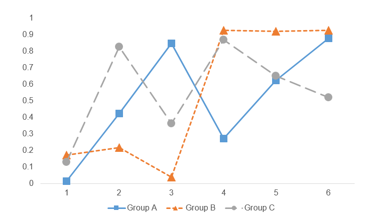
Another method to generate data visualizations for readers with color vision deficiency is to use different line styles or shapes. For example, we can use different types of dashed lines and markers for this line chart (Figure 6).

Figure 6. Line chart using different dash line types and markers (square, triangle, and circle).

CONCLUSIONS

Color vision deficiency can hinder our readers from extracting information from our data visualization. Hence, it is critical that we generate data visualization using the methods above to help our audience. Using the correct color palette and varying the style of the figures by changing the line styles (e.g., dashed) or marker shapes, can assist our readers regardless of their color vision deficiency. More importantly, it will help to reduce any barriers to accessing vital information for our entire audience.


ACKNOWLEDGMENTS

I used the Coblis-Color Blindness Simulator to generate the varying color vision deficiency examples in Figure 4.


REFERENCES

1.         Birch J. Worldwide prevalence of red-green color deficiency. J Opt Soc Am A Opt Image Sci Vis. 2012;29(3):313-320. doi:10.1364/JOSAA.29.000313

2.         Chakrabarti S. Psychosocial aspects of colour vision deficiency: Implications for a career in medicine. Natl Med J India. 2018;31(2):86-96. doi:10.4103/0970-258X.253167

Communicating data effectively with data visualization: Part 40 (Percentage of population with COVID-19 vaccination)

INTRODUCTION

Since the COVID-19 pandemic began on 12 December 2019, there have been several innovations in the forms of vaccinations and treatments. Of critical importance is the world-wide international support for COVID-19 vaccination. A timeline of the COVID-19 pandemic can be found at the CDC website.

The website informationisbeautiful.net has a great COVID-19 dashboard that ranks countries that have administered vaccinations.

Source: www.informationisbeautiful.net (https://informationisbeautiful.net/visualizations/covid-19-coronavirus-infographic-datapack/)

TUTORIAL

We will recreate this chart using Excel. Data can be download from my Dropbox folder or from Our World in Data website.

The data will contain information for 39 countries. These variables include the total number of vaccinations, the number of people vaccinated, the number of people who are fully vaccinated, the number of boosters, the total population, percentage of the population who are vaccinated, percentage of the population who are fully vaccinated, and the percentage of the population with boosters.

We will create a vertical bar chart for the percentage of the total population that received at least one COVID-19 vaccination. You can use these methods to recreate the vertical bar charts of the remaining figures in the figure above.

Visually inspect the data. It should look like the following.

We will us the “total_vaccinations,” “percent_vaccinated,” “percent_full_vaccinated,” and “percent_boosted” to generate the figures.

Step 1: Insert the vertical bar chart.

Once the vertical bar chart is inserted onto the Excel sheet, right click on the chart and click on “Select data.” We want to highlight the data column titled, “percent_fully_vaccinated.” For the “Series name,” enter “% fully vaccinated.”

Step 2. Edit the labels.

In the “Horizontal (Category) Axis Labels,” click on the “Edit” button and select the
location.” In the “Axis label range,” highlight the values in the “location” column. This will assign each value of the “percent_fully_vaccinated” with the country.

Step 3. Delete unnecessary labels and titles.

The figure should look like the following. We can delete the x-axis, the axis title, and the chart title. Extend the chart so that you can view all the countries. You can also narrow the chart so that it will resemble the size of the informationisbeautiful.net figures.

Step 4. Create a progress bar

We will add a progress bar, which will allow us to see how much of the population is fully vaccinated. This requires us to use the “full_bar” column which has a value of “1” for each country. This value represents a 100% progress goal.

Right-click on the chart and add a new data entry. Select the data under the column called “full_bar.” The values are all “1” to represent a 100% progress bar.

The chart will have two bars for each country; one bar represents the percentage of the population that is fully vaccinated, and other bar represents 100% progress. We need to edit the overlay and the width of the bar to match the ones on the informationisbeautiful.net charts.

Right-click the chart and select “Format Data Series…” Change the “Series Overlap” to 100% and the “Gap Width” to 40%. You may not see the blue bar chart because the red bar chart will be in front of it. To fix this, go to the “Select Data Source” window and use the arrow to reposition the data series. This will place the blue bar chart in front of the red bar chart.

Step 5. Add the data labels.

The next step will include the data labels to the progress bar. We want to have the data labels aligned on the right. When you right-click the blue chart, you will get the data labels to be aligned to the left or the end of the bar. This does not get us to the data labels aligned on the right.

To do this, we need to right-click the red bar (not the blue bar) and click on “Add data labels.” This will all the data value for the progress bar, which is “1.”

Right-click on one of the data labels that has a “1” and select “Format Data Labels…” This will open a window where you will need to check the box next to “Value From Cells.” When prompted, select the values in the “percent_fully_vaccinated” column. This will add the percentage of the population that is fully vaccinated on the right-side of the bar chart. Additionally, uncheck the box next to “Value.” This will remove the value from the bar chart so that you will no longer see the “1.”

The chart should be updated to have the percentage of the population who are fully vaccinated aligned to the right-side of the bar chart.

Step 6. Modify the chart to improve the aesthetics.

Once you’ve added the data labels and aligned them on the right-side of the bar chart, you can start to edit the font color, bar colors, and delete the grid lines to emulate the chart in informationinbeautiful.net website.

I changed the background to a dark gray and the data labels to a white color. I also changed the font to Arial Narrow.

I only presented part of the figure here. But you can download and view the whole figure from my Drobox folder.

CONCLUSIONS

Using the vertical bar chart with progress bars allow us to emulate the figures generated by informationisbeautiful.net. I like these types of charts for data visualization because they provide some indication of progress. You can see that the United States is behind many nations when it comes to having the population fully vaccinated. This is much lower than the UAE and South Korea where 95.6% and 86.6% of the total population are fully vaccinated. Hopefully, you can use this exercise to help you develop similar charts for your data visualizations.


REFERENCES

Data was access using the Our World in Data COVID-19 site.

The data visualization that inspired this exercise was based on informationisbeautiful.net COVID-19 Coronavirus Data Dashboard.

The Excel file with the data used for this tutorial is available on my Dropbox folder.