
I wrote a short tutorial on how to perform an interrupted time series analysis in R. I had a challenging time working on this because I wasn’t familiar with all the nuances of the ITSA. More importantly, I wasn’t able to leverage my Stata skills to do this in R. I’m used to the Stata margins command, which is great for creating constrasts. R has its own version of the margins command, but it lacks some of Stata’s features such as the pwcompare, which I use a lot in Stata. However, I found a workaround with linear splines, and I have uploaded this to my RPubs site (link). I hope you find this useful. I also saved my R Markdown code on my GitHub site (link).
Interrupted time series analysis (ITSA) with Stata
Interrupted time series analysis (ITSA) is a study design used to study the effects of an intervention across time. An important feature of the ITSA is the time when the intevention occurs. The time before and after the intervention are of interest because we want to visualize if the trends are similar or different. Additionally, we want to visualize the change immediately after the intervention is implemenated. I call this period the index date.
In this article, I’ll review the single-group ITSA and multiple groups ITSA. Then I’ll review how to perform an ITSA in Stata.
You can view the complete tutorial on my RPubs site.

Two-part models in R - Application with cost data
I created a tutorial on how to use two-part models in R for cost data. I used the healthcare expenditures from the Medical Expenditure Panel Survey in 2017 as a motivating example. Normally, I use Stata when I construct two-part models. But I wanted to learn how I could do this in R. Fortunately, R has a package called twopartm that was developed by Duan and colleagues. You can find their document for the twopartm package here.
The tutorial I created is located on my GitHub page and RPubs page.
Survival analysis in R
I wrote a tutorial on survival analysis using R, which is located on my RPubs page. The R Markdown code is located on my GitHub site.
I provide an introduction to survivor and hazard functions, Kaplan-Meier curves, and Cox proportional hazards model.
Visualizing linear regression models using R - Part 2
I continue my previous blog post on visualizing linear regression models using R (link). Part 2 focuses on using visualization to assess whether the model’s residuals were associated with the predicted values and whether they are normally distributed.
The R Markdown code that I wrote to create this tutorial is located on my GitHub site (link).
You can find the tutorials on my RPubs site:
Part 2 - Visualizing linear regression model using R (link)
(NOTE: on 30 January 2022, I updated these tutorials and they can be found in my RPubs page here. The R Markdown code is saved on my GitHub page here.)
Reproduction number—COVID-19
BACKGROUND
As the COVID-19 pandemic, which began in December 2019, continues into its second year, public health measures have been put into place to mitigate its spread. At the time of writing this article, there have been over 4.5 million deaths and over 216 million cases due to COVID-19.[1] Surveillance of COVID-19 remains an important public health measure of understanding the spread and impact. Daily reports such as the John Hopkins COVID-19 dashboard provide end users with visual and statistical information about the surges in cases and deaths associated with COVID-19. However, one measure that is of great interest is the reproduction number or R0.
Reproduction number (R0) and effective reproduction number (Rt)
The reproduction number is the number of new cases that is directly caused by exposure to a single case.[2,3] Figure 1 provides a visual explanation of the basic reproduction number. However, the underlying assumption with R0 is that everyone in the population is susceptible to infection. With the introduction of vaccines, the R0 isn’t a good measure of the reproductive capabilities of COVID-19. Instead, the effective reproduction number (Rt) is used to provide a more realistic reproduction number based on the population being infected, recovered, or vaccinated. The Rt changes over time as the population susceptible to infection changes.
Figure 1. Basic reproduction number.
I wanted to create a figure that would highlight the changes associated with the Rt for each state in the United States. To do this, I downloaded the Rt data from the by Xihong Lin's Group in the Department of Biostatistics at the Harvard T.H. Chan School of Public Health. They have an amazing COVID-19 tracker dashboard that captures the changing patterns of Rt for each state. Then I created a Cleveland plot to show where the Rt was near the beginning of the pandemic and where it is currently (August 2021). (Note: I wrote a tutorial on creating Cleveland plots that you can review here.) Here is the final figure (because of the length of the figure, I cropped it to show the first 30 states or territories):
Figure 2. Effective reproduction number (Rt) for U.S. states and territories, April 17, 2020 (past) to August 14, 2021 (recent).
The blue dots denote the most recent effective reproduction number (14 August 2021) and the past dots denote the earliest effective reproduction number (17 April 2020).
It seems that some states have gotten worse in terms of increase effective reproduction number since the beginning of the pandemic. This could be due to lack of good data in the early phases of the pandemic. However, what is of concern is the high effective reproduction numbers in some states (Rt > 2), which indicates that the pandemic is still spreading at an alarming rate.
There were some missing data which are identified by a single dot (blue or red) or an empty field in the recent or past effective reproduction number. Rather than fill these in, I left them empty. There may be data in between the two time periods that I could have used, but I left those out.
One thing to mention is that this Cleveland plot only tells us one dimension of the effective reproduction number story (the difference between the most recent Rt and the earliest Rt). It doesn’t tell us much about how the effective reproduction number changes across time. For that, I direct your attention to the Lin’s Laboratory Group at Harvard, they have a great figure that shows the fluctuation of the effective reproduction number for the U.S. and its states/territories (see example):
Source: Lin’s Laboratory Group at Harvard (link). [last accessed on 30 August 2021].
CONCLUSIONS
The effective reproduction number provides us with some interesting patterns in spread of COVID-19 by states/territories. It seems to have worsened over time, but this could be due to poor data early in the pandemic. There are some issues with the us of effective reproduction number for policy decisions. Reporting delays can impact the estimates for the effective reproduction number. A technique called “nowcasting” is used to estimate the reproduction number.[3] But when I explored some of the work in this area, there appears to be a variety of methods for performing this technique. Despite this limitation, the effective reproduction number may be useful to evaluate public health policy decisions to reduce the spread of the COVID-19 pandemic.[4,5]
DATA SOURCE
I provided the link to the COVID-19 Spread Tracker from the Lin Lab at Harvard. You can also download a curated version of the data for this article from my Dropbox folder. The data are current as of 17 August 2021. If you’re interested in recreating this Cleveland plot, I recommend downloading the most recent data to see how much the effective reproduction number has changed.
REFERENCES
Worldometeres.info. COVID Live Update: 217,770,381 Cases and 4,521,936 Deaths from the Coronavirus - Worldometer. Accessed August 30, 2021. https://www.worldometers.info/coronavirus/
Lim J-S, Cho S-I, Ryu S, Pak S-I. Interpretation of the Basic and Effective Reproduction Number. J Prev Med Pub Health. 2020;53(6):405-408. doi:10.3961/jpmph.20.288
Adam D. A guide to R — the pandemic’s misunderstood metric. Nature. 2020;583(7816):346-348. doi:10.1038/d41586-020-02009-w
Inglesby TV. Public Health Measures and the Reproduction Number of SARS-CoV-2. JAMA. 2020;323(21):2186-2187. doi:10.1001/jama.2020.7878
Pan A, Liu L, Wang C, et al. Association of Public Health Interventions With the Epidemiology of the COVID-19 Outbreak in Wuhan, China. JAMA. 2020;323(19):1915-1923. doi:10.1001/jama.2020.6130
Formulating a good research question
On April 16, 2020, I gave a presentation to students from the International Society for Pharmacoeconomics and Outcomes Research (ISPOR) Student Chapter at the University of Washington’s Comparative Health Outcomes, Policy, & Economics (CHOICE) Institute. I reviewed some of the ways to think about a research topic, how to narrow the scope of the topic, and how to formulate a specific and testable research question. The presentation was meant to help students develop their own process for developing a good research question for their thesis.
I discussed the FINER criteria for formulating a research question
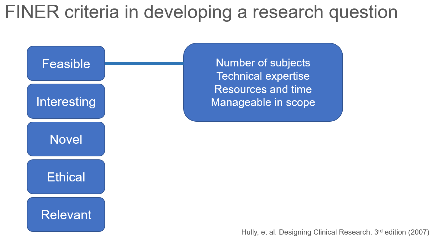
I also discussed the PICOT format of a research question.

The presentation is available on the CHOICE Institute’s blog: https://choiceblog.org/2020/04/27/best-practices-in-developing-research-questions/
Cobb-Douglas production function and costs minimization problem
Update 2: This article was updated on 12 August 2023 when Dimanjan Dahal (Twitter account) identified a better way to present the Lagrangian functions. I updated this to better reflect the minimization problem and set the partial derivative solution to 0. Thank you, Dimanhan.
Update 1: This article was updated on 11 October 2021 when an anonymous reader identified an error with the example used at the end. The error was the negative value generated for the output elasticity of capital. In the previous example, I used R to generate a set of random numbers that were used in a regression model. The beta coefficient generated a negative value which was used in the linear form of the Cobb-Douglass equation. Since the output of elasticity should be between the values of 0 and 1, this negative coefficient should not be possible. Hence, I’ve updated the data frame used in the example to avoid this issue. Appreciation goes out to the anonymous reader who identified this error.
INTRODUCTION
The Cobb-Douglas (CD) production function is an economic production function with two or more variables (inputs) that describes the output of a firm. Typical inputs include labor (L) and capital (K). It is similarly used to describe utility maximization through the following function [U(x)]. However, in this example, we will learn how to answer a minimization problem subject to (s.t.) the CD production function as a constraint.
The functional form of the CD production function:

where the output Y is a function of labor (L) and capital (K), A is the total factor productivity and is otherwise a constant, L denotes labor, K denotes capital, alpha represents the output elasticity of labor, beta represents the output elasticity of capital, and (alpha + beta = 1) represents the constant returns to scale (CRS). The partial derivative of the CD function with respect to (w.r.t) labor (L) is:
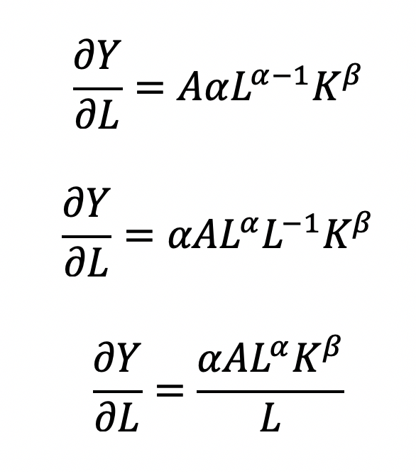
Recall that quantity produced is based on the labor and capital; therefore, we can solve for alpha:
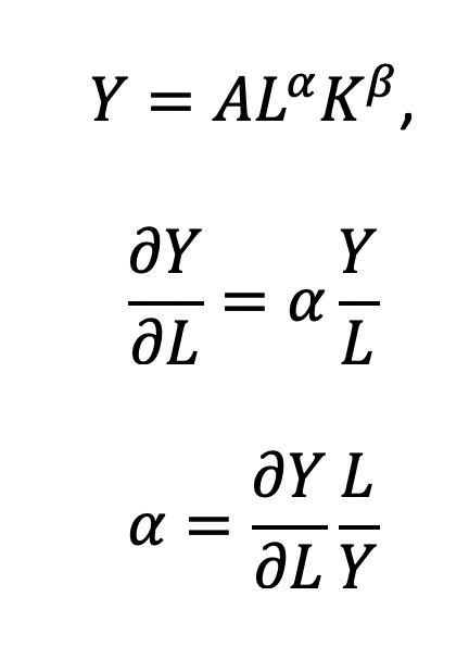
This will yield the marginal product of labor (L). If alpha = 2, then a 10% increase in labor (L) will result in a 20% increase in output (Y).
The partial derivative of the CD function with respect to (w.r.t) labor (K) is:

This will yield the marginal product of capital (K).
The CD production function can be converted to a linear model by taking the logarithm of both sides of the equation:
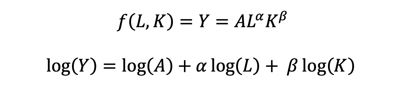
This will allow for OLS regression methods, which is commonly used in economics to understand the association between inputs (L and K) on production (Y).
However, what happens when we are interested in the marginal cost with respect to (w.r.t.) production (Y)? This becomes a constraint (cost) minimization problem where the firm can control how much L and K they will use. In other words, we want to minimize the cost subject to (s.t.) the output

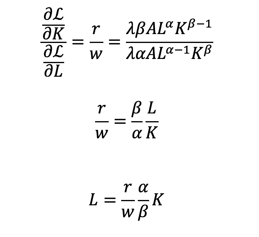
Cost becomes a function of wage (w), the amount of labor (L), price of capital (r), and the amount of capital (K). To determine the optimal amount of inputs (L and K), we solve this minimization constraint using the Lagrange multiplier method:
Solve for L
Substitute L in the constraint term (CD production function) in order to solve for K
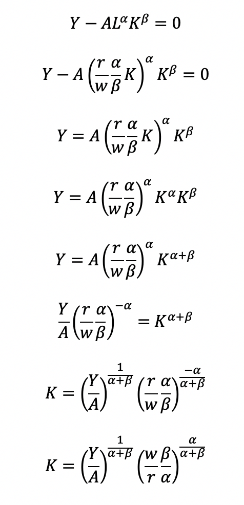
Now, we can completely solve for L (as a function of Y, A, w, and r) by substituting for K

Substitute L and K into the cost minimization problem

Simplify
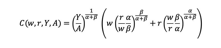
Final cost function
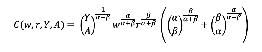
Let’s see how we can use the results from a regression model to give us information about the total costs w.r.t. to the quantity produced.
Recall the linear form of the Cobb-Douglas production function:

I simulated some data where we have the capital, labor, and quantity produced in R.
## Use the following libraries:
library(jtools)
library(broom)
library(ggstance)
library(broom.mixed)

## Generate random data for the data frame (cddata)
set.seed(1234)

production <- sample(100:600, 30, replace=TRUE)

labor <- sample(50:350, 30, replace=TRUE)

capital <- sample(6000:7000, 30, replace=TRUE)

## Cost function parameters: wage and price constants
wage <- 35.00
price <- 30.00

## Set up the data frame (cddata):
cddata <- data.frame(production = production, labor = labor, capital = capital, wage = wage, price = price)

## Name rows using some timeline from 1988 to 2017 (30 years for 30 observations for each variable):
row.names(cddata) <- 1988:2017
Then I perform a regression model using OLS
## Setting up the model, where log(a) is eliminated due to it being the intercept.
cd.lm <- lm(formula = log(production) ~ log(labor) + log(capital), data = cddata)

summary(cd.lm)

Residuals:
     Min       1Q   Median       3Q      Max
-0.96586 -0.25176  0.06148  0.37513  0.67433

Coefficients:
             Estimate Std. Error t value Pr(>|t|)
(Intercept)   4.44637   17.41733   0.255    0.800
log(labor)    0.14373    0.23595   0.609    0.548
log(capital)  0.05581    2.00672   0.028    0.978

Residual standard error: 0.5065 on 27 degrees of freedom
Multiple R-squared:  0.01414,   Adjusted R-squared:  -0.05888
F-statistic: 0.1937 on 2 and 27 DF,  p-value: 0.8251
After running the model, I stored the coefficients for use later in the production function.
## Store the coefficients
coeff <- coef(cd.lm)

## Assign the values to the production function parameters where Y = AL^(alpha)K^(beta)
intercept <- coeff[1]
alpha <- coeff[2]
beta <- coeff[3]
From the parameters, we can get A (intercept), alpha (log(labor)), and beta (log(capital)).

This will give us the quantity produced (Y) for given data on labor (L) and capital (K).
We can get the total costs (C) based on the quantity produced (Y) using the cost function:

I set up my R code so that I have the intercept, alpha, beta, labor, wage, and price of the capital set up. I estimated each part of the cost function separately and then multiply the parts at the end.
## Cost
PartA <- (production / intercept)^(1 / alpha + beta)
PartB <- wage^(alpha / alpha + beta)
PartC <- price^(beta / alpha + beta)
PartD <- as.complex(alpha / beta )^(beta / alpha + beta) + as.complex(beta/ alpha)^(alpha / alpha + beta)

costs <- PartA * PartB * PartC * PartD
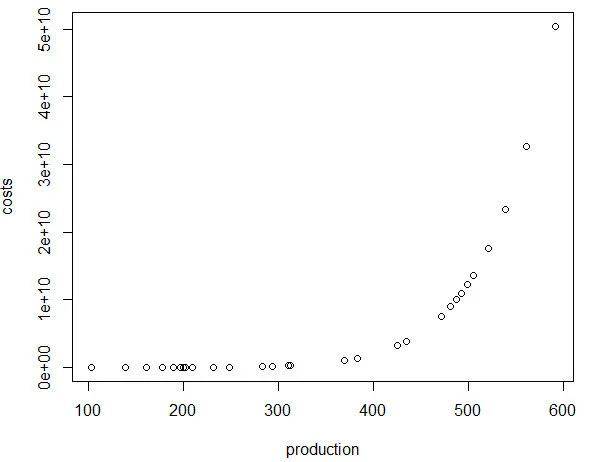
Note: R has a problem with performing complex operations with exponents that were defined using arrays or vectors. If you try to compute something like x^{alpha}, you will get an error where the value is “NaN.” I don’t have a complete understanding of the problem, but the solution is to make sure your root or base term is preceded by “as.complex(x)” to resolve the issue.I plot the relationship between quantity produced and cost. In other words, this tells us the lowest costs needed to produce the quantities on the plot.
plot(production, costs)
CONCLUSIONS
Using the Cobb-Douglas production function and the cost minimization approach, we were able to find the optimal conditions for the cost function and plot the outcome relative to the quantity produced. As production increases, the minimum cost needed increases in a non-linear, exponential fashion, which makes sense given that Y (quantity produced) is in the numerator on the right-hand side of the cost function and positively related to the cost.
This was a fun exercise that made me think about the usefulness of the Cobb-Douglas production function, which I learned to optimize multiple times in my Economics courses. I was excited to find a pleasant utility for it using simulated data and will probably explore more exercises like this in the future.
REFERENCEs
I used a lot of resources to write this blog, which are provided below.
A site dedicated to the discussion of economics called EconomicsDiscussion.net was a great resource.
These papers were incredibly helpful in preparing the example in R:
Lin CP. The application of Cobb-Douglas production cost functions to construction firms in Japan and Taiwan. Review of Pacific Basin Financial Markets and Policies Vol. 5, No. 1 (2002): 111–128.
Larriviere JB, Sandler R. A student friendly illustration and project: empirical testing of the Cobb-Douglas production function using major league baseball. Journal of Economics and Economic Education Research, Volume 13, Number 3, 2012: 81-92
Hu, ZH. Reliable Optimal Production Control with Cobb-Douglas Model. Reliable Computing. 1998; 4(1): 63-69.
I encountered some issues regarding complex numbers in R. Fortunately, I found some great resources about it.
I found a great discussion about R’s calculation of exponents and “NaN” results and why complex numbers can mess up your math in R.
Another good site (R Tutorial: An Introduction to Statistics) explaining complex numbers in R.
John Myles White wrote a nice article about complex numbers in R.
Acknowledgements: I would like to thank the user who reached out to me about the coefficient errors for the output elasticity of capital. This helps me to learn my mistakes and correct them. Without the support and guidance from the community, I would not achieve my own goals of being a lifelong learner. Thank you.
Is my d20 killing me? – using the chi square test to determine if dice rolls are bias
BACKGROUND
Every Tuesdays, my friends and I enjoy playing role playing games (RPGs), especially table top RPGs such as Dungeons & Dragons (D&D). Every week, we get together and pull out our laptops, character sheets, and review our previous notes to return to the fictional fantasy worlds we created (or were created for us) and do battle, solve mysteries, and tell stories over some ciders (and Le Croix). This ritual is important because it allows us to disconnect from the real world and allow our imaginations to run wild. After every session, we think about the various actions that took place and review how things would have been different if the roll of a dice went a different way.
I first started playing D&D Second Edition when I was a kid after I was exposed to it at a comic book store (Golden Apple Comics in Los Angeles). I still remember the strange colorful dice rolling on a table top mat and people scratching away at paper using stats that I wasn’t familiar with. In high school, my friends and I would play different campaigns from the D&D and Forgotten Realms worlds, creating characters based on rule books using statistics and probabilities. The key ingredient with any adventure is having your fate determined by a single dice roll. The iconic dice in RPG is the d20 or the 20-sided dice. A d20 dice is usually used to determine whether you “hit” your opponent, use your skills to identify if a trap has been set or whether or not you can charm your way out of an unnecessary fight. Often times than not, there is the chance that a critical fail (a d20 roll of 1) can occur. When this happens, you fail to hit your opponent and trip over yourself during combat, miss the trap and activate it killing someone in your party, or pissing off the non-playable character (NPC) and having them attack you. Not only will something go wrong, it will go wrong spectacularly. So, it’s only natural that we look at the d20 that was rolled and ask, “Is my d20 killing me?”
Luckily, there is a statistical test that we can use to answer this common question.
CHI SQUARE TEST
The chi square test is one of the most common statistical tests performed in sciences. In its simplest form, the chi square test is used to detect whether the observed frequencies are different from the expected frequencies across different categories. For example, in a 6-sided dice, the probability that the number 6 will land is 16.7% or 1/6. This is true for every value of the 6-sided dice if it was unbiased.

But what if the dice was biased? Suppose we roll the 6-sided dice 100 times and we get the following results:

Visually, we can see that there is some bias with this 6-sided dice. We don’t know what the bias is, but there is a something causing this dice to roll a “3” more times than it should (approximately 2 more times than normal). Alternatively, this 6-sided dice is rolling a value of “1” less times than it should (approximately 70% less likely compared to the expected frequency).
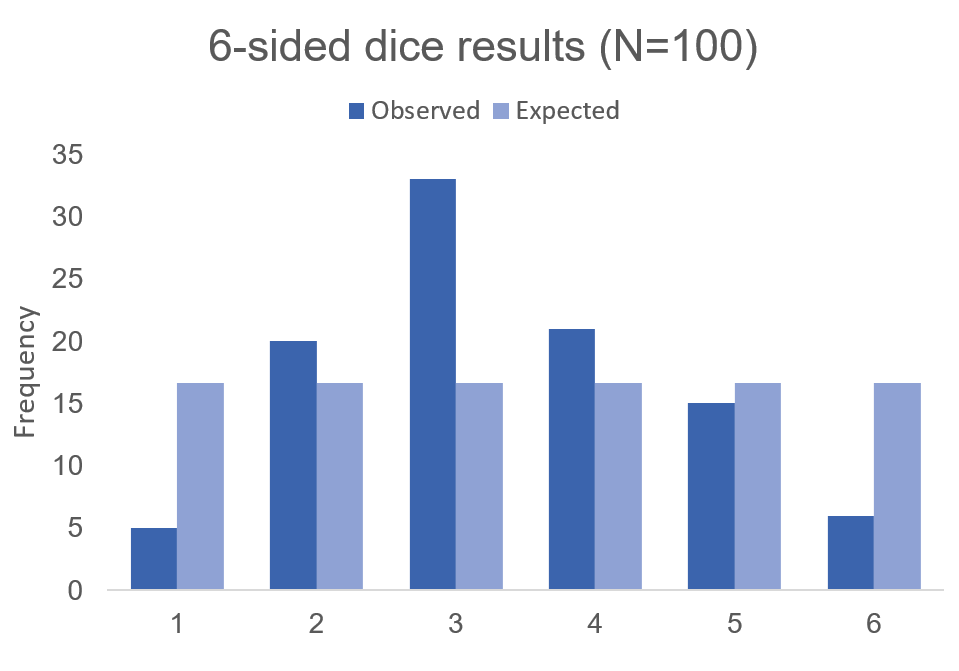
Using these data, we can perform a chi-squared test.
First, we use the following formula:
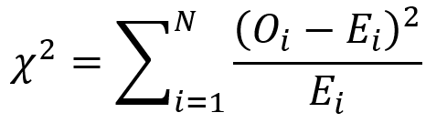
where O is the observed frequency for position i and E is the expected frequency for position i.
We need another piece of information, degrees of freedom. To estimate the degrees of freedom, we use the following equation: df = (R-1) * (C-1), where R = number of rows and C = number of columns. For the 6-sided dice, the df = (2-1) * (6-1) = 5
We can set up the formula using the following table.
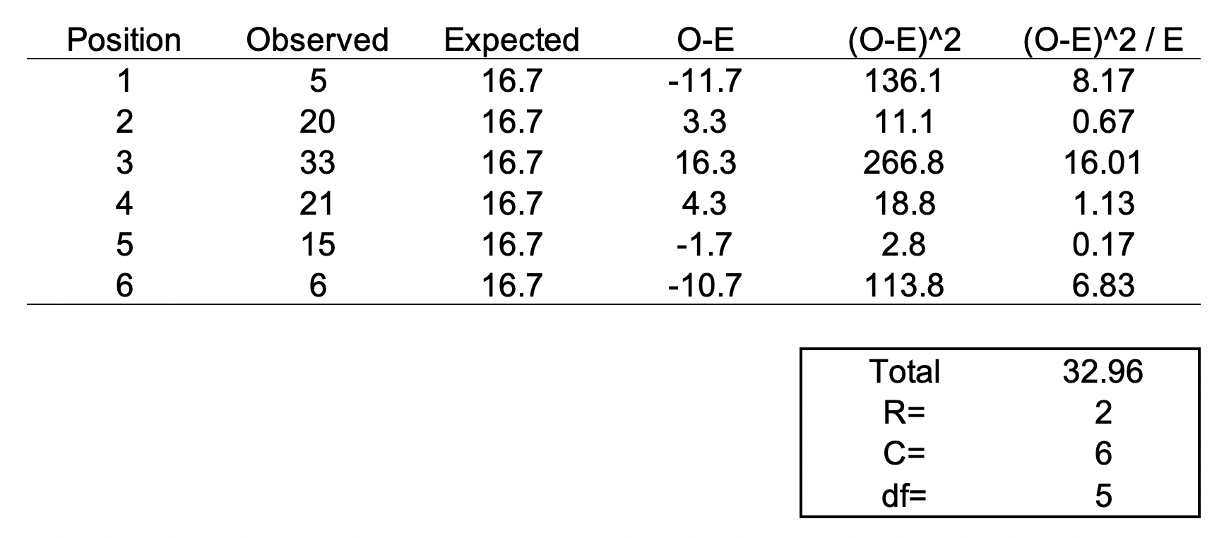
The total value of 32.96 is the chi square statistic. We will need to use the chi square distribution table to determine the p-value. Next, we need to use a chi square table like the one shown below.

So, with a degree of freedom of 5 and a chi square statistic of 32.96, the probability of a more extreme test statistics than the one observed is less 1% assuming that there were no differences. In other words, the dice is definitely bias at the type I error of 5%. I should throw away this dice.
MOTIVATING EXAMPLE
Now, let’s do this for a 20-sided dice. I’m not going to actually roll the dice 100 times, but I will generate a simulation.
> #######################################################################
> ## Simulate a d20 dice roll with 100 trials
> #######################################################################
> sims <- sample(x = 1:20, size=100, replace=TRUE)
>
> ## Generate frequency table
> table(sims)
sims
 1  2  3  4  5  6  7  8  9 10 11 12 13 14 15 16 17 18 19 20
 6  8  2  2  3  2  2  6  7  3  4  8  8  6  3  7  7  4  5  7
>
> ## Generate probability table
> prob <- table(sims) / length(sims)
>
> ## Plot the frequency of the rolls
> plot(table(sims), xlab = 'd20 rolls', ylab = 'Frequency', main = 'Frequency of events for each possible d20 roll (Trials=100)')
>
> ## Plot the probability of the rolls
> plot(prob, xlab = 'd20 rolls', ylab = 'Frequency', main = 'Probability of events for each possible d20 roll (Trials=100)')
>
> ## Perform chi square test
> chi2 <- chisq.test(table(sims))
> chi2

    Chi-squared test for given probabilities

data:  table(sims)
X-squared = 19.2, df = 19, p-value = 0.4441
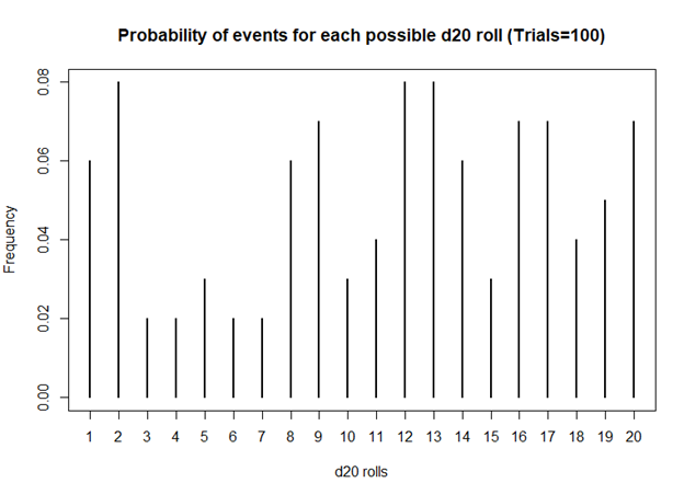
Based on this first simulation run of 100 rolls, the dice is fairly unbiased.
Let’s try 1000 rolls.
> #######################################################################
> ## Simulate a d20 dice roll with 1000 trials
> #######################################################################
> sims <- sample(x = 1:20, size=1000, replace=TRUE)
>
> ## Generate frequency table
> table(sims)
sims
 1  2  3  4  5  6  7  8  9 10 11 12 13 14 15 16 17 18 19 20
51 45 41 54 55 54 33 50 48 46 44 56 50 64 43 49 50 49 54 64
>
> ## Generate probability table
> prob <- table(sims) / length(sims)
>
> ## Plot the frequency of the rolls
> plot(table(sims), xlab = 'd20 rolls', ylab = 'Frequency', main = 'Frequency of events for each possible d20 roll (Trails = 1000)')
>
> ## Plot the probability of the rolls
> plot(prob, xlab = 'd20 rolls', ylab = 'Frequency', main = 'Probability of events for each possible d20 roll (Trials=1000)')
>
> ## Perform chi square test
> chi2 <- chisq.test(table(sims))
> chi2

    Chi-squared test for given probabilities

data:  table(sims)
X-squared = 20.08, df = 19, p-value = 0.3898
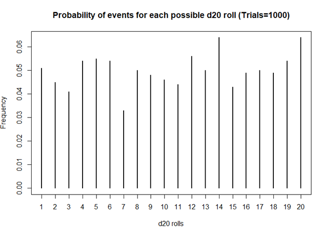
Still unbiased. But notice how the frequencies for each value of the d20 dice is starting to have similar frequencies. Unlike the previous frequency figure where there were more fluctuations, you see less of it with more rolls.
How about 10,000 rolls?
> #######################################################################
> ## Simulate a d20 dice roll with 10,000 trials
> #######################################################################
> sims <- sample(x = 1:20, size=10000, replace=TRUE)
>
> ## Generate frequency table
> table(sims)
sims
  1   2   3   4   5   6   7   8   9  10  11  12  13  14  15  16  17  18  19  20
496 477 518 469 504 492 491 551 507 499 474 527 519 532 493 506 503 473 509 460
>
> ## Generate probability table
> prob <- table(sims) / length(sims)
>
> ## Plot the frequency of the rolls
> plot(table(sims), xlab = 'd20 rolls', ylab = 'Frequency', main = 'Frequency of events for each possible d20 roll (Trails = 10,000)')
>
> ## Plot the probability of the rolls
> plot(prob, xlab = 'd20 rolls', ylab = 'Frequency', main = 'Probability of events for each possible d20 roll (Trials=10,000)')
>
> ## Perform chi square test
> chi2 <- chisq.test(table(sims))
> chi2

    Chi-squared test for given probabilities

data:  table(sims)
X-squared = 19.872, df = 19, p-value = 0.4023
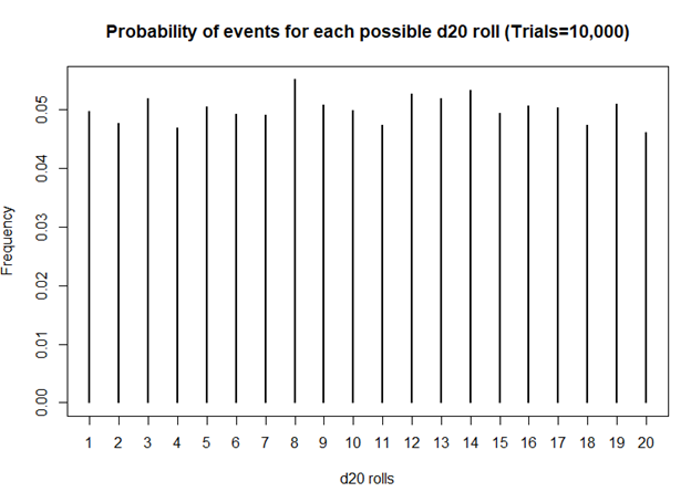
Definitely smoother. As we perform more and more rolls of the d20, we get a nearly equal number of rolls for each value.
A BIASED EXAMPLE: IS MY D20 TRYING TO KILL ME?
What if the dice was actually bias? What then? Let’s use another d20 dice and simulate the probability that the roll will be a critical fail 80% of the time.
> #######################################################################
> ## Simulate a d20 dice roll with 10000 trials -- BIASED sample
> ## This is a biased d20 where the number 1 has an 80% probability of hitting.
> #######################################################################
> sims <- sample(x = 1:20, size=10000, prob=c(0.8, 0.01052632, 0.01052632, 0.01052632, 0.01052632, 0.01052632, 0.01052632, 0.01052632, 0.01052632, 0.01052632, 0.01052632, 0.01052632, 0.01052632, 0.01052632, 0.01052632, 0.01052632, 0.01052632, 0.01052632, 0.01052632, 0.01052632), replace=TRUE)
>
> ## Generate frequency table
> table(sims)
sims
   1    2    3    4    5    6    7    8    9   10   11   12   13   14   15   16   17   18   19   20
7952   99  104  111  111  104  120  109   98   93  107   99  107  110  116  109  118  122  104  107
>
> ## Generate probability table
> prob <- table(sims) / length(sims)
>
> ## Plot the frequency of the rolls
> plot(table(sims), xlab = 'd20 rolls', ylab = 'Frequency', main = 'Frequency of events for each possible d20 roll (Trials=10,000)')
>
> ## Plot the probability of the rolls
> plot(prob, xlab = 'd20 rolls', ylab = 'Frequency', main = 'Probability of events for each possible d20 roll (Trials=10,000)')
>
> ## Perform chi square test
> chi2 <- chisq.test(table(sims))
> chi2

    Chi-squared test for given probabilities

data:  table(sims)
X-squared = 116910, df = 19, p-value < 2.2e-16
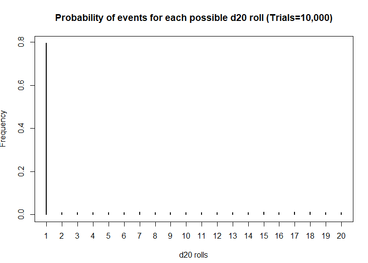
Wow! This d20 is really biased! At a statistical significance threshold that is less than 5%, the very small P-value (P<2.2 x 10^-16) indicates that this d20 is statistically biased from from a fair d20. Maybe that’s why I have more critical fails than any member in my party. I definitely will not be using this dice in the future.
CONCLUSIONS
The chi square test has a lot of usefulness in explaining the bias with anything that provides frequencies of rolls or events. You can use the chi square test for a variety of things such as the fairness of a coin, the differences in the frequency of male and female across different character classes, and determine whether the actual observations matches what you expected. So, when you’re playing D&D with your friends and you suspect that your d20 is rolling a critical fail more often than naught, you may want to run a little experient using the chi square test.
The R code can be found on my GitHub site.
REFERENCES
I had help writing this blog. The codes for the chi square simulation came from Francis J. DiTraglia, Assistant Professor of Economics from the University of Pennsylvania. His website is here. The page where I found his codes is here.
For those interested in probability and games, you should check out this great resource from the Mathematics Assessment Resource Service at the University of Nottingham & UC Berkeley. It uses mathematics to design several games of chance. Fun to do in between campaigns.
And for those who want a more academic presentation on RPGs, Paul Mason wrote an incredible piece that can be found here. Citation: Mason, Paul. 2012. "A History of RPGs: Made by Fans; Played by Fans." Transformative Works and Cultures, no. 11. http://dx.doi.org/10.3983/twc.2012.0444
Using inverse probability of treatment weights & Marginal structural models to handle time-varying covariates
BACKGROUND
When constructing regression models, there are two approaches to handling confounders: (1) conditional and (2) marginal approaches.(1) The conditional approach handles confounders using stratification or modeling (e.g., adding covariates to be regressed to the outcome). Whereas, the marginal approach uses weights to balance the confounders across treatment exposure levels.(1–5) In conventional regression models, the exposure is regressed to the outcome controlling for potential confounders. However, in longitudinal data, time-varying confounders can result in biased estimates of the model parameters if not properly adjusted. This gets more complicated when we have a time-varying exposure in the model to account for.
In panel data analysis or longitudinal data analysis, adjusting for time-varying exposure and time-varying confounders are critical to reducing bias. Additionally, there are time-dependent relationships between the confounders and exposure that need to be considered when adjusting for longitudinal regression models. In this article, we will focus on the marginal approach in terms of using the inverse probability of treatment weights fitted to a marginal structural model.
This article was published on RPubs with the corresponding R code using RMarkdown and can be located at this link.
TIME-DEPENDENT RELATIONSHIPS
In Figure 1, the time-dependent relationships between times 1 and 0 for the treatment variable are indicated by the arrows (We look at the relationships across two time points. In actual longitudinal data, there may be more than two time points to consider). Notice how the Outcome at time==0 is a confounder for the relationship between Exposure and Outcome at time==1.
Figure 1. Time-dependent relationships between the exposure and outcome variables.

Conventional methods to perform longitudinal data analysis such as linear mixed effects models and generalized estimating equations models are capable of handling time-varying covariates. However, in the case of a time-varying elements, the probability of treatment exposure is invariably different across time, which requires application of time-varying weights on the unit of analysis (e.g., individual subjects).
We can address this issue by applying inverse probability of treatment weights (IPTW) to the observations, which are then fitted to a marginal structural model (MSM).(4,5) IPTW are used to make the exposure at time 0 and 1 independent of the confounders that occur beforehand and allow us to generate a causal interpretation between the treatment exposure on the outcome.
DESCRIPTION OF METHODS
IPTW are weights assigned to each observation across time conditioned on the previous exposure history, which are then multiplied to generate a single weight for a subject. Similar to conventional propensity score estimation, IPTW is generated using either a logit or probit model that regresses covariates to a treatment group (exposure) variable. With IPTW, the previous exposure history is incorporated to the propensity score estimation, which is time-varying.
Standardized weights in a longitudinal setting are estimated as

where A is the exposure for subject i at time t_ij (time points range starting at k = 0 to k=j). The numerator contains the probability of the observed exposure at each time point (a_ik) conditioned on the observed exposure history of the previous time point (a_ik-1) and the observed non-time varying covariates (v_i). The denominator contains the probability of the observed exposure at each time point conditioned on the observed exposure history of the previous time point (a_ik-1), the observed time-varying covariates history at the current time point (c_ik), and the non-time varying covariates (v_i).
In standardized weights, the time-varying confounders are captured in the denominator but not in the numerator. However, the non-time varying (also known as fixed-time) covariates are captured in both the numerator and denominator to stabilize the weights. Using stabilized weights is preferable to non-standardized weights, which are not discussed in this article.
Some statistical software are unable to handle time-varying weights; hence, a single weight for each individual needs to be estimated. Once the standardized weights for subject i at time t_ij are calculated, a single weight is estimated by multiplying all the standardized weights across the time points, which is then applied in a marginal structural model for subject i.
There are several key assumptions that must be made in order for IPTW methods to generate causal interpretation between the exposure and outcome (Thoemmes and colleagues provides a detailed explanation in their paper)(5):
1) No unmeasured confounding
2) Positivity
3) Correct specification of the IPTW
Given these assumptions are met, using IPTW fitted to an MSM can yield causal inference between the treatment exposure and outcome. This method is flexible enough where it can be applied to a linear mixed effects model, generalized estimating equation model, and survival model. Gerhard and colleagues used this approach (marginal structural Cox model) to estimate the treatment effects of antihypertensive therapy in a non-randomized trial.(6) Hernan and colleagues used a marginal structural Cox proportional hazard model to estimate the treatment effect of zidovudine and Pnuemocystis carinii therapy on survival of HIV-positive homosexual males in a non-randomized trial.(4)
MOTIVATING EXAMPLE
This article will use CRAN R program statistical software to perform the IPTW fitted to an MSM. We will use the data that was simulated using the following R commands.
#set seed to replicate results
set.seed(12345)

#define sample size
n <- 2000

#define confounder c1 (gender, male==1)
male <- rbinom(n,1,0.55)

#define confounder c2 (age)
age <- exp(rnorm(n, 3, 0.5))

#define treatment at time 1
t_1 <- rbinom(n,1,0.20)

#define treatment at time 2
t_2 <- rbinom(n,1,0.20)

#define treatment at time 3
t_3 <- rbinom(n,1,0.20)

#define depression at time 1 (prevalence = number per 100000 population)
d_1 <- exp(rnorm(n, 0.001, 0.5))

#define depression at time 2 (prevalence = number per 100000 population)
d_2 <- exp(rnorm(n, 0.002, 0.5))

#define depression at time 3 (prevalence = number per 100000 population)
d_3 <- exp(rnorm(n, 0.004, 0.5))

#define tme-varying confounder v1 as a function of t1 and d1
v_1 <- (0.4*t_1 + 0.80*d_1 + rnorm(n, 0, sqrt(0.99))) + 5

#define tme-varying confounder v2 as a function of t1 and d1
v_2 <- (0.4*t_2 + 0.80*d_2 + rnorm(n, 0, sqrt(0.55))) + 5

#define tme-varying confounder v3 as a function of t1 and d1
v_3 <- (0.4*t_3 + 0.80*d_3 + rnorm(n, 0, sqrt(0.33))) + 5

#put all in a dataframe and write data to harddrive to use later in e.g. SPSS
df1 <- data.frame(male, age, v_1, v_2, v_3, t_1, t_2, t_3, d_1, d_2, d_3)

write.table(round(df1,11),"data1.csv", row.names = FALSE, quote = FALSE)
A little data manipulation was done to make treatment in the following period equal to 1 if the previous period was also equal to 1. In other words, E[Treatment=1, time=1 | Treatment=1, time=time-1]. Age was rounded to the nearest whole number. You can download the *CSV file here.
The dataset contains variables for id, male, age, treatment (t), outcome (d), time-varying covariate (v), and time. Exploring the dataset set, we see the structure as:

There are 2000 individuals with three repeated measures of the t, v, and d variables. The t variable represents the Treatment exposure, which is time-varying. The v variable represents an arbitrary time-varying covariate. And the d variable is the outcome (dependent) variable, which is also time-varying. Non-time varying covariates include the age at baseline and the gender of each individual.
LONGITUDINAL DATA ANALYSIS APPROACH
Generalized estimating equations (GEE) were constructed to evaluate the impact of the treatment (t) on the outcome (d) and to handle the time-varying covariate (v) in the panel dataset. Since the outcome was a continuous variable, a generalized linear Gaussian family with identity link was used. Auto-regressive (AR1) correlation structure was selected since this was a time series (panel) data; we expected the correlation to decay as the outcome values were farther away from the time of interest.
We will need the following packages:
geepack
survey
ipw
reshape
deplyr
The following R code was used to generate the IPTW and fitted to a MSM using GEE.
#######################################################################
# Install the required packages
#######################################################################
library(geepack)
library(survey)
library(ipw)
#library(foreign)
#library(multcomp)
#library(gee)
library(reshape)
library(dplyr)

#######################################################################
#Estimate ipw weights (time-varying)
#######################################################################
# estimate inverse probability weights (time-varying) using a logistic regression
w <- ipwtm(
  exposure = t,
  family = "binomial",
  link = "logit",
  numerator = ~ factor(male) + age,
  denominator = ~ v + factor(male) + age,
  id = id,
  timevar=time,
  type="first",
  data = data_long_sort)
summary(w$ipw.weights)

iptw = w$ipw.weights


# Add the iptw variable onto a new dataframe = data2.
data2 <- cbind(data_long_sort, iptw)

#######################################################################
# Plot the stabilized inverse probability weights
#######################################################################
ipwplot(weights = data2$iptw,
        timevar = data2$time,
        binwidth = 0.5,
        main = "Stabilized weights",
        xaxt = "n",
        yaxt = "n")

#######################################################################
# confint.geeglm function (to generate 95% CI for the geeglm())
#######################################################################
confint.geeglm <- function(object, parm, level = 0.95, ...) {
  cc <- coef(summary(object))
  mult <- qnorm((1+level)/2)
  citab <- with(as.data.frame(cc),
                cbind(lwr=Estimate-mult*Std.err,
                      upr=Estimate+mult*Std.err))
  rownames(citab) <- rownames(cc)
  citab[parm,]
}


#######################################################################
# GEE model #1.1 - GEE with cluster robust SE (no IPTW)
#######################################################################
gee.bias <- geeglm(d~t + time + factor(male) + age + cluster(id),
                    id=id,
                    data=data2,
                    family=gaussian("identity"),
                    corstr="ar1")
summary(gee.bias)
confint.geeglm(gee.bias, level=0.95)

#######################################################################
# GEE model #2 - IPTW fitted to MSM with clustered robust SE
#######################################################################
gee.iptw <- geeglm(d~t + time + factor(male) + age + cluster(id),
                   id=id,
                   data=data2,
                   family=gaussian("identity"),
                   corstr="ar1",
                   weights=iptw)
summary(gee.iptw)
confint.geeglm(gee.iptw, level=0.95)
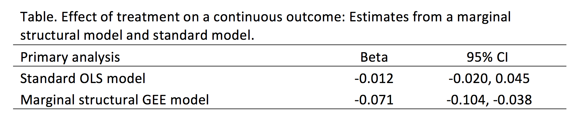
We compared the findings from the convention GEE model without IPTW to the GEE model incorporating IPTW (Table). The differences are significant. In the standard GEE model, the treatment (t) is associated with a reduction in the outcome (d) by 0.012 units with a 95% confidence interval (CI) of -0.020 and 0.045, which is not statistically significant. Conversely, in the GEE model incorporating IPTW, the treatment (t) is associated with a reduction in the outcome (d) by 0.071 units with a 95% CI of -0.104 and -0.038, which is statistically significant.
CONCLUSIONS
Based on our findings, the IPTW fitted to a MSM (GEE model) resulted in a statistically significant reduction in the treatment on the outcome that would not have otherwise been captured in the conventional GEE model. Given that there are time-varying covariates (especially with the treatment variable), IPTW fitted to a MSM may yield important differences that would otherwise be unidentified with conventional methods. However, it is critical that all assumptions regarding the IPTW method are satisfied prior to accepting the model’s results.
REFERENCES
1. Williamson T, Ravani P. Marginal structural models in clinical research: when and how to use them? Nephrol Dial Transplant. 2017 Apr 1;32(suppl_2):ii84–90.
2. Robins JM, Hernán MA, Brumback B. Marginal structural models and causal inference in epidemiology. Epidemiol Camb Mass. 2000 Sep;11(5):550–60.
3. Hernán MA, Hernández-Díaz S, Robins JM. A structural approach to selection bias. Epidemiol Camb Mass. 2004 Sep;15(5):615–25.
4. Hernán MA, Brumback B, Robins JM. Marginal Structural Models to Estimate the Joint Causal Effect of Nonrandomized Treatments. J Am Stat Assoc. 2001 Jun 1;96(454):440–8.
5. Thoemmes F, Ong AD. A Primer on Inverse Probability of Treatment Weighting and Marginal Structural Models. Emerg Adulthood. 2016 Feb 1;4(1):40–59.
6. Gerhard T, Delaney JA, Cooper-DeHoff RM, Shuster J, Brumback BA, Johnson JA, et al. Comparing marginal structural models to standard methods for estimating treatment effects of antihypertensive combination therapy. BMC Med Res Methodol. 2012 Aug 6;12:119.