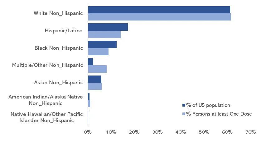
Data visualization

Communicating data effectively with data visualizations: Part 38 (Replicating the LA Times COVID-19 tracker)

INTRODUCTION

Recently, the staff at the Los Angeles Times (LA Times) provided a COVID-19 tracker on their website. This is an impressive set of data visualizations of COVID-19 cumulative cases, new cases, vaccinations, and deaths. I was particularly struck by the “New cases by day” figure which includes a bar chart overlaid with a 7-day moving average line chart. The visualization effectively used the moving average to adjust for the spikes in new COVID-19 cases but maintained the spikes on a daily basis. None of the data are lost and illustrates the spikes in new COVID-19 cases while adjusting for the moving average. The color schemes were also optimal where the daily new cases used a softer color, but the moving average line used a darker color highlighting its importance in the figure.

I wanted to write an article on how to replicate this figure using Excel.

Source: Los Angeles Times, “Tracking the coronavirus in California,” url: https://www.latimes.com/projects/california-coronavirus-cases-tracking-outbreak/ [Accessed on June 24, 2021] * This is for educational purposes only.

DATA SOURCE

Data used in this article can be found on the LA Times GitHub site. I used the “latimes-county-totals.csv” data (link to the raw data). I also made the data available with the final figure on the following Dropbox location.


TUTORIAL

Step 1. Download and visually inspect the data.

After you’ve downloaded the data, take a moment to inspect them. The columns that are used in this tutorial are “date” and “new_confirmed_cases.” But you can use the other columns to replicate other parts of the LA Times COVID-19 tracker.

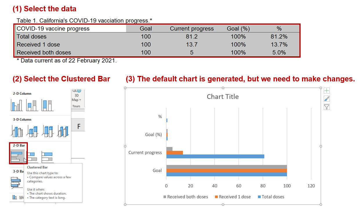
Step 2. Insert a bar chart and select the appropriate data.

Insert a clustered column chart using the Insert tab on the Excel ribbon. When selecting the data, make sure that you select the “new_confirmed_cases” (other data are available, but the new cases are what we are replicating in this exercise).

The default bar chart does a pretty good job of replicating the LA Times figure.

However, we’ll have to do a few edits to the axes to match the LA Times figure.


Step 3. Modify the axes.

Let’s focus on the Y-axis first. Right-click on the Y-axis and select “Format Axis…” In the Axis Options panel, change the Minimum value to 0 and the Major value to 20000. This will match the settings in the target figure. (Note: There are negative values in the data, but these are very small numbers and assumed to be ignorable.) Next, in the Number options, change Category to “Number” and the value in the “Decimal places” to 0. Make sure that you check the box next to “Use 1000 Separator (,)” to replicate the same format in the target figure.

For the X-axis, right-click on the bottom axis and select “Format Axis…”This will open the Axis Options panel where you can make several adjustments to the X-axis. First, we want to change the X-axis display values from dates to months. Change the Number Category field to “Custom” then change the Format Code to “mmm”; make sure to click on “Add” for the changes to take effect. Next, go to the Axis Type area and change the Minimum to “02/01/2020” since we want our timeline to begin on Feb of 2020. Then change the Major value to 4 to match the monthly interval of the target figure. The X-axis should be thicker with tick marks on the outside. To modify these, navigate to the Tick Marks option and change Major type to “Outside” and then click on the Paint Bucket (Fill & Line) option; increase the Width to 1.5. These should match the target figure’s X-axis format.

Step 4. Add the 7-day moving average.

Excel has a Data Analysis tool that will automatically estimate the 7-day average. I’ve written a previous tutorial that describes how to use this tool. I’ll briefly review how to estimate a 7-day moving average.

In the Data tab, click on the Data Analysis tool (instructions on how to install the Data Analysis tool is here). This will open the Data Analysis Tools box. Select “Moving Average” from the tools kit and enter the appropriate values in the options box. For the Input Range, select all the values from “new_confirmed_cases” column. Enter a value of “7” in the Interval field; this will automatically calculated the 7-day moving average. In the Output Range, select a single cell where you want to moving average to be pasted after it is calculated. I chose to use the next available cell on the dataset ($F$2).

Step 5. Add the 7-day moving average to the chart.

To include the moving average data to the current daily new cases bar chart, right-click on the chart and select “Select Data.” This will open a box where you can add new data. Select “Add” which will open the “Edit Series” box. Updates the Series name with the name of the column (“moving_avg”). For the Interval field, change this to “7” for the 7-day moving average. Then in the Series values, select the 7-day moving average data.

By default, Excel will generate a bar chart for the 7-day moving average. However, we want a link chart. We can change this by right-clicking on the bars of the chart and selecting “Change Series Chart Type…” This will open a box that will allow us to select the type of chart for each data. For the “moving_avg” data, change the Chart Type to “Line.” This will create a line chart for the 7-day moving average which will be overlaid over the daily new cases.

Step 6. Modifying the chart format.

To closely match the chart to the one presented in the LA Times, I made the following adjustments. Your mileage may vary depending on the library of fonts available. I tried to select fonts that most Excel users will have access to.

I changed the Y-axis font to Adabi script. The X-axis font was changed to Arial Nova.

The width of the horizontal gridlines was increased to 1.5. The color of the daily new cases bar chart was changed to a light blue using a hex code of #8DC6DF. The color of the 7-day moving average was changed to a dark blue using a hex code of #2B869B; additionally, the width was increased to 2.0.

Step 7. Comparison between LA Times and user-generated charts.

Once the modifications have been made, compare the charts.

CONCLUSIONS

Using data from the LA Times, we can replicate the data visuals on their COVID-19 tracker website. This allows users to verify the data that are presented on a public site. Additionally, it allows us to generate our own data visualizations that could inform policy and education the public on the rate of new cases in California.


REFERENCES

Data was based on the LA Times (link), which was accessed on 24 June 2021.

Excel file used for this exercise can be download from the following Dropbox folder.


ACKNOWLEDGEMENT

The data visual used in this exercise was based on the work of the staffers at the LA Times. They deserve all the credit and acknowledgement for developing these stunning visuals.

Communicating data effectively with data visualizations: Part 37 (visualization COVID vaccinations by race, gender, and age)

INTRODUCTION

The introduction of COVID-19 vaccines sparked a race to administer as many people as possible in the United States (US). To date (31 May 2021), there have been over 167 million people with at least one dose of the vaccine administered according to the Centers for Disease Control and Prevention (CDC).1 However, there have been some concerns about disparities in vaccine coverage among racial, gender, and age groups. The CDC Covid Data Tracker indicates that a disproportionate number of racial groups are not receiving the vaccine. Additionally, there are a disproportionate number of older people who have received at least one dose of the vaccine and less males receiving the vaccine compared to the percentages that make up the US population. We will use simple data visualization techniques to characterize the vaccination of racial groups in the US using data from the CDC.


DATA SOURCE

Data used in this article are located at the CDC’s website (link).

There are several pieces of data that are important. The “% Persons at least One Dose” represents the percentage of people who received at least one dose in the US among those with data on race. The “% US population” represents the percentage of the US population made up by the group. For example, among those who received vaccine, 14.2% identified as Hispanic/Latino, which makes up 17.2% of the entire US population.

Figure 1.jpg

VACCINATIONS BY RACE

A horizontal bar chart was constructed to visually compare the percentage of people in different racial groups who received a vaccine and the percentage of people that made up that racial group in the US.

Figure 2.jpg

Based on this chart, the percentages of Hispanic/Latino and Black, non-Hispanic who received vaccines are less than the percentages that make up the US population. This is in contract to the White non-Hispanic and Asian, non-Hispanic racial groups who have a similar percentages of people who received the vaccine and make up the US population. This figure gives us an illustration on the potential disparities associated with vaccinations.

However, another way to view this figure is to look at the differences in the percentages that received vaccination and make up the US population. With the figure below, we can easily see the disparities.

Figure 3.jpg

VACCINATIONS BY GENDER

According to the CDC, the percentage of males who received vaccination is lower than the percentage that make up the US population. Females have the opposite issue; the percentage of females who received vaccination exceed the percentage the make up the US population.

Figure 4.jpg

We can also view this as the differences in the percentages that received COVID-19 vaccination and make up the US population. The percentages of females who received a vaccination exceeds the percentage that makes up the US population, but the percentage of males who received a vaccination is below the percentage that makes up the US population.

Figure 5.jpg

VACCINATIONS BY AGE GROUPS

According to the CDC, most of the vaccinations occurred among age groups of 40-49, 50-64, 65-74, and 75+ years. However, fewer percentages of the younger age groups have received the vaccination compared to the percentages that make up the US population.

Figure 6.jpg

When we change the metric to look at the differences in the percentages that received the vaccination and the percentages that make up the US population, it is apparent that younger age groups are not receiving the vaccines. However, this is a reflection of the vaccination roll out when early on older age groups were given priority.

fIGURE 7.jpg

CONCLUSIONS

Using simple data visualization techniques and differences in the percentages of vaccination and US population composition, we can graphically display disparities in vaccinations by racial, gender, and age groups. It is unclear what causes these disparities, but it will be paramount that any barriers to a fair and equitable distribution of healthcare be addressed. The biggest challenge will be to establish healthcare policies that will distribute vaccines equitably to all patients in the US.


REFERENCES

  1. Centers for Disease Control and Prevention. COVID Data Tracker. Centers for Disease Control and Prevention. Published March 28, 2020. Accessed May 31, 2021. https://covid.cdc.gov/covid-data-tracker

Communicating data effectively with data visualizations: Part 36 (Scatter plots and Moving Averages for COVID-19 vaccination)

INTRODUCTION

As of 27 April 2021, the Centers for Disease Control and Prevention (CDC) reported that approximately 42.7% of the U.S. population have received at least one dose of the coronavirus (COVID-19) vaccine and 29.1% are fully vaccinated.1 Moreover, a total of over 200 million doses have been administered. Despite the effectiveness of the availability of COVID-19 vaccines, there are some people who have decided to not receive the vaccine. The Economist published a data visualization that summarized the results of weekly surveys that asked respondents, “When a covid-19 vaccine becomes available to you, will you get vaccinated?” This figure shows that approximately 60% of the population will get or already have received the COVID-19 vaccine. However, a little over 20% stated that they will not get the vaccine and nearly 20% are unsure. Using data from The Economist, we can use Microsoft Excel to recreate the figure below:

* Source: The Economist – “When a covid-19 vaccine becomes available to you, will you get vaccinated?” (link). This is for educational purposes only.

DATA

The data to recreate the figure can be found at The Economist YouGov data site (link). I also abstracted the data and saved them onto an Excel file, which is located here. Using the data from The Economist, we will create a scatter plot and use the 2-day moving average to re-create the figure above.

Creating the Scatter Plot with Moving Average

Step 1. Inspect the data

The data include the percentage of respondents who answered “Yes” (includes both Yes and those who received the vaccine), “No”, and “Not Sure”. The timeline is composed of the calendar year, month, and the week the data was collected. Notice that for some of the months, there were 5 weeks. I altered the scale so that the data would fit into a 4-week bin. Hence, you’ll notice that the weekly scale is 1, 2, 3, 3.5, and 4.

Step 2. Highlight the data and insert a line chart

Step 3. Modify the data source

Once the line chart is inserted onto the workspace, you’ll notice that the scatter plot hasn’t been created. A few more steps are required. Right-click on the chart and click on “Select Data” to open the window that will allow you to make modifications to the data source.

Click on the “Edit” option and select the rows containing the Year and Month on the data sheet. This will create the X-axis labels for our data visualization. You should notice that the X-axis labels have changed to reflect the Year and Month.

To further modify the data source, right-click on the chart again and click on “Select Data….” At the data source window, remove “Year”, “Month”, and “Week” from the legend series to only display the percentage of respondents to the survey question. Once these have been removed, click “Ok.” This will generate a link chart with the respondents’ answers to the survey question.

Step 4. Change line chart to scatter plot

Currently, the X-axis displays the data from 2021 before 2020. We can change this by right-clicking on the X-axis and then clicking on “Format Axis.” This brings up a window where we can click on the box by “Categories in reverse order” for the X-axis to display the respondents answers in chronological order.

To change the line chart to a scatter plot, right-click on the line and select  “Format Data Series…” This will open the options to modify the data on the chart. Instead of a line chart, we want a scatter plot. To make this change, click on the paint bucket and under the line group click on “No line” to remove the line chart. Then under the Marker group, select the circle under “Type.” This will replace the line chart with a scatter plot.

Repeat this for the other lines and you should have a chart that looks like the following:

Step 5. Adjust the aesthetics and add a moving average line

The final step involves making changes to the aesthetics of the chart. You can remove the labels on the Y-axis, delete the gridlines, delete the chart title, eliminate the border of the X-axis, and then delete the legend.  You can add moving average lines for each of the scatter plots by right-clicking on the data points and selecting “Add Trendline…” Then select “Moving average” with “2” periods. Change the moving average line from a dashed line to a solid line and a higher thickness.

The final figure can be achieved by changing the colors of the scatter plots and moving average lines. You add additional labels to emulate the figure from The Economist.

CONCLUSIONS

Using data from The Economist, we recreated the figure showing how the perceptions of respondents changed regarding getting a COVID-19 vaccine from 2020 to 2021. All the data files can be downloaded from here.


REFERENCES

1. CDC. COVID Data Tracker. Centers for Disease Control and Prevention. Published March 28, 2020. Accessed April 27, 2021. https://covid.cdc.gov/covid-data-tracker

The Economist YouGov data site (link)


Communicating data effectively with data visualizations: Part 35 (Heat maps – COVID-19 Deaths by Week and State)

INTRODUCTION

With the COVID-19 pandemic entering its second year, the number of deaths in the United States (US), has total over 546 thousand deaths (data from March 26, 2021). Of note is the variation in death rates across US. CDC provides a daily update on the number of deaths reported by each state (and major cities) in the US, which is accessible through their portal. However, it can be difficult to visualize all these data; proper visualizations will assist the audience with interpretability and add to the narrative that the COVID-19 pandemic has been more severe is some states compared to others. The Economist provided some helpful data visualizations for Great Britain by using heat maps to report the deviations from the expected weekly death counts due to COVID-19. Here is an example.

* Source: The Economist – Tracking COVID-19 excess deaths across countries (link). This is for educational purposes only.

From this visualization, it is clear that all sectors of Britain were hit by COVID-19 at similar times. Some areas had higher deviations from the expected mortality rates, while other had lower deviations. Additionally, there appears to be another peak in the deviations from the expected number of deaths in late 2020. Using this example as a model, we can recreate this heat map for the US. Fortunately, The Economist has a GitHub portal with all the data for different countries including the US.

DATA

Data for this exercise is located the The Economist GitHub portal. We will use the “covid-19-excess-deaths-tracker,” which includes data on the deviation from the expected deaths (%). Data on the deviation from the expected deaths (%) for the US will be used to emulate the example from The Economist.


Heat map of deviations from the number expected death (%) for the US.

We will use Excel to create a heat map of the weekly deviations from the number of expected death because of COVID-19 in the US from January 2020 to February 2021.

Step 1. Inspect the data:

The data for this exercise is located here. Download and open the file. Review the data under the “exercise data” sheet. It should look like the following:

We will manipulate this data so copy and paste this into a new sheet.

Step 2. Add spaces:

One of the elements that The Economist added to their heat map were spaces between each state or territory.

This can be accomplished manually by inserted a row between each state or territory. However, when there are a lot of rows, this can be a burden. A systematic method includes a couple of columns (number and alternate) to create the spaces we need. These will represent the spaces between the states/territories.

Once you have created these, select the entire data set. Then sort them by “number” and then by “alternate”; see picture below:

You should have spaces between each state/territory now.

Step 3. Change column width and row height:

Select the columns and right click to change the width. Set the value to 2. Once you done this, the weekly deviations should look like the following:

Next, use the Filter feature in Excel to only select the “alternate” values  of 1. This should only show values for the “alternate” column that equal to 1. Select the rows where the column values are 1 and right-click. This will allow you to select “Row Height” so that you can change the value to 25. Please see the illustration on how to do this below:

Now that you’ve change the row height for the “alternate” column values for 1, we will change the row height for the “alternate” column values for 0 and 0.5 using the same method. The only difference is that the row height will be 5 instead of 25. See the illustration below on how to perform this step:

Step 4. Add condition formatting rules:

Now that the data column width and row height have been set properly, you can add the conditional formatting rules to change the color of the boxes to reflect the deviations from the number of expected death (%) due to COVID-19.

First, select all the data. Then go to the Home tab and select “Conditional Formatting.” Make sure to click on “New Rule...” Select the “3-Color Scale” because we will use the gradient levels to create our heat map. The darker color will denote the higher deviations and the lighter color will denote the low or no deviations from the number of expected deaths (%). Make sure to change the “Type” to “Number.” You can enter any values that work for you, but for this example, use “0”, “0.5”, and “1” for the “Minimum”, “Midpoint”, and “Maximum” types, respectively.

Next, with the data still selected, right-click on the data to open a window. Select “Format Cells” because we want to remove the values from the cells. In the Number tab, select “Custom” and enter the following: "";"";"";"". This will change the number values so that it doesn’t show in the cells.

The Excel file should start looking like a heat map. However, there are a few more features we can do to emulate the heat map on The Economist website.

Step 5. Adding borders to the heat map:

After formatting the cells so that the numbers are not visible, you can add borders to the heat map. Select the heat map area, right-click anywhere on the data and select “Format Cells”; you will select the “Border” tab and change the border color to white. Then apply the borders to the heat map.

Once you’ve applied the border color change, the heat map should look like the following:

Next, we will add a border to separate the states/territories from each other.

Use the “Filter” feature and select rows where the “alternate” values are 0.5. The rows will be very narrow since we set them to a value of 5 earlier. Now, select the data area including the state/territories column and right-click on the data. Select “Format Cells” and then change the border color to a light shade of gray and apply this to the top border. This will apply a light gray border to separate the states/territories from each other. See illustration below for how to perform this step.

Once you’ve added the border, the heat map should look like the following:

Step 6. Final steps:

In the last steps, you can change the font, hide some of the values, and add a label to identify the weekly deviations. For the final figure, I hid the “alternate” and “number” columns, and I hid the weekly labels. I replaced the weekly labels with a more informative timeline to based on quarters. I also rearranged the states/territories so that I had the United States at the top and some of the more active states/territories at the top (e.g., New York and New York City). This should be remarkably similar to the heat map developed by The Economist. The final figure can be downloaded from the following link.

CONCLUSIONS

Using the data from The Economist, we recreated their heat map for the US. We can visualize when the COVID-19-related deaths exceeded the expected all-cause mortality deaths on a weekly basis from January 2020 to February 2021. For example, New York City was hit with a high percentage of COVID-19 deaths around April 2020, which was also reported for The District of Columbia, New York State, and New Jersey. However, North Dakota, South Dakota, California, and Arizona were hit with high percentages of COVID-19 deaths that exceeded the expected number of deaths later in the year.

Heat maps provide us with a useful visual to compare and contrast different states/territories and the severity of COVID-19 deaths using simple tools provided by Excel.


REFERENCES

I used the lessons from a previous blog on developing heat maps (link).

Data on deviations from the number of expected deaths (%) in the US was provided by The Economist (link). However, I cleaned the data so that you can use it for your own exercise (link).

Communicating data effectively with data visualizations: Part 34 (Progress bars in Excel)

INTRODUCTION

With the introduction of the COVID-19 vaccines, states have monitored their vaccination progress. Current progress of each state’s vaccination rates are available at USAFacts.org. California, which has been experiencing some of the highest COVID-19 related rates and deaths, has approximately 81.2% of its current allocation of COVID-19 vaccines. Here is a screen capture of California’s progress as of 22 February 2021:

This visualization contains several progress bars showcasing the COVID-19 vaccination progress in California. We will re-create this in Excel using the data presented in this visualization.


Step 1. Enter data into Excel.

Using the visualization, we can enter the data into Excel. The data should be arranged in the following manner as reflected in Table 1:

Step 2. Select the data and insert a clustered bar chart.

Figure 3.jpg

The default chart is automatically generated by Excel. However, we want to have the labels for the axis to denote the legend. To do that we need to right-click on the chart area and click on “Select Data…” This will bring up a window where you will need to click on “Switch Row/Column” to change the horizontal axis labels.

Figure 4.jpg

Step 3. Modify chart to add data labels.

Right-click on the chart area and click on “Select the data…” This will bring up a window that will allow you to make changes to the data structure. We will unselect the “Goal” and “Current progress” data. This will only leave the Goal (%) and % bars. Next, right-click the top bar and click on “Add data labels.”

Figure 5.jpg

Step 4. Overlap the two bars.

Next, we want to overall the two bars so that we can show the progress of vaccinations in California. Right-click on one of the bars and click on “Format Data Series…” Change the series overlap to 100%. This will cause the two bars to overlap, which will look like a progress bar. Since we only left the data label for the top bar, we can see distinctly the vaccination progress in California.

Figure 6.jpg

Step 5. Modify the aesthetics.

The progress chart is modified using the Abadi font and changed the patterns and colors of the bars. I also added the title “COVID-19 vaccination progress, California.

Figure 7.jpg

Step 6. Add some text.

Then we can add some text to emulate the visualization from USAFacts.org. Change the order of the data so that it reflects the one on the USAFacts.org website.

Figure 8.jpg

Conclusions

Using the overlap feature of Excel will allow us to make progress charts. The example from California showcases how this visualization can effectively show the current vaccination progress. These types of visualizations will help decision makers monitor progress and make any changes when necessary. Files for this exercise can be downloaded here.


References

Data from USAFacts.org.

Communicating data effectively with data visualizations: Part 33 (Bar charts with secondary axis)

INTRODUCTION

Secondary axis allows us to plot two pieces of data with large differences in their scale. For instance, plotting the number of new COVID cases, which number in the hundreds of thousands, will outweigh the number of employees who lose their jobs, which number in the tens of thousands. There is an order of magnitude that makes it difficult to see how these two metrics are presented side-by-side on a single figure. However, we can take advantage of the secondary vertical axis to present both pieces of data that will be visually intuitive to interpret, while preserving the differences in their scale. One problem with this method is how Excel executes this. Instead of maintaining the bar or column chart, Excel will overlay both bars (or columns). This is illustrated in Figure 1.


Figure 1. Excel overlays the two bars in the figure when using the secondary axis.

To address this issue, we will use a method described by Steve True on his Excel Dashboard Templates Website.


MOTIVATING EXAMPLE

We will use data from the California’s Employment Development Department to visualize the number of employees who lost their jobs during the COVID-19 pandemic and compare these trends to the number of new COVID-19 cases in California. Data on the number of COVDI-19 cases in California came from the California Data Portal. You can also download the Excel exercise file from the following shared Dropbox location.


Step 1. Selecting the data.

First, inspect the data. There are three columns of data the contain the month, number of employees affected, and the number of new COVID-19 cases. Next select the data and insert a “Clustered Column” chart.

Excel will automatically generate a figure where the dates are on the X-axis and the values for the metrics are on the Primary Y-axis.

Notice that the Number of new cases is exponentially larger than the number of employees who lost their jobs during the pandemic. It is difficult to see how the pandemic impacts the number of employees who’ve lost their jobs. To address this, we’ll use the secondary axis for the Number of new cases.

Step 2. Select the secondary axis.

To select the secondary axis, right-click on one of the orange bars that denotes the Number of new cases. This will open a window where you can select “Format Data Series…” Once you’ve done this, select the “Secondary Axis.” This will change your current bar chart into a chart with two axes.

The problem with this updated chart is the way Excel overlays the bars. Here is an illustration of how Excel does this. By changing the gap width, we reveal that the bars are actually over one another and not stacked.

Step 3. Fixing this problem.

The solution to this issue is to add gaps between the bars. Add two new columns between the Number of Employees affected and the Number of new cases; label these as “gap1” and “gap2.”

Now, select all the data and insert a bar chart. You should get the following chart.

Right-click on the yellow bar to open the Format Data Series option. In the Format Data Series window, use the “Series Options” drop-down button to select the data element we want to edit. The first data element is “gap2” and the second data element is “gap1.” We want to assign “gap2” to the Secondary Axis and “gap1” to the Primary Axis. Make sure that you change the “Gap Width” to 25% for both the “gap1” and “gap2” data elements. Keep the “Series Overlap” at 0% for both data elements.

Now, your bar chart should have the bars for the Number of Employees affected and the Number of new cases side-by-side (rather than overlaid) and using both axes.

We could improve this bar chart by editing the legend to remove the “gap1” and “gap2” labels, change the color of the bars, modify the fonts, add axis labels, and add a chart title.

CONCLUSIONS

It is possible to use Excel to create bar charts with two vertical axes. Although Excel doesn’t do this intuitively, we can use the extra columns denoted by “gap1” and “gap2” to generate the space needed to have the bars side-by-side.

REFERENCES

I ran into this problem when I wanted to use two different scales of metrics on a recent project, and I was perplexed as how Excel doesn’t intuitively create the bar chart that I needed. Fortunately, I found Steve True’s Excel Dashboard Templates website where he details how to solve this issue. I highly recommend visiting his site as he has wealth of resources on how to use Excel efficiently.

California COVID-19 data are located at the California Open Data Portal

Data on California layoffs are located at California Employment Development Department

Communicating data effectively with data visualizations: Part 32 (John W. Tukey short biography)

INTRODUCTION

John Wilder Tukey (1915 to 2000) was a mathematician, statistician, and data visualization pioneer. He has been attributed with coining computer science terms such as “bit” (shortened version of binary digit) and “software.” However, Tukey is best remembered for his contributions to data visualizations.

Tukey developed the foundations for exploratory data analysis (EDA) which has taken root as a critical first step to understanding complexities of observations. According to Tukey, EDA was about hypothesis generation. Unlike confirmatory analysis, EDA uses data to identify potential hypothesis to explain observed phenomena and assist with selection of appropriate statistical tests. According to Tukey, data visualization plays an important role in EDA. Visualizing the data using his methods allows analysts to better understand the data. Tukey was responsible for developing innovative data visualizations including a new count tally system, stem-and-leaf displays, and box-and-whisker plot. This article will highlight several of Tukey’s innovative data visualizations that continue to be used in today’s data analysis world.  


“The greatest value of a picture is when it forces us to notice what we never expected to see.”

John W. Tukey

Exploratory Data Analysis (1977)

Count tally

Conventional counting tally uses the vertical “stroke” method where you have a single pencil stroke to denote a single count. On the fifth count, a diagonal line is sketched across the four vertical strokes. This can cause miscounts due to the difficulty of interpreting the strokes. Here are some errors that Tukey highlights from his textbook, Exploratory Data Analysis:

Source: Tukey JW. Exploratory Data Analysis. Pearson; 1st edition (January 1, 1977)

Tukey developed an innovative counting tally method that was more efficient than convention methods by using dots and lines to indicate counts. This method is considered easier to interpret without any miscounts, especially when the counting is performed quickly.


Stem-and-leaf display

Although histograms allow us to see whether our data are normally distributed, they do not provide much information. Tukey developed an innovative method to capture additional elements while visualizing the data’s distribution. This visualization is known as the stem-and-leaf display which provides data analysts both with descriptive information and the data distribution. He believed that the histogram left out critical information that the would be informative to the analyst. By using the stem-and-lead display, a data analyst can observe the raw values of the data and quickly identify the mode and outliers. The following is a figure taken from Tukey’s 1977 text Exploratory Data Analysis. The figure represents two different stem-and-leaf plots that display the same data. The “#” represents the frequency in each bin, which are ordered by the first number character of the value. For example, the value 16 is represented as 1 | 6.


Source: Tukey JW. Exploratory Data Analysis. Pearson; 1st edition (January 1, 1977)


Box-and-whisker plots

Tukey discussed improving the box-and-whisker plot (also known as the box plot) by having the whisker length to be standardized at 1.5 times the interquartile range (IQR). This would allow analysts to identify the outliers that exceed this whisker length. In one example from his textbook, Tukey highlights the benefits of the box-and-whisker plot by measuring the elevations of states and volcanoes. The reader can easily identify the outliers as they are labeled (by Tukey’s hand) on the plots.

CONCLUSIONS

Tukey made significant contributions to mathematics, computer science, statistics, and data analysis. But his pursuit for efficient methods to display data has led to innovative methods of data visualizations that we continue to use. Data visualization, according to Tukey, was and important part of analysis from which we could generate hypothesis and select the appropriate inferential tests. He saw the world in a different way, which has helped us shed a little illumination on the mysteries of the world.  


REFERENCE

1.       Tukey JW. Exploratory Data Analysis. Pearson; 1st edition (January 1, 1977).

Communicating data effectively with data visualizations: Part 31 (Visualizing COVID-19 deaths using sparklines)

INTRODUCTION

As the COVID-19 pandemic continues to place a public health burden on our society, the death toll in the United States has reached a terrible milestone; over 240,000 deaths were reported as of November 17, 2020.[1] COVID-19 is now the third leading cause of death behind heart disease and cancer followed by accidents (unintentional injuries) and chronic respiratory diseases (reported by Scientific American).[2] Of note is the epidemiology spread of new deaths over time. New York has borne the brunt of the incidental deaths; early in the pandemic New York City had the highest 7-day moving average of COVID-related death in the country (1,193 deaths in April 21, 2020), but, recently, the 7-day moving average has dropped to 8 deaths in November 16, 2020. One way that we can visualize this is to use sparklines. Excel has a feature that allows users to plot sparklines onto the spreadsheet. We will use this feature to visualize the change in new COVID-related deaths over time by state.


MOTIVATING EXAMPLE

We will recreate the following figure using the Excel sparklines feature to visualize the changing number of new deaths due to COVID-19 from January to October 2020. Data can be downloaded from the CDC Tracker site or from the Dropbox folder. (Data was pulled on November 18, 2020.)

CONSTRUCTING THE SPARKLINES

Step 1. Open and examine the data

You can download and open the Excel file located here. The data should look like the following:

The data are in wide format and are ordered by Total Deaths in descending order.  The abbreviation NYC represents New York City instead of the state. The data also include districts (some cities) and US territories.


Step 2. Identify the location of the sparklines options

Excel’s sparkline feature is located in the ribbon area. You can locate this in the Insert tab under the sparklines area.

For this tutorial, we will use the “Column” option. This will generate bar charts within the cell that we identify.


Step 3. Insert the sparkline

In the cell next to the “Total Deaths” column, we will add the column label “New Deaths Over Time.” Select the empty cell for the first state and insert the sparkline. A window will open prompting for information. Data Range should include the data for the state from Jan to Oct. Once you’ve selected your data, click on “OK.”

Step 4. Change row height to fit the sparkline

The sparkline is inserted into a narrow cell with a low row height. We can change this by right-clicking on the row label, selecting “Row Height…” changing the “Row Height” to 45, and then confirming that this is the height you want. Feel free to change the height to fit your needs.

Step 5. Select other states

At this point, the sparklines are nearly complete. You can expand this to the other states by selecting the corner of the cell and dragging the sparkline to the other cells.

Step 6. Hide cells

We can hide the cells with the number of deaths from Jan to Oct. However, when you do this, the sparklines will disappear. Excel uses the unhidden cells to create the sparklines. When you hide the data, the sparklines will not generate the visual. To fix this, open the sparklines ribbon and select the “Edit Data” box. This opens several options. Select the “Hidden & Empty Cell…” and click on the “Show data in hidden rows and columns.” This will allow you to hide cells that the sparklines are using to generate the visuals.

Step 7. Final touches

You can change the color of the sparklines and add some table lines to separate the states. In this tutorial, the Arial Nova Light font was used. Here is the final sparklines for the first five states with the most total number of COVID-related deaths in the United States.

CONCLUSIONS

Using sparklines can enhance a data visualization by adding a time series of historical events (e.g., COVID-19 deaths). This is useful when you want to incorporate this alongside some data in a table, spreadsheet, or dashboard. In our tutorial, we used the historical of deaths for each states in the United States to give the audience some perspective of what has occurred despite the high number of deaths. For instance, New York City had the highest number of total deaths, but historically, these deaths occurred in the months of April to July and dropped significantly in recent months. Other states started out with low number of deaths but have many their total deaths in recent months. This provides us with another dimension to the visualization of how different the epidemiologic spread of deaths occurred across the United States.

REFERENCES

  1. CDC. COVID-19 Cases, Deaths, and Trends in the US | CDC COVID Data Tracker. Centers for Disease Control and Prevention. Published March 28, 2020. Accessed November 18, 2020. https://covid.cdc.gov/covid-data-tracker

  2. Stix YZ Gary. COVID-19 Is Now the Third Leading Cause of Death in the U.S. Scientific American. Accessed November 18, 2020. https://www.scientificamerican.com/article/covid-19-is-now-the-third-leading-cause-of-death-in-the-u-s1/

Communicating data effectively with data visualizations: Part 30 (Butterfly charts)

INTRODUCTION

COVID-19 data on cases and deaths highlight the devastating impact it has had on public health. As of 20 October 2020, there has been over 8.5 million cases and over 200,000 deaths. A majority of deaths have been among the elderly while a majority of the cases have been among the younger population. The Wall Street Journal recently published an article describing this relationship. Of concern is the potential for transmission to occur between the younger group who have the most cases and the elderly population.

In this tutorial, we will compare the distribution of cases and deaths across different age groups to visualize the relationships between these dimensions. To do that, we will use a butterfly chart, which juxtaposes two vertical bar charts in a mirror-like fashion. Butterfly charts allow us to plot two data sets using a common dimension; this allows us to visually see their differences and scales.

Here is an example of a butterfly chart from datavizproject.com.

MOTIVATING EXAMPLE

We will use data from the CDC on COVID-19 cases and deaths distributed by age groups. You can download the data from the CDC website site here. You can also download the Excel workbook for this exercise here.

CONSTRUCTING THE BUTTERFLY CHART

Step 1. Open the Excel File and review the data.

The main data will include the Age Group, Percentage of cases, Percentage of deaths, Mirror1, Mirror2, and Middle. These columns will be used to build the butterfly chart. The next smaller table will be used to re-align the data on a different X-axis.

Here are some data definitions:

  • Age Group = Age distribution of the population

  • Percentage of cases = Proportion of patients within each age group that had confirmed COVID-19 testing

  • Percentage of deaths = Proportion of patients within each age group that died of COVID-19 related disease

  • Mirror1 = Represents the amount of gap that is created from the left variable of the butterfly chart. This is estimated using: 50 – Percentage of cases (50 was used because it was a reasonable value after the max value). For instance, the max value for the Percentage of cases is 23.7. Therefore, Mirror1 = 50 – 23.7 = 26.3.

  • Mirror2 = Represents the amount of gap that is created from the right variable of the butterfly chart. This is estimated using: 50 – Percentage of deaths (50 was used because it was a reasonable value after the max value)

  • Middle = Represents the gap in the middle where we will place our data labels


Step 2. Create a stacked horizontal bar chart.

Select the data shown in the figure below and select the Stacked Bar Chart.

The stacked bar chart will look like the following:

Step 3. Order the categories.

Once the stacked bar chart is created, we will re-order the categories so that the Middle values are in the middle of the group. The order should be Mirror1, Percentage of cases, Middle, Percentage of deaths, and Mirror2.


Step 4. Remove color from the bars.

Next, we will remove the color fills from the Mirror1, Middle, and Mirror2 bars from the stacked bar chart. We should start to see the beginnings of a butterfly chart.

Step 5. Add labels to the middle of the butterfly chart.

Once the selected bars have their fill colors removed, we can add labels to reflect the age categories. First, we will reverse the order of the Y-axis by right-clicking on it and the selecting the “Categories in reverse order.” Second, we can remove the gridlines by clicking on them and then clicking on the “Delete” button. Third, we will add age category labels to the Middle bars by right-clicking on the bars, selecting “Add data labels,” then select “Format data label” and check the “Category Name” and uncheck the “Values.” This should replace the values with the age category names for the Middle bar in the stacked bar chart.

Figure 5.png

Step 6. Adding the new X-axis labels.

Since the current stacked bar chart uses the X-axis from the main data table, we don’t have a normalized axis. To do that, we will need to add a new set of data and then replace our current X-axis with the updated X-axis.

First, we need to establish where we would like to zero-out our normalized X-axis. Looking at the current X-axis, the left side of the butterfly chart starts at X=50 and the right side of the butterfly chart starts at X=90.

Second, Right-click anywhere on the chart area. Click to add a new data set, then click on the “Add” to add the new data. In the Series Values, select the values in the Old X-axis column.

You chart will look a little strange, but that’s okay. We’ll change the axis so that it looks a little bit more reasonable.

Third, right click on one of the bars from the newly added data, click on the “Change Series Chart Type…” Then change the Chart Type from Stacked Bar Chart for Series 6 to Scatter. This will change the bars to a scatter plot that we will manipulate into a new X-axis.

Fourth, we will right-click on the scatter plot and open a window to update the data by clicking on “Select Data…” Then on Series6, click on “Edit” to update the data. Using the values on the main table, select the Old X-axis values for the Y-values in the Edit Series window; then select the values in the New X-axis for the X-values.

The chart will have a scatter pattern like an upside trapezoid.

We will use a trick with the Y-axis to make this shape a straight line. Let’s add some data labels to the scatter. Afterwards, we want to reposition the label values to the bottom of the scatter points.

To change the scatter points from an upside trapezoid to a straight line, we will compress the Y-axis. To do this right-click on the Y-axis, and change the range of the axis from 0 to 10,000.

The bar chart will now have the scatter at the bottom of the chart along with the labels for the scatter points.

Step 7. Delete the Y-axes, remove the legend, and zoom into the chart.

We are nearly done. All that’s left is to clean the chart of unnecessary labels and axes. First, delete the two Y-axes. Then delete the legend. We can also remove the top X-axis, there’ no need to have that. We just want to keep the bottom X-axis. We can remove the scatter by right-clicking on it and then changing the fill and border colors to none.

After a series of these aesthetic change, your chart should look like the following.

CONCLUSIONS

Based on the final butterfly chart, we can see that the younger patients had a large percentage of cases and the elderly patients had a large percentage of deaths. Policy makers can review this visualization and immediate identify this association, and they may conclude that the reason why there are so many deaths in the elderly population is due to transmission from the younger population.

REFERENCES

I used the following YouTube video by Doug H to help me write this tutorial.

The Excel file for this tutorial is located here.

The WSJ article that highlights the association between age and COVID-19 cases/deaths can be located here (but you will need a subscription to read the whole story).

Communicating data effectively with data visualizations: Part 29 (Forest plots)

INTRODUCTION

A recent paper by Wang and colleagues reported that patients with recent diagnosis of substance use disorder (SUD) had a greater risk for COVID-19.[1] The adjusted odds ratio was 8.699 with a 95% confidence interval (CI) of 8.411 to 8.997). Patients with opioid use disorder (OUD) were at the greatest risk.

The authors used a forest plot to summarize their findings (Figure 1). A forest plot is a diagram that displays the measurement of interest (e.g., odds ratio) with horizontal error bars to represent the 95% CI for several variables, which are aligned on the Y-axis. Forest plots are common in pair-wise meta-analysis where multiple studies are used to describe the effect size of the treatment versus the comparator group. Studies are arranged along the vertical axis and the odds ratio with 95% CI are displayed next to the studies. This allows the readers to see the effect size (e.g., odds ratio) and the uncertainty surrounding each study (or variable) in the meta-analysis.

Wang and colleague used this method to illustrate the odds of developing COVID-19 for different types of substance use disorders diagnosis along with their uncertainties. It’s an effective way to illustrate how much of a risk each SUD diagnosis category is associated with developing COVID-19.

Figure 1. Forest from the study that we will recreate.[1]*

(*This figure is used for educational purposes only.)

DATA

We will use the study by Wang and colleagues[1] to recreate their forest plot using Excel. Although it is much easier to code this in Stata or R, for the purpose of this tutorial, we will use Excel.

Step 1. Get the data

Since there are a few data points, we can enter these directly into an Excel spreadsheet. There are some nuances that we will need to consider when plotting these data points. A template is available to assist you with entering the data correctly. I have provided an illustration below for how you should set up your data in Excel. (You can download this template here.)

Once the data have been entered into Excel, we can begin to generate the figure.


Step 2. Insert a scatter plot chart

In the tab, select Insert and then select the scatter plot drop down. You will see a series of different scatter plots to choose from. Select the one that says “Scatter.”

Step 3. Select the data for the Scatter plot

Right-click in the empty chart area to select the data. Select the Add button to select the data of interest.

In the Series name field, enter “data.” Then for the Series X-values, select the values in the Odds ratio column. For the Series Y-values, select the value in the Y position column as indicated in the figure.

Your scatter should appear on the Chart area.

Step 4. Add labels on the Y-axis

We want to have the labels on the Y-axis indicating what SUD diagnosis was associated with an increased odd for developing COVID-19. Similar to the previous data entry, we will begin by Right-clicking on the Chart Area and selecting Add data. For the X values, select the values in the Y Label position column. For the Y values, select the values in the Y position column as indicated below. Once you select the data, the Chart Area will update with the orange scatter points on the Y-axis.

Right-click the orange scatter points on the Y-axis. Then select the “Add Data Labels” to include data labels to the orange scatter points.

Right click on the data labels and click on the Format Data Series. Make sure to check the box next to Series Name and uncheck the box next to Y value. Check the box next to the Values From Cell, click on the Select Range box to open another window where you can select the data labels. Select all the SUD diagnosis for this data range in the Select Data Label Range field.

Data labels for the SUD diagnoses will appear on the right side of the scatter on the Y-axis. Next, we will reposition the SUD diagnoses labels to the left of the Y-axis. Right-click on the orange scatter and then select “None” in the Marker options to remove the scatter on the Y-axis. Then Right-click on the Y-axis value and then enter the “Delete” key on your keyboard. This will remove the labels on the Y-axis (e.g., 1, 2, 3, 4, 5, 6, and 7). All that should remain are the SUD diagnoses labels. To reposition these, right-click on the SUD diagnoses labels and then check the “Left” option in the Label Position field.

This will reposition the SUD diagnoses labels to the left of the Y-axis.

Step 5. Add the error bars for the 95% CI

Next, we will include the horizontal error bars to represent the 95% CI. Click anywhere in the Chart Area and the Chart Design tab will become available in the Ribbon. Select “Add Chart Element” dropdown arrow to open up the available options and select “Error Bars.” Select the “Standard Errors” to display both the horizontal and vertical error bars around the scatter points on the chart.

We want to keep the horizontal error bars, so we need to delete the vertical error bars. Select the vertical error bars and then hit the “Delete” key on your keyboard. This will remove the vertical error bars and leave you with only the horizontal error bars. Next, you want to adjust the horizontal error bars. Currently, this is not displaying the correct 95% CI. Right-click on the horizontal error bar and select the “Format Error Bars…” option.

Select the “Specify Value” box next to the Custom option for the error bars. We will determine what Excel plots for the 95% CIs. For the “Positive Error Value” select the values under the “UL – OR” column. Similarly, for the “Negative Error Value” select the values under the “LL – OR” column.

The appropriate error bars now reflect the 95% CIs from the figure generated by Wang and colleagues.

Step 6. Adding the null line at Odds Ratio = 1

To add the vertical line that cross where the odds ratio (OR) is equal to 1, we need to use the column “Null position.” Right-click anywhere on the Chart Area and click on “Select Data. This opens up the data menu. Click on “Add Data.” Then follow the instructions to select values in the Null Position column for the Series X values box and the values in the Y position column for the values in the Series Y values box. We’ll name the “null” data series since this is where the odds ratio is equal to 1.

Right click on the scatter and select “Change Series Chart Type” to open the window where you can select different chart styles. For the Null data series (e.g., odds ratio is equal to 1), change the Chart Type from “Scatter” to “Scatter with Straight Lines.” This will generate a straight vertical line along the values where the odds ratio is equal to 1.

Right-click on the scatter point along the straight line and Format Data Series…; then remove the marker by selection None under the Marker Options.

Step 7. Modify the chart presentation

At this stage, most of the necessary steps to include the forest plot is complete. Final steps involve changing the colors, adjusting the length of the Y-axis, and removing the gridlines. I also included the odds ratio (OR) and 95% CI by the forest plot on the right side by enter each value into the corresponding cells in Excel. I also added a blue line at the top of the forest plot and some text boxes for the labels corresponding to the SUD diagnoses and the odds ratios with their 95% confidence intervals.

CONCLUSIONS

The final Excel forest plot is similar to the one generated by Wang and colleagues.1 I opted to leave out the P-values since they were all significant and did not include any additional information to the chart. Some additional modifications included the use of a red dotted line for where the odds ratio (OR) is equal to 1 and the use of a blue top border to separate the labels for the chart columns.

Forest plots are great when you want to show the impact each variable has on a particular outcome. In our example, each of the different SUD diagnosis has an impact on the odds of developing COVID-19. From the forest plot, it is easy to identify OUD as having the greatest odds of developing COVID-19.

One additional thing that we can do is order this from the highest odds ratio to the lowest odds ratio, which will give us a better way to compare relative strengths across the different SUD diagnosis categories (see below).

You can download the Excel file for this exercise here.

REFERENCES

  1. Wang QQ, Kaelber DC, Xu R, Volkow ND. COVID-19 risk and outcomes in patients with substance use disorders: analyses from electronic health records in the United States. Mol Psychiatry. Published online September 14, 2020:1-10. doi:10.1038/s41380-020-00880-7.