Communicating data effectively with data visualizations - Part 7 (Using Small Multiples or Panel Charts in Excel)

BACKGROUND

It can be challenging when you’re trying to visualize many different groups using the same metric repeatedly. Initially, you may want to do this with a single figure, but this is too crowded and prevents you from seeing the differences across the groups. Alternatively, you can separate and visualize the groups individually without compromising the space or size of the figure. In this article, we will discuss the use of small multiples or panel charts in Excel. This will make it easier for the eyes to see the differences while presenting a large number of data.


MOTIVATING EXAMPLE

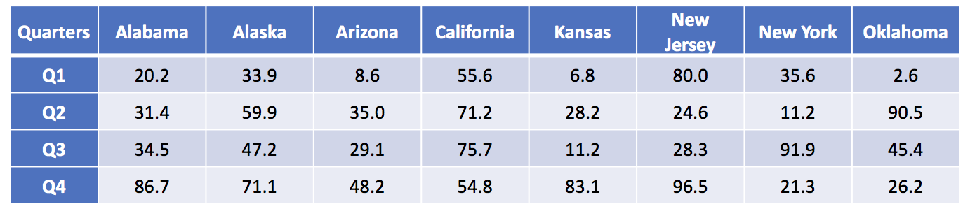
I have created a data set that contains the average temperature (degrees F) across four quarters for eight states in the United States. These temperatures were generated using a random number generator.

The data has the following structure:

Figure 1.png

Using this data, we can generate a single plot that contains all the states and their average temperature for each quarter.

Figure 2.png

There are several issues with this plot. First, there is so much clutter, it is difficult to discern which states are increasing or decreasing over time. Second, the colors, despite being different, seem to mix in too much like spaghetti. In fact, this is commonly called a “spaghetti” plot.[1]

To avoid this cluster of tangled lines, it is best to view these lines separately in small multiples. We can apply the principle of small multiples into an 8 by 1 matrix (8 rows and 1 column of data). 

 
Figure 3.png
 

By separating each state into its own separate line, we can identify which states had temperatures that increased across time. From this figure, we can see that Alabama, Alaska, Arizona, and Kansas have temperatures that increased from Q1 to Q4. However, the magnitude in the change for Kansas looks similar to Alaska (absolute difference of 37 degrees F and 76 degrees F, respectively). Despite using the same Y-axis, the compressed scale gives the illusion that all the changes were similar in magnitude, which they were not.

We can improve upon this figure by furthering the use of small multiples. Tufte argues that small multiples can present a large amount of comparisons through repeated panels.[2] With this in mind, we can take the above figure and separate each state into a 2 by 4 matrix.

Figure 4.png

This is vastly improved. We can see trajectory for each state across the quarters. For example, we can clearly see that Alabama, Alaska, Arizona, and Kansas have temperatures that were increasing steadily across time. However, large fluctuations in temperatures were observed for New Jersey, New York, and Oklahoma. Only California appears to have a steady trend in the temperature across time.

The panel chart has equal sized boxes with temperature scales that are identical. This allowed our eyes to make quick comparisons between the states. Moreover, we can also identify the trends much more easily that in the “spaghetti” plot.


TUTORIAL: PANEL CHARTS (SMALL MULTIPLES)

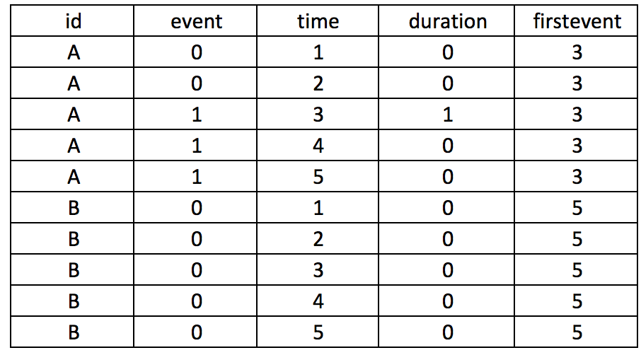
To generate the above panel chart, we will use the randomly generate temperature dataset, which can be downloaded from here.

An important element of the dataset is the column called “strata.” This column will allow us to generate a staggered line plot separated by the strata.

The following figure illustrates the different variable names including the strata column.

 
Figure 5.png
 

Notice how the strata column alternates between 1 and 2? This will be used to separate the temperatures of each state into clusters. In other words, we will cluster the temperature from Q1, Q2, Q3, and Q4 for each state.

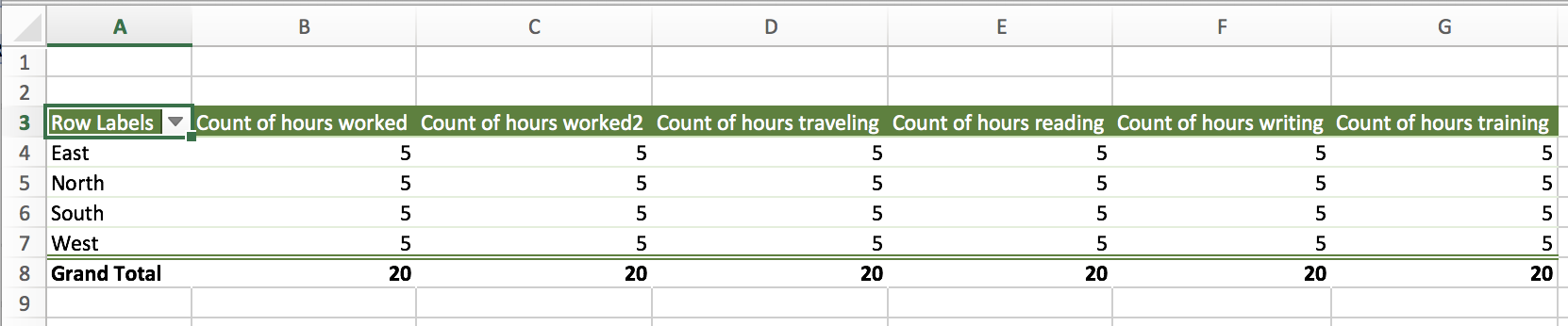
Once you’ve reviewed the data, select all the data and then use the pivot table feature to insert the new table onto a different worksheet.

Figure 6.png

Excel will automatically create a new worksheet with a blank pivot table work space. You can use this work space to generate different tables using the powerful pivot table features.

Figure 7.png

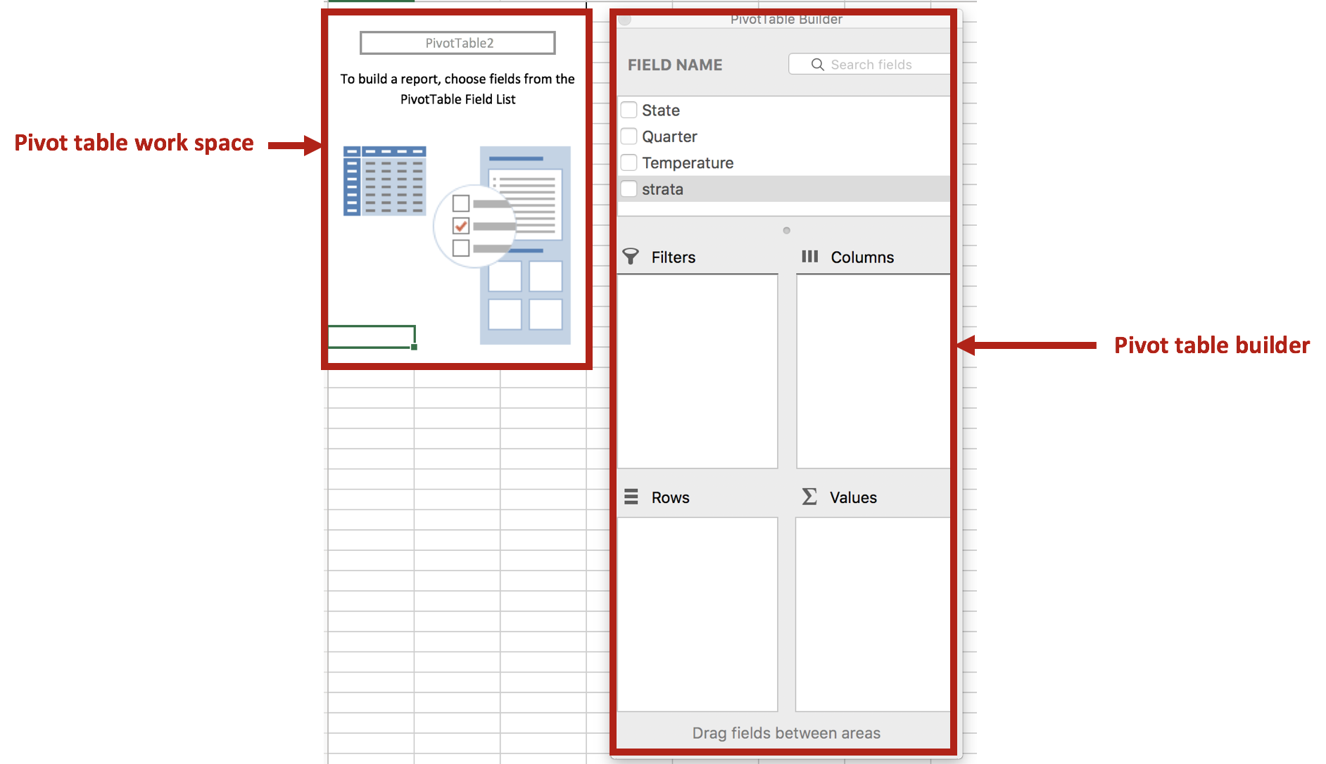
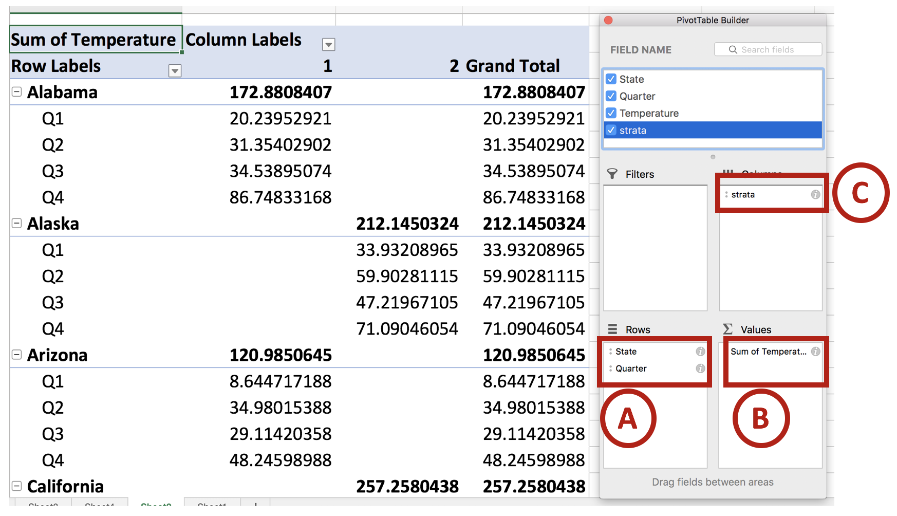
We will use the pivot table builder to generate the table we need for the panel chart. After you insert the pivot table into a new worksheet, move the State variable into the Row box followed by the Quarter variable. (This is denoted by A.) Move the Temperature variable into the Values box. (This is denoted by B.) Then move the Strata variable into the Columns box. (This is denoted by C.) Review your work with the following figure below.

Figure 8.png

Once you set up you pivot table, you should notice that the temperature values are staggered between the states. This is important for when you construct the line graphs for the panel charts.

Next, we will remove the Grand Total column. This isn’t important for us, so let’s right click the cell that contains the column header Grand Total and select Hide.

Figure 9.png

Then click on the Design tab on the ribbon and select Report Layout > Show in Tabular Form. This will change the design of the default pivot table.

Figure 10.png

Next, we are going to remove the total rows for each state. Right click on the first state (Alabama) and select Hide. You should notice that the total row for each state is now hidden. This updated pivot table design will make it easier to create panel charts.

 
Figure 11.png
 

You pivot table should look like the following:

 
Figure 12.png
 

Copy and paste this table and its values onto a blank section of the worksheet. Then highlight the data for the first four states and insert a line chart.

Figure 13.png

You will see the trend lines for the four states, which will be separated by the different time periods.

Figure 14.png

There are two colors for the alternating states. Change this to a single color (e.g. Blue). Then remove the gridlines, chart title, and the legend. The chart should look like the following:

Figure 15.png

The next part will be to include line partitions between each state, which will allow the eye to distinguish each line as separate trends for the states.

We will need to create a new dataset for the line partitions. To do that, count the number of time periods for one of the states (the time periods should be equivalent for all the states. In our case, there are four quarters for each state). In between Q4 and Q1, there is a gap. If you take all the quarters from Q1 and Q4 for Alabama to California, there are a total of 16 intervals. In between interval 4 and 5 is where we want to put first line partition. Interval 8 to 9 is where we want to put the second line partition, etc. For this example, the dataset should look like the following:

 
Figure 16.png
 

Select the chart and click on the Chart Design tab and click on Select Data.

Figure 17.png

The Select Data Source window will appear and list the previous data already used to generate the trend lines for each state. We will add a new dataset (A) and select the Y values from the dataset that was generated for the partitions (B). 

Figure 18.png

This will create a line at the bottom of the chart area.

Figure 19.png

Right click on the line (A) and select Change Chart Type > X Y (Scatter) > Scatter (B).

Figure 20.png

Right click on the scatter and go to Format Data Series > Series Options > Plot Series On > Secondary Axis.

 
Figure 21.png
 

Select the Y-axis on the right side of the chart (A).

Figure 22.png

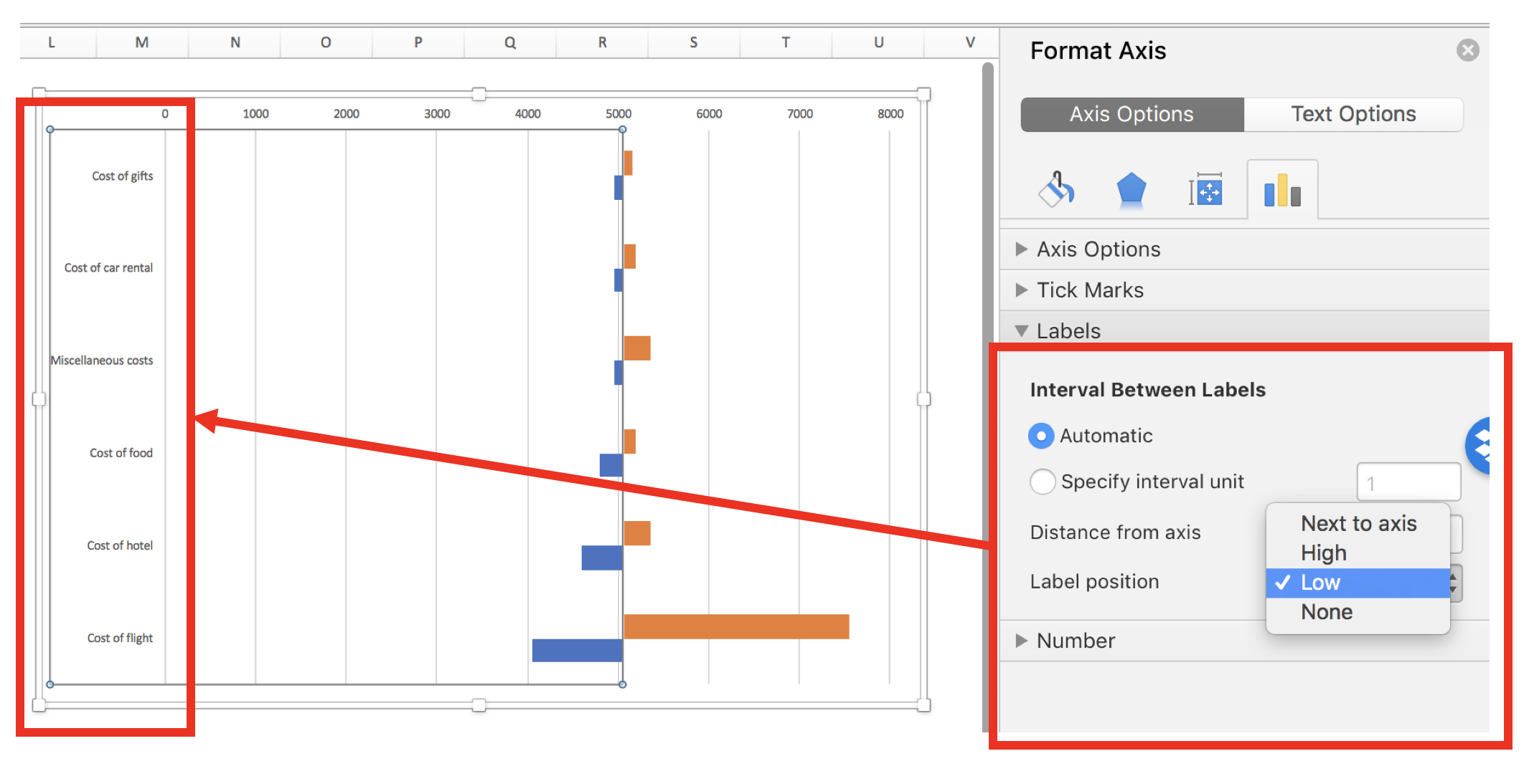
Then go to Format Axis > Axis Options and set the Maximum to 1.0.

 
Figure 23.png
 

Next, we will align the scatter points into the correct partition. Right click on the chart area and click on Select Data. Select Series 3 and go to the X values box. In the X values box, select the data in the Partition column.

Figure 24.png

The scatter points appear to be in the correct location. The next steps will involve including error bars for the partition lines and formatting.

Figure 25.png

Click on scatter points and select Chart Design in the Ribbon. Click on the Add Chart Element and select Error Bars > More Error Bars Options….

 
Figure 26.png
 

Format the error bars and remove the cap. Depending on where the scatter points are, you want to choose error bars that will cover the empty region. In our example, the scatter points are at the top, so having the “Minus” or “Both” direction options will work for us. We will leave it at “Both” for this example.

 
Figure 27.png
 

Click on the horizontal error bars and delete them.

Figure 28.png

Click on the scatter point and go to the Format Data Series. Go to the Fill & Line > Marker Options > None.

 
Figure 29.png
 

The chart should look like the following:

Figure 30.png

The remainder of this tutorial will be to make this aesthetically appealing.

We want to hide the secondary Y-axis, which can be done by hiding the line and change the font color to match the background. Then we want to change the size of the chart using the Chart Options.

Figure 31.png

We also changed the font to Helvetica (native to Apple products), resized the chart boxes, included a Vertical Y-title bar for the temperature axis, added a mean Temperature band using 60% transparency, change the color of the vertical error bars to a lighter gray, changed font size on the Y-axis, and moved the X-axis labels to the top. We repeated these steps for the final four states and carefully placed it below the first four states, using the grid to assist with alignment.

The final panel chart:

Figure 32.png


CONCLUSIONS

When you encounter a data set that can be separated into smaller graphics, consider using the small multiple principle or panel charts approach. It requires a little more work, but the results can provide a narrative that is easy to visualize and interpret. In our example, we start to notice different trends using different approaches to the small multiple principle. It’s best to experiment which ones work best for your needs. Here are some examples of small multiples that may inspire you: link1 and link2.


REFERENCES

1. Knaflic CN. Strategies for avoiding the spaghetti graph. Storytelling with data. http://www.storytellingwithdata.com/blog/2013/03/avoiding-spaghetti-graph. Published March 14, 2013. Accessed May 16, 2018.

2. Tufte ER. The Visual Display of Quantitative Information. Second. Cheshire, CT: Graphics Press, LLC.; 2001.

Communicating data effectively with data visualizations - Part 6 (Tornado diagram)

BACKGROUND

Suppose you had some results and you were interested in whether or not these findings were sensitive to change. You can illustrate these effects using a tornado diagram, which uses bar charts to compare the change from the original findings. In other words, tornado diagrams are useful to illustrate a sensitivity analysis.

In this tutorial, we will provide you with a step-by-step guide on how to graph a tornado diagram from a sensitivity analysis.


MOTIVATING EXAMPLE

Imagine that you are planning a vacation, and you allocated $6,000 for the trip. You perform some cost estimates and find a vacation package that costs $5,050, which is within your budget. But then you see some deals and some extra luxuries that you want to add to your current vacation package. Some of these will change the cost of your original cost estimates. In order to see which of these additional deals or luxuries would impact your cost estimates, you decide to perform a one-way sensitivity analysis. That is, you change the cost of one variable at a time to see how it effects your original cost estimates (e.g., base-case).

Table 1 summarizes your base-case vacation costs and the possible changes due to the additions of deals and luxuries.

Table 1.png

The “Low input” or “deals” reduce the total cost of your vacation. The “High input” or luxuries increase the cost of your vacation.

You want to visualize if any of these adjustments will change your original cost estimates (e.g., $5,050).


BUILDING A TORNADO DIAGRAM

A tornado diagram can be used to visualize these additional changes to the variables.

Step 1: Open Excel and insert a clustered bar chart

Figure 1.png

Step 2: Enter data for the “Low input”

Right-click on the empty chart area and select “Name” and enter “Low input.” Then in the “Y values:” box, select all the values in the “Low result” column of your table. In the Horizontal (Category) axis labels:” highlight the variable names under the “Base-case results” column. The figure below illustrates the correct selections for each input box.

Figure 2.png

Step 3: Enter data for the “High input”

Repeat same steps for the “High input” data range.

Figure 3.png

Step 4: Center the axis at the estimated cost

Right-click on the X-axis and go to the Format Axis > Vertical Axis Crosses > Axis Value and enter “5050.” This will center the axis at the estimated cost of $5,050.

Figure 4.png

Step 5: Move the variable names to the left side of the plot

After centering the axis on the estimate cost of $5,050, you can start to see the beginnings of a tornado diagram. However, the variable names are in the way. To relocate these, Right-click on the Y-axis and select the Axis Options > Interval Between Labels and select “Low.” This will move the variable names to the left side so that it doesn’t interfere with the bars in the middle of the chart.

Figure 5.png

Step 6: Align the bars so that they are next to each other

The bars are not aligned with each other. You can align them using the series overlap option. Right-click on one of the bars and go to Series Options > Plot Series On and enter 100 on the “Series Overlap” widget. After you press Enter, the bars should be aligned with each other.

Figure 6.png

Step 7: Sort and change fonts

To complete the tornado diagram, you can sort the bars so that the largest change is at the top and the smallest change is at the bottom (looks like a tornado). Right-click on the Y-axis and got to Format Axis > Axis Options > Axis Position and check the box “Categories in reverse order.” This will order your diagram to look more like a tornado.

Figure 7.png

Step 8: Final changes and edits

The last steps improve the aesthetics. Changing the fonts and colors can improve the tornado diagram.

Figure 8.png

CONCLUSIONS

The tornado diagram tells us that paying for an additional “luxury” for the cost of the flight will exceed our budget of $6,000 (indicated by dotted red line). As a result, we will not spend extra capital to upgrade our seats! However, we can splurge a little when it comes to other elements of our trip (e.g., expensive meals, luxury vehicle rental, or additional excursions).


REFERENCES

I used the following guide developed by Excel Champs to develop this this blog.

 Note: Updated on 11 July 2022

Communicating data effectively with data visualizations - Part 5 (Colors)

Background

As we decide the type of chart we want to visualize our data with, we should also think about our color scheme. Color should represent the data value. We should be able to see a chart, identify the color that interests us and associate a value with it. However, it is easy to misidentify the data that the color is supposed to represent and it is also easy to confuse the magnitude of the difference between groups.

In this tutorial, we will discuss some basic elements of color theory that will help you to select the best color palette for your graphical presentations. We will use the following simple data and color schemes to illustrate some of these lessons (Figure 1). The X column denotes some arbitrary category that uses the alphabet and the Y column denotes the values associated with each category.

Figure 1. Example data used to illustrate the different color schemes.

table example.png

Figure 2. Color schemes used in this example (single-hue color and rainbow color schemes).

color hues.png


Bias-Precision Tradeoff

There is always a tradeoff between bias and precision. Bias is associated with the ability to accurately identify the data value associated with the color. Precision is associated with the ability to correctly identify the data with little variation. Figure 3 illustrates the differences between the two.


Figure 3. Bias and Precision tradeoff.

Figure 3. Bias-precision tradeoff.png

For example, if you had a single-hue progression color scheme (blue), it is easy to identify the color that contains the higher value versus the color that contains the lower value. In Figure 4A, the darker shade of blue is associated with a higher value compared to the lighter shade of blue. However, it may not be easy when you have a rainbow color scheme because the values can be arbitrarily associated with a different color (Figure 4B). In other words, Figure 4A helps to reduce the bias while Figure 4B can generate a lot of bias.


Figure 4. Comparison between single hue color scheme and rainbow color scheme.

Additionally, Figure 4B is easier to distinguish between the groups. You can easily identify Group F compared to Group E because the colors are distinctly differentiable. However, in Figure 4A, it is very difficult to distinguish between Group F and Group E because the shades of blue associated with both groups appear similar. Therefore, the ability to precisely detect the differences in the groups is limited by the single-hue color scheme (Figure 4A) compared to the rainbow color scheme (Figure 4B).

Another way to look at these principles is to think about the concurrence between the true value and the estimated value. Suppose you were given these color schemes and asked to estimate the correct value. How do you think you’ll do? Would it be easier to estimate the true value from the single-hue color scheme or the rainbow color scheme?


Figure 5. Performance of color schemes according to estimated and true values.

I generated data in Figure 5 to illustrate the principles in this tutorial. Figure 5 compares performance between the single-hue color scheme and rainbow color scheme. Figure 5A has low bias but some scatter (moderate precision) across the gray line, which denotes the 1:1 accuracy between true and estimated values. However, Figure 5B has high bias but very little scatter (high precision) due to the easy identification of the groups. Whereas, there was some uncertainty in correctly identifying the true value within each group.


Summary

When deciding on the color scheme for your data, take into consideration what is more important. Is it critical that your audience precisely distinguish one group from another? Or is it more important to have them visually identify the correct value associated with the color? Ideally, you want to be able to use a color scheme that has low bias and high precision, but in reality, you will need to make a tradeoff between the two.


References

I used the following references to develop this tutorial.

Liu Y, Heer J. Somewhere over the rainbow: An empirical assessment of quantitative colormaps. ACM Human Factors in Computing Systems (CHI) 2018, April 21-26, 2018, Montreal, QC, Canada. http://dx.doi.org/10.1145/3173574.3174172

Cromwell W. Colour schemes in data visualisation: Bias and Precision. Presented at the useR! 2016 international R User conference, June 15, 2017. URL: https://channel9.msdn.com/Events/useR-international-R-User-conference/useR2016/Colour-schemes-in-data-visualisation-Bias-and-Precision

Generating Survival Curves from Study Data: An Application for Markov Models (Part 2 of 2)

BACKGROUND

In a previous blog, we provided instructions on how to generate the Weibull curve parameters (λ and γ) from an existing Kaplan-Meier curve. The Weibull parameters will allow you to generate survival curves for cost-effectiveness analysis. In the second part of this tutorial, we will take you through the process of incorporating these Weibull parameters to simulate survival using a simple three-state Markov model. Finally, we’ll show how to extrapolate the survival curve to go beyond the time frame of the Kaplan-Meier curve so that you can perform cost-effectiveness analysis across a lifetime horizon.

In this tutorial, I will:

  • Describe how to incorporate the Weibull parameters into a Markov model

  • Compare the survival probability of the Markov model to the reference Kaplan-Meier curve to validate the method and catch any errors

  • Extrapolate the survival curve across a lifetime horizon

Link to the Markov model used in this tutorial can be found here.


MOTIVATING EXAMPLE

We will use a three-state Markov model to illustrate how to incorporate the Weibull parameters and generate a survival curve (Figure 1).

Figure 1. Markov model.

 
Figure 1a.png
 

To simulate a Markov model using 40-time units (e.g., months), you will need to think about the different transition probabilities. Figure 2 lists the different transition probabilities and their calculations. We made the assumption that the transition from the Healthy state to the Sick state was 20% across all time points.


Figure 2. Transition probabilities for all health states and associated calculations.

 
Figure 2a.png
 

The variable pDeath(t) denotes the probability of mortality as a function of time. Since we have the lambda (λ=0.002433593) and gamma (γ=1.722273465) Weibull parameters, we can generate the Weibull curve using Excel. Figure 3 illustrates how I set up the Markov model in Excel. I used the following equation to estimate the pDeath(t):

 
equation 2.png
 

where t_i  is some time point at i. This expression can be written in Excel as (assuming T=1 and T+1 = 2):

= 1 – EXP(lambda*(T^gamma – (T+1)^gamma))

Figure 3. Calculating the probability of mortality as a function of time in Excel.

Figure 3a.png

You can estimate the probability of survival as a function of time S(t) by subtracting pDeath(t) from 1. Once you have these values, you can compare how well your Markov model was able to simulate the survival compared to the observed Kaplan-Meier curve (Figure 4).


Figure 4. Survival curve comparison between the Markov model and Kaplan-Meier curve.

Once we are comfortable with the simulated survival curve, we can extrapolate the survival probability beyond the limits of the Kaplan-Meier curve. To do this, we will need to go beyond the reference Kaplan-Meier’s time period of 40 months. In Figure 5, I extended the time cycle (denoted as Time) from 40 to 100 (truncated at 59 months).


Figure 5 illustrates the Weibull distribution extrapolated out to an entire cohort’s life time in the Markov model (Figure 5 is truncated at 59 months to fit this into the tutorial).

Figure 5a.png

Figure 6 provides an illustration of the lifetime survival of the cohort after extrapolating the time period from 40 months to 100 months. The survival curve does a relative good job of modeling the Kaplan-Meier curve. As the time period extends beyond 40 months, the Weibull curve will exponentially reach a point where all subjects will enter the Death state. This is reflected in the flat part of the Weibull curve at the late part of the time period.

Figure 6. Lifetime survival of the cohort using the Weibull extrapolation.


SUMMARY

After extrapolating the survival curve beyond the reference Kaplan-Meier curve limit of 40 months, you can estimate the lifetime horizon for a cohort of patients using a Markov model. This method is very useful when simulating chronic diseases. However, it is always good practice to calibrate your survival curves with the most recent data on the population of interest.

The U.S. National Center for Health Statistics has life tables that you can use to estimate the life expectancy of the general population, which you can compare to your simulated cohort. Moreover, if you want to compare your simulated cohort’s survival performance to a reference specific to your chronic disease cohort, you can search the literature for previously published registry data or epidemiology studies. Using existing studies as a reference will allow you to make adjustments to your survival curves that will give them credibility and validation to your cost-effectiveness analysis.


CONCLUSIONS

Using the Kaplan-Meier curves from published sources can help you to generate your own time-varying survival curves for use in a Markov model. Using the Hoyle and Henley’s Excel template to generate the survival probabilities, which are then used in an R script to generate the lambda and gamma parameters, provides a powerful tool to integrate Weibull parameters into a Markov model. Moreover, we can take advantage of the Weibull distribution to extrapolate the survival probability over the cohort’s lifetime giving us the ability to model lifetime horizons.

The Excel template developed by Hoyle and Henley generates other parameters that can be used in probabilistic sensitivity analysis like the Cholesky decomposition matrix, which will be discuss in a later blog.


REFERENCES

Location of Excel spreadsheet developed by Hoyle and Henley (Update 02/17/2019: I learned that Martin Hoyle is not hosting this on his Exeter site due to a recent change in his academic appointment. For those interested in getting access to the Excel spreadsheet used in this blog, please download it at this link).

Location of the Markov model used in this exercise is available in the following link:

https://www.dropbox.com/sh/ztbifx3841xzfw9/AAAby7qYLjGn8ZfbduJmAsVva?dl=0

Symmetry Solutions. “Engauge Digitizer—Convert Images into Useable Data.” Available at the following url: https://www.youtube.com/watch?v=EZTlyXZcRxI

Engauge Digitizer: Mark Mitchell, Baurzhan Muftakhidinov and Tobias Winchen et al, "Engauge Digitizer Software." Webpage: http://markummitchell.github.io/engauge-digitizer [Last Accessed: February 3, 2018].

  1. Hoyle MW, Henley W. Improved curve fits to summary survival data: application to economic evaluation of health technologies. BMC Med Res Methodol 2011;11:139.


ACKNOWLEDGMENTS

I want to thank Solomon J. Lubinga for helping me with my first attempt to use Weibull curves in a cost-effectiveness analysis. His deep understanding and patient tutelage are characteristics that I aspire to. I also want to thank Elizabeth D. Brouwer for her comments and edits, which have improved the readability and flow of this blog. Additionally, I want to thank my doctoral dissertation chair, Beth Devine, for her edits and mentorship.

Generating Survival Curves from Study Data: An Application for Markov Models (Part 1 of 2)

BACKGROUND

In cost-effectiveness analysis (CEA), a life-time horizon is commonly used to simulate a chronic disease. Data for mortality are normally derived from survival curves or Kaplan-Meier curves published in clinical trials. However, these Kaplan-Meier curves may only provide survival data up to a few months to a few years. Extrapolation to a lifetime horizon is possible using a series of methods based on parametric survival models (e.g., Weibull, exponential); but performing these projections can be challenging without the appropriate data and software.

This blog provides a practical, step-by-step tutorial to estimate a parameter method (Weibull) from a survival function for use in CEA models. Specifically, I will describe how to:

  • Capture the coordinates of a published Kaplan-Meier curve and export the results into a *.CSV file

  • Estimate the survival function based on the coordinates from the previous step using a pre-built template

  • Generate a Weibull curve that closely resembles the survival function and whose parameters can be easily incorporated into a simple three-state Markov model


MOTIVATING EXAMPLE

We will use an example dataset from Stata’s data library. (You can use any published Kaplan-Meier curve. I use Stata's data library for convenience.) Open Stata and enter the following in the command line:

use http://www.stata-press.com/data/r15/drug2b
sts graph, by(drug) risktable

You should get a Kaplan-Meier curve that illustrates the survival probability of two different drugs (Figure 1). The Y-axis denotes the survival probability and the X-axis denotes the time in months. Below the figure is the number at risk for the two drug comparators. We will need this to generate our Weibull curves. (If possible, find a Kaplan-Meier curve with the number at risk. It will make the Weibull curve generation easier.) Alternative methods exist to use Kaplan-Meier curves without the number at risk, but they will not be discussed in this tutorial.

Figure 1. Kaplan-Meier curve.

Figure 1.png

You will need to download the “Engauge Digitizer” application to convert this Kaplan-Meier curve into a *.CSV file with the appropriate data points. This will help you to develop an accurate survival curve based on the Kaplan-Meier curve. You can download the “Engauge Digitizer” application here: https://markummitchell.github.io/engauge-digitizer/

After you download “Engauge Digitizer,” open it and import the Kaplan-Meier file. Your interface should look like the following:

Figure 2. Engauge Digitizer interface.

Figure 2.png

The right panel guides you in digitizing your Kaplan-Meier figure. Follow this guide carefully. I will not go into how to use “Engauge Digitizer;” however a YouTube video tutorial to use Engauge Digitizer was developed by Symmetry Solutions and is available here.

We will use the top Kaplan-Meier curve (which is highlighted with blue crosshairs in Figure 3) to generate our Weibull curves.

Figure 3. Select the top curve to digitize.

Figure 3.png

After you digitize the figure, you will export the data as a *.CSV file. The *.CSV file should have two columns corresponding to the X- and Y-axes of the Kaplan-Meier figure. Figure 4 has the X values end at row 20 to fit onto the page, but this extends till the end of the Kaplan-Meier time period, which is 40.

Figure 4. *.CSV file generated from the Kaplan-Meier curve (truncated to fit onto this page).

Figure 4.png

I usually superimpose the “Engauge Digitizer” results with the actual Kaplan-Meier figure to prove to myself (and others) that the curves are exactly the same (Figure 5). This is a good practice to convince yourself that your digitized data properly reflects the Kaplan-Meier curve from the study.

Figure 5. Kaplan-Meier curve superimposed on top of the Engauge Digitizer curve.

Figure 5.png

Now, that we have the digitized version of the Kaplan-Meier, we need to format the data to import into the Weibull curve generator. Hoyle and Henley wrote a paper that explains their methods for using the results from the digitizer to generate Weibull curves.[1] We will use the Excel template they developed in order to generate the relevant Weibull curve parameters. (The link to the Excel template is provided at the end of this tutorial.)

I always format the data to match the Excel template developed by Hoyle and Henley. The blue box indicates the number at risk at the time points denoted by Figure 1 and the red box highlights the evenly spaced time intervals that I estimated (Figure 6).

Figure 6. Setting up your data using the template from Hoyle and Henley.

Figure 6.png

In order to find the survival probability at each “Start time” listed in the Excel template by Hoyle and Henley, linear interpolation is used. [You can use other methods to estimate the survival probability between each time points given the data on Figure 3 (e.g., last observation carried forward); however, I prefer to use linear interpolation.] In Figure 7, the survival probabilities (Y) correspond to a time (X) that was generated by the digitizer. Now, we want to find the Y value corresponding to the X values on the Excel template.

Figure 7. Generating the Y-values using linear interpolation.

Figure 7.png

Figure 8 illustrates how we apply the linear interpolation to estimate the Y value that corresponds with the X values from the Excel template developed by Hoyle and Henley. For example, if you were interested in finding the Y value at X = 10, the you would need to input the following into the linear interpolation equation using the following expression:

equation 1a.png

This yields a Y value of 0.866993, which is approximately 0.87.

Figure 8. Y values are generated using linear interpolation.

Figure 8.png

After generating the Y values corresponding to the Start time from Figure 5, you can enter them into the Excel template by Hoyle and Henley (Figure 9). Figure 9 illustrates the inputted survival probabilities into the Excel template.

Figure 9. Survival probabilities are entered after estimating them from linear interpolation.

Figure 9.png

After the “Empirical survival probability S(t)” is populated, you will need to go to the “R Data” worksheet in the Excel template and save this data as a *.CSV file. In this example, I saved the data as “example_data.csv” (Figure 10).

Figure 10. Data is saved as “example_data.csv.”

Figure 10.png

Then I used the following R code to estimate the Weibull parameters. This R code is located in the “Curve fitting ‘R’ code” in the Excel templated developed by Hoyle and Henley. (I modified the R code written by Hoyle and Henley to allow for a *.CSV file import.)

rm(list=ls(all=TRUE))   
library(survival)   

#    Step 4.   Update directory name and text file name in line below   
setwd("insert the folder path where the data is stored")
data<- read.csv("example_data.csv")
attach(data)
data    

times_start <-c(  rep(start_time_censor, n_censors), rep(start_time_event, n_events) )  
times_end <-c(  rep(end_time_censor, n_censors), rep(end_time_event, n_events)  )   

#  adding times for patients at risk at last time point 
######code does not apply because 0 at risk at last time point  

#   Step 5. choose one of these function forms   (WEIBULL was chosen for the example)
model <- survreg(Surv(times_start, times_end, type="interval2")~1, dist="exponential")   # Exponential function, interval censoring 
model <- survreg(Surv(times_start, times_end, type="interval2")~1, dist="weibull")   # Weibull function, interval censoring 
model <- survreg(Surv(times_start, times_end, type="interval2")~1, dist="logistic")   # Logistic function, interval censoring   
model <- survreg(Surv(times_start, times_end, type="interval2")~1, dist="lognormal")   # Lognormal function, interval censoring 
model <- survreg(Surv(times_start, times_end, type="interval2")~1, dist="loglogistic")   # Loglogistic function, interval censoring 

#   Compare AIC values  
n_patients <- sum(n_events) +  sum(n_censors)   
-2*summary(model)$loglik[1] + 1*2   #  AIC for exponential distribution 
-2*summary(model)$loglik[1] + 1*log(n_patients)   #  BIC exponential    
-2*summary(model)$loglik[1] + 2*2   #  AIC for 2-parameter distributions    
-2*summary(model)$loglik[1] + 2*log(n_patients)   #  BIC for 2-parameter distributions  


intercept <- summary(model)$table[1]   # intercept parameter    
log_scale <- summary(model)$table[2]   # log scale parameter    

#  output for the example of the Weibull distribution   
lambda <- 1/ (exp(intercept))^ (1/exp(log_scale))    # l for Weibull, where S(t) = exp(-lt^g)   
gamma <- 1/exp(log_scale)     # g for Weibull, where S(t) = exp(-lt^g)  
(1/lambda)^(1/gamma) * gamma(1+1/gamma)    # mean time for Weibull distrubtion  


#  For the Probabilistic Sensitivity Analysis, we need the Cholesky matrix, which captures the variance and covariance of parameters    
t(chol(summary(model)$var))    #  Cholesky matrix   

#  Simulate variability of mean for Weibull 
library(MASS)   

simulations <- 10000  # number of simulations for standard deviation of mean    
sim_parameters <- mvrnorm(n=simulations, summary(model)$table[,1],  summary(model)$var  )   # simulates simulations from multivariate normal    
intercepts <- sim_parameters[,1]   # intercept parameters   
log_scales <- sim_parameters[,2]   # log scale parameters   
lambdas <- 1/ (exp(intercepts))^ (1/exp(log_scales))    # l for Weibull, where S(t) = exp(-lt^g)    
gammas <- 1/exp(log_scales)     # g for Weibull, where S(t) = exp(-lt^g)    
means <- (1/lambdas)^(1/gammas) * gamma(1+1/gammas)    # mean times for Weibull distrubtion 
sd(means)   # standard deviation of mean survival   

# consider adding this (from Arman Oct 2016) to plot KM 
km <- survfit(Surv(times_start, times_end, type="interval2")~ 1)    
summary(km) 
plot(km, xmax=600, xlab="Time (Days)", ylab="Survival Probability") 

There are several elements generated by the above R code that you need to record, including the intercept and log-scale:  

> intercept
[1] 3.494443
> log_scale
[1] -0.5436452

Once you have this, input them into the Excel template sheet titled “Number events & censored,” which is the same sheet you used to generate the survival probabilities after entering the data from the “Engauge Digitizer.” Figure 11 illustrates where these parameters are entered (red square).

Figure 11. Enter the intercept and log scale parameters into the Excel template developed by Hoyle and Henley.

Figure 11.png

You can check the fit of the Weibull curve to the observed Kaplan-Meier curve in the tab “Kaplan-Meier.” Figure 12 illustrates the Weibull fit’s approximation of the observed Kaplan-Meier curve.

Figure 12. Weibull fit (red curve) of the observed Kaplan-Meier curve (blue line).

Figure 12.png

From Figure 11, we also have the lambda (λ=0.002433593) and gamma (γ=1.722273465) parameters which we’ll use to simulate survival using a Markov model.


SUMMARY

In the next blog, we will discuss how to use the Weibull parameters to generate a survival curve using a Markov model. Additionally, we will learn how to extrapolate the survival curve beyond the time period used to generate the Weibull parameters for cost-effectiveness studies that use a lifetime horizon.


REFERENCES

Location of Excel spreadsheet developed by Hoyle and Henley (Update 02/17/2019: I learned that Martin Hoyle is not hosting this on his Exeter site due to a recent change in his academic appointment. For those interested in getting access to the Excel spreadsheet used in this blog, please download it at this link).

Update: 12 January 2023 - The old link to the YouTube video on Engauge was broken. A new link was identified that provided the same content on how to use Engauge.

Location of the Markov model used in this exercise is available in the following link:

https://www.dropbox.com/sh/ztbifx3841xzfw9/AAAby7qYLjGn8ZfbduJmAsVva?dl=0

Design with Greg. “Engauge: A Free Tool for Engineering that pairs great with Excel.” Available at the following url: https://www.youtube.com/watch?v=i1bEFovvvbM

Engauge Digitizer: Mark Mitchell, Baurzhan Muftakhidinov and Tobias Winchen et al, "Engauge Digitizer Software." Webpage: http://markummitchell.github.io/engauge-digitizer [Last Accessed: February 3, 2018].

  1. Hoyle MW, Henley W. Improved curve fits to summary survival data: application to economic evaluation of health technologies. BMC Med Res Methodol 2011;11:139.


ACKNOWLEDGMENTS

I want to thank Solomon J. Lubinga for helping me with my first attempt to use Weibull curves in a cost-effectiveness analysis. His deep understanding and patient tutelage are characteristics that I aspire to. I also want to thank Elizabeth D. Brouwer for her comments and edits, which have improved the readability and flow of this blog. Additionally, I want to thank my doctoral dissertation chair, Beth Devine, for her edits and mentorship.

Counting and Data Manipulation for an ITSA

BACKGROUND

In time series analysis, we are interested on the impact of some exposure over a time period. Exposure can be coded as event==1. If this is time-varying, then the event can occur at any time across a time period. Time series analysis requires us to identify the time when the event first occurred. In most cases this is also considered the post period. In this example, we will label the exposure of interest as event.

Longitudinal data can come in either a wide or long format. However, it is easier to perform longitudinal data analysis in the long format. This assumes that you declare either the xtset or tsset as a panel or time-series data set, respectively.

MOTIVATING EXAMPLE

Let’s assume that we have two subjects (A and B), who can experience an event at any time between some time variable 1 and 5, time(1:5). This is a longitudinal data set in the long format with id as the unique subject-level identifier, the exposure variable of interest event as the exposure, and time as an arbitrary time variable ranging from 1 to 5. The event for subject A occurs at time==3.

Screen Shot 2018-02-18 at 3.13.23 PM.png

Suppose you want to create a variable that counts the number of times the subject has the event. We will call this variable duration.

Screen Shot 2018-02-18 at 3.14.35 PM.png

The following Stata code will generate the duration variable.

by id (time), sort: gen byte duration = sum(event==1)

Sorting by the id and then time will nest the time sequence for each id. The sum() will add all event that is coded as 1.

It’s critical that you put time in parentheses (); otherwise, you can generate incorrect values. For instance, if you make the mistake of typing the Stata code as follows, you will generate a dataset which doesn’t provide the cumulative duration of having the event. Notice how the duration variable only has 1 instead of 1, 2, and 3.

by id time, sort: gen byte duration = sum(event==1)
Screen Shot 2018-02-18 at 3.17.26 PM.png

Similarly, if you use the following code, you will generate the incorrect values. The sum(event)==1 syntax should be sum(event==1). However, this will “flag” the time when the event first occurred, which may be useful in some cases. 

by id (time), sort: gen byte duration = sum(event)==1
Screen Shot 2018-02-18 at 3.18.48 PM.png

Let’s take our example further and generate a variable column that takes into consideration the period before the subject experiences an event. Suppose subject A experiences an event at time==3, but we want to center this as 0 and previous months as -1, -2, and so on. We need to first identify the time when the event occurs and populate that as a new variable, which we will call firstevent. We can use the following State code to generate firstevent based on the condition that the event==1 and the variable it occurs is time==3.

egen firstevent = min(cond(event == 1, time, .)), by(id)
Screen Shot 2018-02-18 at 3.19.41 PM.png

There will be missing values since not all subjects experience the event. To populate the missing values for the subjects with no events (event==0), we need to replace firstevent by identifying the max time of the entire study period using the summary command. Once we have the max time of the study period, we add 1 to this and replace the missing values from the firstevent variable.

replace firstevent = max(time) if firstevent == .
summ time
global maxtime = r(max)

replace firstevent = $maxtime + 1 if firstevent == .
Screen Shot 2018-02-18 at 3.20.31 PM.png

We can subtract the time from the first event to generate a new variable (its) that will capture the negative time before the event occurs and the positive time after the event occurs, centered on when event==1.

by id (time), sort: gen byte its = _n – firstevent
Screen Shot 2018-02-18 at 3.21.29 PM.png

The new variable its is short for interrupted time series analysis. An investigator can use the its variable to plan any interrupted times series analysis without having to go through the ordeal of generating this variable using other software.

Here is a summary of the entire Stata code, which you can also find on my Github page:

***** Declare XTSET panel dataset.
* Variable list: id event time 
* id        =   subject identifier
* event     =   exposure of interest
* time      =   time interval

**** Create the duration variable to capture time after event.
by id (time), sort: gen byte duration = sum(event==1)

**** Create a variable for the time before the event.
egen firstevent = min(cond(event == 1, time, .)), by(id)

**** Identify the maxtime.
summ time
global maxtime = r(max)

**** Replace missing data with the maxtime + 1.
replace firstevent = $maxtime + 1 if firstevent == .

**** Create its to capture time before and after event. 
by id (time), sort: gen byte its = _n - firstevent

ACKNOWLEDGEMENTS

I used several online references to develop this tutorial for Stata. Nicholas J. Cox has some excellent tutorials that was influential in developing this piece.

Cox N. First and last occurrences in panel data. From https://www.stata.com/support/faqs/data-management/first-and-last-occurrences/

The Statlist forum was also helpful; in particular, the following discussion threads.

https://www.statalist.org/forums/forum/general-stata-discussion/general/965910-how-generate-variable-that-indicates-current-and-prior-event-occurrence-for-id-in-panel-data

https://www.statalist.org/forums/forum/general-stata-discussion/general/1297707-creating-duration-variable-for-panel-data

https://www.stata.com/statalist/archive/2010-12/msg00193.html

https://www.stata.com/statalist/archive/2012-09/msg00286.html

The UCLA Institute for Digital Research and Education has a tutorial on using _N and _n to count in Stata.

Counting from _N to _N. UCLA: Statistical Consulting Group. From https://stats.idre.ucla.edu/stata/seminars/notes/counting-from-_n-to-_n/

Excel macro to convert cell values in a pivot table from COUNT to SUM

Background

I was preparing a report for the Veterans Health Administration and I ran into an inconvenience where I had to convert the values in a pivot table from the default COUNT to SUM. Normally, this would not be an onerous process. However, there were several columns that I wanted to convert, which would take an enormous amount of work to perform. Fortunately, I ran into Doctor Moxie's blog, which providers tips and tricks to using Excel efficiently. You can find the blog here.

Doctor Moxie created a Visual Basic Macro that conveniently converts all the data in the pivot table from the default COUNT to SUM.


Motivating Example

To illustrate the solution, I used the following example dataset, which was generated using the following function:

=RANDBETWEEN(0, 100)

This will generate a value between 1 and 100 for each cell.

Screen Shot 2018-02-01 at 3.38.09 PM.png

I used the pivot table to see see the number of hours per region. From the pivot table, the values were reported as COUNT per region instead of SUM per region.

Screen Shot 2018-02-01 at 3.40.47 PM.png

I could go through each column and change the values from COUNT to SUM, but this would be inconvenient if there were over 100 columns.

Doctor Moxie developed an inventive solution to address this problem using a macro, which you can get from his/her website.

Using the macro converted the values from COUNT to SUM.

Screen Shot 2018-02-01 at 3.45.35 PM.png

The macro nicely converts all the cells and makes the analysis easier to perform. This saved me hours of work and I recommend you keep this macro in your Excel arsenal.


Acknowledgements

Doctor Moxie is credited with developing the macro and his/her website (ExcelPivots) can be found here.

Communicating data effectively with data visualization - Part 4 (Time series)

Introduction

An important element of data visualization is to tell a story. To do that, we should have the end in mind. Namely, what is it you want to share with your audience?

Often, time series data can do this using some clever data visualization. Typically, this is presented on an XY plane where time is presented on the X-axis and the value of interest is presented on the Y-axis. We will not go into time series analysis, which involves a lot more than just plotting the data. However, we will go over the proper way in which to present your time series data visually.


Motivating example

We will use data from the National Health Expenditure Account (NHEA), which contains historical data on health expenditures in the U.S. from 1960 to 2016. The costs presented by the NHEA are properly adjusted for inflation. You can find the data at this link: https://www.cms.gov/Research-Statistics-Data-and-Systems/Statistics-Trends-and-Reports/NationalHealthExpendData/NationalHealthAccountsHistorical.html


Time series data

To visualize time series data, it is best to have increments of time that are equally spaced in the X-axis. We use Excel to illustrate these examples. Figure 1 illustrates the annual interval of national health expenditures ($ billions) in the United States from 1960 to 2016. The outcome (national health expenditure) is on the Y-axis and time (year) is on the X-axis. Notice that each time increment is one year and evenly spaced across the X-axis. This allows the eyes to intuitively see the changes across time in the U.S. national health expenditure.

Figure 1. National Healthcare Expenditure in the United States, 1960 to 2016.

Figure 1.png

What if the story is to see highlight health expenditures in the last decade? How would we do this?

First, we can use the same data and restrict the X-axis to 2007 to 2016 as in Figure 2.


Figure 2. National Health Expenditures in the United States, 2007 to 2016.

Screen Shot 2018-01-24 at 6.02.04 PM.png

Figure 2 doesn’t seem interesting. There is an increase in health expenditures from 2007 to 2016, but this doesn’t seem significant. However, there is a 45% increase from 2007 to 2016 in health expenditures ($2,295 billion to $3,337 billion). Figure 2 doesn’t convey this increase because there is a lot of white space between the lowest health expenditure value in 2007 and $0.

One way to illustrate the large increase in health expenditure is to truncate the Y-axis. In previous articles, we stressed that truncated axis can distort and trick the mind into seeing large differences where they don’t exist. However, this same technique can be used to make sure that differences that exist are not misinterpreted as not visually significant. According to Tufte:

In general, in a time-series, use a baseline that shows the data not the zero point. If the zero point reasonably occurs in plotting the data, fine. But don't spend a lot of empty vertical space trying to reach down to the zero point at the cost of hiding what is going on in the data line itself.[1]

In other words, time series data should focus on the area of the timeline that is interesting. The graphic should eliminate the white space and show the data horizontally for time series visuals.

Eliminating the white space and identifying the baseline value as $2,200 billion instead of $0 changes the figure as illustrated in Figure 3.


Figure 3. National Health Expenditures in the United States, 2007 to 2016.

Figure 3.png

Figure 3 illustrates the increase in national expenditure in the last decade better than Figure 2 and maintains the narrative that there was a visually significant increase.

Putting these concepts together (along with Tufte’s other principles), we can generate a similar figure using R (Figure 4). The R code is listed below.

# Plot trend - without truncation
library(lattice)
  
xyplot(y~x, 
       xlab=list(label="Year", cex=1.25),
       ylab=list(label="National Health Expenditures ($ Billions)", cex=1.25),
       main=list(lable="National Health Expenditure (2007 to 2016)", cex=2),
       par.settings = list(axis.line = list(col="transparent")),
       panel = function(x, y,...) { 
          panel.xyplot(x, y, col="darkblue", pch=16, cex=2, type="o")
          panel.rug(x, y, col=1, x.units = rep("snpc", 2), y.units = rep("snpc", 2), ...)})

Figure 4. National Health Expenditures in the United States, 2007 to 2016.

Figure 4 (darkblue).png

Figure 4 incorporates the use of Tufte’s principles on data-ink ratio and truncation on the y-axis to highlight the change in National Health Expenditure between 2006 go 2017.


Conclusions

With time series data, truncating the Y-axis to eliminate white space and show the data horizontally is appropriate when telling the story of what’s happening across time. Using zero as the baseline for the Y-axis is appropriate if it is reasonable. However, do not compromise the story by having the Y-axis extend all the way to zero if it doesn’t tell the story properly. Knowing when and how to truncate the Y-axis will help you explain to your audience the significance of a change across a specific period in time.


References

1. Edward Tufte forum: baseline for amount scale [Internet]. [cited 2018 Jan 14];Available from: https://www.edwardtufte.com/bboard/q-and-a-fetch-msg?msg_id=00003q

Communicating data effectively with data visualization – Part 3 (Truncated Axis and Area as Quantity)

Introduction

Data visualization is a powerful tool that allows us to use data to tell an engaging story. The narrative we present is enhanced by our data, especially when it is easily accessible and intuitive to understand. This is evident by the large amount of data visualization tools and galleries available throughout the internet. For example, Tableau Software hosts a data viz gallery that allows users to post their creations using their software. However, for most users, Microsoft Excel is the first tool they are exposed to when it comes to developing data visualizations for their business, school, and social projects.

Creating data visualization has its caveats. Improper data visualization can mislead, distort, and “lie,” which can result in poor decisions, loss of profit, and regret. In this blog, we will explore two of the most common distortion techniques that violate Tufte’s principles of graphical integrity: Truncated Axis and Area as Quantity.[1]


Motivating example

We will use data from the Medical Expenditures Panel Survey, which is a large-scale survey of households on health care resource use and spending in the United States. We will compare insurance status (Private, Public, Uninsured) between genders, which is summarized in Table 1. We will use Microsoft Excel to generate all our examples.

Table 1.png


Distortions

Data visualization has opened the door to increased misrepresentation of numbers. Interest groups and advocates will distort the data visualization to try and mislead or convince their audience of their arguments or narrative. Such techniques include using truncating axes and disproportionate sizes.

Let’s compare the difference in the proportion of males with public insurance to females with public insurance. In Figure 1, a bar chart is used to compare the proportion of males and females with access to public insurance. In Panel A, a truncated y-axis is used to distort the difference in the proportion of males and females with public insurance. The absolute difference is approximately 4%. However, Panel B, which uses a non-truncated y-axis, the perceived difference is not as great as that appearing in Panel A, despite having an absolute difference of 4%. Our mind perceives Panel A as having a greater difference; however, Panel B shows the same absolute difference of 4%, but does not illicit the same perception. This is supported by a study performed by Pandey and colleagues who reported that respondents rated the truncated bar chart as having a greater difference than the non-truncated bar chart.[2] It is our recommendation that a non-truncated y-axis is used when presenting data as a bar chart.

Figure 1. Comparisons of bar charts using a truncated y-axis (A) and a full y-axis (B).

Figure 1.png

Another distortion technique uses disproportionate sizes or “Area and Quantity” method. With this distortion, the values or quantitative data is not proportional to the area that represents it. Tufte argues that “the representation of numbers, as physically measured on the surface of the graph itself, should be directly proportional to the numerical quantities represented.”[1] In order words, the area used to represent the values or quantitative data should not be grossly exaggerated. Figure 2 illustrates how this principle is violated.

Figure 2. Proportion of males and females with public insurance using improper Area as Quantity.

Figure 2.png


In Figure 2, 27% of males have public insurance versus 31% of females. In terms of relative difference, females have a 15% greater proportion with public insurance compared to males per the equation: .

However, the area in Figure 2 has females with an area that is 96% greater than males, which is not reflective of the relative difference of 15%.

Figure 3 illustrates the correct Area as Quantity that reflect the relative difference between males and females with public insurance. We estimated the area of the circle for males and females and properly adjusted the sizes to reflect their relative differences. Now, the relative difference is not as great as previously illustrated. Instead, we have an accurate representation of the relative difference in having public insurance between males and females. We recommend estimated the area of a shape to reflect the relative difference between the groups with these types of data visualizations.

Figure 3. Proportion of males and females with public insurance using the proper Area as Quantity.

Figure 3.png

Conclusions

Distortions can mislead or convince an audience of a narrative that do not reflect the actual data. Developing data visualization that provides empirical support for your narrative should be accurate and honest. Fortunately, innocent mistakes like the examples above are easy to correct, especially when using programs like Microsoft Excel.


Notes

We calculated the area of the circle using Archimedes method where Area = pr^2 where p is the constant (p=3.14) and r is the radius of the circle.


References

1. Tufte ER. The Visual Display of Quantitative Information. Second. Cheshire, CT: Graphics Press, LLC.; 2001.

2. Pandey AV, Rall K, Satterthwaite ML, Nov O, Bertini E. How Deceptive Are Deceptive Visualizations?: An Empirical Analysis of Common Distortion Techniques [Internet]. In: Proceedings of the 33rd Annual ACM Conference on Human Factors in Computing Systems. New York, NY, USA: ACM; 2015. p. 1469–1478.Available from: http://doi.acm.org/10.1145/2702123.2702608