Communicating data effectively with data visualizations - Part 10 (Heat Maps)

BACKGROUND

A heat map is a data visualization tool that uses positioning and coloring to identify clusters and correlations in multivariable analysis. The most common type of heat map is a 2 x 2 matrix, where two variables are examined using the rows and columns (R x C) positions on a matrix. A heat map matrix helps us identify any patterns or similarities across the different dimensions. In a heat map, color is critical in denoting degrees of change. (Please see refer to the past blog on colors.)

For example, we can see the changes in opioid overdose rates across time for each state (Figure 1). As the rates increase, the cells are darker (indicated by the legend). All the states experience an increase in opioid overdose deaths, but State 1 is experiencing it faster than States 2 and 3.

In this tutorial, we will perform two methods to create heat maps. The first method will use the built in Excel conditional formatting rules and the second method will use VBA macros.

Figure 1. Heat map matrix.

Figure 1 - heatmap matrix.png

MOTIVATING EXAMPLE

We will continue to use the state-level drug overdose mortality data from the CDC.

https://www.cdc.gov/drugoverdose/data/statedeaths.html

Mortality rate is presented as the number of deaths per 100,000 population.

In this tutorial, we will develop a heat map using opioid overdose mortality from 2013 to 2016.

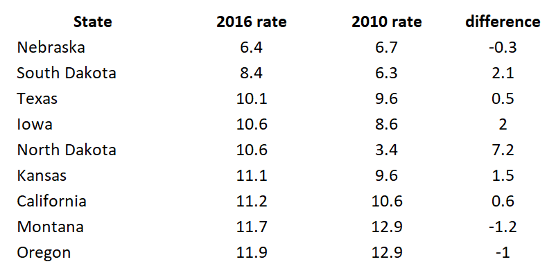
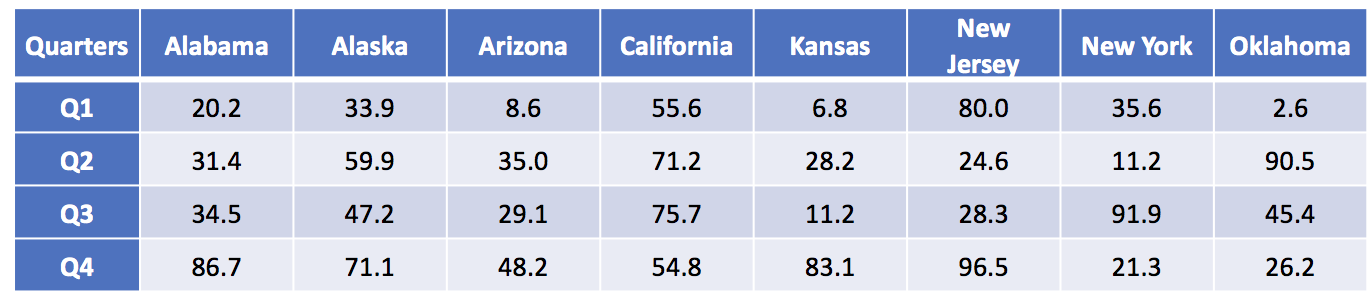
The data setup in Excel has State indicators as the rows and time indicators as the columns. We are visualizing the change in opioid overdose mortality from 2013 to 2016 for each state. Figure 2 illustrates the data structure for the first seven states.


Figure 2. Data structure for the first seven states.  

Figure 2 - Data structure.png


METHOD 1: CONDITIONAL FORMATTING RULES

Excel has a convenient tool that allow us to use conditional formatting to shade our heat map matrix.

Step 1: First highlight all the data.


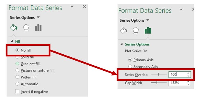
Step 2: In the Excel Ribbon, select Conditional formatting and then New.

Figure 3 - conditional formatting.png

Step 3: Select “Format all cells based on their values” and change the Format Style to “3-Color scale.” Change the color to the different shades you are interested in using. (In this example, we used a blue base with varying degrees of shading.) Select percentile and then click “Ok.” The percentile will use the Median for each column to distinguish the middle category for the rates of opioid overdose mortality for each state.

Figure 4 - 3-color scale.png

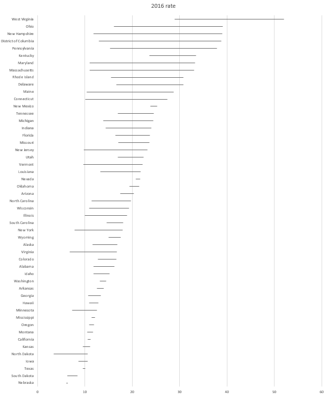
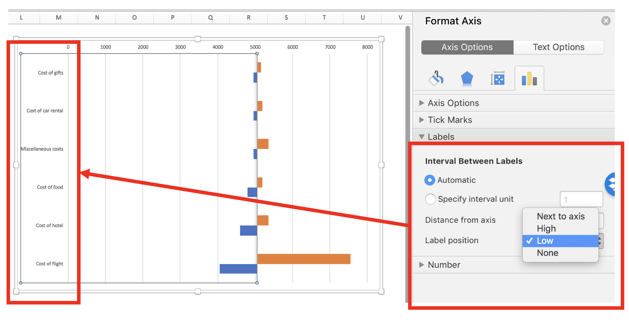
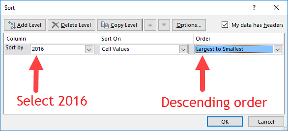
Step 4: Visually inspect the results. If there are no apparent pattern in the heat map, we will need to sort the rate of opioid overdose mortality for 2016 in descending order.

Figure 4 - Descending order.png

The heat map should look like the following:

 
Figure 6 - heat map example 1.png
 

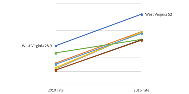
There is a pattern emerging in regards to the rate of opioid overdose mortality across the different states. West Virginia has the highest opioid overdose mortality rate in 2016, but they also appear to have the highest from 2013 to 2015. The dark cell in 2016 indicates that West Virginia has exceeded the 50 deaths per 1000 population incidence rate. Other states also have high rates of opioid overdose mortality across 2013 to 2016, which continued to increase. The 2013 column is clearly lighter indicating that the opioid overdose mortality has increased over time up to the available data in 2016.


Step 5: We can improve this heat map by removing the numbers, which can be distracting. We need to select all the data and format the cells. Select only the numeric data and then format the number. Use the “Custom” category and enter the following: "";"";"";"". This will change the number values so that it doesn’t show in the cells.

Figure 7 - change the number format.png

Step 6: Change the column width and row height so that you have a nice square-like matrix for the final result. We used a column width of 5 and a row height of 30. (Only the first fifteen states are shown.)

The heat map can be used to quickly identify states with the highest opioid overdose mortality and the trends across time. The states with the highest rates of opioid overdose mortality are clustered at the top while the states with the lowest rates are clustered at the bottom.

We could also arrange this into regions of the US to further stratify the results (not shown).


METHOD 2: USING VBA MACROS FOR CONDITIONAL FORMATTING OF MORE THAN 3 CATEGORIES

Excel only allows us to choose up to 3-Color scales. If we wanted to use more than 3 color categories, we will need to use VBA macros.

But before we do, we need to think about the colors for the scales. Since we have more than 3 categories, we will need to figure out how to divide the colors.


COLOR CODES

We will need to determine the base color for our heat map. In this example, we will use a blue base-color and change the shading using the RGB color values. RGB colors are based on a system using a combination of three base colors (red, green, and blue) that can be used to change the intensity of the color from a range between 0 and 250. An example of an RGC color table can be found in the following site.

For this example, we used the following RGB color values where dark-navy denotes high rates of opioid overdose mortality (50 or more per 1000 population). However, you can change the values of these colors however you like.

Figure color codes.png

We will continue to use the blue color base and change the gradient using the RGB values.


VISUAL BASIC FOR APPLICATION (VBA) MACRO

The VBA macro comes from the site Excel For Beginners and written by Kristoff deCunha. We used the VBA code on the site, but modified it for this tutorial.

The VBA code is written in a way where any changes in the values will automatically update the color of the cell. Additionally, the code also sorts the 2016 opioid overdose mortality rate in descending order, adds thin-white continuous borders around the cells, and changes the font to Times New Roman.

Here are the VBA macros used for Method 2.


Macro 1 changes the font to Times New Roman.

‘Macro1
Sub ChangeFont()

Dim rng As Range
Set rng = Range("J1:N52")

With rng.Font
    .Name = "Times New Roman"
    .Size = 12
    .Strikethrough = False
    .Superscript = False
    .Subscript = False
    .OutlineFont = False
    .Shadow = False
    .Underline = xlUnderlineStyleNone
    .ThemeColor = xlThemeColorLight1
    .TintAndShade = 0
    .ThemeFont = xlThemeFontNone
End With

End Sub


Macro 2 changes the cell shading to the 6-Color scale (blue-base)

‘Macro2
Sub ChangeCellColor()


Dim rng As Range
Dim oCell As Range

Set rng = Range("K2:N52")

For Each oCell In rng
        Select Case oCell.Value
                 Case 50 To 100
                     oCell.Interior.Color = RGB(37, 54, 97)
                     oCell.Font.Bold = True
                     oCell.Font.Name = "Times New Roman"
                     oCell.HorizontalAlignment = xlCenter
                 Case 40 To 49.999
                     oCell.Interior.Color = RGB(56, 83, 145)
                     oCell.Font.Bold = True
                     oCell.Font.Name = "Times New Roman"
                     oCell.HorizontalAlignment = xlCenter
                 Case 30 To 39.999
                     oCell.Interior.Color = RGB(147, 168, 215)
                     oCell.Font.Bold = True
                     oCell.Font.Name = "Times New Roman"
                     oCell.HorizontalAlignment = xlCenter
                 Case 20 To 29.999
                     oCell.Interior.Color = RGB(183, 198, 228)
                     oCell.Font.Bold = True
                     oCell.Font.Name = "Times New Roman"
                     oCell.HorizontalAlignment = xlCenter
                 Case 10 To 19.999
                     oCell.Interior.Color = RGB(218, 225, 240)
                     oCell.Font.Bold = True
                     oCell.Font.Name = "Times New Roman"
                     oCell.HorizontalAlignment = xlCenter
                 Case 0 To 9.999
                     oCell.Interior.Color = RGB(230, 237, 253)
                     oCell.Font.Bold = True
                     oCell.Font.Name = "Times New Roman"
                     oCell.HorizontalAlignment = xlCenter
                  Case Else
                     oCell.Interior.ColorIndex = xlNone
         End Select
    Next oCell
    
End Sub


Macro 3 sorts the 2016 opioid overdose mortality rates in descending order.

‘Macro3
Sub SortColumn()

Dim DataRange As Range
Dim keyRange As Range
Set DataRange = Range("J1:N52")
Set keyRange = Range("N1")
DataRange.Sort Key1:=keyRange, Order1:=xlDescending

End Sub


Macro 4 hides the font from the heat map.

‘Macro4
Sub HideFont()
    
Dim rng As Range
Dim oCell As Range

Set rng = Range("K2:N52")

    For Each oCell In rng
        oCell.Font.Color = oCell.Interior.Color
    Next oCell
    
End Sub


Macro 5 creates thick white borders for each cell in the table.

‘Macro5
Sub WhiteOutlineCells()

    Dim rng As Range

    Set rng = Range("J1:N52")

    With rng.Borders
        .LineStyle = xlContinuous
        .Color = vbWhite
        .Weight = xlThick
    End With
    
End Sub

INSERTING DATA AND RUNNING MACRO

The five macros are assigned to a button in the Excel Macro-Enabled Workbook. Pressing the button will perform the task of creating a 6-Color scale heat map. Download the Excel Macro-Enabled Workbook here. This file will have the raw data and the macro-enabled worksheet for you to create a heat map.

Step 1: Copy the raw data from the “combined” worksheet.

Figure 9 - Copy Data.png

Step 2: Paste it in the worksheet “heatmap_2” starting on cell "J1".

Figure 10 - Copy onto J1.png

Step 3: Then press the “PressStart” button to run the macros. Your final heat map should look like the following:

Compare the heat map from Method 1 (3-Color scale) to the one generated by Method 2 (6-Color scale). The heat map with the 6-Color scale has a lighter pattern compared to the 3-Color scale heat map. The differences are dramatic. Depending on the granularity of the heat map you want, either one of these color scales would be fine. However, Method 2 requires some VBA coding.

* Not all states shown.


Conclusions

Heat maps allow us to observe patterns in the data. In our example, we notice that West Virginia has a high rate of opioid overdose mortality indicated by the clustering of dark cells from 2013 to 2016. Other states had similar patterns as West Virginia. Using heat maps provides a quick and easy interpretation of the changes in opioid overdose mortality across time and the states that are clustered together that have high rates of opioid overdose mortality.


REFERENCES

I used the following websites to help develop this tutorial.

Conditional formatting with more than 3 categories:
https://sites.google.com/site/excelforbeginners/Home/vba-codes/conditional-formatting-more-than-3-criterias
 
Changing the RGB color codes:
https://analysistabs.com/excel-vba/change-background-color-of-cell-range/
https://www.w3schools.com/colors/colors_rgb.asp

Excel color palette library:
http://dmcritchie.mvps.org/excel/colors.htm

Excellent site for VBA coding:
https://www.excel-easy.com/vba.html


Communicating data effectively with data visualizations - Part 9 (Cleveland Plots)

BACKGROUND

Visualizing change across two time points allows your audience to see the impact of a program’s impact. In a previous article, I demonstrated how you can use slope graphs to illustrate changes across two time points. However, there is a risk of the slope graphs becoming a tangled mess (or spaghetti plot) if too many comparisons are being made. An easier way to illustrated changes cross two time points for a large number of groups is with a Cleveland dot plot (or lollipop plot).

By using a horizontal line between two points arranged from most change to least change, your audience can quickly visualize the program’s impact and rank them according to the subject or group.


MOTIVATING EXAMPLE

We will continue to use the state-level drug overdose mortality data from the CDC.

https://www.cdc.gov/drugoverdose/data/statedeaths.html

Mortality rate is presented as the number of deaths per 100,000 population.

In a previous tutorial, we only looked at eight different states. In this tutorial, we will illustrate a change in all 50 states onto a single plot using a Cleveland plot.

Here is the data setup in Excel:

Figure 1 - example data.png

The difference is calculated as the difference in mortality rates between 2016 and 2010.

In Excel, select the first two rows (State and 2016 rate) and generate a horizontal bar chart. Make sure to sort the order of the 2016 rate from least to greatest.

Figure 1 a - select horizontal bar.png

The horizontal bar chart should look like the following:

Figure 2 - bar chart of us states.png

After you created the horizontal bar plot, you will need to add error bars. Select the Design tab > Add Chart Elements > Error Bars > More Error Bars Options:

figure 3 - adding error bards.png

In the Format Error Bars options, make sure to check Minus under Directions, No Cap under End Style, and Custom under Error Amount:

figure 4 - error bars format.png

Click Specify Value and then select the differences column for the Negative Error Value:

figure 5 - select the error bar values.png

On the bar chart, select the bars and then under the Format

figure 6 - no fill selection.png

The horizontal bar chart should have the fill remove and the error bars present and should look like the following:

figure 7 - error bars with differences and no fill.png

Select the error bar and go to the Format Error Bars option. Under the Joint type select Round and under the Begin Arrow Size select the Oval Arrow. This will add a circle on the one end of the error bar.

figure 8 - error join type round.png

You can also increase the size of the Oval Arrow by selecting a larger size from the Begin Arrow Size drop down.


After selecting the Oval Arrow for the Join Type and the Begin Arrow Type, your chart should look like the following:

figure 9 - error bars with rounded caps.png

The next steps will require you to add a second data series. Right-click on the chart area and select the 2010 mortality rates.

figure 10 - adding a series.png

After selecting the data, make sure to map the Horizontal Axis Labels to the corresponding states.

figure 10a - adding a series p2.png

Your chart should now include the second data series (2010 mortality rates) as horizontal bars.

figure 11 - data series2.png

In the next steps, you will add error bars to the 2010 mortality horizontal bars (similar to the error bars for the 2010 mortality rates data). Instead of adding error bars for the Minus, you will add error bars for the Plus.

figure 12 - horizontal bars series 2.png

Similar to the 2016 mortality rates data, you will remove the horizontal bars by selecting No fill and then setting the Series Overlap to 100%

figure 13 - series overlap.png

Select the error bars and then change the Begin Arrow Type to Oval and increase the size.

figure 14 - oval type series2.png

Your chart should now include two dots with lines between them for each state.

figure 15 - second dots are visitble.png

After a few more adjustments to the dot size and colors, the final Cleveland plot can look like the following:

Figure 1. Cleveland plot comparing the drug overdose mortality rates between 2010 and 2016.

figure 17 - final figure.png

The dots give us a good illustration of the magnitude of change in the drug overdose mortality rates between 2010 and 2016. Additionally, using the colored fonts help to map the drug overdose mortality values with the dots. For example, West Virginia had the highest drug overdose mortality rate in 2016 (blue dot) and a large increase in drug overdose mortality rates between 2010 (red dot) to 2016. Nebraska has the lowest drug overdose mortality rate in 2016 (blue dot) among the states, which was lower than in 2010 (red dot).


CONCLUSIONS

Cleveland plots can illustrate the change in drug overdose mortality rates between two time points for multiple groups without cluttering the chart space. Unlike slope graphs which can be difficult to distinguish between states, the Cleveland plot separates each state into their own rows allowing for a simple estimation of change across two time points. Moreover, it is also easier to see the magnitude in change in between 2010 and 2016. We recommend using Cleveland plots when you have a lot of groups (e.g., states) with an outcome that changes across two time points (2010 and 2016).


REFERENCES

I used the following websites to help develop this tutorial.

http://stephanieevergreen.com/lollipop/

https://policyviz.com/2016/02/04/lollipop_graph_in_excel/

https://zebrabi.com/lollipop-charts-excel/

https://peltiertech.com/dot-plots-microsoft-excel/


The following video provides step-by-step instructions in making a horizontal lollipop chart:

https://www.youtube.com/watch?v=tHa8eEb-LTg


The following website provides examples of lollipop charts:

https://www.r-graph-gallery.com/lollipop-plot/


Communicating data effectively with data visualizations - Part 8 (Slope graphs)

BACKGROUND

Suppose you wanted to show a change across two periods in time for several groups. How would you do that? One of the best data visualizations for this is the slope graph. In this tutorial, we’ll show you how to create a slope graph in Excel and highlight a state using contrasting colors.


MOTIVATING EXAMPLE

We will use the state-level drug overdose mortality data from the CDC.

https://www.cdc.gov/drugoverdose/data/statedeaths.html

Here is a sample of set of data from the CDC:

figure 1.png

Each value is a rate for the number of deaths per 100,000 population.


In Excel, select the three columns (State, 2010 rate, and 2016 rate).

figure 2.png

Go to Insert Chart and select Line with Markers.

figure 3.png

The chart should look like the following:

figure 4.png

Right-click anywhere on the chart and click Select Date and then click on the Switch Row/Column.

figure 5.png

The Y and X axes should switch places and the chart should look like the following:

figure 6.png

Delete the Chart title, legend, and Y-axis.


Right-click on the X-axis and select Format Axis. Then select “On tick marks.”

figure 7.png

This will move the lines to the edges of the chart.

figure 8.png

Now, we want to add labels to the ends of each line. Right click on one of the lines and select Add Data Labels. Then select the left data label and format it according to the following guide:

figure 9.png

Do the same thing for the right label, but make sure to use the right label position. Bring both ends of the chart closer to the middle to give your data labels room to expand (otherwise, the state will stack on top of the value, which you do not want). The chart should look like the following:

figure 10.png

Finally, you can format the figure using different colors and removing the excess gridlines. Try to experiment with different shades of color to generate the desired effect. In our example, we wanted to highlight West Virginia from the rest of the other states.


Here is what the slope graph looks like after some tweaking and adjustments:

figure 11.png

In the above slope graph, West Virginia was highlighted using a cranberry color to give it a greater contrast to the lighter grey of the other states. You could use this method to highlight other states of interest such as New Hampshire or the District of Columbia, which had greater percentage increases between 2010 and 2016.


In the final slope graph, we highlight West Virginia and New Hampshire in different colors to distinguish them from the other states.

figure 12.png

CONCLUSIONS

Using slope graphs can show simple trends across two periods in time. More complex slope graphs can have multiple time points and more states. In our simple example, we highlight the key steps to generate a slope graph in Excel. Using colors to highlight certain states can make a simple slope graph more visually appealing and assist the eyes in identifying the states that are important according to the data.


REFERENCES

Knaflic, CN. Storytelling with Data. 2015. John Wiley & Sons, Inc., Hoboken, New Jersey.

Estimating marginal effects using Stata Part 1 – Linear models

BACKGROUND

Regression models provide unique opportunities to examine the impact of certain predictors on a specific outcome. These predictors’ effects are usually isolated using the model coefficients adjusting for all other predictors or covariates. A simple linear regression model with a single predictor x_i is represented as

 
fig1.png
 

where y_i denotes the outcome (dependent) variable for subject i, beta0 denotes the intercept, beta1 is the model coefficient that denotes the change in y due to a 1-unit change in x, and epsilon_i is the error term for subject i.

A 1-unit increase in x is associated with some change in the outcome y. This finding may explain predictor variable x’s impact on outcome variable y, but it doesn’t not tell us the impact of a representative or prototypical case.

The marginal effect allows us to examine the impact of variable x on outcome y for representative or prototypical cases. For example, Stata’s margins command can tell us the marginal effect of body mass index (BMI) between a 50-year old versus a 25-year old subject.

There are three types of marginal effects of interest:

1.       Marginal effect at the means (MEM)

2.       Average marginal effect (AME)

3.       Marginal effect at representative values (MER)

Each of these marginal effects have unique interpretations that will impact how you examine the regression results. (We will focus on the first two, since the third one is an extension of the AME.) The objective of this tutorial is to review these marginal effects and understand their interpretations through examples using Stata.


MOTIVATING EXAMPLE

We will use the Second National Health and Nutrition Examination Survey (NHANES) data from the 1980s, which can be found in Stata’s library using the following command:

use http://www.stata-press.com/data/r15/nhanes2.dta

Table 1 summarizes the characteristics of the NHANES population.

fig2.png


ADJUSTED PREDICTIONS

Adjusted prediction for a regression model provides the expected value of an outcome y conditioned on x assuming all other things are equal. In other words, this is the effect of the predictor variable x regressed to outcome variable y adjusting or controlling for other covariates. Therefore, if you were comparing the effect of a 1-unit increase in age to the BMI, then you could compare this across all patients who are equally White, Black, or Others.

Example 1

A simple linear regression model can capture the incremental effect of age on body mass index. For example, the impact of age on body mass index (BMI) can be represented as a linear regression:

 
FIG3.png
 

where BMI_1  is the body mass index for individual i, beta0 denotes the intercept (or BMI when AGE=0), beta1 denotes the change in BMI for each 1-unit increase in Age for individual i, and episilon_i denotes the error term for individual i. (The unit of BMI is kg/m^2).

The Stata command to perform a simple linear regression:

regress bmi age

The corresponding regression output is:

fig4.png

In this regression output example, the predictor of interest is AGE. The _cons parameter denotes the coefficient beta0 otherwise known as the intercept; therefore, a subject with AGE = 0 has a BMI that is 23.2 kg/m^2. (Although this is unrealistic, we will ignore this for now.) The impact AGE has on the BMI is denoted by the slope parameter beta1, which is the change in BMI due to a 1-unit change in Age. In this example, the a 1-unit increase in Age is associated with a 0.05 kg/m^2 increase in BMI.

If we wanted to know the difference in BMI between a 50-year old and 25-year old, we need to estimate the adjusted prediction, which estimates the difference in the outcome based on some user-defined values for the x variables.

To estimate the adjusted predicted BMI for a 50-year old, we used the following equation:

 
fig5.png
 

which is 25.7 kg/m^2. We can do this using the following Stata command:

di _b[_cons] + 50*_b[age]
25.655896

Similarly, we can estimate the adjusted predicted BMI for a 25-year old:

 
fig6.png
 

which is 24.4 kg/m^2.

The difference between these two is:

25.655896 - 24.433991 = 1.2 kg/m^2. 

Therefore, the difference in BMI between a 50-year old and 25-year old is on average 1.2 kg/m^2. This seems like a tedious process, but let’s see how we can make this exercise simpler using Stata’s margins command.

We can use Stata’s margins command to estimate the adjusted predicted BMI for a 50-year old and 25-year old:

margins, at(age=(25 50))

Figure 2. Stata’s margins command output for adjusted prediction of BMI for a 50-year old and 25-year old.

fig7.png

Example 2

We use a linear regression with other independent variables to illustrate the complexity of having other covariates adjusted in the model.

The regression model has the structure:

 
fig8.png
 

where  is the body mass index for individual i, beta0 is the intercept (or BMI when AGE=0), beta1 is the change in BMI for each 1-unit increase in Age for individual i, beta2 denotes the change in BMI for a female relative to a male, beta3 denotes the change in BMI due to contrasts in race categories (White, Black, and Other), and  is the error term for individual i. (The unit of BMI is kg/m^2).

For this example, RACE will be included into the regression model as a dummy variable using the following Stata command:

regress bmi age i.race i.sex

The corresponding regression output is:

fig9.png

The following are interpretations of the regression output.

A 1-unit increase in age is associated with a BMI increase of 0.05 kg/m^2 adjusting for race and sex or all things being equal.

Blacks are associated with a BMI increase of 1.4 kg/m^2 adjusting for age and sex compared to Whites.

Others are associated with a BMI decrease of 1.2 kg/m^2 adjusting for age and sex compared to Whites.

Females are associated with a BMI increase of 0.03 kg/m^2 adjusting for age and race.

If we wanted to know the adjusted prediction for a 50-year old and 25-year old, we can use the margins command:

margins, at(age=(25 50)) atmeans vsquish

The output is similar to Example 1 but there are some differences.

fig10.png

The atmeans option captures the “average” sample covariates. In our example, the mean proportion of females is 0.525, males is 0.475, Whites is 0.876, Blacks is 0.105, and Others is 0.019. Therefore, the adjusted predictions for 50-year old and 25-year old’s BMI is conditioned on the “average” values of the covariates in the model. This may not make sense because an individual subject can’t be 0.525 female and 0.475 male. Fortunately, we have other ways to address this with the marginal effect.


MARGINAL EFFECT

Marginal effect with the margins command generates the change in the conditional mean of outcome y with respect to a single predictor variable x. In other words, this is the partial effect of x on the outcome y for some representative or prototypical case. Usually this is obtained by performing a first-order derivative of the regression expression:

 
fig11.png
 

where the partial effect of the expected value of y condition on x is the first order derivative of the expected value of y condition on x with respect to x.

The representative or prototypical case can be the mean, observed, or a user defined case.


MARGINAL EFFECT OF THE MEAN (MEM)

MEM is the partial effect of on the dependent variable (y) conditioned on a regressor (x) after setting all the other covariates (w) at their means. In other words, MEM is the difference in x’s effect on y when all other covariates (RACE and FEMALE) are at their mean.

Let’s revisit the linear regression model but with the dummy variables included:

 
FIG12.png
 

In the output the beta1 = 0.0493881.

Getting the partial effect with respect to Age at the means for the other covariates, we use the following command:

regress bmi age i.race i.sex
FIG13.png
margins, dydx(age) atmeans vsquish
FIG14.png

Interpretation: For a subject who is average on all characteristics, the marginal change of a 1-unit increase in age is a 0.049 increase in the BMI.

We can also look at the MEM at different ages (e.g., 25 and 50 years):

margins, dydx(age) at(age=(25 50)) atmeans vsquish

This command performs the MEM for 25- and 50-year old subjects with their covariates set at the population mean. We interpret the results as the effect of age at different values of age at the average values of the other covariates.

The MEM should be:

fig15.png

The effect of age at 25 and 50 years old is an increase of 0.05 years. Notice that the MEM for 25- and 50-year olds are the same (MEM = 0.0493881). This is because the model is a linear regression. For every incremental increase in age, the incremental increase in the BMI is 0.0493881 given the other covariates are set at the mean.

To illustrate, we can manually perform this operation using the information above. Recall that the linear regression model with the dummy variables is represented as:

 
fig16.png
 

BMI for a 25-year old subject at the mean = intercept + 25*(beta1) + (mean of Black)*(beta2) + (mean of Other)*(beta3) + (mean of Female)*(beta4) = 24.42243 kg/m^2.

BMI for a 25-year old subject at the mean = 23.0528 + 25*(0.0493881) + .1049174*(1.382849) + .0193218*(-1.2243) + .5251667*(.025702) = 24.42243 kg/m^2, which is the same as the value presented in the adjusted prediction output.

Why are these the same? The linear regression is predictable in terms of the slope coefficients. Therefore, an incremental increase in predictor variable x will have the same incremental marginal increase in outcome variable y. When you apply the MEM to non-linear models, the slopes are no longer linear and will change based on varying levels of the continuous predictor x.


AVERAGE MARGINAL EFFECT (AME)

Unlike the MEM the average marginal effect (AME) doesn’t use the mean for the covariates when estimating the partial effect of the predictor variable x on the outcome variable y. Rather, the AME estimates the partial effect of the variable x on the outcome variable y for using the observed values for the covariates and then the average of that partial effect is estimated. In other words, the partial derivative is estimated with respect to x using the observed values for the other covariates (RACE and FEMALE), and then the average of that first-order derivative are averaged over the entire population to yield the AME. This is represented as:

 
ame figure.png
 

where the partial derivative of the estimated value of the outcome variable y with respect to x is conditioned on the values of covariates (w) for subject i over the entire population (N) and multiplied by beta_k (or the parameters of interest) .

Getting the partial effect with respect to Age at the observed values for the other covariates, we use the following command:

regress bmi age i.race i.sex

margins, dydx(age) asobserved vsquish
fig18.png

Interpretation: The average marginal effect of a 1-unit increase in age is a 0.049 increase in the BMI.

We can also look at the AME at different ages (e.g., 25 and 50 years):

margins, dydx(age) at(age=(25 50)) asobserved vsquish

This command performs the MEM for 25- and 50-year old subjects with their covariates set at the observed values. We interpret the results as the effect of age at different values of age at the observed values of the other covariates.

The AME should be:

fig19.png

The effect of age at 25 and 50 years old is an increase of 0.05 years. Notice that the AME for 25- and 50-year olds are the same (MEM = 0.0493881). Similar to the MEM, this is because the model is a linear regression. For every incremental increase in age, the incremental increase in the BMI is 0.0493881 given the other covariates are set at the observed values.


CONCLUSIONS

We see that the MEM and AME are exactly the same because of the linear model. The marginal effect of an increase in 1-unit of age is an increase in 0.05 kg/m^2 of the BMI. In the next part, non-linear models will be used to demonstrate that the MEM and AME are not equal.


REFERENCES

I used the following websites to help create this tutorial:

https://thomasleeper.com/margins/articles/Introduction.html

https://support.sas.com/rnd/app/ets/examples/margeff/index.html

https://www.ssc.wisc.edu/sscc/pubs/stata_margins.htm


I also used the following paper by Richard Williams:

Using the margins command to estimate and interpret adjusted predictions and marginal effects. The Stata Journal. 2012;12(2):308-331.

https://www.stata-journal.com/article.html?article=st0260

CHOICE Blog: Trump Administration’s Blueprint to Address Drug Prices

I wrote a piece about the Trump Administration's plans to address drug prices, which was published on The CHOICE Institute Blog, Incremental Thoughts, on 16 May 2018. I summarized the key points from the Trump Administration and highlighted an interview by The CHOICE Institute alumnus, Dr. Jonathan H. Watanabe, Associated Professor of Clinical Pharmacy at the UCSD Skagg School of Pharmacy and Pharmaceutical Sciences. Dr. Watanabe argued that Medicare is unable to negotiate for lower prices like the U.S. Department of Veterans Affairs.

Dr. Watanabe's interview with NBC7 can be viewed here.

You can read my piece here.


Communicating data effectively with data visualizations - Part 7 (Using Small Multiples or Panel Charts in Excel)

BACKGROUND

It can be challenging when you’re trying to visualize many different groups using the same metric repeatedly. Initially, you may want to do this with a single figure, but this is too crowded and prevents you from seeing the differences across the groups. Alternatively, you can separate and visualize the groups individually without compromising the space or size of the figure. In this article, we will discuss the use of small multiples or panel charts in Excel. This will make it easier for the eyes to see the differences while presenting a large number of data.


MOTIVATING EXAMPLE

I have created a data set that contains the average temperature (degrees F) across four quarters for eight states in the United States. These temperatures were generated using a random number generator.

The data has the following structure:

Figure 1.png

Using this data, we can generate a single plot that contains all the states and their average temperature for each quarter.

Figure 2.png

There are several issues with this plot. First, there is so much clutter, it is difficult to discern which states are increasing or decreasing over time. Second, the colors, despite being different, seem to mix in too much like spaghetti. In fact, this is commonly called a “spaghetti” plot.[1]

To avoid this cluster of tangled lines, it is best to view these lines separately in small multiples. We can apply the principle of small multiples into an 8 by 1 matrix (8 rows and 1 column of data). 

 
Figure 3.png
 

By separating each state into its own separate line, we can identify which states had temperatures that increased across time. From this figure, we can see that Alabama, Alaska, Arizona, and Kansas have temperatures that increased from Q1 to Q4. However, the magnitude in the change for Kansas looks similar to Alaska (absolute difference of 37 degrees F and 76 degrees F, respectively). Despite using the same Y-axis, the compressed scale gives the illusion that all the changes were similar in magnitude, which they were not.

We can improve upon this figure by furthering the use of small multiples. Tufte argues that small multiples can present a large amount of comparisons through repeated panels.[2] With this in mind, we can take the above figure and separate each state into a 2 by 4 matrix.

Figure 4.png

This is vastly improved. We can see trajectory for each state across the quarters. For example, we can clearly see that Alabama, Alaska, Arizona, and Kansas have temperatures that were increasing steadily across time. However, large fluctuations in temperatures were observed for New Jersey, New York, and Oklahoma. Only California appears to have a steady trend in the temperature across time.

The panel chart has equal sized boxes with temperature scales that are identical. This allowed our eyes to make quick comparisons between the states. Moreover, we can also identify the trends much more easily that in the “spaghetti” plot.


TUTORIAL: PANEL CHARTS (SMALL MULTIPLES)

To generate the above panel chart, we will use the randomly generate temperature dataset, which can be downloaded from here.

An important element of the dataset is the column called “strata.” This column will allow us to generate a staggered line plot separated by the strata.

The following figure illustrates the different variable names including the strata column.

 
Figure 5.png
 

Notice how the strata column alternates between 1 and 2? This will be used to separate the temperatures of each state into clusters. In other words, we will cluster the temperature from Q1, Q2, Q3, and Q4 for each state.

Once you’ve reviewed the data, select all the data and then use the pivot table feature to insert the new table onto a different worksheet.

Figure 6.png

Excel will automatically create a new worksheet with a blank pivot table work space. You can use this work space to generate different tables using the powerful pivot table features.

Figure 7.png

We will use the pivot table builder to generate the table we need for the panel chart. After you insert the pivot table into a new worksheet, move the State variable into the Row box followed by the Quarter variable. (This is denoted by A.) Move the Temperature variable into the Values box. (This is denoted by B.) Then move the Strata variable into the Columns box. (This is denoted by C.) Review your work with the following figure below.

Figure 8.png

Once you set up you pivot table, you should notice that the temperature values are staggered between the states. This is important for when you construct the line graphs for the panel charts.

Next, we will remove the Grand Total column. This isn’t important for us, so let’s right click the cell that contains the column header Grand Total and select Hide.

Figure 9.png

Then click on the Design tab on the ribbon and select Report Layout > Show in Tabular Form. This will change the design of the default pivot table.

Figure 10.png

Next, we are going to remove the total rows for each state. Right click on the first state (Alabama) and select Hide. You should notice that the total row for each state is now hidden. This updated pivot table design will make it easier to create panel charts.

 
Figure 11.png
 

You pivot table should look like the following:

 
Figure 12.png
 

Copy and paste this table and its values onto a blank section of the worksheet. Then highlight the data for the first four states and insert a line chart.

Figure 13.png

You will see the trend lines for the four states, which will be separated by the different time periods.

Figure 14.png

There are two colors for the alternating states. Change this to a single color (e.g. Blue). Then remove the gridlines, chart title, and the legend. The chart should look like the following:

Figure 15.png

The next part will be to include line partitions between each state, which will allow the eye to distinguish each line as separate trends for the states.

We will need to create a new dataset for the line partitions. To do that, count the number of time periods for one of the states (the time periods should be equivalent for all the states. In our case, there are four quarters for each state). In between Q4 and Q1, there is a gap. If you take all the quarters from Q1 and Q4 for Alabama to California, there are a total of 16 intervals. In between interval 4 and 5 is where we want to put first line partition. Interval 8 to 9 is where we want to put the second line partition, etc. For this example, the dataset should look like the following:

 
Figure 16.png
 

Select the chart and click on the Chart Design tab and click on Select Data.

Figure 17.png

The Select Data Source window will appear and list the previous data already used to generate the trend lines for each state. We will add a new dataset (A) and select the Y values from the dataset that was generated for the partitions (B). 

Figure 18.png

This will create a line at the bottom of the chart area.

Figure 19.png

Right click on the line (A) and select Change Chart Type > X Y (Scatter) > Scatter (B).

Figure 20.png

Right click on the scatter and go to Format Data Series > Series Options > Plot Series On > Secondary Axis.

 
Figure 21.png
 

Select the Y-axis on the right side of the chart (A).

Figure 22.png

Then go to Format Axis > Axis Options and set the Maximum to 1.0.

 
Figure 23.png
 

Next, we will align the scatter points into the correct partition. Right click on the chart area and click on Select Data. Select Series 3 and go to the X values box. In the X values box, select the data in the Partition column.

Figure 24.png

The scatter points appear to be in the correct location. The next steps will involve including error bars for the partition lines and formatting.

Figure 25.png

Click on scatter points and select Chart Design in the Ribbon. Click on the Add Chart Element and select Error Bars > More Error Bars Options….

 
Figure 26.png
 

Format the error bars and remove the cap. Depending on where the scatter points are, you want to choose error bars that will cover the empty region. In our example, the scatter points are at the top, so having the “Minus” or “Both” direction options will work for us. We will leave it at “Both” for this example.

 
Figure 27.png
 

Click on the horizontal error bars and delete them.

Figure 28.png

Click on the scatter point and go to the Format Data Series. Go to the Fill & Line > Marker Options > None.

 
Figure 29.png
 

The chart should look like the following:

Figure 30.png

The remainder of this tutorial will be to make this aesthetically appealing.

We want to hide the secondary Y-axis, which can be done by hiding the line and change the font color to match the background. Then we want to change the size of the chart using the Chart Options.

Figure 31.png

We also changed the font to Helvetica (native to Apple products), resized the chart boxes, included a Vertical Y-title bar for the temperature axis, added a mean Temperature band using 60% transparency, change the color of the vertical error bars to a lighter gray, changed font size on the Y-axis, and moved the X-axis labels to the top. We repeated these steps for the final four states and carefully placed it below the first four states, using the grid to assist with alignment.

The final panel chart:

Figure 32.png


CONCLUSIONS

When you encounter a data set that can be separated into smaller graphics, consider using the small multiple principle or panel charts approach. It requires a little more work, but the results can provide a narrative that is easy to visualize and interpret. In our example, we start to notice different trends using different approaches to the small multiple principle. It’s best to experiment which ones work best for your needs. Here are some examples of small multiples that may inspire you: link1 and link2.


REFERENCES

1. Knaflic CN. Strategies for avoiding the spaghetti graph. Storytelling with data. http://www.storytellingwithdata.com/blog/2013/03/avoiding-spaghetti-graph. Published March 14, 2013. Accessed May 16, 2018.

2. Tufte ER. The Visual Display of Quantitative Information. Second. Cheshire, CT: Graphics Press, LLC.; 2001.

Communicating data effectively with data visualizations - Part 6 (Tornado diagram)

BACKGROUND

Suppose you had some results and you were interested in whether or not these findings were sensitive to change. You can illustrate these effects using a tornado diagram, which uses bar charts to compare the change from the original findings. In other words, tornado diagrams are useful to illustrate a sensitivity analysis.

In this tutorial, we will provide you with a step-by-step guide on how to graph a tornado diagram from a sensitivity analysis.


MOTIVATING EXAMPLE

Imagine that you are planning a vacation, and you allocated $6,000 for the trip. You perform some cost estimates and find a vacation package that costs $5,050, which is within your budget. But then you see some deals and some extra luxuries that you want to add to your current vacation package. Some of these will change the cost of your original cost estimates. In order to see which of these additional deals or luxuries would impact your cost estimates, you decide to perform a one-way sensitivity analysis. That is, you change the cost of one variable at a time to see how it effects your original cost estimates (e.g., base-case).

Table 1 summarizes your base-case vacation costs and the possible changes due to the additions of deals and luxuries.

Table 1.png

The “Low input” or “deals” reduce the total cost of your vacation. The “High input” or luxuries increase the cost of your vacation.

You want to visualize if any of these adjustments will change your original cost estimates (e.g., $5,050).


BUILDING A TORNADO DIAGRAM

A tornado diagram can be used to visualize these additional changes to the variables.

Step 1: Open Excel and insert a clustered bar chart

Figure 1.png

Step 2: Enter data for the “Low input”

Right-click on the empty chart area and select “Name” and enter “Low input.” Then in the “Y values:” box, select all the values in the “Low result” column of your table. In the Horizontal (Category) axis labels:” highlight the variable names under the “Base-case results” column. The figure below illustrates the correct selections for each input box.

Figure 2.png

Step 3: Enter data for the “High input”

Repeat same steps for the “High input” data range.

Figure 3.png

Step 4: Center the axis at the estimated cost

Right-click on the X-axis and go to the Format Axis > Vertical Axis Crosses > Axis Value and enter “5050.” This will center the axis at the estimated cost of $5,050.

Figure 4.png

Step 5: Move the variable names to the left side of the plot

After centering the axis on the estimate cost of $5,050, you can start to see the beginnings of a tornado diagram. However, the variable names are in the way. To relocate these, Right-click on the Y-axis and select the Axis Options > Interval Between Labels and select “Low.” This will move the variable names to the left side so that it doesn’t interfere with the bars in the middle of the chart.

Figure 5.png

Step 6: Align the bars so that they are next to each other

The bars are not aligned with each other. You can align them using the series overlap option. Right-click on one of the bars and go to Series Options > Plot Series On and enter 100 on the “Series Overlap” widget. After you press Enter, the bars should be aligned with each other.

Figure 6.png

Step 7: Sort and change fonts

To complete the tornado diagram, you can sort the bars so that the largest change is at the top and the smallest change is at the bottom (looks like a tornado). Right-click on the Y-axis and got to Format Axis > Axis Options > Axis Position and check the box “Categories in reverse order.” This will order your diagram to look more like a tornado.

Figure 7.png

Step 8: Final changes and edits

The last steps improve the aesthetics. Changing the fonts and colors can improve the tornado diagram.

Figure 8.png

CONCLUSIONS

The tornado diagram tells us that paying for an additional “luxury” for the cost of the flight will exceed our budget of $6,000 (indicated by dotted red line). As a result, we will not spend extra capital to upgrade our seats! However, we can splurge a little when it comes to other elements of our trip (e.g., expensive meals, luxury vehicle rental, or additional excursions).


REFERENCES

I used the following guide developed by Excel Champs to develop this this blog.

 Note: Updated on 11 July 2022

Communicating data effectively with data visualizations - Part 5 (Colors)

Background

As we decide the type of chart we want to visualize our data with, we should also think about our color scheme. Color should represent the data value. We should be able to see a chart, identify the color that interests us and associate a value with it. However, it is easy to misidentify the data that the color is supposed to represent and it is also easy to confuse the magnitude of the difference between groups.

In this tutorial, we will discuss some basic elements of color theory that will help you to select the best color palette for your graphical presentations. We will use the following simple data and color schemes to illustrate some of these lessons (Figure 1). The X column denotes some arbitrary category that uses the alphabet and the Y column denotes the values associated with each category.

Figure 1. Example data used to illustrate the different color schemes.

table example.png

Figure 2. Color schemes used in this example (single-hue color and rainbow color schemes).

color hues.png


Bias-Precision Tradeoff

There is always a tradeoff between bias and precision. Bias is associated with the ability to accurately identify the data value associated with the color. Precision is associated with the ability to correctly identify the data with little variation. Figure 3 illustrates the differences between the two.


Figure 3. Bias and Precision tradeoff.

Figure 3. Bias-precision tradeoff.png

For example, if you had a single-hue progression color scheme (blue), it is easy to identify the color that contains the higher value versus the color that contains the lower value. In Figure 4A, the darker shade of blue is associated with a higher value compared to the lighter shade of blue. However, it may not be easy when you have a rainbow color scheme because the values can be arbitrarily associated with a different color (Figure 4B). In other words, Figure 4A helps to reduce the bias while Figure 4B can generate a lot of bias.


Figure 4. Comparison between single hue color scheme and rainbow color scheme.

Additionally, Figure 4B is easier to distinguish between the groups. You can easily identify Group F compared to Group E because the colors are distinctly differentiable. However, in Figure 4A, it is very difficult to distinguish between Group F and Group E because the shades of blue associated with both groups appear similar. Therefore, the ability to precisely detect the differences in the groups is limited by the single-hue color scheme (Figure 4A) compared to the rainbow color scheme (Figure 4B).

Another way to look at these principles is to think about the concurrence between the true value and the estimated value. Suppose you were given these color schemes and asked to estimate the correct value. How do you think you’ll do? Would it be easier to estimate the true value from the single-hue color scheme or the rainbow color scheme?


Figure 5. Performance of color schemes according to estimated and true values.

I generated data in Figure 5 to illustrate the principles in this tutorial. Figure 5 compares performance between the single-hue color scheme and rainbow color scheme. Figure 5A has low bias but some scatter (moderate precision) across the gray line, which denotes the 1:1 accuracy between true and estimated values. However, Figure 5B has high bias but very little scatter (high precision) due to the easy identification of the groups. Whereas, there was some uncertainty in correctly identifying the true value within each group.


Summary

When deciding on the color scheme for your data, take into consideration what is more important. Is it critical that your audience precisely distinguish one group from another? Or is it more important to have them visually identify the correct value associated with the color? Ideally, you want to be able to use a color scheme that has low bias and high precision, but in reality, you will need to make a tradeoff between the two.


References

I used the following references to develop this tutorial.

Liu Y, Heer J. Somewhere over the rainbow: An empirical assessment of quantitative colormaps. ACM Human Factors in Computing Systems (CHI) 2018, April 21-26, 2018, Montreal, QC, Canada. http://dx.doi.org/10.1145/3173574.3174172

Cromwell W. Colour schemes in data visualisation: Bias and Precision. Presented at the useR! 2016 international R User conference, June 15, 2017. URL: https://channel9.msdn.com/Events/useR-international-R-User-conference/useR2016/Colour-schemes-in-data-visualisation-Bias-and-Precision

Generating Survival Curves from Study Data: An Application for Markov Models (Part 2 of 2)

BACKGROUND

In a previous blog, we provided instructions on how to generate the Weibull curve parameters (λ and γ) from an existing Kaplan-Meier curve. The Weibull parameters will allow you to generate survival curves for cost-effectiveness analysis. In the second part of this tutorial, we will take you through the process of incorporating these Weibull parameters to simulate survival using a simple three-state Markov model. Finally, we’ll show how to extrapolate the survival curve to go beyond the time frame of the Kaplan-Meier curve so that you can perform cost-effectiveness analysis across a lifetime horizon.

In this tutorial, I will:

  • Describe how to incorporate the Weibull parameters into a Markov model

  • Compare the survival probability of the Markov model to the reference Kaplan-Meier curve to validate the method and catch any errors

  • Extrapolate the survival curve across a lifetime horizon

Link to the Markov model used in this tutorial can be found here.


MOTIVATING EXAMPLE

We will use a three-state Markov model to illustrate how to incorporate the Weibull parameters and generate a survival curve (Figure 1).

Figure 1. Markov model.

 
Figure 1a.png
 

To simulate a Markov model using 40-time units (e.g., months), you will need to think about the different transition probabilities. Figure 2 lists the different transition probabilities and their calculations. We made the assumption that the transition from the Healthy state to the Sick state was 20% across all time points.


Figure 2. Transition probabilities for all health states and associated calculations.

 
Figure 2a.png
 

The variable pDeath(t) denotes the probability of mortality as a function of time. Since we have the lambda (λ=0.002433593) and gamma (γ=1.722273465) Weibull parameters, we can generate the Weibull curve using Excel. Figure 3 illustrates how I set up the Markov model in Excel. I used the following equation to estimate the pDeath(t):

 
equation 2.png
 

where t_i  is some time point at i. This expression can be written in Excel as (assuming T=1 and T+1 = 2):

= 1 – EXP(lambda*(T^gamma – (T+1)^gamma))

Figure 3. Calculating the probability of mortality as a function of time in Excel.

Figure 3a.png

You can estimate the probability of survival as a function of time S(t) by subtracting pDeath(t) from 1. Once you have these values, you can compare how well your Markov model was able to simulate the survival compared to the observed Kaplan-Meier curve (Figure 4).


Figure 4. Survival curve comparison between the Markov model and Kaplan-Meier curve.

Once we are comfortable with the simulated survival curve, we can extrapolate the survival probability beyond the limits of the Kaplan-Meier curve. To do this, we will need to go beyond the reference Kaplan-Meier’s time period of 40 months. In Figure 5, I extended the time cycle (denoted as Time) from 40 to 100 (truncated at 59 months).


Figure 5 illustrates the Weibull distribution extrapolated out to an entire cohort’s life time in the Markov model (Figure 5 is truncated at 59 months to fit this into the tutorial).

Figure 5a.png

Figure 6 provides an illustration of the lifetime survival of the cohort after extrapolating the time period from 40 months to 100 months. The survival curve does a relative good job of modeling the Kaplan-Meier curve. As the time period extends beyond 40 months, the Weibull curve will exponentially reach a point where all subjects will enter the Death state. This is reflected in the flat part of the Weibull curve at the late part of the time period.

Figure 6. Lifetime survival of the cohort using the Weibull extrapolation.


SUMMARY

After extrapolating the survival curve beyond the reference Kaplan-Meier curve limit of 40 months, you can estimate the lifetime horizon for a cohort of patients using a Markov model. This method is very useful when simulating chronic diseases. However, it is always good practice to calibrate your survival curves with the most recent data on the population of interest.

The U.S. National Center for Health Statistics has life tables that you can use to estimate the life expectancy of the general population, which you can compare to your simulated cohort. Moreover, if you want to compare your simulated cohort’s survival performance to a reference specific to your chronic disease cohort, you can search the literature for previously published registry data or epidemiology studies. Using existing studies as a reference will allow you to make adjustments to your survival curves that will give them credibility and validation to your cost-effectiveness analysis.


CONCLUSIONS

Using the Kaplan-Meier curves from published sources can help you to generate your own time-varying survival curves for use in a Markov model. Using the Hoyle and Henley’s Excel template to generate the survival probabilities, which are then used in an R script to generate the lambda and gamma parameters, provides a powerful tool to integrate Weibull parameters into a Markov model. Moreover, we can take advantage of the Weibull distribution to extrapolate the survival probability over the cohort’s lifetime giving us the ability to model lifetime horizons.

The Excel template developed by Hoyle and Henley generates other parameters that can be used in probabilistic sensitivity analysis like the Cholesky decomposition matrix, which will be discuss in a later blog.


REFERENCES

Location of Excel spreadsheet developed by Hoyle and Henley (Update 02/17/2019: I learned that Martin Hoyle is not hosting this on his Exeter site due to a recent change in his academic appointment. For those interested in getting access to the Excel spreadsheet used in this blog, please download it at this link).

Location of the Markov model used in this exercise is available in the following link:

https://www.dropbox.com/sh/ztbifx3841xzfw9/AAAby7qYLjGn8ZfbduJmAsVva?dl=0

Symmetry Solutions. “Engauge Digitizer—Convert Images into Useable Data.” Available at the following url: https://www.youtube.com/watch?v=EZTlyXZcRxI

Engauge Digitizer: Mark Mitchell, Baurzhan Muftakhidinov and Tobias Winchen et al, "Engauge Digitizer Software." Webpage: http://markummitchell.github.io/engauge-digitizer [Last Accessed: February 3, 2018].

  1. Hoyle MW, Henley W. Improved curve fits to summary survival data: application to economic evaluation of health technologies. BMC Med Res Methodol 2011;11:139.


ACKNOWLEDGMENTS

I want to thank Solomon J. Lubinga for helping me with my first attempt to use Weibull curves in a cost-effectiveness analysis. His deep understanding and patient tutelage are characteristics that I aspire to. I also want to thank Elizabeth D. Brouwer for her comments and edits, which have improved the readability and flow of this blog. Additionally, I want to thank my doctoral dissertation chair, Beth Devine, for her edits and mentorship.